 |
|
 |
| View previous topic :: View next topic |
| Author |
Topic : "New Art" |
Spiral
member
Member #
Joined: 17 Feb 2003
Posts: 82
|
 Posted: Tue Mar 23, 2010 3:37 am Posted: Tue Mar 23, 2010 3:37 am |
 |
 |
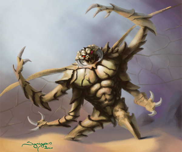
These are the two first of a series of illustrations I have been commissioned to create for the trade card game, Fallen Worlds.
I'm using this commission also as a form of practice, first to use my graphic tablet more, since I am more in tune with natural media, and also in the next few I will begin using reference, aiming for more realism.
I also plan to make a few of these illustrations with natural media.
Any pointers or critiques on these are welcomed.
_________________
"Don't judge a book by it's cover" -Frank Frazetta |
|
| Back to top |
|
Spiral
member
Member #
Joined: 17 Feb 2003
Posts: 82
|
| Posted: Wed Apr 14, 2010 12:59 am |
|
|
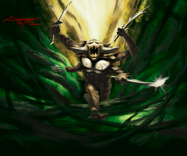
Two more images fro the Fallen Worlds card game.
I'm trying to force myself into making the images more defined. I have a small difficulty with that, I am always keeping things a bit to smooth, the main edges not at the sharpest they can be.
_________________
"Don't judge a book by it's cover" -Frank Frazetta |
|
| Back to top |
|
Anthony
member
Member #
Joined: 13 Apr 2000
Posts: 1577
Location: Winter Park, FLA
|
| Posted: Wed Apr 14, 2010 9:19 am |
|
|
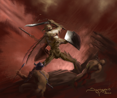
Hey Spiral, nice work! You have lots of potential so keep at it!  If I had more time I'd dig out one of Jason Manley's tirades about contrast, but lemme summarize in a small way. To create interest in a painting you first have to define what the point of the painting is. I'm gonna use the last one you posted as an example. The main action here is the hero/villain slicing the neck of a hapless attacker. So it's the line formed between the main character and what he just did. You must use composition to bring our attention to this. There are various ways to do this, all involving contrast. There's the contrast of saturation. If I had more time I'd dig out one of Jason Manley's tirades about contrast, but lemme summarize in a small way. To create interest in a painting you first have to define what the point of the painting is. I'm gonna use the last one you posted as an example. The main action here is the hero/villain slicing the neck of a hapless attacker. So it's the line formed between the main character and what he just did. You must use composition to bring our attention to this. There are various ways to do this, all involving contrast. There's the contrast of saturation.
I did a 0 second paintover (hope you don't mind!), just changing color hues and saturation. First I added blues and greens to the image. This color shift creates a contrast of warm vs. cold in the image. If you notice, the warm part encompasses the main guy and the guy being killed. It also starts large (upper left) and narrows (lower right), to make our eyes follow the line of action. The color shift also adds visual variety that keeps us interested, but also keeps our eyes from fatiguing. I then used a jarring, highly saturated red for the blood. Especially in a small image like this, the intense red on both his blade and the neck of his victim makes it instantly recognizable what's just happened. This gives movement to the pose as well. Another type of contrast is the contrast of definition.
You want more detail in the areas of interest. So here you would define his face, the sword and blood, the victim's neck, and whatever around those items you feel important, lessening as you move away from the focal points. Another is texture contrast. More texture near focals. Another is brightness contrast. Harder lights/darks near focal area. Now take all these and reverse them. It still works. An image that is mostly high contrast with a small area of low contrast will have the focal point at the low contrast area. Your brain automatically zeroes in on the parts of an image that are unique or different, that define a pattern, that are interesting in some way. These are exceptions though, normally higher contrast, brighter colors, more detail, etc etc, pulls you in.
One note: you should not have both high brightness contrast and high saturation in the same part of the painting. If you have strong lights/darks try to keep the hues from going crazy, and if you have way saturated color values then try not to have solid blacks and whites for the shadows/highlights. And there are exceptions to this as well Overall my advice for you would be to try starting with what my old watercolor teacher called a "bright, colorful warsh (wash)" - try to have numerous hues in there. Then paint on top of that in semi-transleucent tones. You'll find the color patterns from the background start to give you ideas for the forground.
Later on you'll have a picture in your head for the piece from the beginning, and you can lay down a color wash in the BG with more purpose in mind (for instance a cool to warm transition from top to bottom when painting an early evening campfire with misty mountains in the background, etc. Or you can start with the cool at the bottom and use the BG to be the shadow color. It's endless, but don't be afraid to go crazy with the color shifts initially. Paintings always get stiffer/tighter as you work them, so if they're a little wacky at the outset it's probably a good thing! Sorry for the crappy PO, spent all my time typing hehe

_________________
-Anthony
Carpe Carpem
http://www.anthonyfransella.com |
|
| Back to top |
|
Spiral
member
Member #
Joined: 17 Feb 2003
Posts: 82
|
| Posted: Thu Apr 15, 2010 2:32 pm |
|
|
Thanks for the crit Anthony.
You're not saying things that I haven't read of, but it's good you said them, because knowing theory and then actually seeing where to apply it on an image is quite a different thing.
All I can say is that I may have needed to put more texture and definition (there's detail in there, but this is very small and it's all dissapeared), I may not have wanted any cool/warm play (but maybe it would have helped, you have a point) but I am 100% sure that I didn't want a spray of blood.
Thanks for the crit, unknowingly you have given me a direction to a solution to the next illustration I'm working on. Thanks man.
_________________
"Don't judge a book by it's cover" -Frank Frazetta |
|
| Back to top |
|
Anthony
member
Member #
Joined: 13 Apr 2000
Posts: 1577
Location: Winter Park, FLA
|
|
| Back to top |
|
|
|
You cannot post new topics in this forum
You cannot reply to topics in this forum
You cannot edit your posts in this forum
You cannot delete your posts in this forum
You cannot vote in polls in this forum
|
|
Powered by phpBB © 2005 phpBB Group
|


