| View previous topic :: View next topic |
| Author |
Topic : "a quicky-messy somethingsomething :)" |
Boink!
member
Member #
Joined: 18 Jan 2009
Posts: 52
Location: Serbia, Belgrade city space port
|
 Posted: Tue May 05, 2009 3:02 pm Posted: Tue May 05, 2009 3:02 pm |
 |
 |
An illustration I finished yesterday 
A bit messy on some parts, but I kinda did it in a hurry 'cause uni. is takin' all of my free time at the moment. I was very reluctant to post it because of couple of mistakes I made [ right-hand-big-sail-connection, lightning, leg anathomy...ye ye I know.. jst dont have the time to fix it now ], but what the hell... I love the forum and wanna contribute whenever I can until schools over for this year 
Oh..right.. I actually have 2 versions.. Though perspectives are a bit cramped on both I never quite managed to figure out which one looks better
Thats my biggest problem I guess, I tend to make one or 2 versions of everything I do and keep it for generations to come...without any logical reason 
So, while on the subject, if any1 has any idea how to get that nasty habbit out of my system, and has any other comments on these 2 master pieces I did, I'm all ears

and second version of the same..
 |
|
| Back to top |
|
Boink!
member
Member #
Joined: 18 Jan 2009
Posts: 52
Location: Serbia, Belgrade city space port
|
| Posted: Wed May 06, 2009 3:00 am |
|
|
| That bad eh? 40 ppl watchin' and no1s got a thing 2 say ? |
|
| Back to top |
|
kimchi
member
Member #
Joined: 30 Jul 2003
Posts: 140
Location: Canada!
|
| Posted: Wed May 06, 2009 6:08 am |
|
|
| Yep, that bad. |
|
| Back to top |
|
a_sh
member
Member #
Joined: 04 Oct 2001
Posts: 149
Location: Uppsala, Sweden
|
| Posted: Wed May 06, 2009 6:30 am |
|
|
lots of guests who just browse and dont comment on this board.
i like it. very nice colors!
the stone peaks in the left feels abit like a cut-out. especially the far left one.
i guess what i mean is that i would have expected to see some valuechanges near the silouette, that represent the stone turning parallell to the viewer. unless they are supposed to have a knife edge like form that is.
_________________
The horror... |
|
| Back to top |
|
med
member
Member #
Joined: 22 Dec 2006
Posts: 230
Location: LA
|
| Posted: Wed May 06, 2009 6:47 am |
|
|
First of all, I think it's an interesting illustration, clashing two different civilizations. The composition is pretty well balanced. Even if you think the anatomy is wrong, it still works. It still reads as a person etc. One thing that would help is use of atmospheric perspective, I know I say this a lot but it really helps to get that sense of depth into the field of vision.
I hope you don't mind the paintover. (Not really a paintover, I just used some layers set to "lighten".)
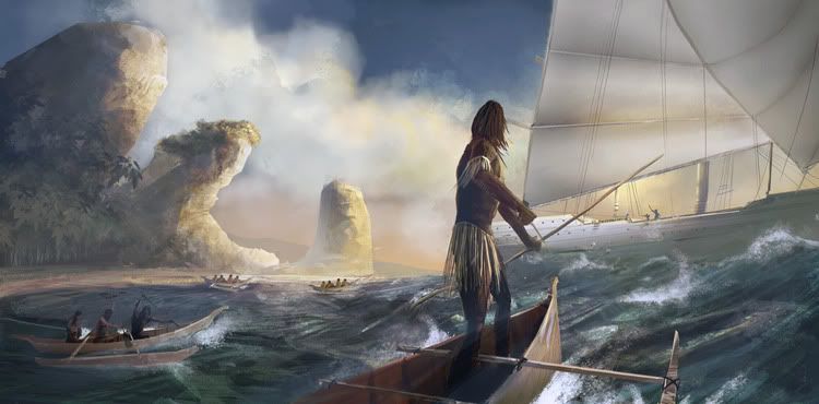
imho, you used too much pure black for the darks. Keep in mind that if the light is warm (reds, yellows etc...the sun...) then the shadows are very likely to be cool. Which is why I used a bluish color for the shadows.
Keep up the good work |
|
| Back to top |
|
Boink!
member
Member #
Joined: 18 Jan 2009
Posts: 52
Location: Serbia, Belgrade city space port
|
| Posted: Wed May 06, 2009 12:05 pm |
|
|
Yeah, yer right MED ... I usually try to avoid black as much as possible, but it turns out am not all that great with back lighting situations. I tried what you suggested so it turned out much better. Thanks
Now only if some1 could tell me how to get rid of that nasty must-keep-at-least-two-versions habit |
|
| Back to top |
|
|


