| View previous topic :: View next topic |
| Author |
Topic : ""I told you this was a bad idea..."" |
Synnical
member
Member #
Joined: 28 May 2005
Posts: 177
Location: Toronto, Canada
|
 Posted: Wed Jan 14, 2009 6:36 pm Posted: Wed Jan 14, 2009 6:36 pm |
 |
 |
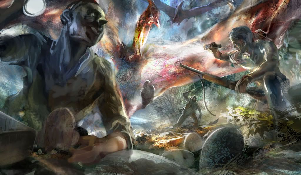
hey guys,
This started out as a speedpaint a couple nights ago and I decided to put a bit more time into it tonight. (one of my new year's resolution is to start finishing paintings, as i have tons of unfinished speedpaints lying around - my artistic ADD be damned!  ) )
I hope the scenes is self-explanatory; I was interested in the effect of transparent skin against a strong light source, and thought a Pteranodon would make a cool thing to illustrate that.
I would just like to hear what people think of it so far before i sink more time into it. Comments and critique are most welcome.
 |
|
| Back to top |
|
med
member
Member #
Joined: 22 Dec 2006
Posts: 230
Location: LA
|
| Posted: Wed Jan 14, 2009 10:31 pm |
|
|
Hey Synnical;
First of all, great composition mah bruddah
It is a good new year's resolution to finish paintings, a lot of us have that problem too lol...
As for your goal in this painting, I think you're somewhat on the right track. But!
I feel you're afraid of the dark! You're using the extreme darks in spurts here and there, rather than grouped areas. I hope you don't mind my edit;
Since your goal was to manipulate lighting, it's important to get the objects to read three dimensionally by using grouped darks/shadows (like the neck of the creature in the edit). See how it reads more like it has separate rounded planes? You seem to try to do that, but I feel like you need to use a wider range of values (darks/lights).
To get the figures to read like they're in a field of depth, try out the effect of atmospheric perspective. A fancy word for saying; objects further away have less contrast than things closer to the viewer. Notice in the edit, the guy up front has pure black within his darks, but the second guy has a lighter value on him (that bluish color, gradient on a layer set to "lighten"). I know the edit isn't all that great, but it's just to kind of nudge you towards a more effective sense of the illusion of visual reality.
I'm talking too much lol....
Anyway, that's my opinion! |
|
| Back to top |
|
Synnical
member
Member #
Joined: 28 May 2005
Posts: 177
Location: Toronto, Canada
|
| Posted: Thu Jan 15, 2009 10:46 am |
|
|
Hey med,
'mah brudddah', ha, that to me is Little Jacob from GTAIV. hilarious character.
thanks a bunch for the comments! I think you are totally right about me being afraid of the dark. I have less of an issue with that when things are relatively well-lit, but when it comes to low light conditions, I get nervous of using too much black, thinking that I would make things look bland and uninteresting.
My initial concern was how to illuminate most of the foreground with only the scattered light from the two flashlights, and that's when I ended up stepping away from the darks. Your overpaint really helped me in seeing how effective the grouped shadows can be used, and the dramatic effect that I was aiming for  thanks dude!! thanks dude!!
oh, and you are not talking too much. You know what you are talking about and I am all ears here. |
|
| Back to top |
|
med
member
Member #
Joined: 22 Dec 2006
Posts: 230
Location: LA
|
| Posted: Thu Jan 15, 2009 11:41 am |
|
|
Awesome, glad that helped.
I'm not sure who little jacob is though...lol
But yeah keep posting your works! |
|
| Back to top |
|
sometimes
member
Member #
Joined: 04 Dec 2008
Posts: 160
|
| Posted: Thu Jan 15, 2009 12:04 pm |
|
|
| it looks like he is sukking the soul from that bird thingy, pretty unique I must say. |
|
| Back to top |
|
canvasdezign
junior member
Member #
Joined: 19 Jan 2009
Posts: 10
|
| Posted: Fri Jan 23, 2009 3:37 am |
|
|
hello Synnical, i would like to say that the painting is truly awsome u have rightly justify with your resolution, please let me know what medium, tools or software u adapted to create this wonderful painting. all the best for future endeavors.
_________________
(no spam) |
|
| Back to top |
|
Klipsh
junior member
Member #
Joined: 04 Aug 2009
Posts: 5
|
| Posted: Wed Aug 05, 2009 12:25 pm |
|
|
| You have a TON of stuff going on. Some good sections and some bad but I think you could approach this entire painting with a less is more mentality and push what you want to push and remove distractions fomr the puepose of the painting. |
|
| Back to top |
|
|


