| View previous topic :: View next topic |
| Author |
Topic : "Capture" |
Capt. Fred
member
Member #
Joined: 21 Dec 2002
Posts: 1425
Location: South England
|
 Posted: Tue Dec 05, 2006 8:42 am Posted: Tue Dec 05, 2006 8:42 am |
 |
 |
Hi guys, if you could suggest any narrative tweaks to make here or there before I put a sock in it, that would be great. I'm not a fan of the red-lazers by the way so I'm not going to bother with beams or dots. thanks for looking
 |
|
| Back to top |
|
The Insane Lemur
member
Member #
Joined: 19 Oct 2003
Posts: 768
|
| Posted: Tue Dec 05, 2006 9:03 am |
|
|
| thats bangin mofo-very good use of values-it is interesting to my eye, aswell the idea of badass commandos from a shadowy organization doing what they do. sry i have nothing to suggest critwise |
|
| Back to top |
|
Joe84
member
Member #
Joined: 26 May 2004
Posts: 262
|
| Posted: Tue Dec 05, 2006 10:23 am |
|
|
that looks great
only crit is maybe the guy on the ground his left arm looks as though its penetrating the guards arm |
|
| Back to top |
|
Tzan
member
Member #
Joined: 18 Apr 2003
Posts: 755
Location: Boston MA
|
| Posted: Tue Dec 05, 2006 11:55 am |
|
|
I thought of something very silly immediatly.
Put pink fairy wings on all the troopers  |
|
| Back to top |
|
neff
member
Member #
Joined: 11 May 2002
Posts: 1444
Location: Germany
|
| Posted: Tue Dec 05, 2006 12:50 pm |
|
|
Yeah nice! But wheres the White Unicorn?
_________________
*
 |
|
| Back to top |
|
ax--hv
member
Member #
Joined: 08 Dec 2003
Posts: 349
|
| Posted: Tue Dec 05, 2006 12:52 pm |
|
|
Great one, love the idea.
Crits: Some details are so realistic they immediately make surrounding look kinda fragmental. Also light on the right and on the wall doesn't feel right - looks foggy. Should be darker and more contrasting in my opinion.
Cheers |
|
| Back to top |
|
Capt. Fred
member
Member #
Joined: 21 Dec 2002
Posts: 1425
Location: South England
|
| Posted: Tue Dec 05, 2006 1:29 pm |
|
|
Lima, Joe, Tzan, Neff, thank you
joe, true, I have tweaked it slightly but I am okay with that, thanks though.
axhv, I completely agree, thanks for the observation. |
|
| Back to top |
|
RyanWalsh
Guest
Member #
|
| Posted: Tue Dec 05, 2006 2:40 pm |
|
|
Its an amazing painting, im taking by it so bad. Its so Great. I love Sci-fi soldiers, and this is the painting i have been waiting for that hit the spot.
I have only one critique, i just dont like the proportions of the soldier in the middle. His upper body looks wrong, and his gun should be perhaps on his left shoulder side. But aside from that everything else is spectacular, what an amzing picture. |
|
| Back to top |
|
Max
member
Member #
Joined: 12 Aug 2002
Posts: 3210
Location: MIND
|
| Posted: Tue Dec 05, 2006 2:53 pm |
|
|
wow. awesome work Capt.!!
Cool mood and great details.
The right area seems very dark to me. Composition wise it needs some light areas. Depands on what you want tho. Maybe it's better to force the viewer to look at the poor man immediatly.
Anyways. Makes me want to see more of your recent stuff! |
|
| Back to top |
|
Tinusch
member
Member #
Joined: 25 Dec 1999
Posts: 2757
Location: Rhode Island, USA
|
| Posted: Tue Dec 05, 2006 7:14 pm |
|
|
| Narrative tweaks... The first thing that comes to mind is some sort of suggestion as to why theyre beating the shit out of this unarmed guy... Maybe something on the ground next to him, or something hidden in his back pocket? Or one of the troops holding some seized object? Maybe some political identifications on the troops or the victim to create a division between them? It's an incredible painting, but it isn't telling a story yet. |
|
| Back to top |
|
Cicinimo
member
Member #
Joined: 03 Mar 2001
Posts: 705
Location: Seattle
|
| Posted: Wed Dec 06, 2006 2:08 am |
|
|
Love this fred! I remember a while back you did a really helpful paintover on one of my pieces. Trying to return the favor here, although I dont know that my version is much of an improvement.
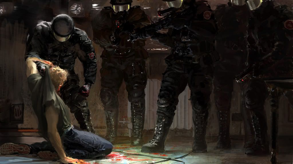
The main thing that was bugging me was the texture and variation in the wall behind the main figures seemed to be coming forward in space. It didnt look like one consistent surface to me. I tried to push it back and flatten it out a bit. I also played with the lighting on the main figures just a tad, tried to follow their forms a little more closely. Don't know that I had much success, but I hope you find it helpful.
_________________
artpad.org |
|
| Back to top |
|
Mikko K
member
Member #
Joined: 29 Apr 2003
Posts: 639
|
| Posted: Wed Dec 06, 2006 2:40 am |
|
|
I was going to mention the skin values, but Cicinimo fixed them already 
The old one looked too emissive (self illuminating).
Some of the reflections in those SWAT helmets look a bit forced. The guy staring at the camera with those yellow reflections looks a bit flat. Maybe you could add more three dimensionality by not using the same reflection on both sides? Like a stronger key light and a more subtle fill.
Very good work nevertheless! |
|
| Back to top |
|
Popeye
member
Member #
Joined: 16 Jun 2002
Posts: 198
Location: La
|
| Posted: Wed Dec 06, 2006 3:15 am |
|
|
| hey capt! cool painting, i especially like the sole of the sneaker. |
|
| Back to top |
|
udal
member
Member #
Joined: 26 May 2006
Posts: 97
Location: UK
|
| Posted: Wed Dec 06, 2006 3:50 am |
|
|
yep. Truthfully narrative seems pretty clear to me - only thing i can't work out is the black lines on the floor - is it just tiling? i would just agree with ryan up there and say the body of the second soldier on the left looks awkward, too short or something. Perhaps it's the foreshortening on the arms - don't know if there's a way you could get it to read better..i had to look at it for a while to work out what he was doing. The poses of the other characters are great though. Agree with mikko about the balance of key/fill. You could add secondary to help with the forms of the soldiers, too.
...if you like |
|
| Back to top |
|
ax--hv
member
Member #
Joined: 08 Dec 2003
Posts: 349
|
| Posted: Wed Dec 06, 2006 9:01 am |
|
|
Forgive me my overpaint (or rather tuning). I just was curious
 |
|
| Back to top |
|
Tomasis
member
Member #
Joined: 19 Apr 2002
Posts: 813
Location: Sweden
|
| Posted: Wed Dec 06, 2006 9:28 am |
|
|
whoaa pretty cool painting, capt fred! all kudos for you!
ax-hv's overpaint is very good describing what i was exactly thought for some improvements. I think that the bright arm is very important for the composition which is unfortunately not noticed by cicinimo. Frankly I could not come even near to such fantastic painting of Capt fred. |
|
| Back to top |
|
Capt. Fred
member
Member #
Joined: 21 Dec 2002
Posts: 1425
Location: South England
|
| Posted: Wed Dec 06, 2006 11:22 am |
|
|
fantastic, thank you all.
Ryan: I know, I have never liked his proportions. But I figure there has to be a limit to how much you're willing to revise an image otherwise you will be perfecting the same image your whole life. I'll leave anatomical improvements to future pictures. Regarding the gun: It IS on his life side!
Max: Agreed, I have lightened that area up a bit now.
Tinusch: That's all true, and is what I asked for. However it's done for some guys' mod and the context is well known to them. I am contradicting myself.
Cicinimo: Great, I love what you've done with the LHS, especially the way you have re-computed the light. The anatomical and rendering improvements are very nice aswell - great the t-shirt, I will try and incorporate these. My anatomy is pretty basic, and I really came up against it this time. Thanks
Mikko: Emissive.. it's kind of a trick I like with flesh, (like the exaggerated subsurface scattering in the incredibles). I see now that it looks better when done naturally. Regarding the visors: that greenish light at the edges is supposed be visor illumination rather than reflection. It looks better without it anyway, as in ax-hvs paint.
Udal: those are wires. i went off them, and then forgot about them
ax-hv: I like it, good suggestion.
I have made some of the earlier alterations - Will update you next week after deadlines. |
|
| Back to top |
|
RyanWalsh
Guest
Member #
|
| Posted: Wed Dec 06, 2006 11:44 am |
|
|
Its bugging me. Loosen him up. Im sorry  |
|
| Back to top |
|
RyanWalsh
Guest
Member #
|
| Posted: Wed Dec 06, 2006 11:48 am |
|
|
| Im thinking... if you just got rid of that soldier.. it would maybe look better :\ |
|
| Back to top |
|
Sampster
member
Member #
Joined: 01 Jun 2005
Posts: 182
|
| Posted: Wed Dec 06, 2006 3:20 pm |
|
|
Just a thought...yes the arm does look a little weird, but is it so bad that it outweighs the good features of the soldier (the boots in particular are very nice)?
It probably doesn't apply here, but just think...sometimes there are things in real life where you look at them...then you do a double take and in your head you say, "That doesn't make sense to my eyes, it looks messed up". (of course we have to accept it if its in real life anyway, our eyes don't see things that aren't there in most cases)
You have to look at it from other angles for it to make sense but in a picture you only get once angle, you can't "explain" to your viewers why certain things look a little out of place.
So thinking about that can make you more anal about poses the first time you paint stuff, but it also makes me want to be a little more forgiving. Am I talking nonsense or does this make sense?... the idea that sometimes stuff will look a little odd from an angle even if it's not too far off how things would appear in real life. |
|
| Back to top |
|
Misc
member
Member #
Joined: 04 Jun 2004
Posts: 475
Location: Sweden
|
| Posted: Thu Dec 07, 2006 7:11 am |
|
|
wow, this is a great picture! sorry just had to play with the composition and pose a bit, hope that's ok...
 |
|
| Back to top |
|
Nag
member
Member #
Joined: 25 Apr 2004
Posts: 287
Location: Iceland
|
| Posted: Thu Dec 07, 2006 7:24 am |
|
|
| That�s excactly what I was thinking with the pose of that soldier Misc. |
|
| Back to top |
|
RyanWalsh
Guest
Member #
|
| Posted: Thu Dec 07, 2006 10:57 am |
|
|
| Sampster= I know exactly what you mean. |
|
| Back to top |
|
RyanWalsh
Guest
Member #
|
| Posted: Thu Dec 07, 2006 11:01 am |
|
|
| No hard feelings, this is amazing painting.. I wish i understood how to paint so well like this. |
|
| Back to top |
|
Capt. Fred
member
Member #
Joined: 21 Dec 2002
Posts: 1425
Location: South England
|
| Posted: Tue Dec 12, 2006 4:22 pm |
|
|
Sorry to bump this back up again,
Thank you for you help
 |
|
| Back to top |
|
B0b
member
Member #
Joined: 14 Jul 2002
Posts: 1807
Location: Sunny Dorset, England
|
| Posted: Tue Dec 12, 2006 5:00 pm |
|
|
that guy standing face on in the pick still feels wrong - should turn him to the right so he has a stronger stance with the gun..
but a gr8 painting all the same 
oh and i much prefer the UK style of handcuff |
|
| Back to top |
|
octavian
member
Member #
Joined: 28 Feb 2004
Posts: 401
Location: Kalifornia
|
| Posted: Tue Dec 12, 2006 5:03 pm |
|
|
| Capt. Fred wrote: |
| Hi guys, if you could suggest any narrative tweaks to make here or there before I put a sock in it, that would be great. |
Hey there Capt.!
This piece is very stunning. Thanks for sharing. Since you opened up a question about narrative, I wanted to throw in a little crit. The "victim" looks pretty badly beat up and with all those hightech soldiers I'm wondering why they all seem so tense and ready to pounce? I guess my thinking is that they would be a bit more cocky/relaxed, certainly having guns at ready, but maybe not pointing at him in such an overtly aggressive manner. Mainly because the dude is not looking like he has much fight left in him to be any sort of threat to the soldiers... it seems like overkill? does this make sense? I hope I helped. |
|
| Back to top |
|
Capt. Fred
member
Member #
Joined: 21 Dec 2002
Posts: 1425
Location: South England
|
| Posted: Wed Dec 13, 2006 5:07 am |
|
|
Bob, I can't easily draw somebody holding a gun in profile, let alone from the front! What are American handcuffs? Those plastic ties?
octavian, I know what you mean.it just sort of happened, I never really planned the whole picture as one happening. I just put in all the things that I wanted at the same time.
Now I see it now more like a shot from a stage play or a movie poster. You know, it's a scene that has been condensed into a posed picture, a bit melodramatic.
Thanks |
|
| Back to top |
|
notic
member
Member #
Joined: 09 Apr 2001
Posts: 441
Location: Sweden
|
| Posted: Wed Dec 13, 2006 6:17 am |
|
|
Hey there Capt Fred, looks like a really nice piece, but i was just thinking about that overpaint Misc did, and it became obvious:
the right leg is missing on the soldier who's beating up the other guy. |
|
| Back to top |
|
Max
member
Member #
Joined: 12 Aug 2002
Posts: 3210
Location: MIND
|
| Posted: Wed Dec 13, 2006 9:55 am |
|
|
| Yeah, you nailed it! Can't await the next pice. You always have such a special mood in your images,..I dunno what it s tho - only to be described as "capt. fred mood" : ) |
|
| Back to top |
|
|


