| View previous topic :: View next topic |
| Author |
Topic : "green forest light on skin" |
Moogle
junior member
Member #
Joined: 10 Jan 2003
Posts: 10
Location: Long Island
|
 Posted: Wed Nov 08, 2006 5:22 pm Posted: Wed Nov 08, 2006 5:22 pm |
 |
 |
As a lifelong pencil sketcher, I'm trying to get a grasp on finally using some color via painting in photoshop. I've been a lurker here for a few years and an admirer of the work of the many skilled CG painters who frequent this forum, so I recognize the need to vastly improve my understanding and execution of color in different lighting. Heh, of course the things I think of to paint keep being these unusual lighting situations. Maybe not the best choices for trying to learn the fundamentals... (or for finding reference, grrr) but I can't really keep myself from picturing things and wanting to try to make them the way I visualize them. I'm hoping I'm making progress but I will eagerly accept brutal criticism in order to make better progress.
So, please have a judgemental look.
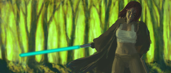
face: http://www.keltlore.com/kikioteaser.jpg |
|
| Back to top |
|
Joe84
member
Member #
Joined: 26 May 2004
Posts: 262
|
| Posted: Wed Nov 08, 2006 7:34 pm |
|
|
| the color in the bg is too intense, tone it down. |
|
| Back to top |
|
Moogle
junior member
Member #
Joined: 10 Jan 2003
Posts: 10
Location: Long Island
|
| Posted: Wed Nov 08, 2006 8:24 pm |
|
|
? |
|
| Back to top |
|
Moogle
junior member
Member #
Joined: 10 Jan 2003
Posts: 10
Location: Long Island
|
| Posted: Fri Nov 17, 2006 9:56 am |
|
|
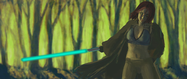
Just wanted to update with current result, now that I've spent alot more time on this.
 |
|
| Back to top |
|
faeklone
member
Member #
Joined: 03 Apr 2002
Posts: 215
Location: Calgary
|
| Posted: Fri Nov 17, 2006 1:08 pm |
|
|
looking pretty good so far. Just remember to touch the other items as you're doing the figure. The figure looks great but the cloak isn't showing any indication of volume within it. Although that may be because you're working on it, the element of the Cloak and how you deal with the background will affect the rest of the image no matter how well you did the figure.
I do think you're doing really well so keep at it and keep us posted.
_________________
"It's not the tools you use but how you use them that counts." |
|
| Back to top |
|
notic
member
Member #
Joined: 09 Apr 2001
Posts: 441
Location: Sweden
|
| Posted: Tue Nov 21, 2006 12:03 am |
|
|
Hi there Moogle, welcome to the forums.
I think you need to work less on the details(even though they are nice), and more on fundamental things such as composition, color, and trying to interact the figure with the scene. The scene looks flat, and also awkward because of the image is cut right above her head. Also, do not forget to identify the primary light source, and be consistent with it.
Keep at it! |
|
| Back to top |
|
Diruo
member
Member #
Joined: 02 Jan 2002
Posts: 164
Location: Sweden
|
| Posted: Wed Nov 22, 2006 1:51 am |
|
|
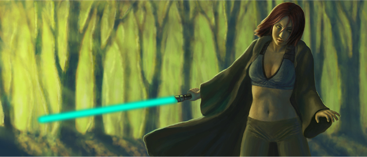
Nice. Some comments on the lightsabre though (I'm a star wars geek).
If you're going for a star wars-esqe lightsabre you make a very common mistake (or maybe you havn't started working on it yet). The core of the sabre is ALWAYS white or very close to white, and then the glow radiates out from the core. Do a google image search. Notice how fake this looks compared to this?
And then you have to consider how the lightsabre should look, and in particular, the glow. There's the new trilogy look, which has a smaller white core and a wider, uniform glow. And there's the old trilogy look, with larger core and smaller, but more intense glow. Personally, I think the old trilogy lightsabres are far superior and look way more real and vibrant. There's also a difference in hues, compare the hues in the image with Luke and the darker hue of the Obi-Wan image. Again, I personally prefer the old trilogy look.
Of course, you could always do a more artistic looking one.
Edit: links |
|
| Back to top |
|
patrick
member
Member #
Joined: 07 May 2001
Posts: 163
Location: Maryland
|
| Posted: Fri Nov 24, 2006 3:14 pm |
|
|
I actually like the feel of your first draft, with her lightsaberpointed more down and a little behind her( make it more of a straight line from arm to sabre tip) and her left arm behind her adding that mysterious "whats in my other hand" effect. Her expression should be almost taunting but confident, kind of a "you feel lucky, punk??" not scared like she does in your last update.
_________________
Feel Free to feel me!!! |
|
| Back to top |
|
|


