| View previous topic :: View next topic |
| Author |
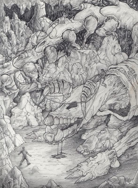
Topic : "Gorebeast WIP" |
Zafo999
junior member
Member #
Joined: 28 Feb 2006
Posts: 7
Location: Seattle
|
|
| Back to top |
|
Spiral
member
Member #
Joined: 17 Feb 2003
Posts: 82
|
 Posted: Sat Nov 04, 2006 3:57 pm Posted: Sat Nov 04, 2006 3:57 pm |
 |
 |
Well, if I were you, I'd go with what you have already set down yourself. What I mean is that you have almost no detail in the background, and things spice up as you get to the monster.
Well, the whole set up seems (in my mind) to be begging for a very dark cave background and you should have a spot light flooding the creature from above, as if it's coming from a crack through the ceiling. But don't go over board and light up the whole monster. You will have to increase the contrast where the powerful light hits, the rest should be darker and with less contrast. Maybe throw a streak of light on the man too.
Put most of the light on the head, then on the man, next go to the detailed rocks and last the back half of the moster, the rest should be pretty dark. Strong shadows from the head on the strongly lit rocks underneath will create as much contrast as is needed to attract the eye and keep the rest of the image less powerful.
_________________
"Don't judge a book by it's cover" -Frank Frazetta |
|
| Back to top |
|
Zafo999
junior member
Member #
Joined: 28 Feb 2006
Posts: 7
Location: Seattle
|
| Posted: Mon Nov 06, 2006 1:35 am |
|
|
| Thanks for such a detailed critique! |
|
| Back to top |
|
Zafo999
junior member
Member #
Joined: 28 Feb 2006
Posts: 7
Location: Seattle
|
| Posted: Mon Dec 11, 2006 11:24 am |
|
|
 |
|
| Back to top |
|
fruity_loops
member
Member #
Joined: 03 Nov 2006
Posts: 111
Location: Vienna, Austria
|
| Posted: Tue Dec 26, 2006 8:28 am |
|
|
This thread is already a little old... but anyway... 
I think the picture could be much better if you would define the light a little more. Gives the viewer more idea about the perspective and about what is important in the picture, just like Spiral said...
Here is a rough overpaint to show you what i mean.
 |
|
| Back to top |
|
3nasty
member
Member #
Joined: 05 Dec 2005
Posts: 340
Location: myspace.com/halomoto
|
| Posted: Tue Dec 26, 2006 9:34 am |
|
|
nice sketch Zafo  |
|
| Back to top |
|
|


