| View previous topic :: View next topic |
| Author |
Topic : "(UPDATE - new BG) Young Kung Fu Master (step by step)" |
R a n d i s
member
Member #
Joined: 10 Feb 2003
Posts: 139
Location: Bangkok/Berlin
|
 Posted: Fri Jun 30, 2006 8:09 am Posted: Fri Jun 30, 2006 8:09 am |
 |
 |
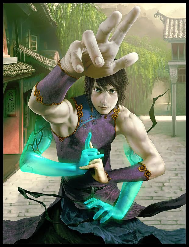
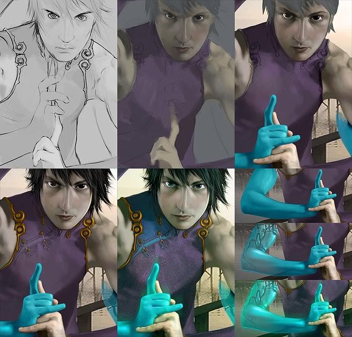
Lates Image, just finished today.
Done in Open Canvas 1 and Photoshop 5.5
Worked on it about 40 hours.
Used a Mirror for reference for the character.
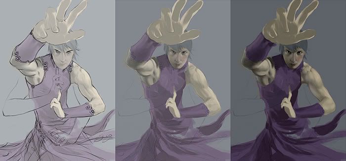
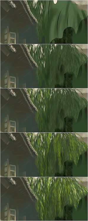
/// UPDATE: Painted a new BG in OC, fixed minor mistakesa and added some step by steps.
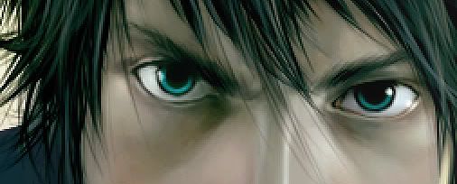
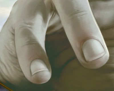
Here is the final Image, some detail views and a rough step by step.
-


_________________
www.hd-fortresss.com
Last edited by R a n d i s on Sat Jul 01, 2006 7:05 pm; edited 1 time in total |
|
| Back to top |
|
eyewoo
member
Member #
Joined: 23 Jun 2001
Posts: 2662
Location: Carbondale, CO
|
| Posted: Fri Jun 30, 2006 9:05 am |
|
|
Very nice... My only suggestion would be to de-confuse the left-side dock in the background. The structure is so clear and easy to read elsewhere in the picture... it just suddenly seems confusing when you get to the left-side bg.
...but, cool picture!!!
_________________
HonePie.com
tumblr blog
digtal art |
|
| Back to top |
|
xbrianx
member
Member #
Joined: 30 Jun 2006
Posts: 134
Location: Savannah, GA
|
| Posted: Fri Jun 30, 2006 9:06 am |
|
|
| That is amazing. I like the extra pair of arms. |
|
| Back to top |
|
3nasty
member
Member #
Joined: 05 Dec 2005
Posts: 340
Location: myspace.com/halomoto
|
| Posted: Fri Jun 30, 2006 2:05 pm |
|
|
wierd left arm..but nice  |
|
| Back to top |
|
R a n d i s
member
Member #
Joined: 10 Feb 2003
Posts: 139
Location: Bangkok/Berlin
|
| Posted: Fri Jun 30, 2006 9:51 pm |
|
|
Hi People! Thank you for the great Response!
As i see that most people do not like the BG and i am myself to be honest have to admit that i was to lazy to come up with something better, will chang it. In fact i am already painting a new one, it will be a dreamy chinese Town or something like that. A temple is IMO not a good idea as everyone would expect it in the first place. I will change other things too such as details, colours and add new elements to the character.
I will update this when i am done.
_________________
www.hd-fortresss.com |
|
| Back to top |
|
daryl
member
Member #
Joined: 28 Oct 2000
Posts: 441
Location: Stockholm, Sweden
|
| Posted: Sat Jul 01, 2006 3:04 am |
|
|
great! skin is perhaps a bit grey for my taste but I like the whole pose and extra arms and their colors against the more real renderings.
_________________
homepage:blog |
|
| Back to top |
|
Nausea
junior member
Member #
Joined: 26 Jul 2000
Posts: 14
Location: Brazil
|
| Posted: Sat Jul 01, 2006 8:21 am |
|
|
very nice!
I like all details |
|
| Back to top |
|
R a n d i s
member
Member #
Joined: 10 Feb 2003
Posts: 139
Location: Bangkok/Berlin
|
|
| Back to top |
|
Godwin
member
Member #
Joined: 24 Apr 2002
Posts: 701
Location: Singapore
|
| Posted: Sat Jul 01, 2006 11:48 pm |
|
|
Wow awesome, lovely rendering of skin, the hand(s) especially, and the general green hue used in shading. Great movement in the robes too, my only qualm is that he doesn't look Asian, but I guess that's because of the reference you used?
_________________
Derelict Studios|Godwin's Space |
|
| Back to top |
|
Sumaleth
Administrator
Member #
Joined: 30 Oct 1999
Posts: 2898
Location: Australia
|
|
| Back to top |
|
daryl
member
Member #
Joined: 28 Oct 2000
Posts: 441
Location: Stockholm, Sweden
|
| Posted: Sun Jul 02, 2006 1:30 am |
|
|
this is not what you want to hear after spending time on the new bg, but I had less problems with the first one, as the simplicity of it brought the character alot more in focus. along with what sumaleth said about the hair, I also feel there's a big perspective problem, unless he's floating in the air or the houses are very small in height. because you look at the left houses from above.
_________________
homepage:blog |
|
| Back to top |
|
R a n d i s
member
Member #
Joined: 10 Feb 2003
Posts: 139
Location: Bangkok/Berlin
|
| Posted: Sun Jul 02, 2006 2:55 am |
|
|
Yes the Cam is lookin slightly from above at the character as you can see it on his bodies perspectve. The cam is not eye to eye, it is placed higher then the roof of the front house. The cloths movement and his reaching out hand are sugesting that is he is jumping, floating. Coule be more clear i guess....
_________________
www.hd-fortresss.com |
|
| Back to top |
|
daryl
member
Member #
Joined: 28 Oct 2000
Posts: 441
Location: Stockholm, Sweden
|
| Posted: Sun Jul 02, 2006 3:05 am |
|
|
ok, that explains it 
perhaps the cobble stones large size create the feeling the viewer is close to the ground - if they would be smaller and the closest ones would be drawn a bit more towards a top view might give a better understanding of the characters position.
_________________
homepage:blog |
|
| Back to top |
|
R a n d i s
member
Member #
Joined: 10 Feb 2003
Posts: 139
Location: Bangkok/Berlin
|
| Posted: Sun Jul 02, 2006 3:25 am |
|
|
Yes i actually had the stones small in my imagination, small, clear and in many different colours, however as soon as painted about the first 2-3 of them i deleted them because i felt lazy to spend hours on that. 
_________________
www.hd-fortresss.com |
|
| Back to top |
|
eyewoo
member
Member #
Joined: 23 Jun 2001
Posts: 2662
Location: Carbondale, CO
|
| Posted: Mon Jul 03, 2006 5:07 am |
|
|
I prefered the simplicity of the first BG... That far left dock just needed to be more simple in style.
The second version BG is certainly interesting, but for me it competes too much with the central character.
_________________
HonePie.com
tumblr blog
digtal art |
|
| Back to top |
|
|


