| View previous topic :: View next topic |
| Author |
Topic : "Reynald" |
rv_el
junior member
Member #
Joined: 08 Nov 2000
Posts: 39
Location: Eureka, CA, USA
|
 Posted: Thu Nov 10, 2005 5:21 pm Posted: Thu Nov 10, 2005 5:21 pm |
 |
 |
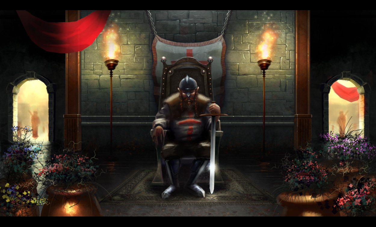
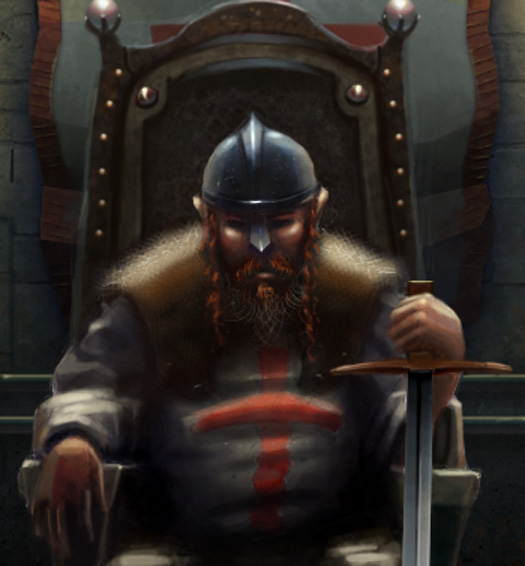
I was inspired to create this image after watching Kingdom of Heaven. I wasn't big on the movie but I do recall this character, Reynald, that was basically the embodyment of what i think/see when i think of the crusades.
Please critique this image. What is the worste aspects of it? what could be added?
Is the red sash inside the building pretty bad? I'm not sure how to do it well.
Could it use some more nicknacks like rings on his fingers, wood work, etc.?
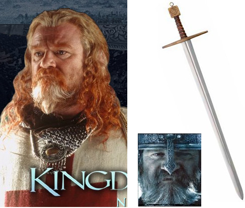
Reference
 |
|
| Back to top |
|
antx
member
Member #
Joined: 21 Jan 2002
Posts: 320
Location: Berlin, Germany "OLD EUROPE"
|
| Posted: Fri Nov 11, 2005 4:59 pm |
|
|
Well. I like it, but if you really want to make it better, then his shoulder pads should not come out so blurry. They are right in the focus of the image and should therefore be as sharp as the rest of the character. Also the reflections on the helmet have the wrong color. They should be yelloish like the flames.
Otherwise its really nice.  |
|
| Back to top |
|
rv_el
junior member
Member #
Joined: 08 Nov 2000
Posts: 39
Location: Eureka, CA, USA
|
| Posted: Sat Nov 12, 2005 1:25 am |
|
|
Thanks,
ah, thats supposed to be a fur garment over his shoulders and attached to his under garment. is it not reading as fur? |
|
| Back to top |
|
antx
member
Member #
Joined: 21 Jan 2002
Posts: 320
Location: Berlin, Germany "OLD EUROPE"
|
| Posted: Sat Nov 12, 2005 3:41 am |
|
|
| Oh, well, I did not recognize it as such, sorry. Perhaps look for a reference pic on the net to see what might be the problem. Even fur has some texture and structure. The outher edges don't necessarily have to be blurry. |
|
| Back to top |
|
Affected
member
Member #
Joined: 22 Oct 1999
Posts: 1854
Location: Helsinki, Finland
|
| Posted: Mon Nov 14, 2005 2:48 am |
|
|
| I guess the biggest problem is to do with the composition. You've got a very symmetrical composition with the main interest in dead center - this in itself can be pretty boring, but you also have a lot of attention-drawing stuff at edges: the bright arches and the detailed flowers. |
|
| Back to top |
|
artbank
junior member
Member #
Joined: 21 Nov 2005
Posts: 6
|
| Posted: Wed Nov 23, 2005 6:59 am |
|
|
a good piece of work
it took you much time

_________________
"Climbing the highest peak is like falling into a bottomless abyss." |
|
| Back to top |
|
|


