| View previous topic :: View next topic |
| Author |
Topic : "woman with guns" |
Odds
member
Member #
Joined: 17 Sep 2004
Posts: 374
|
 Posted: Thu May 12, 2005 2:47 pm Posted: Thu May 12, 2005 2:47 pm |
 |
 |

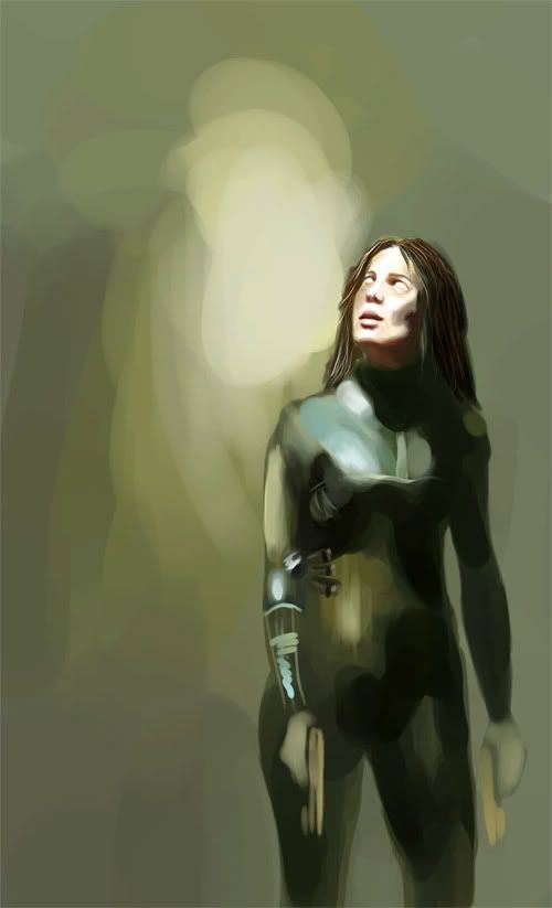
wip :p |
|
| Back to top |
|
Odds
member
Member #
Joined: 17 Sep 2004
Posts: 374
|
| Posted: Thu May 12, 2005 4:57 pm |
|
|

 |
|
| Back to top |
|
Sumaleth
Administrator
Member #
Joined: 30 Oct 1999
Posts: 2898
Location: Australia
|
|
| Back to top |
|
Odds
member
Member #
Joined: 17 Sep 2004
Posts: 374
|
| Posted: Thu May 12, 2005 6:10 pm |
|
|
| Thanks Sumaleth, i'll try working on that. |
|
| Back to top |
|
Odds
member
Member #
Joined: 17 Sep 2004
Posts: 374
|
| Posted: Thu May 12, 2005 6:54 pm |
|
|
i think i fixed the stomach problem a bit... |
|
| Back to top |
|
Odds
member
Member #
Joined: 17 Sep 2004
Posts: 374
|
| Posted: Sat May 21, 2005 10:35 am |
|
|
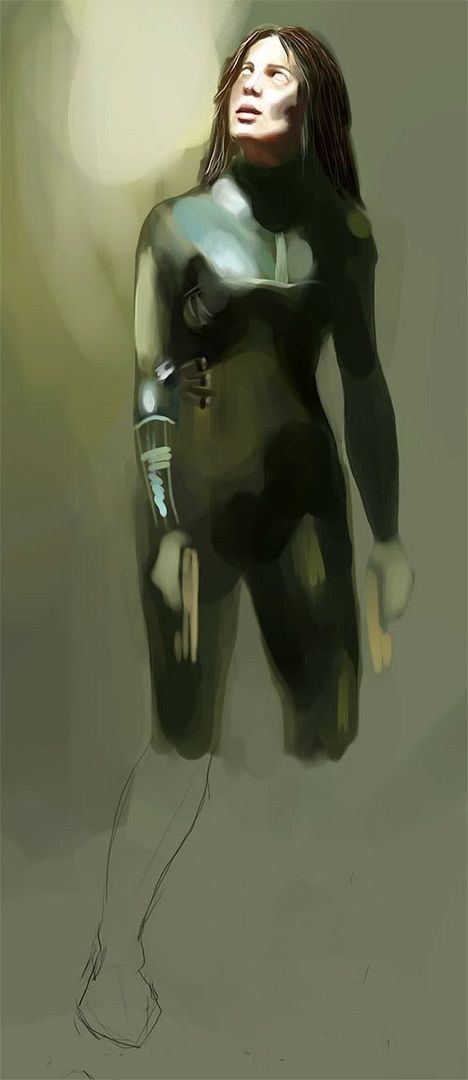
changed it up a little... any suggestions? i dunno where this is goin' |
|
| Back to top |
|
DeadbeaT
member
Member #
Joined: 18 May 2003
Posts: 97
Location: Norway
|
| Posted: Sat May 21, 2005 3:12 pm |
|
|
i like the new pose better, the old one was kind of saggy.. keep it up!
_________________
DeadbeaT was here |
|
| Back to top |
|
watmough
member
Member #
Joined: 22 Sep 2003
Posts: 779
Location: Rockland, ME
|
| Posted: Sun May 22, 2005 7:33 pm |
|
|
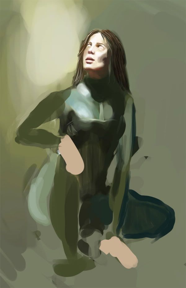
| old pose was better,had more story,just some minor anatomy changes and you would get it. |
|
| Back to top |
|
Capt. Fred
member
Member #
Joined: 21 Dec 2002
Posts: 1425
Location: South England
|
| Posted: Mon May 23, 2005 1:29 am |
|
|
| agree with watmough, defo. |
|
| Back to top |
|
Andromeda
member
Member #
Joined: 18 Jan 2000
Posts: 708
Location: Lower Ward, Sigil
|
| Posted: Mon May 23, 2005 9:36 am |
|
|
agreed .. the old pose was nicer .. i dont think the old pose was 'saggy' ..
i think it was more natural, had more of a story to it ... shes tired or something..
the new one looks too cliche' .. |
|
| Back to top |
|
DeadbeaT
member
Member #
Joined: 18 May 2003
Posts: 97
Location: Norway
|
| Posted: Mon May 23, 2005 11:33 am |
|
|
You guys are right.. It was kind of cliche.. Sorry
_________________
DeadbeaT was here |
|
| Back to top |
|
vidghost
junior member
Member #
Joined: 27 Apr 2005
Posts: 21
Location: Australia
|
| Posted: Tue May 24, 2005 5:05 am |
|
|
| No i like the new pose its allot more interesting then a girl standing ,., great job ... the tones are awsome. |
|
| Back to top |
|
kanelo
junior member
Member #
Joined: 19 May 2005
Posts: 6
|
| Posted: Tue May 24, 2005 10:34 am |
|
|
| the colors are very nice ... ^_^ |
|
| Back to top |
|
Odds
member
Member #
Joined: 17 Sep 2004
Posts: 374
|
| Posted: Thu May 26, 2005 3:46 pm |
|
|
hey thanks everyone... i'm still pending on this one, school is over in a few weeks and the load of HW has risen. for everyone that likes the old pose better, how do you think i could change the anatomy etc to make it better? i'll try defining the new pose now and wait 'till i get suggestions on the old pose. Thanks again  |
|
| Back to top |
|
MCMA
member
Member #
Joined: 14 Apr 2005
Posts: 61
Location: Ume�, Sweden
|
| Posted: Thu May 26, 2005 8:21 pm |
|
|
I am no expert by any means as I am struggling with anatomy and proportions everyday to learn. Spot a few things though. Upper arm and lower arm could be more equal in length. Extend the upper arm a little.
Torso could use a corsette type of slant but without the ridiculously slim midsection hehe. I mean tuck the upper abdominal area in a little and tuck the sides of the belly in a little while still maintaining hips. Subtle stuff as I think you're very close to decent proportions already.
Third spot is her jawline. Maybe a softer curve. More feminine.
Keep up the nice work with this one. I like it a lot and the old pose is more interesting to me as well. It's 06am in the morning so I hope any o this makes sense :}
_________________
The Dark Ages was caused by the Y1K problem. |
|
| Back to top |
|
Capt. Fred
member
Member #
Joined: 21 Dec 2002
Posts: 1425
Location: South England
|
| Posted: Sat May 28, 2005 8:14 am |
|
|
I tried for 3 hours to do paint over, but everything I did made it worse.
I think the original pose, for sure, no doubt imo. There's something about it that is 100% right, magic inside it. And great use of colour, a hard palette to pull off, i found whn p-o'ing.
Only thing I can think is this. breasts are too high, plus, feel on your own shoulder (or look in the mirror) where the shoulder meats your chest, it curves in and the chest projects forward before curving round the ribcage etc. Apart from those tiny things, the anatomy, to me, looks a-ok, maybe I am missing something(?) just think about the angles the surfaces are facing on the body. Just feel around your own ribs and arms and you feel the make-up of your body.
It could make a better illustration than the the one the cover of the book I've got sitting next to me (also depicting a human figure against a plain background), and he got paid(!)
That pose is priceless, tells a story, somehow, like watmough said.
With such a stong light on the face the eyes sockets, under nose etc, could go brighter and more saturated.
what I mean about the shoulder and the face
this one's gonna be a great. |
|
| Back to top |
|
|


