| View previous topic :: View next topic |
| Author |
Topic : "The Green House (oil) *updated*" |
Heysoos
member
Member #
Joined: 24 Mar 2004
Posts: 294
Location: the New Mexico
|
 Posted: Thu Apr 21, 2005 2:44 pm Posted: Thu Apr 21, 2005 2:44 pm |
 |
 |
This painting isn't quite done, but I wanted to get some feedback and see where I need to work on it the most, and where I should completely change things. Thanks.
size: 30"x40"

_________________
http://www.angelfire.com/art2/wfkeil
Last edited by Heysoos on Tue Apr 26, 2005 5:32 pm; edited 1 time in total |
|
| Back to top |
|
Naeem
member
Member #
Joined: 13 Oct 2004
Posts: 1222
Location: USA
|
| Posted: Thu Apr 21, 2005 3:00 pm |
|
|
its beautiful so far!
just one crit. it looks a bit 'abstract'.. if u're going for that look, great. right now, its in the middle. so might wanna detail it just a bit and it'll be perfect  . . |
|
| Back to top |
|
gLitterbug
member
Member #
Joined: 13 Feb 2001
Posts: 1340
Location: Austria
|
| Posted: Thu Apr 21, 2005 3:50 pm |
|
|
| It looks quite nice, but I have to admit that I�m kind of lost looking at it in parts. |
|
| Back to top |
|
jinnseng
member
Member #
Joined: 07 Oct 2004
Posts: 100
Location: AZ
|
| Posted: Thu Apr 21, 2005 3:56 pm |
|
|
| It's not bad, but its hard to tell what you're going for. It kind of looks like some kind of forest scene, but it's just not clear enough to tell. Maybe you could explain to us what this picture is suppose to be? |
|
| Back to top |
|
Heysoos
member
Member #
Joined: 24 Mar 2004
Posts: 294
Location: the New Mexico
|
| Posted: Thu Apr 21, 2005 4:55 pm |
|
|
hmmm, good question. Basically, I wanted to capture the essence of a place without it being so much a depiction of a specific place....if that makes any sense. This painting fits in a line of work where I've been trying to explore the idea of expressing a frame of mind through the language of landscape. Its kinda like the merging of ones mind and emotions with nature I suppose. Heres some previous samples in this line to maybe help make more sense (or less).
The Black House
The Grey House
Wrath
Ruins
In the Blackhouse, things are much more clearly laid out, but it seems maybe too clear in a way. More like an illustration of a specific setting. In The Grey House and Wrath I tried to make things more vague and just capture more of the raw mood. In this one my initial idea was to be more vague and have more of a bare emotion than a setting but as I worked on it it seemed to want to be more refined and detailed. Right now its kinda half way in the middle which probably isn't good and should be made either more abstract or more refined.
Hopefully people won't think I'm TOO full of shit after reading that 
_________________
http://www.angelfire.com/art2/wfkeil |
|
| Back to top |
|
Matthew
member
Member #
Joined: 05 Oct 2002
Posts: 3784
Location: I am out of here for good
|
| Posted: Fri Apr 22, 2005 12:22 pm |
|
|
wuw Heysoos really neat works you got there, I wish I could paint like you.
I really like the above painting as it is but as you wanted tips. Mostly I am thinking compositionally for this one and that would be to add light to the left and some more shadow in the bottom foliage bushes, hmm maybe I am thinking too much landscape here and it may be not what you are looking for. A quick overpaint to show what I mean:

Ruins is a Master piece I tell you, keep up the good work. |
|
| Back to top |
|
Heysoos
member
Member #
Joined: 24 Mar 2004
Posts: 294
Location: the New Mexico
|
|
| Back to top |
|
watmough
member
Member #
Joined: 22 Sep 2003
Posts: 779
Location: Rockland, ME
|
| Posted: Fri Apr 22, 2005 3:21 pm |
|
|
awesome,heysoos!
very Turnery,i like it very much. |
|
| Back to top |
|
TemplaStormX
junior member
Member #
Joined: 22 Apr 2005
Posts: 16
|
| Posted: Fri Apr 22, 2005 3:23 pm |
|
|
| annisahmad wrote: |
its beautiful so far!
just one crit. it looks a bit 'abstract'.. if u're going for that look, great. right now, its in the middle. so might wanna detail it just a bit and it'll be perfect . |
I agree with him, for later versions there should be a clear focus on things. |
|
| Back to top |
|
noxi
member
Member #
Joined: 04 Jul 2003
Posts: 281
Location: Finland
|
| Posted: Tue Apr 26, 2005 12:19 am |
|
|
| veeery nice. reminds me very much of Turner. allways nice to see pics influencd by romantic era things. me likey alot! |
|
| Back to top |
|
Diruo
member
Member #
Joined: 02 Jan 2002
Posts: 164
Location: Sweden
|
| Posted: Tue Apr 26, 2005 12:33 am |
|
|
| *love* |
|
| Back to top |
|
Pringle
member
Member #
Joined: 05 May 2001
Posts: 376
Location: Ontario, Canada.
|
| Posted: Tue Apr 26, 2005 2:13 am |
|
|
Very nice.
I don't mind that it looks a bit abstract. It gives the viewer room to let
the image grow in the imagination.
And if you stand back from the monitor it all settles down nicely.
_________________
http://pringleart.com |
|
| Back to top |
|
Heysoos
member
Member #
Joined: 24 Mar 2004
Posts: 294
Location: the New Mexico
|
| Posted: Tue Apr 26, 2005 5:29 pm |
|
|
Thanks a lot for the comments everyone. I appreciate it greatly. Yeah, I am definitely heavily influenced by the likes of Turner. I tried to take some of the advice i've been getting, Heres an update:
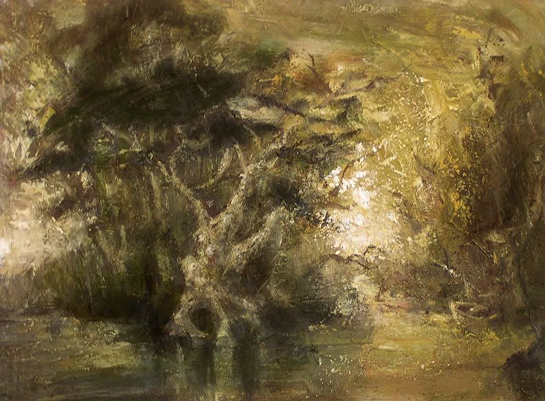
(I had a bit of a glare problem taking the photo which I tried to fix up in photoshop, so some of the colors and such might be a tad bit wonky)
_________________
http://www.angelfire.com/art2/wfkeil |
|
| Back to top |
|
Matthew
member
Member #
Joined: 05 Oct 2002
Posts: 3784
Location: I am out of here for good
|
| Posted: Wed Apr 27, 2005 2:20 am |
|
|
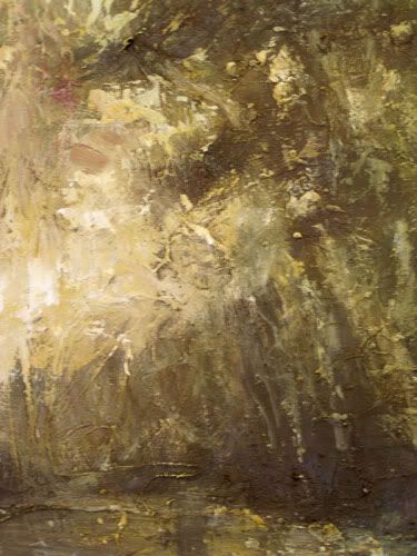
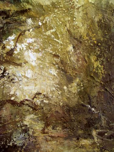
oh yea this is a lot better.
There is one thing though and I might sound tacky or something and maybe it is the glow u mentioned above causeing it. There is a small part taking a lot of attention, it is to me anyway so others may think differently.
The left part has a small part being bright, I guess it could be like that in the reality, clouds or similar, but mostly I am thinking what is the best for the paintings nowadays so I made you a quick fix, look beneath.
First pic show you the area I am talking about and the second pic is without the glow part.
This is a picky crit but since you wanted comments I thought I could tell you this too, otherwise with the painting I wouldn't change anything. I really like the parts to the right and how you solved some areas aound the rowing- boat and such. Mucho nice painting this. Keep up the good work.


. |
|
| Back to top |
|
Heysoos
member
Member #
Joined: 24 Mar 2004
Posts: 294
Location: the New Mexico
|
| Posted: Wed Apr 27, 2005 4:26 pm |
|
|
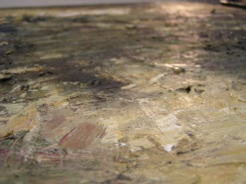
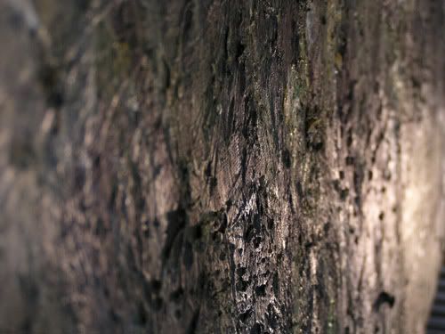
thanks matthew, good eye.
heres some detail shots and some angled shots where I tried to show the texture of the surface. I experimented a bit with this one by mixing some pebbley sand with thick gesso when preparing the canvas.
 [/img] [/img]
_________________
http://www.angelfire.com/art2/wfkeil |
|
| Back to top |
|
the_insider
member
Member #
Joined: 06 Apr 2002
Posts: 547
Location: DENVER COLORADO--rocky mountains whoo hoo!!
|
| Posted: Wed Apr 27, 2005 8:39 pm |
|
|
awesome texture...there isn't much left to say other than opinions...i love your strokes...good variation in your latest updates...too much of anything is bad
_________________
www.andresguzman.com
---Would you believe me if i told you i was a liar?... |
|
| Back to top |
|
Naeem
member
Member #
Joined: 13 Oct 2004
Posts: 1222
Location: USA
|
| Posted: Thu Apr 28, 2005 6:15 am |
|
|
hey heysoos
just wanted to say that you're an awesome oil painter. good improvements on the latest! you're doing great! keep it up  |
|
| Back to top |
|
Heysoos
member
Member #
Joined: 24 Mar 2004
Posts: 294
Location: the New Mexico
|
|
| Back to top |
|
CwStone
member
Member #
Joined: 27 Jan 2003
Posts: 489
Location: New York, USA
|
| Posted: Thu Apr 28, 2005 3:10 pm |
|
|
whats really cool about this and your other paintings is that at first you dont really know what it is your looking at, but as you look at it more little details and distinguishable objects trickle into view (i.e the boat), until finally u r left looking at a picture in which you can easily identify the setting and what goin on. Atleast thats how it was with me.
_________________
-Chase |
|
| Back to top |
|
Misc
member
Member #
Joined: 04 Jun 2004
Posts: 475
Location: Sweden
|
| Posted: Thu Apr 28, 2005 4:02 pm |
|
|
| I like this alot, especially the colors, harmonic and nice. Something I'd have on my wall if I owned a house |
|
| Back to top |
|
|


