| View previous topic :: View next topic |
| Author |
Topic : "octopus chase" |
acrylic
junior member
Member #
Joined: 16 Jan 2003
Posts: 32
|
 Posted: Fri Dec 31, 2004 6:45 am Posted: Fri Dec 31, 2004 6:45 am |
 |
 |
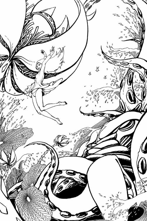
this is a linework for a new piece of mine. It's for a cover art. Still in the process of coloring before i finish i would like to get some opinion on which area needs improvement.
THanks for your time spend here.
 |
|
| Back to top |
|
Yarik
member
Member #
Joined: 11 May 2004
Posts: 231
Location: Russian/Ukrainian American in California
|
| Posted: Fri Dec 31, 2004 8:19 am |
|
|
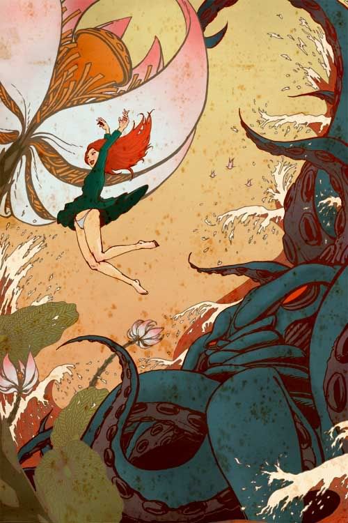
| The girl looks a bit flat, other wise it looks like it is going to be good. |
|
| Back to top |
|
acrylic
junior member
Member #
Joined: 16 Jan 2003
Posts: 32
|
| Posted: Sat Jan 01, 2005 10:56 am |
|
|
| Quote: |
| The girl looks a bit flat, other wise it looks like it is going to be good. |
Could you explain more on "a bit flat." Sorry couldn't really grasp the meaning.
ANyway here is the colored one
 |
|
| Back to top |
|
judson
member
Member #
Joined: 25 Jan 2004
Posts: 59
Location: Spain
|
| Posted: Sat Jan 01, 2005 11:13 am |
|
|
| Nice color... |
|
| Back to top |
|
Matthew
member
Member #
Joined: 05 Oct 2002
Posts: 3784
Location: I am out of here for good
|
| Posted: Sat Jan 01, 2005 1:24 pm |
|
|
omg I am set to overpaint and help mode today and maybe I am not helping either, oh well.
Sorry for adding a bit late here but when u added the color some things became more obvious.
For me the arm is distracting and I know the arm can be bent like that but the arm is the only thing I see in this piece and maybe that comes down to taste and my likeings, thought I could mention anyway.
The composition needs more space and maybe even more than what I added in the overpaint, especially the flower whoms stalk ends outside of the picture. Those are some things that came to me mind but I guess mostly is my taste hence why I am not sure if I am helping u or not.
I made a quick overpaint to show what I was talking about, hope you are ok with it. I really like the color in the piece and every part of the color tells what they are, really awesome and also nice dynamic which is the most important as to what I believe.

see you and keep it up.  |
|
| Back to top |
|
acrylic
junior member
Member #
Joined: 16 Jan 2003
Posts: 32
|
| Posted: Sun Jan 02, 2005 5:00 am |
|
|
Matthew- Thanks for taking time to overpaint it. Looks rough but i know what you mean. The girl from far could look like a bunny with two green ears hoping around hahahahah. I know why you change the hand it look more pleasing for her and the composition too. I will take that as a note for my furture to avoid stuff like that. I will stick to the original post as she has more "i am falling helplessly feeling to it". I could be wrong though.
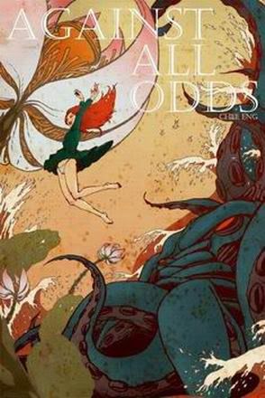
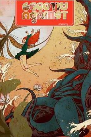
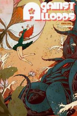
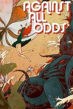
Here are some of the different layout of the tittle called " Against All Odds ".
Which one appeals to you?
 |
|
| Back to top |
|
Matthew
member
Member #
Joined: 05 Oct 2002
Posts: 3784
Location: I am out of here for good
|
| Posted: Sun Jan 02, 2005 8:17 am |
|
|
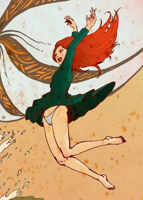
yea I agree about the helplessly falling cause the hand fix I did makes her look like she is floating instead of falling, hehe art is difficult.
The first one appeals more to me since the others are too much, the first one with a different font would be awesome, like a hand-writing font or something. I think that 3rd one could work too but that depends on what kind of thing u are doing it for, is it for a book?
ok keep it up.
see you |
|
| Back to top |
|
acrylic
junior member
Member #
Joined: 16 Jan 2003
Posts: 32
|
| Posted: Sun Jan 02, 2005 8:36 am |
|
|
| it is for a comic book cover competition. Yeah i agree with you on the arms as in your overpainting she looks more like hoping/jumping rather than falling but i get what you wanted to say there as two of the hands seems stick together. |
|
| Back to top |
|
|


