| View previous topic :: View next topic |
| Author |
Topic : "hellboy" |
acrylic
junior member
Member #
Joined: 16 Jan 2003
Posts: 32
|
 Posted: Sat Sep 25, 2004 7:06 pm Posted: Sat Sep 25, 2004 7:06 pm |
 |
 |
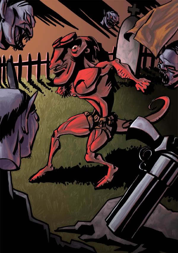
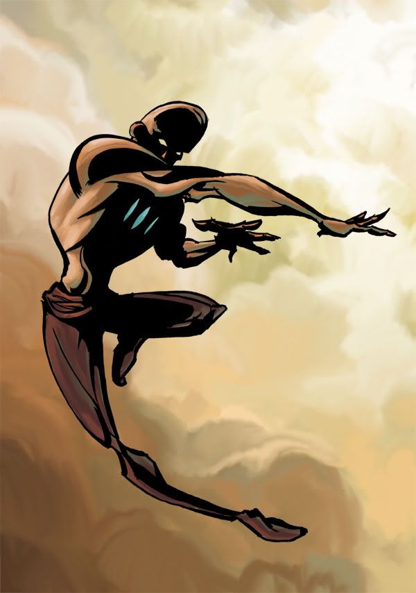
Workin hard this days to build up my portfolio. Here is another new one. Hope you like it.
As usual love to hear some C&C. Thank you very much.
 |
|
| Back to top |
|
Spooky
member
Member #
Joined: 18 Oct 2000
Posts: 217
Location: Banff, Alberta, Canada
|
|
| Back to top |
|
JickyJak
member
Member #
Joined: 20 Feb 2001
Posts: 61
Location: Kelowna, BC, Canada
|
| Posted: Wed Sep 29, 2004 7:59 pm |
|
|
I like the characterizations and the illustrations for the most part, but the effect breaks down at the coloring stage....it just seems to fall short imo. One example I can point out in the first one is the bg seems to be theis smooth gradient and the rest of the image is painted with bush strokes - the two things seem contradictory style-wise so tehre is a loss of harmony. In the second one...as much as I like clouds and smoky stuff for bgs this just seems to be an after thought.
Good luck with the folio 
Cheers.
_________________
Steel Dolphin Creative |
|
| Back to top |
|
acrylic
junior member
Member #
Joined: 16 Jan 2003
Posts: 32
|
| Posted: Thu Sep 30, 2004 1:34 am |
|
|
| You are right JickyJak i think you've got a point there.i think i will improve the first post's background.Thanks a lot. |
|
| Back to top |
|
Greensun
member
Member #
Joined: 03 Aug 2004
Posts: 92
Location: Almere, Netherlands
|
| Posted: Sat Oct 02, 2004 8:09 am |
|
|
awesome!  no crits for me! no crits for me!
_________________
Rabies up your bunghole |
|
| Back to top |
|
acrylic
junior member
Member #
Joined: 16 Jan 2003
Posts: 32
|
| Posted: Sat Oct 02, 2004 9:34 am |
|
|
here you go with the improvement on the background.
 |
|
| Back to top |
|
Highfive
member
Member #
Joined: 08 Oct 2001
Posts: 640
Location: Brisbane, AU
|
| Posted: Sun Oct 03, 2004 3:28 pm |
|
|
Great style that expresses a new kind of character, but Hellboy is missing one vital feature:

_________________
www.high5art.com |
|
| Back to top |
|
diced
junior member
Member #
Joined: 12 Jan 2003
Posts: 22
|
| Posted: Mon Oct 04, 2004 2:50 am |
|
|
Indeed these are refreshing.
Hellboy:
I think the harshness of the lines and structure which stands as the outline is too strong. When making lines that are this heavy they get a large impact, and at places you have used the lines is a rather scruffy way which brings the entire image down.
I am not a big fan of the way you used the lighting filter on the grass.
Perspective is really interesting and gives the image a lot of depth.
Leaping guy:
I like the idea of his body getting twisted to elaborate on his dynamic. Though I do think that his pose does follow a harmonized direction and therefore is confusing. I like the choice of colour, but again the contrast/pressure of the outlines is too harsh. |
|
| Back to top |
|
|


