| View previous topic :: View next topic |
| Author |
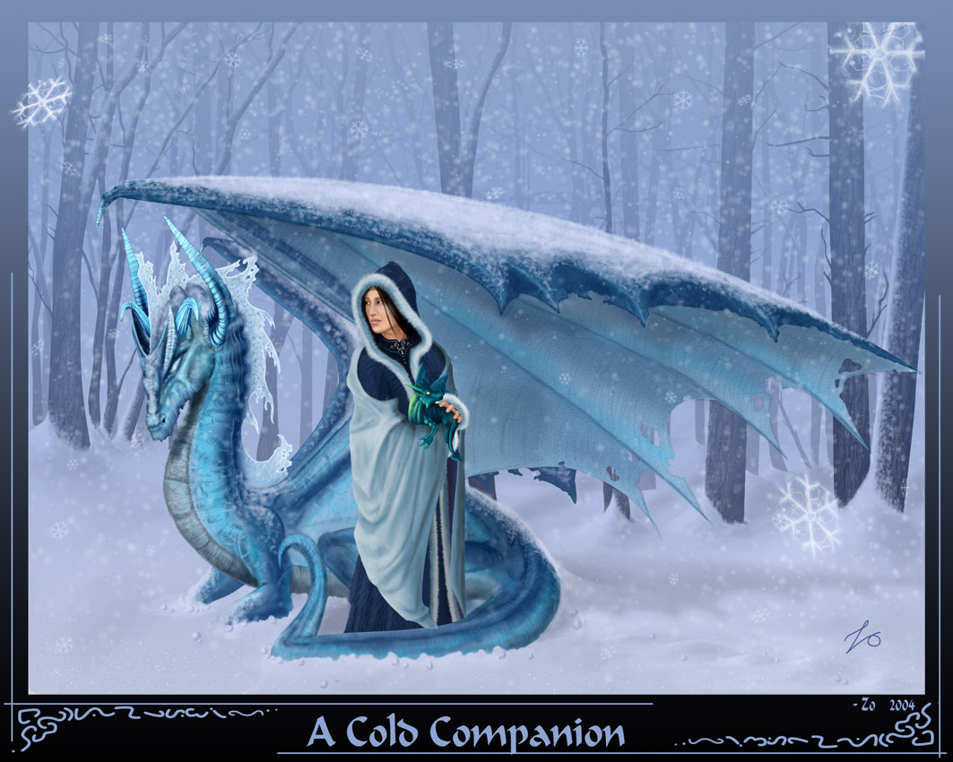
Topic : "A Cold Companion" |
Zo
junior member
Member #
Joined: 12 Nov 2003
Posts: 9
Location: Sacramento
|
 Posted: Wed Jul 21, 2004 1:06 pm Posted: Wed Jul 21, 2004 1:06 pm |
 |
 |
Been a while since I first posted here, but I only now finally finished another painting. 
This is a piece I did for my best friend (the woman in the painting), she likes dragons and blue....so there ya go...
Took about 4 months to finish, working on and off, with long breaks inbetween.
photoshop 7 + graphire2.
hope ya like it,
_________________
 |
|
| Back to top |
|
AndyT
member
Member #
Joined: 24 Mar 2002
Posts: 1545
Location: Germany
|
| Posted: Wed Jul 21, 2004 3:49 pm |
|
|
Hell ... amazing! I love the idea/concept.
The image does look a little stiff but I think only the heads take away from the image.
They seem to have the same distance to the viewer for some reason. Makes the image flat a little.
Can you still change things?
The dragon's head could be a little more blurry.
The resulting contrast to the woman would get the point - that she is safe under the wing - across better.
And making her skin more blueish so that it goes with the palette might help too ...
I made a quick overpaint to show what I mean. I'll remove it if you want of course.
I also made the space between the words bigger. And I overdid the making the dragon's head blurry part 

_________________
http://www.conceptworld.org |
|
| Back to top |
|
Capt. Fred
member
Member #
Joined: 21 Dec 2002
Posts: 1425
Location: South England
|
| Posted: Thu Jul 22, 2004 5:58 am |
|
|
really like the characters, I think it's the characters that make the pic, the dragons head design is really nice, but I had ago at what andyt was getting at I think, and tried to push the realism and make it softer, mainly on the woman. Hope you don't mind the input and overpaint.
 |
|
| Back to top |
|
Zo
junior member
Member #
Joined: 12 Nov 2003
Posts: 9
Location: Sacramento
|
| Posted: Thu Jul 22, 2004 8:17 am |
|
|
Thanks for the crits guys, and I dont mind the overpaints at all...in fact I like seeing my work with a little different twist/style, hehe.
I know what you mean with the face needing a more bluish tint Andy...
and I actually had it looking like that when I made it. If I open the psd file up it looks like that...but when I saved it as jpg for the web it seemed to up the contrast on everything and made the face more tan looking. :\
_________________
|
|
| Back to top |
|
Anthony
member
Member #
Joined: 13 Apr 2000
Posts: 1577
Location: Winter Park, FLA
|
| Posted: Sun Jul 25, 2004 11:00 am |
|
|
Cool image, very nice paintover Cpt. Fred, at first glance I thought it must be a spooge P.O. :]
_________________
-Anthony
Carpe Carpem
http://www.anthonyfransella.com |
|
| Back to top |
|
|


