| View previous topic :: View next topic |
| Author |
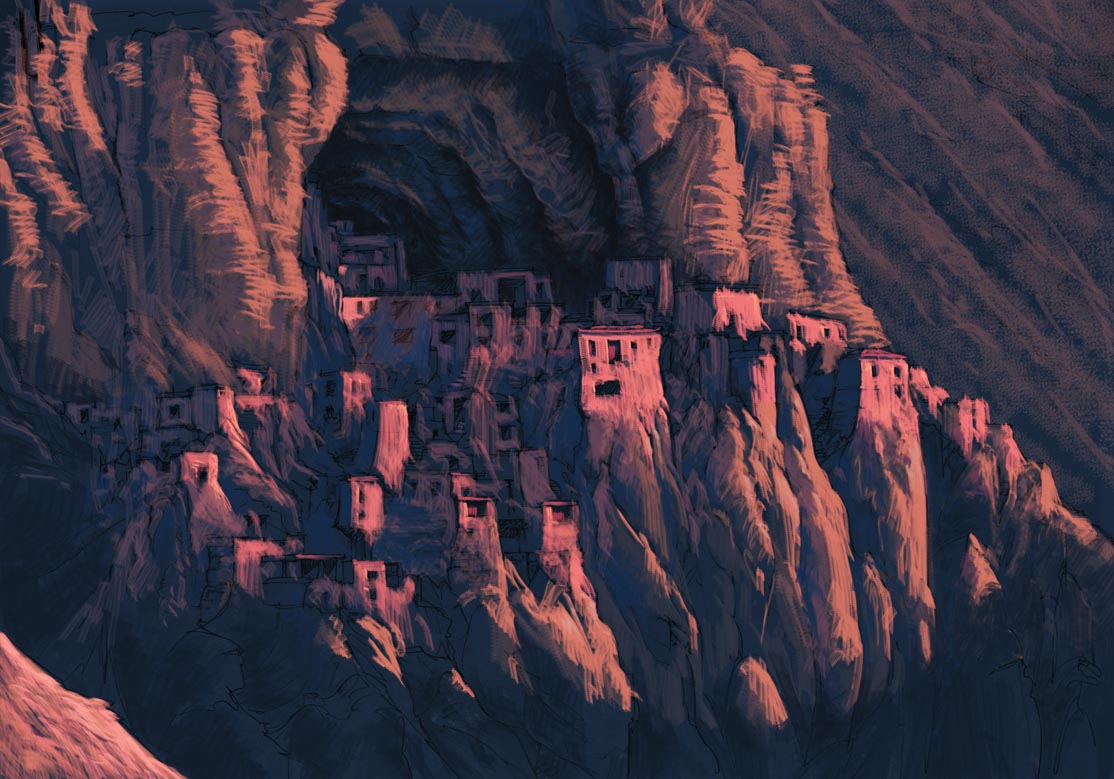
Topic : "Landscape: tibetan monastery." |
hdri
junior member
Member #
Joined: 28 Mar 2003
Posts: 20
|
 Posted: Wed Apr 07, 2004 12:54 am Posted: Wed Apr 07, 2004 12:54 am |
 |
 |
Thisis a colour key to get the mood of the scene. 2-3 hours with PS 7 and wacom. C&C are very welcome
 |
|
| Back to top |
|
drunken_muse
member
Member #
Joined: 24 Aug 2003
Posts: 154
Location: sweden
|
| Posted: Wed Apr 07, 2004 4:47 am |
|
|
I really like this one, especially the contrasts between blur & sharpness and the cutting contours from where the blue in the shadows meet the pinkish orange-lit walls. (Nice colours too.) It looks nice and thick, kinda like crayons have sometimes.
Also nice that it isn't tweaked in infinity so one can still trace the work - Is some parts of the orangy brown areas of the mountain walls on double layers with radial blur? It kinda looks like it.
Nice work. |
|
| Back to top |
|
balistic
member
Member #
Joined: 01 Jun 2000
Posts: 2599
Location: Reno, NV, USA
|
| Posted: Wed Apr 07, 2004 5:12 am |
|
|
I like it a lot. The colors are maybe a little cliche, but then people say the same about my stuff. Very nice.
_________________
brian.prince|light.comp.paint |
|
| Back to top |
|
hdri
junior member
Member #
Joined: 28 Mar 2003
Posts: 20
|
| Posted: Wed Apr 07, 2004 6:28 am |
|
|
Thanx for your C&C's.
Drunken_Muse: No, there are no filters on the image, neither layers, except for the original pencil draft scan and the colour layer...
Balistic: I was trying to get acquainted with this particular colour palette in the end of the day, when the sun is almost down, and the way it behaves on the surfaces where it hit. |
|
| Back to top |
|
xray360
junior member
Member #
Joined: 09 Apr 2004
Posts: 12
Location: NY
|
| Posted: Sat Apr 10, 2004 4:18 pm |
|
|
You captured the sun set feeling in this piece. The colors work very well together. I like how you used blues and violets for the shading and pinks and oranges for the highlights. The composition is also well done. The layout of the rock formation has a nice variety giving the piece a natural look.
My only critique is I'm not sure whats going on to the right of the rock village. I'm thinking it's a distant mountain, but there is really no depth between it and the village.
Nice work keep it up. I like your style. |
|
| Back to top |
|
|


