| View previous topic :: View next topic |
| Author |
Topic : "Eagle from Advance Wars 2" |
Highfive
member
Member #
Joined: 08 Oct 2001
Posts: 640
Location: Brisbane, AU
|
 Posted: Tue Sep 23, 2003 7:25 am Posted: Tue Sep 23, 2003 7:25 am |
 |
 |
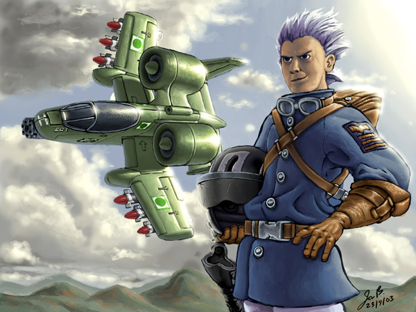
Anyone played this game on the GBA yet? Eagle's my CO of choice for his "Lightning Strike" Super Power. Crits appreciated.
EDIT: Oops, this was meant to be in Finished Works. Could this be moved there please?
_________________
www.high5art.com |
|
| Back to top |
|
Freddio
Administrator
Member #
Joined: 29 Dec 1999
Posts: 2078
Location: Australia
|
| Posted: Wed Sep 24, 2003 1:51 am |
|
|
Very cool image indeed. I feel you need to work on the saturation of the colours at the moment they feel a bit washed out. I think it will better suit the style of image.
good work mate!
_________________
Design portfolio |
|
| Back to top |
|
see
member
Member #
Joined: 04 Aug 2001
Posts: 481
Location: Austria
|
| Posted: Wed Sep 24, 2003 4:35 am |
|
|
yeah ... i have to agree with freddio ! plus
The fold from right arm to the shoulder look strange but its a cool image ! |
|
| Back to top |
|
Godwin
member
Member #
Joined: 24 Apr 2002
Posts: 701
Location: Singapore
|
|
| Back to top |
|
MCnasto
member
Member #
Joined: 10 Mar 2003
Posts: 116
Location: Thunder Bay, Ontario Canada
|
| Posted: Wed Sep 24, 2003 8:21 pm |
|
|
looks good, but i agree with these guys...
i played around with the brightness/contrast:

hope u didnt mind 
keep it up!
_________________
"Man! I just noticed that I write a lot of fragment sandwiches!" |
|
| Back to top |
|
Highfive
member
Member #
Joined: 08 Oct 2001
Posts: 640
Location: Brisbane, AU
|
| Posted: Thu Sep 25, 2003 6:35 am |
|
|
Freddio - Cheers! I'v just discovered my monitor's contrast was turned up too high so hopefully this will be avoided in my next picture.
see - The character in the game has this weird jacket which has large humps just above the elbows that I'd tried to get across in this image. Otherwise, I'll still ned some practise in drawing folds in thick material.
Godwin - Apparently so, and I wouldn't draw it any other way  AW2 is fill of "Chibified" graphics like soldiers with big heads and tanks with oversized, stumpy barrels. It's all Metal Slug style! AW2 is fill of "Chibified" graphics like soldiers with big heads and tanks with oversized, stumpy barrels. It's all Metal Slug style! 
MCnasto - Thanks so much for offering this suggestion! The strong shadows do look a lot more dramatic, particularly on the A10. The contrast might be a little to strong on the blue jacket, though, but damn, it's worked great on the clouds!
_________________
www.high5art.com |
|
| Back to top |
|
MCnasto
member
Member #
Joined: 10 Mar 2003
Posts: 116
Location: Thunder Bay, Ontario Canada
|
| Posted: Thu Sep 25, 2003 7:55 pm |
|
|
glad i could help
_________________
"Man! I just noticed that I write a lot of fragment sandwiches!" |
|
| Back to top |
|
CalicoRabbit
junior member
Member #
Joined: 04 Jul 2003
Posts: 21
Location: Depends
|
| Posted: Fri Sep 26, 2003 6:01 am |
|
|
As a player of Advance Wars I think the low contrast is part of the games look. The background could use some more contrast but the character and plane are, I think, spot on for the game. The contrast enhanced version doesn't look like Advance Wars.
-CalicoRabbit |
|
| Back to top |
|
|


