| View previous topic :: View next topic |
| Author |
Topic : "my cd cover" |
thor64
member
Member #
Joined: 03 Feb 2000
Posts: 154
Location: Fredericia, Denmark
|
|
| Back to top |
|
faustgfx
member
Member #
Joined: 15 Mar 2000
Posts: 4833
Location: unfortunately, very near you.
|
 Posted: Wed Mar 26, 2003 3:12 pm Posted: Wed Mar 26, 2003 3:12 pm |
 |
 |
it sucks compared to the others which suck too, but i voted for it anyway. good luck.
_________________
"hey, wanna dance?"
"do i look like kevin costner to you?
"..no you don't"
"i don't dance with wolves either." |
|
| Back to top |
|
Sukhoi
member
Member #
Joined: 15 Jul 2001
Posts: 1074
Location: CPH / Denmark
|
| Posted: Wed Mar 26, 2003 3:30 pm |
|
|
What's with the Feng jeep ripoff in the last one?
Good stuff Thor. However it seems to suffer from poor image material (back and front gun) and is a little "seen before" stylewise.
I like the way the front is sleak and the backside is rough, and it has some striking and 'great' colours aswell.
Sukhoi |
|
| Back to top |
|
faustgfx
member
Member #
Joined: 15 Mar 2000
Posts: 4833
Location: unfortunately, very near you.
|
| Posted: Wed Mar 26, 2003 4:21 pm |
|
|
my only gripe is the horrid orange tones that remind me more of an apple juice carton than anything else. also the typography is too.. blunt. plain. too fat. (fat as in too thick and coarse, not 'phat leet') it woulda been cool in a ministry album sleeve in the 80s (can you say Twitch) but not now. the choice for font is poor. i'd go with something with a little bit more sharpness, a bit more edge, something that's.. dirtier. i would have resorted in the usual deviantart-grunge-ingredients even though that's a commercial and design suicide. the gun in the backside looks fucking stupid, it'd look much better without it. it looks really out of place and.. in lack of a better word, pretentious. it looks just like you haven't been able to figure out anything that'd actually fit in it so you've just decided to use the gun. the black "3d" effect of the text is just wtf. why is that there. it has never looked good and this isn't the front cover for a 80s miami vice set porno. might as well have put some glitter and palms in it. on the front side, the text on the gun looks so fake its not even funny. and what's with the orange/white gradient in it? again, it looks horribly out of place. why isn't majority of it in that applejuicecarton-orange.. and the prodigy logo. so out of place yet again. the dark shade of red you've used in it just does not fit in the mix of the color scale from the gun photo versus the horrid gradient. either keep the logo too small or make it blatantly huge. just don't make it just.... hang in there in the mid-air looking like its from another design alltogether.
that's all. don't worry, the other "designs" aren't any better to me..
http://dictionary.reference.com/search?q=design
v. intr.
To make or execute plans.
To have a goal or purpose in mind.
The purposeful or inventive arrangement of parts or details: the aerodynamic design of an automobile; furniture of simple but elegant design.
A plan; a project. See Synonyms at plan.
_________________
"hey, wanna dance?"
"do i look like kevin costner to you?
"..no you don't"
"i don't dance with wolves either." |
|
| Back to top |
|
Impaler
member
Member #
Joined: 02 Dec 1999
Posts: 1560
Location: Albuquerque.NewMexico.USA
|
| Posted: Wed Mar 26, 2003 5:25 pm |
|
|
That is a BLATANT feng rip-off. Alert the authorities, thor64.
_________________
QED, sort of. |
|
| Back to top |
|
balistic
member
Member #
Joined: 01 Jun 2000
Posts: 2599
Location: Reno, NV, USA
|
| Posted: Wed Mar 26, 2003 5:39 pm |
|
|
What gets me is how gritty and angsty all of these designs are . . . I mean, Prodigy used to make kitchy glowstick rave records. I wouldn't say that your design is notably bad in any respect, in fact it's probably the best one on there in terms of not being ridiculously dark . . . it's just that none of them fit my impression of the Prodge'.
But then I guess most people who would buy a Prodigy CD these days have probably never heard "Charlie" . . . no amount of "Smack My Bitch Up" can erase that one.
And yeah, that guy with the Feng sketch . . . real class act there.
Voted for you. Honestly hope you win.
*Meeeeeyoooowwwwwrrrr*
_________________
brian.prince|light.comp.paint |
|
| Back to top |
|
faustgfx
member
Member #
Joined: 15 Mar 2000
Posts: 4833
Location: unfortunately, very near you.
|
| Posted: Wed Mar 26, 2003 6:41 pm |
|
|
wtf is that balistic, you sound.. supportive and encouraging *slap*
_________________
"hey, wanna dance?"
"do i look like kevin costner to you?
"..no you don't"
"i don't dance with wolves either." |
|
| Back to top |
|
balistic
member
Member #
Joined: 01 Jun 2000
Posts: 2599
Location: Reno, NV, USA
|
| Posted: Wed Mar 26, 2003 7:17 pm |
|
|
| faustgfx wrote: |
| wtf is that balistic, you sound.. supportive and encouraging *slap* |
Dude, shut up, you'll ruin the trap I'm setting for him! |
|
| Back to top |
|
faustgfx
member
Member #
Joined: 15 Mar 2000
Posts: 4833
Location: unfortunately, very near you.
|
| Posted: Wed Mar 26, 2003 8:10 pm |
|
|
hokay. durr..
_________________
"hey, wanna dance?"
"do i look like kevin costner to you?
"..no you don't"
"i don't dance with wolves either." |
|
| Back to top |
|
faustgfx
member
Member #
Joined: 15 Mar 2000
Posts: 4833
Location: unfortunately, very near you.
|
| Posted: Wed Mar 26, 2003 8:13 pm |
|
|
besides, as a late remark, we all know it's about weather experience, jericho and ruff in the jungle bizness and nothing else. nothing.
_________________
"hey, wanna dance?"
"do i look like kevin costner to you?
"..no you don't"
"i don't dance with wolves either." |
|
| Back to top |
|
Herb
member
Member #
Joined: 06 Jul 2002
Posts: 78
|
| Posted: Wed Mar 26, 2003 9:41 pm |
|
|
Markus' is VERY laugable.
_________________
"So...remember, whenya put down one mutha, you puttun down muthas all ovah da worhl." - Mr. T |
|
| Back to top |
|
B0b
member
Member #
Joined: 14 Jul 2002
Posts: 1807
Location: Sunny Dorset, England
|
| Posted: Thu Mar 27, 2003 1:19 am |
|
|
i don't think its a direct Feng rip off? any1 got a URL to that pic? cos its not on his site..

^^^ by feng ^^^
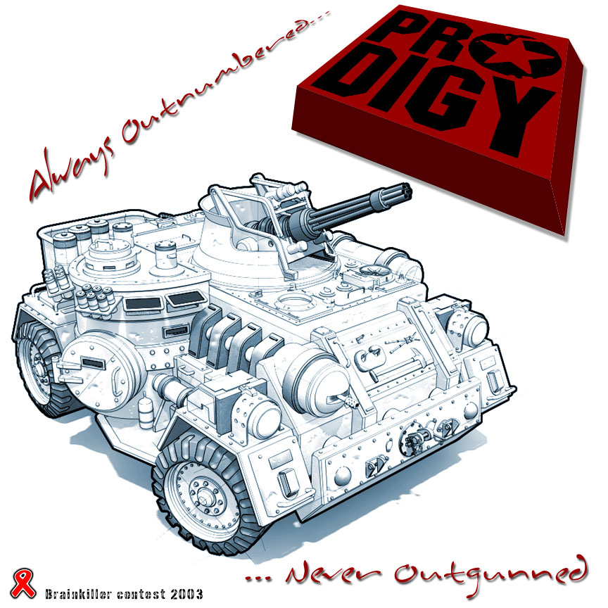
^^^ Aleged rip off ^^^ |
|
| Back to top |
|
thor64
member
Member #
Joined: 03 Feb 2000
Posts: 154
Location: Fredericia, Denmark
|
| Posted: Thu Mar 27, 2003 2:59 am |
|
|
hmm. It's Feng Ripoff I believe too.
Thanks for the votes. I haven't done any cd covers before - so this is my first try. If I'd more time I'd drwan something myself.
Yeah some of the old Prodigy songs are still cool today - also the b-sides from the Prodge rules... |
|
| Back to top |
|
Sumaleth
Administrator
Member #
Joined: 30 Oct 1999
Posts: 2898
Location: Australia
|
|
| Back to top |
|
Chthonic Divinity
member
Member #
Joined: 22 Aug 2002
Posts: 191
Location: Philly
|
| Posted: Mon Mar 31, 2003 10:31 pm |
|
|
| that feng one is very suspicious... if that dude COULD possibly make that himself, possibly based on Feng's, why would he be so completely and utterly horrible with the rest of the piece |
|
| Back to top |
|
B0b
member
Member #
Joined: 14 Jul 2002
Posts: 1807
Location: Sunny Dorset, England
|
| Posted: Tue Apr 01, 2003 12:45 am |
|
|
| some ppl can b really good with a pencil but then b totally clueless about typeography.. |
|
| Back to top |
|
|


