| View previous topic :: View next topic |
| Author |
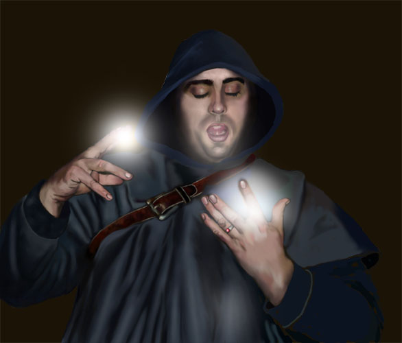
Topic : "First Spell" |
Germ01
member
Member #
Joined: 06 Aug 2001
Posts: 197
Location: Montreal, Canada
|
 Posted: Tue Jan 28, 2003 7:03 am Posted: Tue Jan 28, 2003 7:03 am |
 |
 |
This is something I have been working on for the past few nights. I used myself as a ref. I'm not too sure about the "magic part" coming from his hands, I'm still playing with it. Any thoughts or crits would be greatly appreciated! Thanks for looking!
_________________
It's better to have something and not need it, then to need it and not have it. |
|
| Back to top |
|
jHof
member
Member #
Joined: 23 Jun 2000
Posts: 252
Location: Chicago, IL
|
| Posted: Tue Jan 28, 2003 8:47 am |
|
|
Wonderful piece so far.
I'd like to see you push the skin tones brighter around the hands and face. They still seem to dark for that bright magic.
Maybe if a deep forest background or something back there would help brigten him up as it is though.
The three fingers close together on his left hand seem a bit long.
Other than above comments, you did a great job on your skin tones and pose. |
|
| Back to top |
|
AndyT
member
Member #
Joined: 24 Mar 2002
Posts: 1545
Location: Germany
|
| Posted: Tue Jan 28, 2003 9:12 am |
|
|
The light especially in your/his left hand might look better if it was completely behind the hand. Maybe that hand could be visible just as a silhouette?
He reminds me a little of that guy: http://www.bastian-pastewka.de 
_________________
http://www.conceptworld.org |
|
| Back to top |
|
see
member
Member #
Joined: 04 Aug 2001
Posts: 481
Location: Austria
|
| Posted: Tue Jan 28, 2003 9:35 am |
|
|
bastian pastewka ? *gg* yeah damn right.
The picture is lovely done especially hands and the lether texture. I would say really work on the lightning thing cause it's great work so far.
Agree with ANDYT. Maybe add a different color like blue or red in the middle of the lightning.
Can't wait seeing it finished.
Yours
Flo |
|
| Back to top |
|
CwStone
member
Member #
Joined: 27 Jan 2003
Posts: 489
Location: New York, USA
|
| Posted: Tue Jan 28, 2003 1:22 pm |
|
|
Very nice. Your hands are very well done, with the exception of that lighting thing. I also agree with jHof about the background. Anyways, excellent stuff so far.
_________________
-Chase |
|
| Back to top |
|
Inspector Lee
member
Member #
Joined: 28 Oct 2002
Posts: 270
Location: San Francisco, CA.
|
| Posted: Tue Jan 28, 2003 10:59 pm |
|
|
Yeah, definitely change the background. Even if you're going to leave it a flat color, then just pick a different one because that dark umber isn't helping it. Otherwise it's a pretty nice image.
_________________
Smokey, this is not 'Nam this is bowling. There are rules. |
|
| Back to top |
|
|


