| View previous topic :: View next topic |
| Author |
Topic : "pilot" |
nil900
member
Member #
Joined: 19 Sep 2000
Posts: 248
Location: Hamburg, Germany
|
 Posted: Wed Oct 03, 2001 1:31 pm Posted: Wed Oct 03, 2001 1:31 pm |
 |
 |
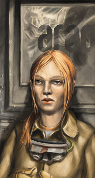
Hi everybody. This is what I did the last two days. It startet as facedrawing training but I decided to add a sf background. I'm not really happy about the bg but I tried to do a better one, it did't work. Now I lost patience so it's done.
Some crits? http://www.nil900.freeservers.com/m3-6.jpg
I posted this picture in work in pr section if anybody is interested in the progress feel free to take a look.
[ October 04, 2001: Message edited by: nil900 ]
[ October 04, 2001: Message edited by: nil900 ] |
|
| Back to top |
|
cybertoker2001
member
Member #
Joined: 13 Jun 2001
Posts: 276
Location: Arizona
|
| Posted: Wed Oct 03, 2001 1:44 pm |
|
|
Her nose seems a bit off, but other than that I dig it.
Great goggles by the way. 
Take it easy,
CT2001 |
|
| Back to top |
|
DarkGarden
member
Member #
Joined: 19 Jan 2001
Posts: 83
|
| Posted: Wed Oct 03, 2001 2:03 pm |
|
|
Yep, her nose deviates from the direction under her eyeline....but then the mouth fits in the same line as the nose..so I can't decide if the nose is off, or if it's the eyes 
Wonderful colours and tones. I really enjoy the sickly look of her face with her expression. Two concerns, really: One is that she seems quite rigid, her pose and rendering make her seem board straight. The second thing was that she seems to lack texture. Well her clothes and the goggles do, anyway. I know you mentioned it was a work in progress, so maybe you're headed toward those details. As it is, the goggles look like they're made of clay right now, maybe making the specular a bit sharper will give that "shined rubber" look more.
It is truly great, though. I'm still loving the colours. 
Peter |
|
| Back to top |
|
MoleculeMan
member
Member #
Joined: 12 Jul 2001
Posts: 324
Location: Chicago
|
| Posted: Wed Oct 03, 2001 8:32 pm |
|
|
I like the picture a lot. I was messing around with the picture and i got the girl to look more female by narrowing the nose and bringing her right eye (your left heh) in a little and narrowing the nose. I could post the 'repaint' (the changes are really so small its funny ) if you're interested.
Jake |
|
| Back to top |
|
Matt Elder
member
Member #
Joined: 15 Jan 2000
Posts: 641
Location: Sydney, NSW, Australia
|
| Posted: Wed Oct 03, 2001 11:33 pm |
|
|
| It's been interesting to see how this has developed from my first comment of the face being a bit too black. I like what you've done with the background and how the picture has evolved. I think it is a good image and can stand well as it is. |
|
| Back to top |
|
nil900
member
Member #
Joined: 19 Sep 2000
Posts: 248
Location: Hamburg, Germany
|
| Posted: Thu Oct 04, 2001 12:15 am |
|
|
Thank you for comments. The parts of the face allways point in different directions in my pics. I hope I can get rid of that in future cause it gets on my nervs.
cybertoker2001: Took a look at your homepage. Amazing colours in your pictures. I really like the fantasy ones!
DarkGarden: The face structure is off I know but my problem is that I don't recognize these little mistakes so I'm not able to correct them (I'll try to correct the ones you mentioned). The textures are still interesting to me. I somehow didn't recognize that they are missing too. Perhaps this one will look a little bit more realistic then. I took a look at your webside too. Great design!!! But it doesn't work on my computer  I always wanted to do something like that. Perhaps I'll try that in near future. I always wanted to do something like that. Perhaps I'll try that in near future.
MoleculeMan: please post the overpaint! I'm happy about every kind of help and overpaints are often the best way to improve.
Thank you all for your replies! I'll sit down know and try to fix some things. I want textures  . .
What about the background any idea how to get that better looking? |
|
| Back to top |
|
nil900
member
Member #
Joined: 19 Sep 2000
Posts: 248
Location: Hamburg, Germany
|
| Posted: Thu Oct 04, 2001 2:55 am |
|
|
Please don't beat me up, cause this is the finished pic section but I got good crits and wanted to do some changes on my pic. I put some textures in the bg, looks a little better now I think but still far from being perfect.
 |
|
| Back to top |
|
DarkGarden
member
Member #
Joined: 19 Jan 2001
Posts: 83
|
| Posted: Thu Oct 04, 2001 4:30 am |
|
|
I'm going to get run out of this place if I keep overpainting, I can just smell it
Anyway, this is just to illustrate how softening the jaw structure, playing with the compositional contrasts and changing the direction of the nose and lips (as well as tweaking the eyes slightly) changes the piece.
It's a fast little overpaint, but I think a few elements of issue were addressed.

I think this is a really strong piece, but it just needs a bit more focusing.
I also played with the texture of the goggles a bit, as well as the skin around the nose and cheeks, and the jacket she's wearing.
Hope it gives you a few ideas of where to take this next. Noone's going to beat you up, we want to see where this goes...at least *I* do.
Peter
P.S. Thanks for the compliments on Pixelflo, it's a labour of love. If you drop me a line ( [email protected] ) telling me about which browser and OS you're using, I might be able to see why the site isn't working for you. |
|
| Back to top |
|
Samson & Friends
member
Member #
Joined: 02 Jan 2001
Posts: 106
|
| Posted: Thu Oct 04, 2001 4:30 am |
|
|
I'm sorry to say, but I rather the original. I don't like the freckles you've added, or the skin texture. I also don't see a problem with the proportions of her face, in fact I'd go as far as to say they look great. Your picture has an appearance that makes it have a different look about it, it's interesting. I like how the face is a little asymmetrical; it gives it character. She looks like a woman who has faced hardships, heh, she's had some tough times.
The lips and eyes are gorgeous.
Oh, and she looks kind of like my mum. |
|
| Back to top |
|
MoleculeMan
member
Member #
Joined: 12 Jul 2001
Posts: 324
Location: Chicago
|
| Posted: Thu Oct 04, 2001 5:06 am |
|
|
Here it is. Its pretty rudimentary, but it gets the job done.
REPAINT:

Jake |
|
| Back to top |
|
Jezebel
member
Member #
Joined: 02 Nov 2000
Posts: 1940
Location: Mesquite, TX, US
|
| Posted: Thu Oct 04, 2001 5:09 am |
|
|
| Personally I love her... she is very "real". Great character in that face. |
|
| Back to top |
|
Aimok
member
Member #
Joined: 31 Oct 2000
Posts: 64
Location: Hamburg,Germany
|
| Posted: Thu Oct 04, 2001 7:24 am |
|
|
hm, i prefer the original, too.
i like these "ugly" faces which are not perfect, but interesting and more realistic...and there is certainly a woman out there with such nose
|
|
| Back to top |
|
Jucas
member
Member #
Joined: 14 Jan 2001
Posts: 387
Location: Pasadena, CA
|
| Posted: Thu Oct 04, 2001 8:05 am |
|
|
Hi!
I like the pic. Well for the most part. The painting technique is very slick. I really like how you actually applied the textures and colors. But as for the Image, I don't like it. NOT because it isn't well done. But because it doesn't strike me. Her expression seems nothing more than that zombie look my characters tend to get more than anything else.
Anyways the pic IS well done. Her left eye (our right) is up too high, and as other people said her eyes slightly kilter compared to her nose and mouth.
Take it or leave it,
-jono |
|
| Back to top |
|
nil900
member
Member #
Joined: 19 Sep 2000
Posts: 248
Location: Hamburg, Germany
|
| Posted: Thu Oct 04, 2001 8:28 am |
|
|
Wow  that much comments thank you all. that much comments thank you all.
DarkGarden- Thank you for takeing time for this overpaint. I agree with you in most parts. The jawline and the nose are much better in your painting. The googles look better too. And I'll have to work on some parts to get a better contrast but I'm not sure about the textures on her jacket and the face. I don't know how I like it better with or without. I'll have to try I guess.
I tried pixelflo again and it's working now. Nice games I did't win one of them. I don't know what was wrong I tried it the first time.
Samson & Friends- thank you for your comment. I thought about it a long time and you might be right too. Perhaps I shouldn't work that much on the jacket. I'll just have to try.
MoleculeMan-Thank you too for your work on my pic. The eye looks much better in that place. The nose is a little bit to narrow (just my opinion)in your pic but I'll take some time to change her nose a bit.
Jezebel -Thank you. I'm allways happy if someone tells me that he or she loves my work.
Aimok- Hi again didn't see you over here for a long time. Thank you for your comment. I just read it after typing the answers offline. I think I should just leave this pic for today and take a close look tomorrow morning. Then I'll decide which parts to work on. Did you decide what to study?
Jucas- I thought there would be more people saying that they don't like this pic. I do understand it because it started as a study of a girlface. I didn't think about a hole concept at that point. I didn't go for an image full of tension. That's probably the reason for it being a little boring for some people but that isn't a problem for me. I just wanted to train painting.
The next version will probably be posted tommorow morning (central european time). |
|
| Back to top |
|
|


