 |
|
 |
| View previous topic :: View next topic |
| Author |
Topic : "This started out as spooge's head assignment" |
Zorglub
member
Member #
Joined: 20 Dec 2000
Posts: 268
Location: Ontario Canada
|
 Posted: Fri Jun 22, 2001 12:40 pm Posted: Fri Jun 22, 2001 12:40 pm |
 |
 |
I don't post much but I saw this photo on spooge's thread and found the "who farted" look on the guy's face kind of amusing so I decided to exagerate a bit.
Here's the original photo
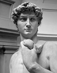
and here's my interpretation
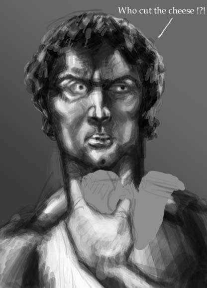
hehe the comment in the pic was an afterthought that I found interesting 
I still have to replace the boring background and paint that thing in his hand.
Comments, critiques and repaints are welcome  |
|
| Back to top |
|
mellowsmoothe
member
Member #
Joined: 16 Mar 2001
Posts: 125
Location: cali
|
| Posted: Fri Jun 22, 2001 12:59 pm |
|
|
| the thing in his hand is a sling, you know, to throw rocks with...duh. interesting take on a masterpiece, a kinda sacrilegious defiling of a martyr by renouncing common morals and substituting them with a flatulation...i like it. anyway have fun. |
|
| Back to top |
|
Zorglub
member
Member #
Joined: 20 Dec 2000
Posts: 268
Location: Ontario Canada
|
| Posted: Fri Jun 22, 2001 3:54 pm |
|
|
Oooh so it's Michelangelo's David. Yeah I remember that Simpsons episode
Yeah I'm not one of the most religious people. hehe
Thnx for your comment |
|
| Back to top |
|
Zorglub
member
Member #
Joined: 20 Dec 2000
Posts: 268
Location: Ontario Canada
|
| Posted: Mon Jun 25, 2001 10:37 am |
|
|
Anybody else? I reeeally need to learn. Any help is appreciated. Tell me what's wrong, how to make it better etc, etc...
Tnx |
|
| Back to top |
|
Frosted Flame
member
Member #
Joined: 01 Jun 2001
Posts: 232
Location: Ontario
|
| Posted: Mon Jun 25, 2001 10:52 am |
|
|
Well.. I like the hand
You did a good job at defining planes in the face, but I think you overdid it. There aren't THAT many planes on the human head. It looks like his cheekbones have two seperate vertical planes, which.. isn't true Pay close attention to the SUBTLETY of the original. It isn't nearly as saturated, the shadows and highlights are much less prounounced. The cross-hatching could be toned down a bit, I feel like it is being misused in places. For ideas on how to properly use hatching in defining a face, look at Janne's work. He does it quite well. So does Gecko.
I hope this helped, and please, don't take it as insulting, because I was trying desperately to offer you as much as I could without hurting your feelings. If I did, I humbly apologize. |
|
| Back to top |
|
Zorglub
member
Member #
Joined: 20 Dec 2000
Posts: 268
Location: Ontario Canada
|
| Posted: Mon Jun 25, 2001 1:47 pm |
|
|
Frosted Flame, this is exactly what I need. Don't worry about hurting my feelings, I've got extremely thick skin I'd be an idiot if I took helpful advice such as yours as an insult and cry like a baby If I don't get any critiques, then how the hell am I supposed to learn hehe. You were very helpful
Thanks, I'll go study some more of people's art here, especially Janne's and Gecko's
oh I wasn't really going for the original (hell I wouldn't even try ). I was just trying to really exagerate on it.
[ June 25, 2001: Message edited by: Zorglub ] |
|
| Back to top |
|
Joachim
member
Member #
Joined: 18 Jan 2000
Posts: 1332
Location: Norway
|
| Posted: Mon Jun 25, 2001 4:43 pm |
|
|
ok, I won't bother to wrap my words in, since you seem to be pretty capable of recieving constructive crits
First of, for me it doesn't seem like you've paid enough attention to the picture while painting it. Way to much contrasts and shadings that are not on the original picture. If you are going to learn more from this, I think you should try as MUCH as possible to create what you see, look closely to the picture and what values it has in the different areas. ANd, if you are going to add something that is not there, it has to be for a reason, if not you will only cludder things up. But, for an exercise like this, the photo is your guidance and create what you see.
when you start the painting, get the main values down (the background) so it's easier to continue. You've done this, but you haven't gotten the background gradient in the right direction or the values that are in the picture....not that I don't think you can do this, because I'm sure you can.
then, work in the middle values (not too dark or too light- start clean), get the basic shapes down. think simple shapes and rough big obvious planes. Like if you would start carving from wood. Continue in the dark, after getting the overall rough shapes, start to go deeper, and carve out more flakes, and pay a lot of attention to the values, if you fuck it up at this level, it will be carried out the rest of the process, atleast it does that for me Start going into the darker areas of the picture, while still getting things clearer through and more defined. And, then get the lightes areas in place.
then the rest is just cleaning depending on how you like the image to be, ultrapolished or rough..but still the basic things must in and for an exercise like this you really should try to focus on getting it as the photo as simple as poosible, ofc. without cheating 
a bad and very quick attempt, but it will give you an idea:

Just thought I could throw in my two cents....but I'm sure there could be added a lot more info to what I said and other point of views for that matter. But, this is a typical way to work, I think. |
|
| Back to top |
|
Zorglub
member
Member #
Joined: 20 Dec 2000
Posts: 268
Location: Ontario Canada
|
| Posted: Mon Jun 25, 2001 7:38 pm |
|
|
Wow Joachim that kicks ass! That tutorial will never leave my hard drive You are soo right. I always over-exagerate and overuse things. And because of my lack of technical knowledge I attempt to compensate with clumsy and messy brush strokes that shouldn't even be there. I think I also went a step ahead by trying to do my own interpretation of the photo. In the future I have to take it one ste at a time and start with more simple excercises. I think I'll also get some books on traditional painting and re-read Sargent's notes on spooge's website.
Thank you soo much for taking the time you did to help me out. I gotta go learn how to paint now |
|
| Back to top |
|
|
|
You cannot post new topics in this forum
You cannot reply to topics in this forum
You cannot edit your posts in this forum
You cannot delete your posts in this forum
You cannot vote in polls in this forum
|
|
Powered by phpBB © 2005 phpBB Group
|


