 |
|
 |
| View previous topic :: View next topic |
| Author |
Topic : "Werewolf -- Tuesday deadline, quick crits appreciated" |
Torstein Nordstrand
member
Member #
Joined: 18 Jan 2002
Posts: 487
Location: Norway
|
 Posted: Mon Jun 03, 2002 8:18 am Posted: Mon Jun 03, 2002 8:18 am |
 |
 |
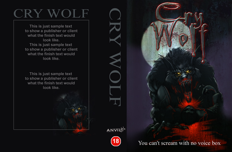
Short background: Estonian publisher contacted me after a visit to Elfwood, wants this picture for a book cover. All I know is that it is contemporary Sci-fi, "X-files" style - werewolves included. Since I don't know much about the story, the picture can't have many symbols in it (which I feel is a limiting factor).
I have started touching it up, but I'd really like some fresh eyes' comments on composition, "feel", colours and what else you can think of. Ideas I've held in mind is contrast (since it's a book cover), speed/motion, and a sense of danger. What hugs or bugs you?
Thanks,
Torstein

[ June 03, 2002: Message edited by: Torstein Nordstrand ] |
|
| Back to top |
|
kaylon
member
Member #
Joined: 08 Nov 2000
Posts: 128
Location: Dundee, Scotland
|
| Posted: Mon Jun 03, 2002 10:27 am |
|
|
It's a nice rendering..nice movement, the forground figure could be sharper and more detailed but as a whole pretty good as a picture  . .
But one bigish prob though....it's not the right composition layout for a book cover, theres no title space anywhere (top, side or bottom) if it's wrap around then the front of the cover will be a little odd as it will only be the chap and maybe a claw. If it's just a front cover, then I would probably imagine a portrait layout would be better then landscape. Also if wrap around the wolf will be lost if any Bio/story text etc is added. I think you should have a think a bit about how the book will be laid out.
Kay. |
|
| Back to top |
|
kaylon
member
Member #
Joined: 08 Nov 2000
Posts: 128
Location: Dundee, Scotland
|
| Posted: Mon Jun 03, 2002 12:12 pm |
|
|
I've done a quick layout sample here, for a portrait style hope the pic and comments help... .
Kay. |
|
| Back to top |
|
dogfood
member
Member #
Joined: 27 Mar 2001
Posts: 131
Location: dog bowl
|
| Posted: Mon Jun 03, 2002 11:18 pm |
|
|
| I've started this comment a couple times, now and haven't fully worked out how to really convey this: this scene doesn't give me any suspense, whatsoever. It seems to me, that in illustration, the scene shouldn't really give away what's going to happen. This is an action scene, but it's the END of the action. We've scene what happens to the most identifiable subject (those of us not afflicted with lycanthropy), he loses a bloody great chunck of flesh. Bummer. Gory, not very scary. I like to look at some of the early/mid century illustrators (check out "Visions of Adventure") for the way they were able to pull off such great illustrations, really capturing the reader without them even opening the book, yet. |
|
| Back to top |
|
Torstein Nordstrand
member
Member #
Joined: 18 Jan 2002
Posts: 487
Location: Norway
|
| Posted: Tue Jun 04, 2002 3:01 am |
|
|
I really appreciate you help, but I'm afraid I can't do much about these issues you're mentioning. The original thumbnail is shown below, the publisher originally just wanted me to send a full-resolution copy. As you can see, it is already a "landscape" picture, and I don't see how he is going to fit it to the cover. But hey, it's his choice, his money.

Dogfood: Thanks, I think I understand what you mean... I am unscholared, but I see that this is not very inviting or mysterious. If I could start all over, knowing the book's theme, I'd follow your advice. I Appreciate it - and your reading recommendation is now part of my Amazon wishlist 
Kaylon: Thanks for the quick cover, I see your point. I suppose the editor will solve this by leaving a lot of dead space on the top and bottom. I've saved your layout image for future handling.
So there's my less-than-fortunate situation. If anybody have anything to say on the picture as is, I'd love to hear it! I'd like it to work on the cover even though it won't fit the page.
Thanks,
Torstein
[ June 04, 2002: Message edited by: Torstein Nordstrand ] |
|
| Back to top |
|
Torstein Nordstrand
member
Member #
Joined: 18 Jan 2002
Posts: 487
Location: Norway
|
| Posted: Tue Jun 04, 2002 8:45 pm |
|
|
I did this picture nearly a year ago, you can see it posted here on Elfwood. It was one of my very first tries with Painter, and I didn't really know what colour was at that time. Unfortunately, to a significant degree I still don't.
My pardons that you don't like my take on the werewolfies, I think they're kinda devilishly cute/funny myself.
As for composition, the space was designed before I realized that 'composition' really existed. Same goes with theme, hue, saturation, focus, setting, texture, you name it. I'd prefer to make a new picture for this assignment, but the guy wants this, so... go figure. Should I redo it, I would try and make the werewolves more 'classic' to appeal to readers, as this was mainly made to please my own tastes.
I'm glad you appreciate the colours, which are still a huge pain to me. I try picking up schemes and palettes, but I'm still developing a basic colour sense. Will get better though...
For those who are interested, I'll post the finished one in the correct gallery soon.
Thanks for helping out |
|
| Back to top |
|
Basse_Ex
member
Member #
Joined: 29 Mar 2002
Posts: 251
Location: The rainiest city in norway
|
| Posted: Tue Jun 04, 2002 11:05 pm |
|
|
Have I seen that picture before? Where? How? Is it possible? Have you shown it anywhere else? I'm damned sure I've seen it before. Must be at least some weeks ago. Months perhaps? Hmm...
Anyhow... I don't really like the picture, there's just something that put's me off. It's a style I don't really like, so I shouldn't really comment all that much. Don't mean to flame you or anything. But, just to not make this a completly useless post, here's some off the points that bug me:
- The composition seems uninspired. If you have to use that composition, I'd suggest cutting it off at the top and right side, placing the human head in the corner. Getting a more close-up feel, and emphasising the motion off the drawing.
- The human figure doesn't look good. It's stiff and dull. It doesn't really convey the action\emotion.
- I don't like the charicature style on the werewolf. It's not how I picture werewolves. The look itself isn't bad, it's actually quite cool, but it doesn't seem all that werewolfy to me. More like a muppet. But that's a matter of personal taste\expectations(Fordommer?).
And here's some thing I like:
- The motion is awesome. Getting a sense of motion in colorwork is often a pain in the ass, but you've nailed it.
- The background color is real nice, and the way it plays off the red on the werewolf and the green moss\shrubbery\grass in the forenground is very good. The red on the werewolf is perhaps a bit strong, but you've made some very nice color choices, all in all. |
|
| Back to top |
|
Thuduil
junior member
Member #
Joined: 16 Mar 2002
Posts: 48
|
| Posted: Sun Jun 09, 2002 7:59 pm |
|
|
for me...it doesnt look like the traditional werewolf cause your one doesnt have a snout...i think if u give ur figure more wolf/dog like qualities then it would look great
but atm the ears and facial expression dont look very wolfish
sory bout the crits..but the composition is really well done! |
|
| Back to top |
|
|
|
You cannot post new topics in this forum
You cannot reply to topics in this forum
You cannot edit your posts in this forum
You cannot delete your posts in this forum
You cannot vote in polls in this forum
|
|
Powered by phpBB © 2005 phpBB Group
|


