| View previous topic :: View next topic |
| Author |
Topic : "look at my picture!" |
nightmare
member
Member #
Joined: 04 Aug 2000
Posts: 269
Location: calgary, alberta, canada
|
 Posted: Thu Aug 24, 2000 4:33 pm Posted: Thu Aug 24, 2000 4:33 pm |
 |
 |
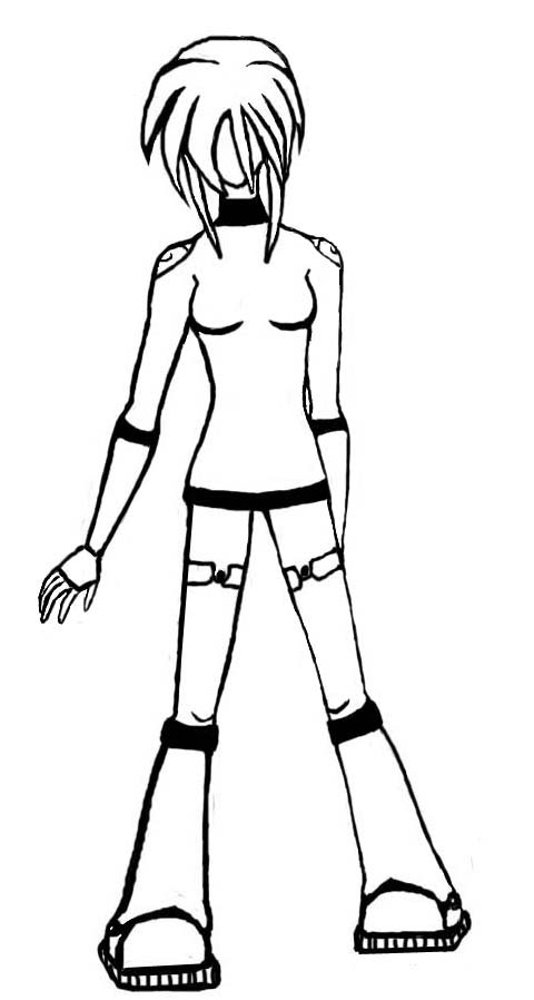
nobody ever looks at my pictures *sniff*
but tell me whats wrong with it. on a side note, i don't like drawing hands and suck at it. well, here's the pic.
well the picture worked for a little while :P. heres the link. http://waypoint.iwarp.com/wormhole/ayumi.html
[This message has been edited by nightmare (edited August 24, 2000).]
[This message has been edited by nightmare (edited August 24, 2000).] |
|
| Back to top |
|
Nex
member
Member #
Joined: 25 Mar 2000
Posts: 2086
Location: Austria
|
| Posted: Thu Aug 24, 2000 5:00 pm |
|
|
| i see a rather simplistic little red cross in a little white box... |
|
| Back to top |
|
Harnish Studios
member
Member #
Joined: 27 Jun 2000
Posts: 95
Location: California, USA
|
| Posted: Thu Aug 24, 2000 5:14 pm |
|
|
That's one of the most ingenious things I've ever seen! A white box with a red x in the middle!!! OMG...how much can I buy it for?
Sorry...couldn't resist 
- Brian |
|
| Back to top |
|
samdragon
member
Member #
Joined: 05 May 2000
Posts: 487
Location: Indianapolis
|
| Posted: Thu Aug 24, 2000 5:29 pm |
|
|
I think you did a pretty good job on that hand.
Your biggest problems with this image:
Try to vary your stroke width, don't keep it the same thickness all around. Some areas that would be darker may have a thicker stroke where as the ones where the light come from, have a thinner stroke.
There really isn't much as far as depth goes with this image. All that negative space is distracting..I'll see if I can come up somethng that might help ya out more. It's alot easier to see something than read about.
Something you might want to try is contour drawing. Draw something with out lifting up the pencil, all one big line. You will be surprised at what you will find. This is a simple exercise and it's great for getting your eye to hand to pencil to paper cordination.
It's obvious you're going for a stylized look, but don't push away traditional methods.
|
|
| Back to top |
|
nightmare
member
Member #
Joined: 04 Aug 2000
Posts: 269
Location: calgary, alberta, canada
|
| Posted: Thu Aug 24, 2000 8:16 pm |
|
|
thanx for the tips! i sorta tried to vary the line width but it didn't make a significant impact on the picture :P
what is this about negative space? i don't quite understand... |
|
| Back to top |
|
samdragon
member
Member #
Joined: 05 May 2000
Posts: 487
Location: Indianapolis
|
| Posted: Thu Aug 24, 2000 9:23 pm |
|
|
See all those areas between your dark outlines? Look at her shirt, there isn't much there, other than the contour of the breasts, the rest is a vast white void. That could be seen as negative space.
the usual way of looking at negative space is to look at the area around your character, is it interesting in anyway? Or is just throw on there.
See where her right arm (our left) sticks out from the body? See how the hips and arm form a graphical element or some sorts? It almost looks like the end of a scalpel. Alot of people only look at the "positive space" of something when they draw it. Try to look at everything, look at the image as a whole, not just as "a girl standing there."
Another example of "negative space ", see the triangle formed by the space between her legs? (that sounded funny)
I'm really bad about explaining stuff with out visual aids. I hope you can understand some of my rambling.
If it's okay with you, I would like to take your image and "do it up" to better explain this negative space thing I'm talking about.
Give me a while tho, i've got to finish updating a site.
Sometimes the first thing i see in images is the negative space. learning how to look at negative space can realllly help out your drawing skills. I give you can example of what I mean when i get some more time..Untill then, hang in there.
|
|
| Back to top |
|
Rinaldo
member
Member #
Joined: 09 Jun 2000
Posts: 1367
Location: Adelaide, Australia
|
| Posted: Fri Aug 25, 2000 7:04 am |
|
|
Hey there Nightmare.
Just thought I'd chime in an' give you a hand with a few things.
First off I was wondering if you were using the computer for this. If so then I would advise against it. Visigoth sems to be able to get good lines with PS but I find the best way to do a line drawing is with a pencil or pen (IMHO).
The main problem I se with your pic is that here is no overlap. you need to overlap lines to show depth and form, otherwise it's just an outline and you get what Samdragon is talking about. You start to see "spaces" inbetween the lines as opposed to seeing three dimensional "Form".
I pulled a couple of pages out of the old sketchebook (done about 10 min ago for this purpose).
There not absolutly fabbo, but they help to Ilustrate a few points 

You can see that there is a bit of overlap in places like the neck. even if it is just a smidgen, you should make ther right shoulder (in this instance) behind the neck cylinder it is possible to use pure line in a shilloete fashon. but the drawing has to be spot on. I have also varied the line weight a bit. There is a huge outline on the face (Joe MAD anyone) which is purely styleistic. but even the nose has different weights. it adds contrast and meaning to an otherwise static line.
http://dove.net.au/~jbrasted/Girlwalk.jpg
just something I thought might help a bit. A
whole buch of anatomy problems in there but just ignore. Were not talking anatomy right now (Well I wasn't anyway). Drawing a static front on shot like yours can sometime make it harder to describe form. The overlaping shapes in this pic help to give it a sense of depth.
Don't hesitate to ask some more specific Questions.
L8r
[This message has been edited by Rinaldo (edited August 25, 2000).]
[This message has been edited by Rinaldo (edited August 25, 2000).] |
|
| Back to top |
|
Chapel
member
Member #
Joined: 18 Mar 2000
Posts: 1930
|
| Posted: Fri Aug 25, 2000 7:05 am |
|
|
| Throw some slashes in there Rinaldo. |
|
| Back to top |
|
Rinaldo
member
Member #
Joined: 09 Jun 2000
Posts: 1367
Location: Adelaide, Australia
|
| Posted: Fri Aug 25, 2000 7:24 am |
|
|
Hahahahahahah..........Damn that anatomy is shite. OMFG I shoud have measured twice cut once
Ya know when you look at something after a few minutes and it just stinks. well I'm a gettin that now. Sorry nightmare. I'll have another go in the morning. The head on the second one is pretty shocking 
I'll refrain from removing because it'll teach me to not be so trigger happy.
*big Sigh* |
|
| Back to top |
|
Rinaldo
member
Member #
Joined: 09 Jun 2000
Posts: 1367
Location: Adelaide, Australia
|
| Posted: Fri Aug 25, 2000 10:46 am |
|
|
This might be a better example of what I'm rattling on about.

Sorry to fill your thread up with this trash nightmare. I mean well......honest.... |
|
| Back to top |
|
Chapel
member
Member #
Joined: 18 Mar 2000
Posts: 1930
|
| Posted: Fri Aug 25, 2000 10:52 am |
|
|
| hey that stuff looks sweet Rinaldo.. not like that crappy marvel junk. You should ink and color some of these. |
|
| Back to top |
|
Rinaldo
member
Member #
Joined: 09 Jun 2000
Posts: 1367
Location: Adelaide, Australia
|
| Posted: Fri Aug 25, 2000 10:58 am |
|
|
Chapel- thanks
I'm trying to find my fountain pen. when that happens. it'll all happen
There are still problems tho. no hip tilt ( you can see it was there in the sketch but it just never happend), head is too far to the left, and the hand is just plane ol' crap
I'll get there eventuialy.
Cheers.
(Tell me if this has helped at all nightmare.)
|
|
| Back to top |
|
Rinaldo
member
Member #
Joined: 09 Jun 2000
Posts: 1367
Location: Adelaide, Australia
|
| Posted: Fri Aug 25, 2000 12:51 pm |
|
|
Ok nightmare, no more messing around
I had a look around and found this, it's a page from Jack Hamm's "Drawing the Head and Figure" It explains what I was dancing around.

Nice little book. helped me a whole lot more than Hogarth.
Enjoy
|
|
| Back to top |
|
nightmare
member
Member #
Joined: 04 Aug 2000
Posts: 269
Location: calgary, alberta, canada
|
| Posted: Fri Aug 25, 2000 1:06 pm |
|
|
| wow. thanx everyone! if that stuff is trash then u can fill my threads with trash anytime! |
|
| Back to top |
|
nightmare
member
Member #
Joined: 04 Aug 2000
Posts: 269
Location: calgary, alberta, canada
|
| Posted: Mon Aug 28, 2000 9:16 pm |
|
|
sorry to bring my ugly picture back up but i just wanted to make sure samdragon wouldn't forget to show me how to fix the negative space thing ^^;
sorry |
|
| Back to top |
|
Chapel
member
Member #
Joined: 18 Mar 2000
Posts: 1930
|
| Posted: Tue Aug 29, 2000 7:34 am |
|
|
| I'm not sure that is a good method or not Rinaldo. It almost seems like he is teaching you to think in 2d instead of 3d. |
|
| Back to top |
|
|


