| View previous topic :: View next topic |
| Author |
Topic : "The Speedpainting Thread (IV)" |
mattyuk
member
Member #
Joined: 23 Sep 2007
Posts: 392
Location: Cumbria, UK
|
 Posted: Mon Aug 08, 2011 1:56 am Posted: Mon Aug 08, 2011 1:56 am |
 |
 |
| This is why I love this board. Everyone chips in and helps everyone, superb. |
|
| Back to top |
|
Nide
member
Member #
Joined: 20 Jul 2009
Posts: 477
Location: Banks of the Styx
|
| Posted: Mon Aug 08, 2011 2:30 am |
|
|
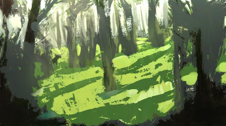
great work all! 
another day , another tree ! 

thanks III |
|
| Back to top |
|
Absorber
junior member
Member #
Joined: 25 Jan 2011
Posts: 16
Location: Netherlands
|
| Posted: Mon Aug 08, 2011 3:18 am |
|
|
Thanks for all the overpaints!  No offense taken so don't worry No offense taken so don't worry
My intentions were indeed to create the photographic feel from a shadowy place. So that the area that is lit is way to bright for the camera. Maybe I've overdone it. So Tomasis, the lightning in your forest is great, but not the mood I was looking for. And RayToh, then your overpaint A suits more.
To get it straight, I didn't used the custom brushes to get the 'wooo!-see what brushes I got-message', imho it was used to create more depth and tell stuff like material.
And one final thing, not as an excuse but I'm having trouble with monitor-calibration. I'm working on my second screen (HP 2309m), which has great contrast and color-output. But when I work on darker images like this one and switch it over to my laptop-screen the image turn way too dark, than I first had. So I can't know how dark you guys are seeing my image. I think those new macbook-glassy-screens are just to dark (I hope).
Version 2: (Can any of you can see the lighter details drawn in the red circles? Because that's where it becomes to dark on my darker screen.)

Thanks again for all the effort. Appreciate it!
_________________
http://mittmac.deviantart.com |
|
| Back to top |
|
Tomasis
member
Member #
Joined: 19 Apr 2002
Posts: 813
Location: Sweden
|
| Posted: Mon Aug 08, 2011 4:52 am |
|
|
absorber, i know i never paint such overpaint that satisfies the author. It was a little demonstration of "cleaning up stuffs", not saying that it is right, or wrong or suggesting specific light or mood as every artist know all this is subjective. Personally, I read better image if shapes & values are simplified (it applies any possible light, limited or extended latitude, mood, whatever). If custom brushes add only fuss, mess that doesnt read well, the more reason wait using that unless one is sure. Again it is my personal opinion. Regarding taking one's advices, one knows and understands best from his own experience and mistakes no matter what other say as in your case. If I say million words, things dont get better, only you will understand making your own stuffs, nothing else. Im sure you will do awesome stuffs.
Using custom brush may sound very tempting, it slows one new aspiring artist's development unless he get solid foundation at first IMO. Taking easy shortcuts may produce "satisfying" results but in long future it may force to take one back on the road. It is common mistake of beginners (I did that many times)
"LESS IS MORE"
(good example is Mon's works, i know it is very stylish, but it tells much info from so simple shapes&values, nothing too much (unnecessary as clutter) added there)
Please note my posts are always highly subjective and I try only to help Feel free to make your own interpretation and stay in defensive position in the castle
BTW buy monitor calibrator and it saves lots of fuss.
Nide, nice painting!
_________________
out |
|
| Back to top |
|
Bierberg
member
Member #
Joined: 13 Apr 2010
Posts: 71
Location: Copenhagen, Denmark
|
| Posted: Mon Aug 08, 2011 6:52 am |
|
|
@ the Absorber discussion
I think a problem with the high key versions is that you are having a hard time putting
detail into anything but the outlines of the shapes, because you burn out the lights AND
tone down the shadows. this leaves a very small tonal space to work from (though it can be done ofc.)
so my advice would be to put more light and detail in the shadow of the high key versions.
on a side note to Tomasis version. here is a photo displaying roughly the lighting condition and values.. i think www.bierberg.com/absorber.jpg
here the shadows go dark and there is a big midtonal range..
and if you cut down some trees you would have the highs in there at the top
my 50 cents |
|
| Back to top |
|
Lemur
member
Member #
Joined: 22 Apr 2010
Posts: 318
Location: NYC
|
| Posted: Mon Aug 08, 2011 9:32 am |
|
|
cool overpaints and of course thanks Absorber for putting up with our crap lol
Bierberg-thats a great point you make that for an image with that range silhouette design becomes such a biggy! Didn't think of that right away.
I tried to hit some sortof middleground between the examples and have shadows of the trees on the ground or something- it was really beyond me though and didn't have any good ref as an example. I like the narrative of this picture if you think of the deer as the character and the center tree as the object of interest. Like the deer is eyeing that tree to go pee on during mating season hehe
 |
|
| Back to top |
|
Absorber
junior member
Member #
Joined: 25 Jan 2011
Posts: 16
Location: Netherlands
|
| Posted: Mon Aug 08, 2011 12:28 pm |
|
|
@ALL; sorry for the spam around my image. I don't wanna claim this topic with all the feedback. So I think we need to quit it from here and I take all the feedback with me onto a new speedpainting.
@ Tomasis: Thanks for all the feedback! don't see me as an defender in his castle, I'm sorry if I gave this idea. I'm a big fan of feedback/critique, so everything you guys say is looked through with care.
Although the chance of misunderstanding is unfortunately quite big, due to language- and mindwave-gaps.
@ Bierberg. I agree with the to strong contrast between light and shadow and it's detail. But I need to know if you could see the light details drawn in the round circles (prev. image), because if not the image looks indeed very flat. Maybe I should lighter up all my images in the future to get out of the way of this problem.
@ Lemur: Why didn't I came up with the peeing narrative?! 
Also, thanks for the overpaint, although you got the entire forest floor lit (lighted?!), but I wanted only this small area in the middle to be bright. As we all can see, doing overpaints for other artists can be hard since we all have our own ideas when it comes to one picture.
So enough with the chitchat, lets get back to painting again!
_________________
http://mittmac.deviantart.com |
|
| Back to top |
|
ili
junior member
Member #
Joined: 31 May 2011
Posts: 18
|
| Posted: Mon Aug 08, 2011 12:35 pm |
|
|
Thanks Lemur! Yeah, the enviro was originally just a grayscale for my composition class, and then I threw a super quick little grisaille over the top. It's pretty much a round grad with a bit of shape carving...
Just something simple for now:

I'll play and do a paintover as well:

I moved the tree out of the direct center for a "better" composition. As much as I can, I try to avoid verticals or horizontals along the centerlines of the image to avoid evenly splitting the image in half. The trees are all of a similar shape and size, and I tried to break that up and just get rid of a few of them to simplify it down a bit. I blew out the light even more instead of trying to knock it back: if something looks wrong, try fixing it by pushing it even further before pulling it back. Then, I added a bit more form to everything and shadow conditions to conform with the lighting situation. I blurred out some areas of the background and knocked back areas that were competing with the focal points and the fleshy things, dropping a bit of blue onto the birds so they stick out more. Finally, I knocked back the foreground blacks so there wasn't just an empty vacuum at the bottom of the image.
If I can recommend something for the next piece, I'd recommend getting your comp and shape design worked out early so you can focus on your color, lighting, and mark making later.
Last edited by ili on Wed Aug 10, 2011 7:46 am; edited 1 time in total |
|
| Back to top |
|
Bierberg
member
Member #
Joined: 13 Apr 2010
Posts: 71
Location: Copenhagen, Denmark
|
| Posted: Mon Aug 08, 2011 1:44 pm |
|
|
ARGH. i was going to PM this to you Absorber. but i feel it might be worth something to add out here.
(not like a little conversation will hurt the 1200 pages of pictures (or am i gravely mistaken there?...))
You asked if we could see the circled areas of your picture; Yes. I can see some detailing/texture in there.
nothing particular looks to be lost. im on an old but decent Samsung Syncmaster 215TW monitor.
BUT
Might it be worth concidering that pictures don't necessarily have to go all the way to #000000 black ?
I feel its a bit like drawing too close to the edge of the canvas; you are bound to make unconcious distortions to keep certain elements within the frame.
The same with the edge of the tonal range, if you get too close you're going to distort your range (because you cant get below #000000)
Lately i have been trying to stay above 10% Black in the HSB color tab. (saw some tutorial video who's author i cant remember the name of now)
I find i can control my values better like that and if i really want it to go to 0% i can clamp the image with an adjustment layer without destroying
too much information. (not saying its a foolproof method.. just that i feel more in control when doing it. and it might compensate for the above mentioned distortion)
Just a though.
ill post a picture next time i promise!!! |
|
| Back to top |
|
Bierberg
member
Member #
Joined: 13 Apr 2010
Posts: 71
Location: Copenhagen, Denmark
|
| Posted: Mon Aug 08, 2011 2:41 pm |
|
|
And here it is
A funny thing happened in this image. in the first one, focus is outside the car and there is an emphasis on the silhouette of the vehicle.
The second version has the sunlight comming into the car, hitting the interior and moving focus there, in the process, destroying some of the silhouette quality of the firs one.
But when i showed them to my girlfriend, she was all about the sunlight, saying that it drew her into the narrative of the car etc.
But i like the first one better as it's more true to my initial idea and the silhouette is a big plus too..
Thats why i post both of them.

 |
|
| Back to top |
|
Odds
member
Member #
Joined: 17 Sep 2004
Posts: 374
|
| Posted: Mon Aug 08, 2011 4:52 pm |
|
|
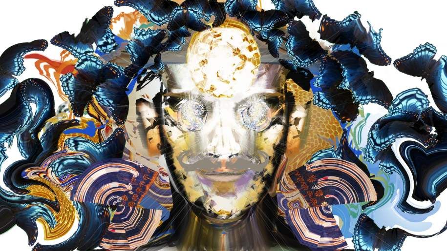
Painter has always been troubling for me compared to PS, but after I downloaded Android Jones' workspace, I found it a bit more fun to play with. This is a little experiment I created using his typical textures and the like with mirror painting on.
 |
|
| Back to top |
|
Lemur
member
Member #
Joined: 22 Apr 2010
Posts: 318
Location: NYC
|
| Posted: Mon Aug 08, 2011 7:23 pm |
|
|
Bierberg-ah i like the sunlit one too-don't think it messes up the silhouette,it does provide more breathability in a spacial way-I think little lighting effects really ad a finishing credibility to a design. like the bounce light inside the car, my brain recognizes it as 'realistic' instantly. Though of course its easy to overdo, probly why it works is cause you like the basic one better
Odds- thats cool, psychedelic maaaan 
I was sortof playing around drawing from ref and then tried to spruce it up. I love the effect of rain on a mountain, getting those epic lost and found edge of the mountain silhouette-always wanted to do pictures with that in it-
 |
|
| Back to top |
|
Tomasis
member
Member #
Joined: 19 Apr 2002
Posts: 813
Location: Sweden
|
| Posted: Mon Aug 08, 2011 7:45 pm |
|
|
awesome overpaints! i like them all.
beautiful personal works, lemur, bieberg, ili
absorber, no problems Im very agressive soldier, so it is good idea staying on top of castle, kidding haha ... I added short 5 min sketch to give idea to you how Im trying planing so I dont waste time fiddling around. It happens that I just dont do nothing but looking at picture for a minute before knowing next stroke or serie of strokes im sure of.
enough of babbling for me under extended time period
structure, structure for me WIP


_________________
out |
|
| Back to top |
|
Ying_Dragoon
junior member
Member #
Joined: 02 Aug 2011
Posts: 7
|
| Posted: Tue Aug 09, 2011 12:05 pm |
|
|
fantastic work here guys, this thread is awesome!
Here's my first city speed paint. Hope it aint too bad
 . .
[img]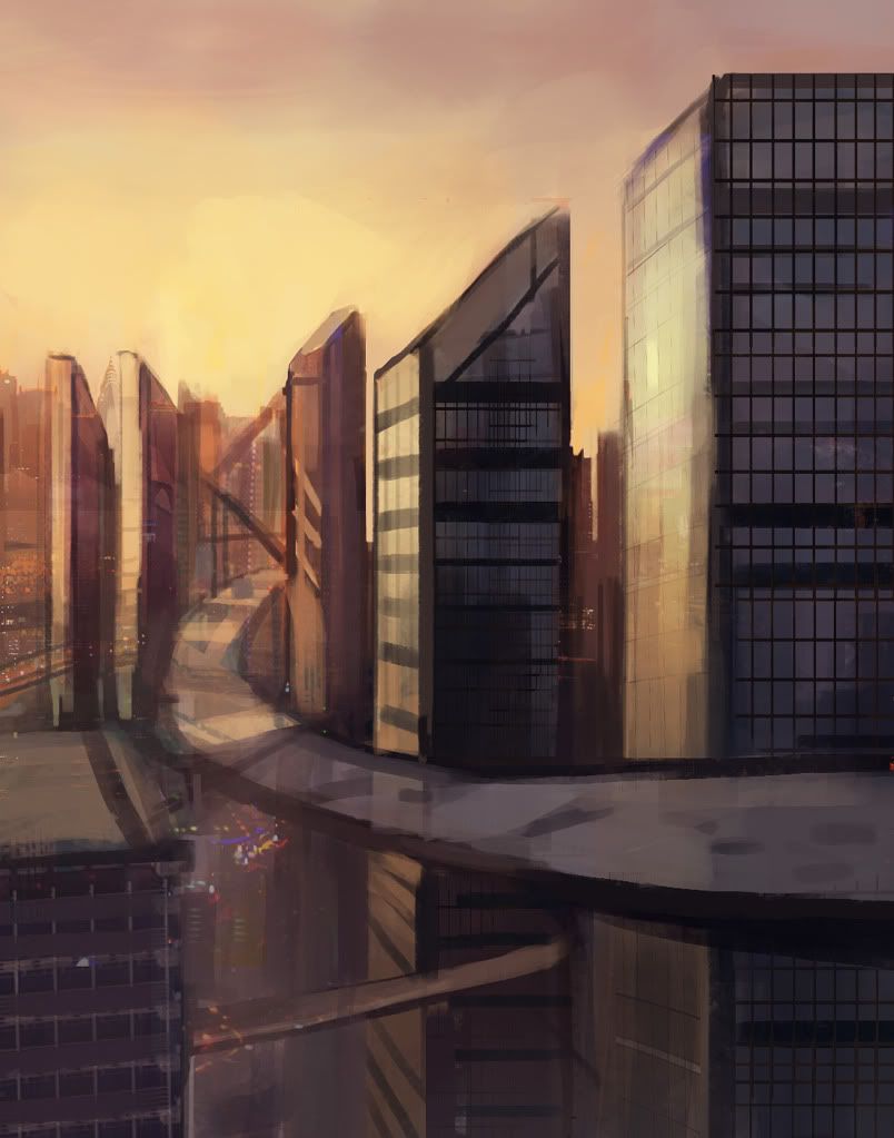 [/img] [/img] |
|
| Back to top |
|
Tomasis
member
Member #
Joined: 19 Apr 2002
Posts: 813
Location: Sweden
|
| Posted: Tue Aug 09, 2011 1:57 pm |
|
|
ying dragon, nice!
testing brushes from a very important and secret person haha.

_________________
out |
|
| Back to top |
|
Lemur
member
Member #
Joined: 22 Apr 2010
Posts: 318
Location: NYC
|
| Posted: Tue Aug 09, 2011 2:39 pm |
|
|
Tomasis-hey i recognize some of them i like it, reminds me of blade runner!
a couple greys, like to paint wit da greys
 |
|
| Back to top |
|
Nide
member
Member #
Joined: 20 Jul 2009
Posts: 477
Location: Banks of the Styx
|
| Posted: Wed Aug 10, 2011 9:05 am |
|
|

tomasis  |
|
| Back to top |
|
RayToh
member
Member #
Joined: 22 May 2008
Posts: 263
Location: Singapore
|
| Posted: Wed Aug 10, 2011 10:01 am |
|
|
All> Interesting discussion. And yeah, got to thanks absorber for putting up with our crap. Haa. Nicely written, lemur.
Lemur> Love the last few pieces. Very nice. T^T
Tomasis> I can always feel ur passion when you are talking about all this. Haa. Don't know why. Love the last piece. Very interesting.
Nide, Bierberg, ili > Great work.
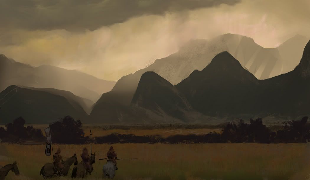
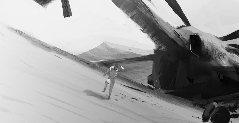
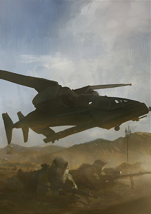
Photo ref. I basically did this as a photo study but i decide to change the head of the guys and make the plane more sci-fi looking. The photo is from a news article that caught my eyes.
_________________
www.raytoh.com
http://torei.blogspot.com |
|
| Back to top |
|
Sup_Ben
member
Member #
Joined: 11 Jun 2002
Posts: 416
|
|
| Back to top |
|
Howie
member
Member #
Joined: 31 Oct 2006
Posts: 229
|
| Posted: Wed Aug 10, 2011 10:16 pm |
|
|
 |
|
| Back to top |
|
Ying_Dragoon
junior member
Member #
Joined: 02 Aug 2011
Posts: 7
|
| Posted: Thu Aug 11, 2011 7:15 am |
|
|
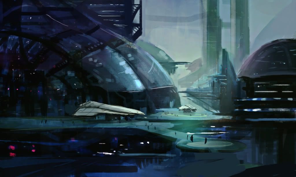
Another attempt, def need to practice futuristic cityscapes more
 [/img] [/img] |
|
| Back to top |
|
RayToh
member
Member #
Joined: 22 May 2008
Posts: 263
Location: Singapore
|
|
| Back to top |
|
Tomasis
member
Member #
Joined: 19 Apr 2002
Posts: 813
Location: Sweden
|
| Posted: Thu Aug 11, 2011 12:16 pm |
|
|
thanks guys
lemur, yeah greys are cool! like them. 
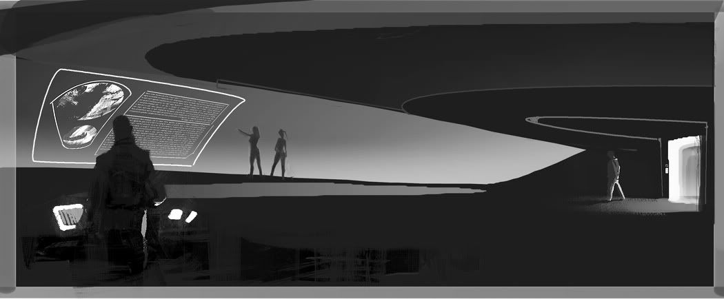
raytoh, hehe, I sometimes scare people away hehe nice oil study.. I would love if you post all studies in the analog thread.
howie, nide, ying, supben, Cool
oil sketch. WIP

_________________
out |
|
| Back to top |
|
mayk
junior member
Member #
Joined: 21 Apr 2006
Posts: 30
Location: Warsaw, PL
|
|
| Back to top |
|
notaf1nga
junior member
Member #
Joined: 27 Jul 2010
Posts: 17
|
| Posted: Thu Aug 11, 2011 4:16 pm |
|
|
Been a while? ...me too.
This is from some months ago but hadn't posted.

_________________
scribblepad
chadweatherford.com |
|
| Back to top |
|
Nide
member
Member #
Joined: 20 Jul 2009
Posts: 477
Location: Banks of the Styx
|
| Posted: Thu Aug 11, 2011 4:26 pm |
|
|
raytoh nice mood ! tomasis nice ! mayk oh yeah !!!
muscle !
 |
|
| Back to top |
|
ili
junior member
Member #
Joined: 31 May 2011
Posts: 18
|
| Posted: Thu Aug 11, 2011 6:54 pm |
|
|
Thanks RayToh, Tomasis!
Lemur: Love that enviro with the samurai
Bierberg, RayToh, Nide, mayk, notaf1nga: Great work!
Here's a quick little watercolor I did of one of Jon Foster's busts for his figure painting class. That guy just blows my mind; I'm going to learn so much from him this semester. Probably going to have another couple of these in a few days if I crank through this ortho I have to get done...
 |
|
| Back to top |
|
rodjer
member
Member #
Joined: 04 Jan 2009
Posts: 66
Location: Moscow
|
|
| Back to top |
|
Sup_Ben
member
Member #
Joined: 11 Jun 2002
Posts: 416
|
|
| Back to top |
|
das-Adam
junior member
Member #
Joined: 12 Aug 2011
Posts: 1
|
| Posted: Fri Aug 12, 2011 9:52 am |
|
|
....err. hi guys hugs and kisses!


 |
|
| Back to top |
|
|