| View previous topic :: View next topic |
| Author |
Topic : "The Speedpainting Thread (IV)" |
Bierberg
member
Member #
Joined: 13 Apr 2010
Posts: 71
Location: Copenhagen, Denmark
|
 Posted: Wed Aug 03, 2011 9:12 am Posted: Wed Aug 03, 2011 9:12 am |
 |
 |
Back after two weeks vacation. Nice pages these last ones!
Ditlev (a few pages back allready) yay 
PS: thats an elephant btw...
 |
|
| Back to top |
|
Tzan
member
Member #
Joined: 18 Apr 2003
Posts: 755
Location: Boston MA
|
| Posted: Wed Aug 03, 2011 10:48 am |
|
|
| WhereTrumpAt wrote: |
| Hey everyone, I'm new. |
|
|
| Back to top |
|
Nide
member
Member #
Joined: 20 Jul 2009
Posts: 477
Location: Banks of the Styx
|
| Posted: Wed Aug 03, 2011 10:58 am |
|
|

maybe repost , with something more ! 
Last edited by Nide on Thu Aug 04, 2011 2:21 am; edited 1 time in total |
|
| Back to top |
|
Howie
member
Member #
Joined: 31 Oct 2006
Posts: 229
|
| Posted: Thu Aug 04, 2011 12:10 am |
|
|
love it nide

 |
|
| Back to top |
|
Samsonsreaper
member
Member #
Joined: 29 Jan 2007
Posts: 382
Location: Irvine, CA
|
| Posted: Thu Aug 04, 2011 12:20 am |
|
|
 |
|
| Back to top |
|
Bierberg
member
Member #
Joined: 13 Apr 2010
Posts: 71
Location: Copenhagen, Denmark
|
| Posted: Thu Aug 04, 2011 2:48 am |
|
|
 |
|
| Back to top |
|
Bierberg
member
Member #
Joined: 13 Apr 2010
Posts: 71
Location: Copenhagen, Denmark
|
| Posted: Thu Aug 04, 2011 4:18 am |
|
|
Study. guess where it's from 
 |
|
| Back to top |
|
eightball
junior member
Member #
Joined: 17 Jan 2011
Posts: 18
Location: California
|
|
| Back to top |
|
M-e-f
junior member
Member #
Joined: 24 Jun 2011
Posts: 5
Location: Kiev, Ukraine
|
|
| Back to top |
|
Tomasis
member
Member #
Joined: 19 Apr 2002
Posts: 813
Location: Sweden
|
| Posted: Thu Aug 04, 2011 5:34 pm |
|
|
lemur, designating around light and set right values are different things. What I meant are different approach to start a image. Whether composition, light, gesture.. I could design light around composition not vice versa. Graphical image has only shapes, none thinks about light exactly (sure one dark, one bright tones). If you look at my image there guy punches other guy in face. The guy supposed to be backlighted behind but I didnt because I decided to break rule. To get it appear right, I could change perspective of the human being or making light very complicated as putting wall behind "light spot" creating split lighting. It is much more than cinematography light which is usually limited of real tools in life. To break rules is always cool! 
ok I thought first to post first image of the serie, but i fiddled with layers, it become more images, i thought it is cool with a story like that.

_________________
out |
|
| Back to top |
|
Tarumbana.
junior member
Member #
Joined: 01 Jun 2007
Posts: 40
Location: Brussel
|
| Posted: Fri Aug 05, 2011 6:45 am |
|
|
Been a while
 |
|
| Back to top |
|
Lemur
member
Member #
Joined: 22 Apr 2010
Posts: 318
Location: NYC
|
| Posted: Fri Aug 05, 2011 6:48 am |
|
|
wow Samsons, Nide!
WhereTrumpAt-welcome to sijun, and thanks! like the simplicity of your comp.
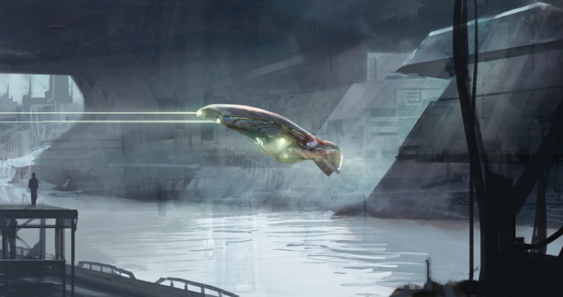
Bierberg-great depth and story in the forest pic.
Tomasis- yeah you've got the exposure levels to think about, been thinking alot about that lately. Usually I start with masses and stuff that just suggest it,you can also do lightless painting-like graphic design sortof or lots of asian artwork. Its very fun to break certain rules when you want to get something out of it, I would suggest studying that limited lighting though. Growth comes through limitations/digestable amounts of info!
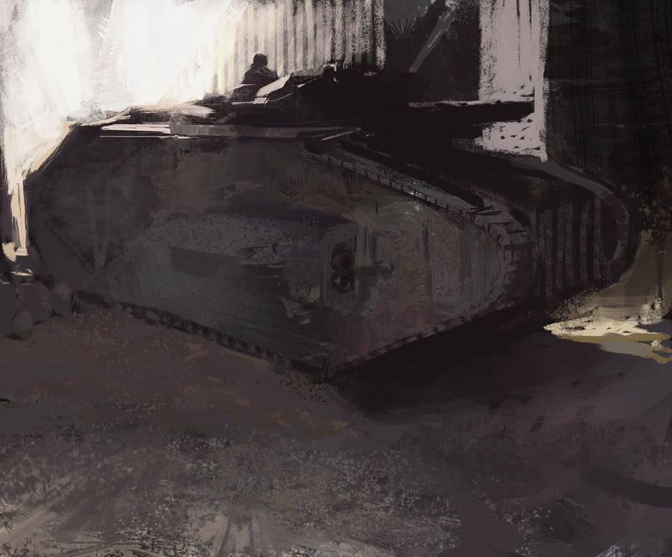
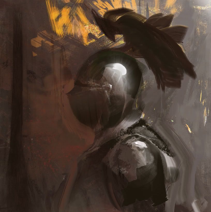
Chopped up the truck and made a tank and redid the knight cause it sucked on all levels. I've been thinking about what exposure levels show lately, lots of nice modern looking work describes most in the ambient halftones and blows out/flattens lightest lights. Sortof opposite from the 20th century illustration where they render in the lights and crush the darks.
 |
|
| Back to top |
|
ili
junior member
Member #
Joined: 31 May 2011
Posts: 18
|
| Posted: Fri Aug 05, 2011 11:09 am |
|
|
Samsonsreaper: Excellent
The last few pages have been great, keep it up!
Lemur: Funny you should mention exposure and value rendering; it's a subect we've been talking about at the studio a lot as of late. I think as a general rule, most artists pick a side of the halftone to render into. The highest color saturation in an image is generally around the halftones, and traditional paints have a bias towards rendering opaque lights and transparent darks.
There are plenty of paintings in museums with the details in the lights and plenty of paintings with the details in the dark, but you generally don't see too many paintings with detail in both the darks and lights (in part because "academic painting" is a curse word in this day, and the Bouguereaus and Waterhouses are all mildewing in the basement). Ideally, your decision to render the darks or the lights should be more based on the value structure of the image itself rather than a monolithic process applicable to all images. Figuring out your comp, value structure, and where the eye is going to be focused early on in the image making process helps considerably; that way you can determine what needs to be flat and what needs polish.
Haven't had much time to work digitally for a minute and I finally broke down and did something with the stylus...
 |
|
| Back to top |
|
Nide
member
Member #
Joined: 20 Jul 2009
Posts: 477
Location: Banks of the Styx
|
| Posted: Fri Aug 05, 2011 12:30 pm |
|
|
Howie ! , Lemur ! thaanks 
great stuff all
 |
|
| Back to top |
|
Absorber
junior member
Member #
Joined: 25 Jan 2011
Posts: 16
Location: Netherlands
|
| Posted: Fri Aug 05, 2011 12:45 pm |
|
|
Been gone for some time now 
Great speedpaintings/studies everyone. Love to see the variety of styles and techniques. I have a lot to learn!

Study after some works of Thomas Moran

Studies of women, planning to do more since I'm more familiar with environments then humans.


Any critique will be welcome Edit: I'll try to downscale my images next time a bit more. Forgive me this time
_________________
http://mittmac.deviantart.com |
|
| Back to top |
|
Howie
member
Member #
Joined: 31 Oct 2006
Posts: 229
|
| Posted: Fri Aug 05, 2011 6:12 pm |
|
|
 |
|
| Back to top |
|
ili
junior member
Member #
Joined: 31 May 2011
Posts: 18
|
| Posted: Fri Aug 05, 2011 9:49 pm |
|
|
Nide, Absorber: I'm digging those enviros.
Just a still life for today:
 |
|
| Back to top |
|
M-e-f
junior member
Member #
Joined: 24 Jun 2011
Posts: 5
Location: Kiev, Ukraine
|
|
| Back to top |
|
Absorber
junior member
Member #
Joined: 25 Jan 2011
Posts: 16
Location: Netherlands
|
| Posted: Sat Aug 06, 2011 3:00 pm |
|
|
@ Samsonsreaper: Great to see you posting here Levente Recognised your style. I tried to include some of the grassy details you used in this latest work as well. Not that it is as good, sadly not
@ Bierberg, great studies. I like the mood of the paintings
@ Eightball; try to create a focal point by including sharper and more detailed areas.
@ M E F: Great mood on your second painting (aug 05). The color of the water is great. But watch out with over-detailing the ground
@ Lemur, great color palette and texture. The color variety on the side of the tank is great.
@ Howie, nice dramatic lightning on the face.

Crit's are welcome. Btw, I definitely need to create more home-made custom brushes since I'm starting so see some likeness in some speedpainting haha
_________________
http://mittmac.deviantart.com |
|
| Back to top |
|
Tomasis
member
Member #
Joined: 19 Apr 2002
Posts: 813
Location: Sweden
|
| Posted: Sat Aug 06, 2011 3:38 pm |
|
|
absorber, dont try hide weak, bad structure behind fancy effects like custom brushes, textures *imitating spooge demon* lol
overpaint of one of alexson work. this was challenging, as I suck at anatomy (also at eveything haha) but it was fun!

_________________
out |
|
| Back to top |
|
Absorber
junior member
Member #
Joined: 25 Jan 2011
Posts: 16
Location: Netherlands
|
| Posted: Sun Aug 07, 2011 12:57 am |
|
|
Hi Tomasis, so your saying that my structure is weak? I haven't thought very much about the composition indeed since it was more about capturing a mood and trying some new brush-methods. But still, I first blocked everything out with a regular oval-shaped brush and worked for about 80-90% with a regular brush. After that I started to use custom brushes for texture so in my opinion it isn't about hiding.
I do think that the image, especially in the mid-ground it is to flat.
So if you do mend what I thought you did, please give more feedback and examples, if not you can forget what I just said.
Thanks!
_________________
http://mittmac.deviantart.com |
|
| Back to top |
|
RayToh
member
Member #
Joined: 22 May 2008
Posts: 263
Location: Singapore
|
|
| Back to top |
|
Bierberg
member
Member #
Joined: 13 Apr 2010
Posts: 71
Location: Copenhagen, Denmark
|
| Posted: Sun Aug 07, 2011 8:31 am |
|
|
Random shapes for the win!
Also: clich� sunset colors for the win! >o<

Lemur, Absorber, Thanks |
|
| Back to top |
|
Lemur
member
Member #
Joined: 22 Apr 2010
Posts: 318
Location: NYC
|
| Posted: Sun Aug 07, 2011 8:48 am |
|
|
ili-great to hear everybody else has been thinking the same stuff! It definitely is a case by case basis sort of thing. Haha, the more I learn about the general rules of painting the more I realize its all case by case/specific to the scenario. Awesome enviro btw- did you start greyscale?
Absorber-thanks! since you asked for crit- I probably wouldn't have blown out the grass in the midground, would've kept it midtonal but pretty saturated/ textural green. Sortof hard to talk about/describe in words, if you don't mind i'll try an overpaint
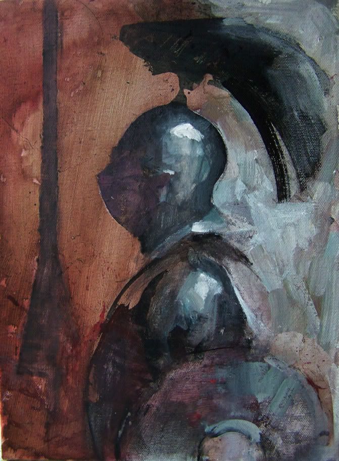
Heres my acrylic try of the knight head. Things I learnd: rubber cement makes great masker, a sponge is good for getting gradient effect in acryl, i need to use a limited pallette for now, and you can blow plasticky bubbles with a straw and wet acrylic on a surface! also I need to go darker with mids so the lightest lights actually look light (probably my biggest problem)-
 |
|
| Back to top |
|
Sup_Ben
member
Member #
Joined: 11 Jun 2002
Posts: 416
|
|
| Back to top |
|
kang__
member
Member #
Joined: 24 Dec 2006
Posts: 158
Location: China
|
|
| Back to top |
|
Absorber
junior member
Member #
Joined: 25 Jan 2011
Posts: 16
Location: Netherlands
|
| Posted: Sun Aug 07, 2011 12:37 pm |
|
|
Thanks for the crit Lemur. And I do think your right, but I was to lazy to change it when I saw it afterwards.
_________________
http://mittmac.deviantart.com |
|
| Back to top |
|
Synnical
member
Member #
Joined: 28 May 2005
Posts: 177
Location: Toronto, Canada
|
| Posted: Sun Aug 07, 2011 12:52 pm |
|
|
I just wanted to say, Bierberg, that your elephant pic really made my day. great narrative.
this page is getting ridiculous. so much gold  |
|
| Back to top |
|
Tomasis
member
Member #
Joined: 19 Apr 2002
Posts: 813
Location: Sweden
|
| Posted: Sun Aug 07, 2011 3:10 pm |
|
|
absorber, to see what is structure really, look at quintus dias sketches. composition has do with how viewer perceives the image but for structure, you have to build a image slowly, make sure that tree is of cylinder form, start with middle value and build from it toward to both ends (light and dark). It may sound very simple but such process goes slowly. For better quicker result, start with big masses and slowly shape "light" (values & form). If you put custom brush, or any random stroke, fiddle and hope it does fix itself or wait for happy accident. It doesnt work so. You have to think more, much less painting.
It doesnt matter what kind of brushes do you use, all is in the head. How do you know if the structure is good enough?
I could have started paint on blank canvas to show you simple blocked mass but I fiddled instead on your image, it was more difficult to repair this, hehe. -However, as you see, I just made trees to cylinder form, made values back to middle, creating depth.
See, how my texture of grass sucks, hehe but it doesnt stop me creating other things with simple "stupid" brush I look forward what Lemur can do. He is better on simplifying things
Painting simple things is tough, one thinks about millions things Not contrary as one ought to assume.

_________________
out |
|
| Back to top |
|
RayToh
member
Member #
Joined: 22 May 2008
Posts: 263
Location: Singapore
|
| Posted: Mon Aug 08, 2011 12:46 am |
|
|
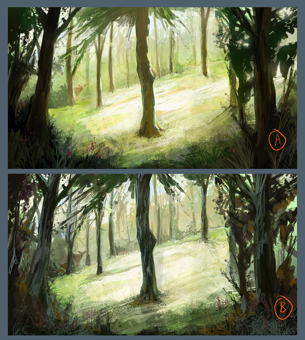
I thought this is quite an interesting exercise so i just pop in for fun.
The thing about what is wrong and right really depend on the choices u make as an artist. So by right if u understand all your foundation. Nothing is right or wrong. It's just choice. From what i see from Absorber's piece. I don't really feel there's a big problem, mainly because the idea is there. The center tree is lighted from both side thus giving it a kind of "flat" look. Having this "flat" look suggest that the light isn't coming from any strong direction. So what this could suggest is, the scene is lighted by natural light. Which is the result of overpaint "B" I have attach. Instead of leaving some area too dark, i added in more info on the branches and leafs surrounding the main tree since it's natural lighting.
Overpaint "A" is painted base on an oppsite idea that lemur suggest about bringing back abit more midtone for the grass. ( Not sure if i understand right or wrong, Lemur, hope you don't mind) I wanted to create a "we are looking out from the shade" kind of feeling. So the result should have been a high key scene surrounded by dark low key silhouette of the surrounding branches. Overpaint "A" didn't really work out to what i have in mind. Need to do abit more reseach. I'm thinking more in terms of photography for this piece. When u take a photo from a dark area looking out into a bright area. Either u will have too bright or too dark results, due to the limitation of the exposure and how a camera works. So usually a balance needs to be found. And it's base on what the photographer shooting that particalur scene wants. Overall for overpaint "A", i feel, is a good idea badly executed. T^T
Train more, see more, think more. End of the day is really just choices which makes art interesting. Keep painting!
Absorber> Hi Absorber, I'm not painting to suggest that your idea is wrong or anything, i'm just illustrating the choices that anyone could make when painting an idea. Hope you don't mind me.
_________________
www.raytoh.com
http://torei.blogspot.com |
|
| Back to top |
|
|


