| View previous topic :: View next topic |
| Author |
Topic : "Character re-design WIP" |
Spiral
member
Member #
Joined: 17 Feb 2003
Posts: 82
|
 Posted: Thu Mar 18, 2010 4:50 am Posted: Thu Mar 18, 2010 4:50 am |
 |
 |
Hello to everyone. I haven't posted anything in a long time, but have been returning to the forums periodically. Now it's time to make it an eveyday thing.
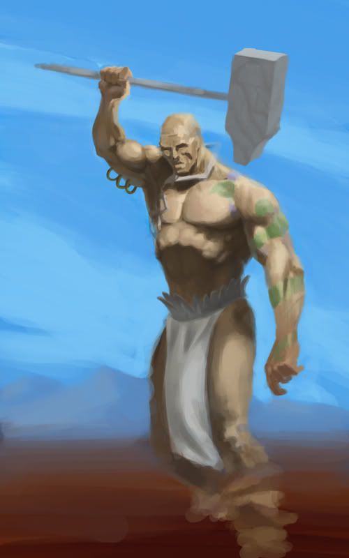
I am posting a character WIP I've worked on for a couple of hours, mostly just drawing the body, there's not much of the re-design ideas I have in mind put into it yet.
Any critique will be usefull. I need fresh eyes to look at it before I tackle it again, hopefully during the weekend, after finishing with some commissions.
Any advice on improving the lighting and getting the coloring to be more authentic (realistic) would be great. Even pointing to any related reference is useful.
 [/img] [/img]
_________________
"Don't judge a book by it's cover" -Frank Frazetta |
|
| Back to top |
|
durgldeep
member
Member #
Joined: 14 Sep 2001
Posts: 859
|
 Posted: Thu Mar 18, 2010 3:27 pm Posted: Thu Mar 18, 2010 3:27 pm |
 |
 |
1. I'm jealous (again) 
2. With the light source upper right, slightly foreground, I think the inside of his right forearm would be lit? [oh wait, there is the shadow of his hand/thumb to factor in...]
3. Am waffling about where the shadow of his left arm would fall on the thigh...
4. ... |
|
| Back to top |
|
Spiral
member
Member #
Joined: 17 Feb 2003
Posts: 82
|
 Posted: Fri Mar 19, 2010 4:40 pm Posted: Fri Mar 19, 2010 4:40 pm |
 |
 |
Thanks for your words durgldeep
1)Don't be jealous, it's not that great, I am a beginner.
2)The lightsource is more of a top-bottom-to-the-right-and-slightly-in-the-background thing. I considered the mass of the forearm also when I was laying in the tone, but after looking at my arm, under similar light, that's what I saw, and thinking of the anatomy during construction that's what I had visualized more or less, but it still looked odd. I opted to paint it in that way anyway because that's what I saw on my own arm. If I'm wrong correct me.
3) The light's orientation is top-down, the arm is exteneded to the right of the picture plane and outward, away from the body and thigh, and the thigh itself is forward, towards the picture plane, so mostly the area of the armpit casts any shadow on the thigh, and I've painted it on the upper leg portion. If it's wrong please elaborate.
4)...?
_________________
"Don't judge a book by it's cover" -Frank Frazetta |
|
| Back to top |
|
durgldeep
member
Member #
Joined: 14 Sep 2001
Posts: 859
|
 Posted: Fri Mar 19, 2010 8:58 pm Posted: Fri Mar 19, 2010 8:58 pm |
 |
 |
Likely not a good idea for me to correct anyone - I read the lighting wrong, for starters... 
4. Cool that the elbows are oriented so well (likewise I tested the pose, but not the lighting; ie. "medial epicondyle": right one points forward, left one points backward - exactly)...
I like the pose and the more I look the more I want to solve the lighting etc...  |
|
| Back to top |
|
durgldeep
member
Member #
Joined: 14 Sep 2001
Posts: 859
|
 Posted: Sat Mar 20, 2010 2:08 am Posted: Sat Mar 20, 2010 2:08 am |
 |
 |
Someone else could do this a helluva lot better than I can but here goes... 
A few suggestions (while staying close to the original), the main one being his right palm now points straight over his head...
 |
|
| Back to top |
|
Anthony
member
Member #
Joined: 13 Apr 2000
Posts: 1577
Location: Winter Park, FLA
|
 Posted: Sun Apr 11, 2010 8:16 am Posted: Sun Apr 11, 2010 8:16 am |
 |
 |
Durgledeep has a good point there. Also his right bicep and forearm are too short compared to his left. If the perspective of the shot was more extreme (ie; we were much closer) then we'd expect that, hut since we're faraway they should be reasonably similar. It would also be nice to see more counterbalance with his left arm-that hammer looks heavy even for him! Great work though, keep it up!
_________________
-Anthony
Carpe Carpem
http://www.anthonyfransella.com |
|
| Back to top |
|
|


 [/img]