| View previous topic :: View next topic |
| Author |
Topic : "Environment WIP" |
farvus
member
Member #
Joined: 21 Jan 2005
Posts: 241
Location: Poland
|
 Posted: Wed Nov 05, 2008 3:28 am Posted: Wed Nov 05, 2008 3:28 am |
 |
 |
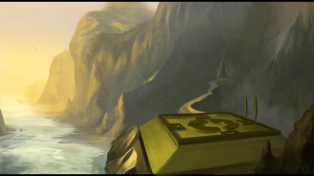
I started series of enviros for my personal project. I don't usually post WIPs for crit and it's propably bad habit.
Here's the first one.
I'm satisfied on the overall mood but something seems like it's pushing this pic back. I'm planning to check the perspective on that square garden and add more detail there beacause it feels a bit emplty but I don't know what else could help. Maybe some additional closer foreground element or more space at the bottom?
Thanks for any help.

_________________
Carbonmade portfolio / Blog |
|
| Back to top |
|
farvus
member
Member #
Joined: 21 Jan 2005
Posts: 241
Location: Poland
|
|
| Back to top |
|
Petri.J
member
Member #
Joined: 04 Dec 2003
Posts: 437
Location: Helsinki, Finland
|
| Posted: Thu Nov 06, 2008 7:10 am |
|
|
| farvus wrote: |
| Never mind. |
You really need to give people more time than 12 hours to respond  |
|
| Back to top |
|
umbus
member
Member #
Joined: 12 Oct 2008
Posts: 193
Location: above?
|
| Posted: Thu Nov 06, 2008 7:17 am |
|
|
I like what you did in the latest one, however the scale seems weird to me. those trees are like gigantic?
Also would be good to have some kinf of foreground to it, like a cliff platform...could be people on it the platform again to get some scale and proportions down. but hey just my opinion. keep up. |
|
| Back to top |
|
farvus
member
Member #
Joined: 21 Jan 2005
Posts: 241
Location: Poland
|
| Posted: Fri Nov 07, 2008 11:33 am |
|
|
| Quote: |
| You really need to give people more time than 12 hours to respond |
Hehe. I don't paint so slow  . .
Thanks for advice umbus. Here's finished pic.

_________________
Carbonmade portfolio / Blog |
|
| Back to top |
|
Hideyoshi
member
Member #
Joined: 08 Jun 2005
Posts: 303
Location: Germany
|
| Posted: Sun Nov 09, 2008 5:45 am |
|
|
hey dude!
I know you're finished with it, but I have a little remark:
the perspective of the structure doesn't match the one for the background. Yeah, it's an organic environment, but the architecture is viewed through a very distorted wide angle lens which doesn't seem to apply to the rest. But it's very hard to tell with organic elements as I said. You actually need to rely on gut feeling sometimes if done without any 3D or well-done grid...
What I know is that the type of wide distortion you have on your structure would definitely make for stronger spacial offsetting and distortion on the mountains.
People tend to neglect that perspective is closely related to the effect of a camera (or the human eye in that respect). You need to keep it all consistent... 
I did a quick overpaint, hope you don't mind. Just eyeballed everything, but I hope you see what I was trying to convey. 
 |
|
| Back to top |
|
farvus
member
Member #
Joined: 21 Jan 2005
Posts: 241
Location: Poland
|
| Posted: Sun Nov 09, 2008 5:45 pm |
|
|
Hideyoshi - Thanks! I still don't see how cliffs are not enough wide angle lens but your overpaint feels slightly better (only two edges of that square place cross far above the horizon line). I tried changing the perspective as you suggested. The result is not as good as I would like but I want to leave it for now. I think composition doesn't feel as dynamic as in wide angle lens version. Cropping didn't help much.

Here's second environment WIP. Design needs some small improvements.

_________________
Carbonmade portfolio / Blog |
|
| Back to top |
|
Hideyoshi
member
Member #
Joined: 08 Jun 2005
Posts: 303
Location: Germany
|
| Posted: Mon Nov 10, 2008 4:06 am |
|
|
hehe, yeah, I should have set up a grid and checked where the horizon was
Anyway, glad I could somehow help.
The changes you made definitely work better! It looks more correct now!
And that 2nd WIP is looking nice so far! |
|
| Back to top |
|
farvus
member
Member #
Joined: 21 Jan 2005
Posts: 241
Location: Poland
|
| Posted: Tue Nov 11, 2008 11:23 am |
|
|
I added more stuff according to suggestions from another forum.

_________________
Carbonmade portfolio / Blog
Last edited by farvus on Thu Nov 27, 2008 4:50 am; edited 2 times in total |
|
| Back to top |
|
umbus
member
Member #
Joined: 12 Oct 2008
Posts: 193
Location: above?
|
| Posted: Tue Nov 11, 2008 12:01 pm |
|
|
this is a poor overpaint but I wanted to emphasize more about putting down a more distinct foreground versus background. I still think you have problems with the scale, though I am not sure it is the perspective versus the objects making the problem. Anyway this is what I meant more in my post above. keep up, nice rendering tecnique you have.

.. |
|
| Back to top |
|
farvus
member
Member #
Joined: 21 Jan 2005
Posts: 241
Location: Poland
|
| Posted: Tue Nov 11, 2008 3:34 pm |
|
|
umbus - Thanks for overpaint and suggestion. I like your idea but I would have to start almost from scratch and I got a bit tired of this one. Maybe I'll completely rework it after some time.
Here's continuation of secon one.

_________________
Carbonmade portfolio / Blog
Last edited by farvus on Thu Nov 27, 2008 4:57 am; edited 1 time in total |
|
| Back to top |
|
Petri.J
member
Member #
Joined: 04 Dec 2003
Posts: 437
Location: Helsinki, Finland
|
| Posted: Wed Nov 12, 2008 7:43 am |
|
|
Looking good, but as with the first painting, this one also needs a better separation for foreground, middleground and background.
You might want to see this DVD for more information about the subject:
http://thegnomonworkshop.com/dvds/fzh03.html |
|
| Back to top |
|
farvus
member
Member #
Joined: 21 Jan 2005
Posts: 241
Location: Poland
|
| Posted: Wed Nov 19, 2008 4:54 pm |
|
|
Thanks Petri.J. That's not typical arrangement of elements though so I have to improvise.
Here's next stage of second one. I corrected perspective and added some details in the background. I don't want to overwork it though beacause I like some of the textures here. I tend to polish things too much.

_________________
Carbonmade portfolio / Blog |
|
| Back to top |
|
farvus
member
Member #
Joined: 21 Jan 2005
Posts: 241
Location: Poland
|
|
| Back to top |
|
Affected
member
Member #
Joined: 22 Oct 1999
Posts: 1854
Location: Helsinki, Finland
|
| Posted: Thu Dec 11, 2008 10:26 am |
|
|
| I like the elements of your last piece, although they don't really seem to fall together for me. I can't decide if I'm supposed to look at the doorway / arc on the right or the statue and vines on the left. For me, the left part of the image is more interesting, but my eye keeps being drawn to the right. I think just getting rid of that bright orange archway on the right, cropping about 20% off the right side and adding more space to the left would make this image read much better. Maybe some variation in colour saturation would be nice, too. Right now it looks a bit like there's a yellow cast over the whole image, having some clean lights there might liven things up a little. I opened this up in PS quickly and ran a cooling photo filter on it (LBB, 37% density), which made it look a lot nicer to my eye. Maybe try it and see if you like that or not. |
|
| Back to top |
|
farvus
member
Member #
Joined: 21 Jan 2005
Posts: 241
Location: Poland
|
| Posted: Fri Mar 06, 2009 9:59 am |
|
|
Affected - Thanks man. Cooling photo filter worked. Nice trick. I left this piece.
Here's new WIP. I painted in a messy way to get more organic but now it's hard for me to refine it without loosing all the vibrancy. The colors will be stronger at the end. Composition is supposed to be on triangle with gate being the primary element (although I fear that character on foreground will always dominate here).
Thanks for all the suggestions and advices.

_________________
Carbonmade portfolio / Blog |
|
| Back to top |
|
farvus
member
Member #
Joined: 21 Jan 2005
Posts: 241
Location: Poland
|
| Posted: Fri Mar 06, 2009 1:06 pm |
|
|
This enviro gives me headache beacause of complexity. I changed the values a bit to make it more focused, simplified planes, emphasized pose of foreground figure and balanced strong diagonal line in composition.

_________________
Carbonmade portfolio / Blog |
|
| Back to top |
|
|


