| View previous topic :: View next topic |
| Author |
Topic : "into the void and a bonus" |
gLitterbug
member
Member #
Joined: 13 Feb 2001
Posts: 1340
Location: Austria
|
 Posted: Thu Jul 31, 2008 4:53 pm Posted: Thu Jul 31, 2008 4:53 pm |
 |
 |
Just finished a painting I started quite a while ago and thought it's time I post something for once.
Into the Void
Acrylics on canvas, 20x60cm. No clear coat on it yet, would've probably enrichened the colors, but also made it even harder to get a decent photo of it done.
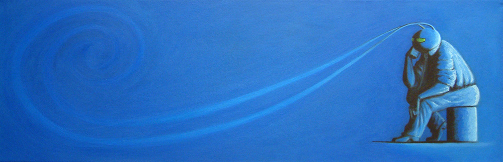
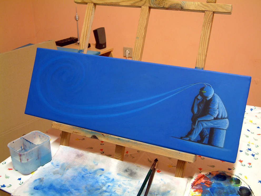
bigger version and close up
here it is on the easel (which I made out of some scrap wood myself also)
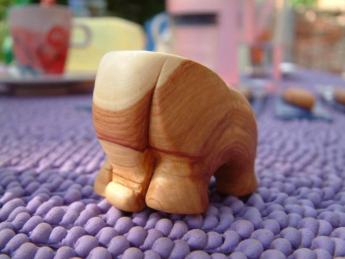
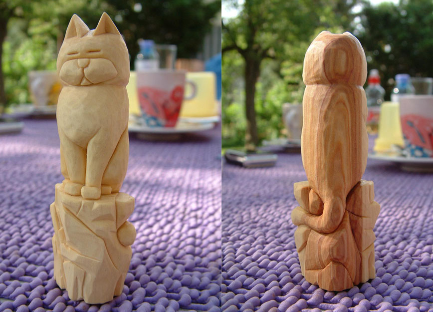
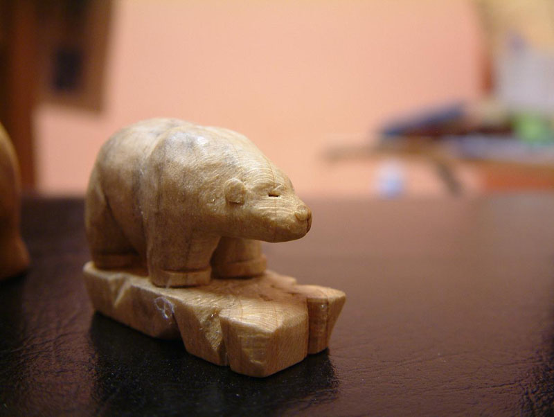
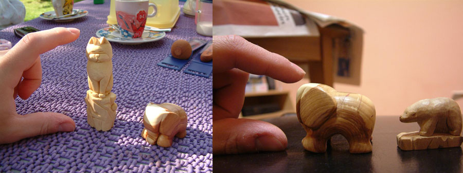
And as a bonus some carvings I did. One of the new things I dabbled in recently.
elephant, which now is in possession of my sister
sitting cat
tinybear
and finally a size comparison
Thanks for looking, I hope you liked it. |
|
| Back to top |
|
bobthedinosaur
junior member
Member #
Joined: 04 Feb 2005
Posts: 49
Location: Orlando, Florida
|
| Posted: Thu Jul 31, 2008 9:15 pm |
|
|
fun stuff 
been working a lot in blues lately myself.
well, blues with some gold or yellow here and there... just cause  and speaking of which, i would say, don't compromise on them! i think it would be just a little bit better if his eyes had some true yellow to them instead of being mostly greenish and speaking of which, i would say, don't compromise on them! i think it would be just a little bit better if his eyes had some true yellow to them instead of being mostly greenish
very much enjoyed, looks like you're having fun
edit: i checked your site, and saw that you've painted him before, and that his eyes are supposed to be green, so my sincerest apologies!  |
|
| Back to top |
|
Tzan
member
Member #
Joined: 18 Apr 2003
Posts: 755
Location: Boston MA
|
| Posted: Fri Aug 01, 2008 6:15 am |
|
|
Nice stuff.
Love that cat |
|
| Back to top |
|
Omi-kun
member
Member #
Joined: 30 Nov 2002
Posts: 318
Location: Austin, tx
|
| Posted: Fri Aug 01, 2008 8:29 am |
|
|
| Nice. I haven't worked with oil in such a long time. I like how his antennae disappears into the wind or something. His back looks a bit weird though; like he has some weird hump right underneath the back of his head.... otherwise it looks good! |
|
| Back to top |
|
Bg
member
Member #
Joined: 20 Jan 2000
Posts: 675
Location: Finland
|
|
| Back to top |
|
gLitterbug
member
Member #
Joined: 13 Feb 2001
Posts: 1340
Location: Austria
|
| Posted: Mon Aug 04, 2008 2:57 pm |
|
|
Thanks for the replies everyone.
@bobthedinosaur - the eyes do actually look a tad more yellow irl. Since I did mix in some especially for the highlight.
@Omi-kun - thanks again for the back crit, I hope I fixed that now (might take another photo and look at it in comparison). It's weird how different a few things look on a photo of a painting and what you notice on it that you don't while staring at it for hours when painting it.
Seems the cat is everyones favorite. Should make me a strop as my carving knives need some sharpening me thinks. But I always get sidetracked onto something new and oh well. Also I'm not entirely sure what compound to use for the strop and where to get it really. Sometimes getting certain tools or materials is a real pain. |
|
| Back to top |
|
|


