| View previous topic :: View next topic |
| Author |
Topic : "Destruction." |
ceddo
junior member
Member #
Joined: 24 Jul 2008
Posts: 3
Location: Lausanne, Switzerland
|
|
| Back to top |
|
Sumaleth
Administrator
Member #
Joined: 30 Oct 1999
Posts: 2898
Location: Australia
|
 Posted: Thu Jul 24, 2008 4:54 pm Posted: Thu Jul 24, 2008 4:54 pm |
 |
 |
Some first impressions:
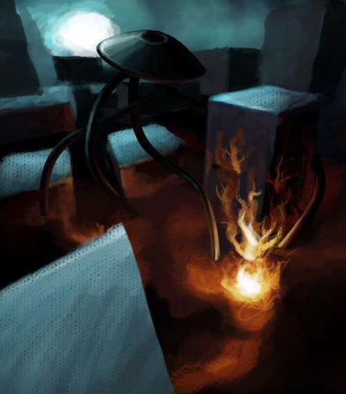
It looks more like a scene on a table than a cityscape. Reasons include the high value range across rooftops (at a city scale, you wouldn't get that contrast from sunlight -- and you wouldn't get fat leading-edge highlights on real buildings), the very loose perspective (you went to the trouble of doing perspective lines, but didn't follow them), shading on the "lamp" that doesn't follow the lighting of the scene, perspective vanishing points that are very close together (which sort of gives the appearance of being really close to a small scene), and there's nothing in the scene to suggest its intended scale.
Fire is tricky. You should use reference for it, to try and capture a realism. At the moment it looks like a glowing tree.
It's a good start though. Keep at it.
_________________
Art Links Archive -- Artists and Tutorials |
|
| Back to top |
|
ceddo
junior member
Member #
Joined: 24 Jul 2008
Posts: 3
Location: Lausanne, Switzerland
|
| Posted: Fri Jul 25, 2008 1:04 pm |
|
|
Thank for the good post Sumaleth. I've decided not to work on this any longer since I've learnt a few good lessons from this already, and I'd be better spending my time trying to use this new knowledge:
- make my vanishing points far away from each other
- lower lighting contrast on large objects
- work with larger canvases. I was told by someone on another forum that it's essential when going into detail in the further stages of development.
Sorry for the short-lived topic - I'll post something new when I get a concept though. Thanks again Suma  |
|
| Back to top |
|
|