| View previous topic :: View next topic |
| Author |
Topic : "Reactor" |
raybender
member
Member #
Joined: 14 Sep 2007
Posts: 98
Location: germany
|
 Posted: Mon May 26, 2008 1:34 am Posted: Mon May 26, 2008 1:34 am |
 |
 |
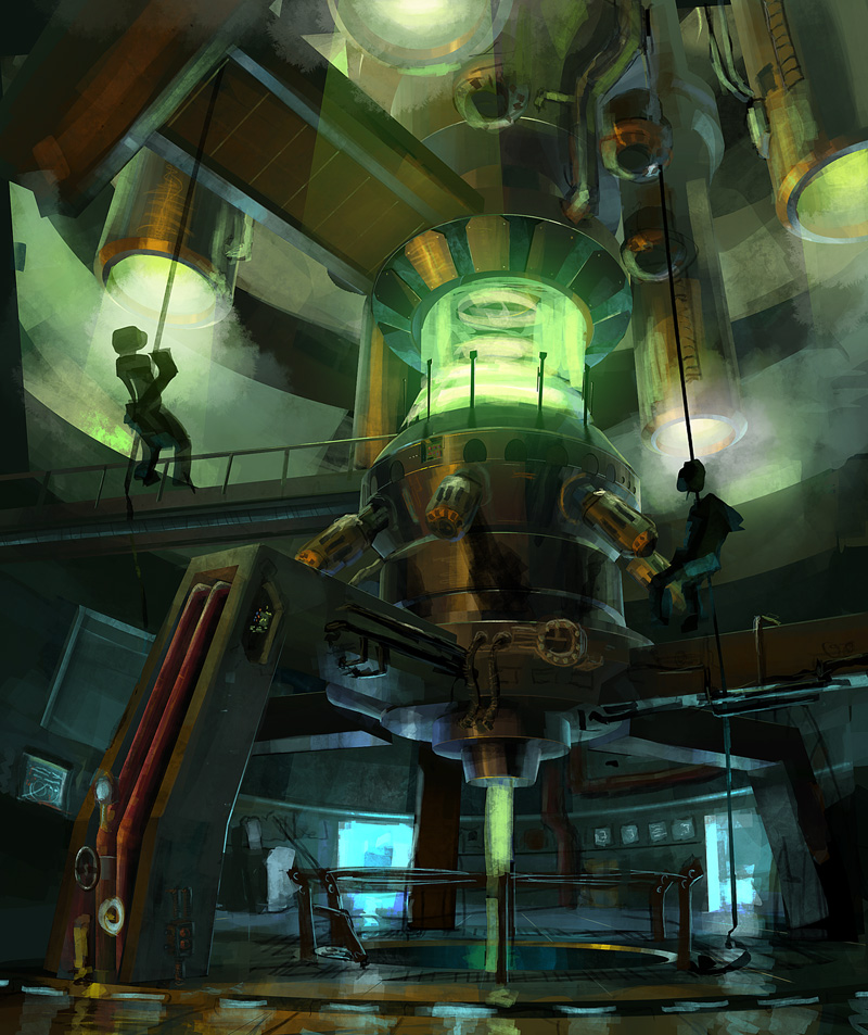
Hi guys!
i could use some helpful comments on this WIP.
its some kind of Reactor or Machine i dont know yet.. I wanted it to look a little bit 50�s Style.. or maybe Art deco... not High Tech.
currently im struggling with readability and chaos in the picture..
suggestions on how to improve the image or general opionions before going into cleaning it up would be great !!
 |
|
| Back to top |
|
raybender
member
Member #
Joined: 14 Sep 2007
Posts: 98
Location: germany
|
| Posted: Wed May 28, 2008 4:32 am |
|
|
no one got something to say ? any help ?  |
|
| Back to top |
|
Sumaleth
Administrator
Member #
Joined: 30 Oct 1999
Posts: 2898
Location: Australia
|
| Posted: Wed May 28, 2008 4:43 am |
|
|
Hard to think of anything to say.
I guess the composition doesn't feel quite right to me. The machine is off-center, but it's not balanced by something large on the left which makes the image seem off-balance.
Both abseilers line up with the cyclinders hanging from the roof which is also an unusual choice, unless there's a reason for it.
It's also a picture with a lot of bright areas spread almost evenly around the image. That's not something you'd usually go for in a composition. It could work in the final image, but it's hard to tell if it will from this sketch. It doesn't work at the moment IMO.
If you remove the top half of the image and treat the bottom half as a stand-alone composition then it's actually quite nice. The lower half has a good feel and the compositional balance (for shapes and values) is good. It's that top half that causes trouble.
_________________
Art Links Archive -- Artists and Tutorials |
|
| Back to top |
|
raybender
member
Member #
Joined: 14 Sep 2007
Posts: 98
Location: germany
|
| Posted: Wed May 28, 2008 5:48 am |
|
|
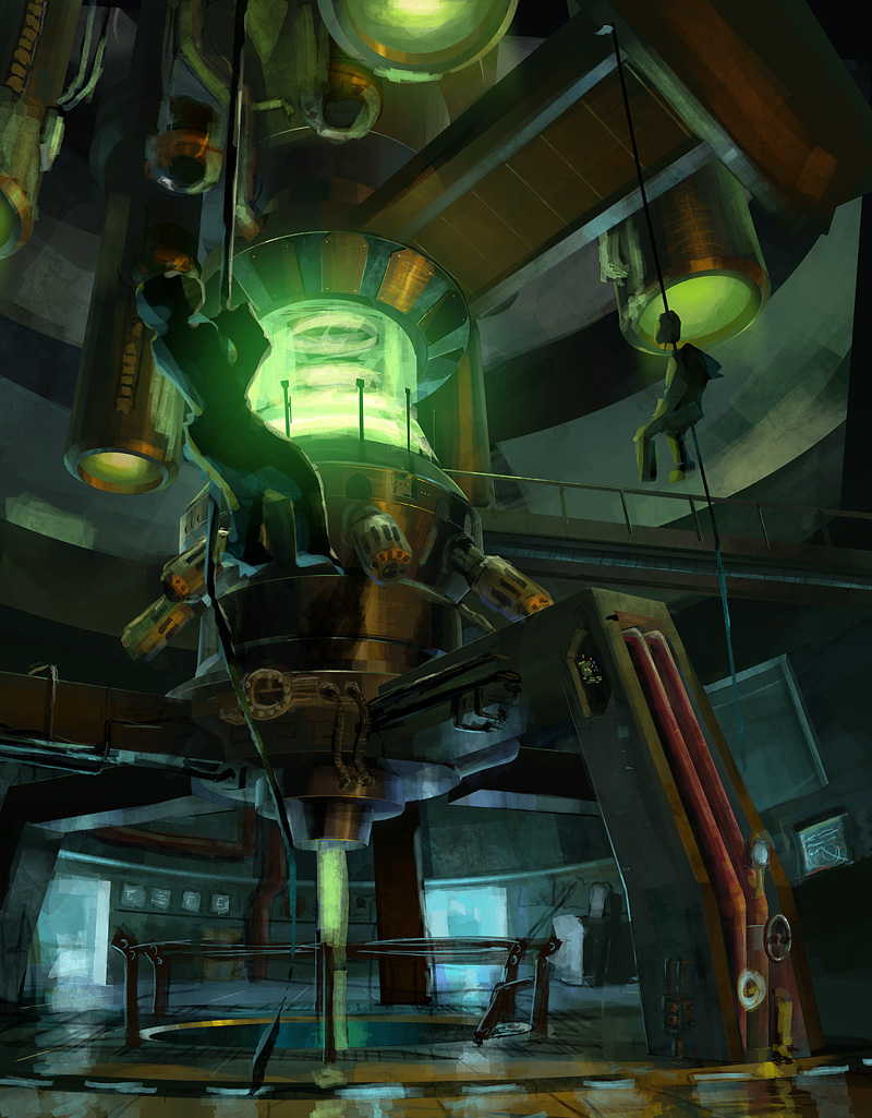
Thank you Sumaleth for you help... i tried to change compostion and lighting a bit te get it more focused.... hope its better now.
 |
|
| Back to top |
|
Sumaleth
Administrator
Member #
Joined: 30 Oct 1999
Posts: 2898
Location: Australia
|
| Posted: Wed May 28, 2008 6:24 am |
|
|
Only helped 10%. 
You have the large foreground object (the guy) on the same side of the image as the large background object (the reactor), so it feels even more unbalanced now.
The the values composition still doesn't look right. Perhaps if the top half was mostly dark except for the portals or something. It's all too bright IMO.
_________________
Art Links Archive -- Artists and Tutorials |
|
| Back to top |
|
SubJodge
member
Member #
Joined: 15 Sep 2007
Posts: 142
|
| Posted: Fri May 30, 2008 7:51 am |
|
|
I like the blue green colour-shift.
I agree with Sumaleth, the composition in your updated one feels unbalanced, i feel that the position of the abseilers should be swapped, i think that a foreground guy hanging to our right of the reactor would balance things out. My opinion anyways  |
|
| Back to top |
|
scumm
junior member
Member #
Joined: 12 Jul 2007
Posts: 42
Location: cph
|
| Posted: Sun Jun 15, 2008 1:14 pm |
|
|
Only thing I really dislike on the first pic, is that the men look like giants (compared to the rail) I realize theyre closer then the rail, but its just hard to tell due to shading and pose of the left guy (almost looks as if hes standing on it).
Overall I really like it tho =D |
|
| Back to top |
|
|


