| View previous topic :: View next topic |
| Author |
Topic : "To Games" |
Tinusch
member
Member #
Joined: 25 Dec 1999
Posts: 2757
Location: Rhode Island, USA
|
 Posted: Mon Oct 22, 2007 4:54 pm Posted: Mon Oct 22, 2007 4:54 pm |
 |
 |
 |
|
| Back to top |
|
Sampster
member
Member #
Joined: 01 Jun 2005
Posts: 182
|
| Posted: Mon Oct 22, 2007 7:22 pm |
|
|
Very interesting piece man. I'm liking this style that you're developing more and more these days. My crits are these (and I might be wrong in making them so take them with a grain of salt).
I feel compositionally it's boring to have that palm tree at the same place as the man, a more noticeable offset would be nice in my mind. Edit to clarify: I mean in distance from the viewer, i.e. draw a perspective grid going straight back or just a horizontal line from the center tree and it looks close to even with the man.
Secondly I'm not totally sure if this is on purpose, but I'm getting snow, beach, and smog all in the same place, it's strange to me but is that intentional?
Not a crit, just curiosity, what does the title mean (besides the reference to the arcade game in the piece)? |
|
| Back to top |
|
Tinusch
member
Member #
Joined: 25 Dec 1999
Posts: 2757
Location: Rhode Island, USA
|
| Posted: Tue Oct 23, 2007 11:15 am |
|
|
made some slight tweaks, updated above.
sampster: hey thanks a lot for the comments. youre right about the composition. ill take a look at the psd and see if its possible to fix without major surgery. about the elements, i just wanted some kind of surreal haze going on, didnt mean for it to look like snow and smog but i dont mind. and the title.. well it means a couple different things to me but im going to leave you guessing. |
|
| Back to top |
|
Affected
member
Member #
Joined: 22 Oct 1999
Posts: 1854
Location: Helsinki, Finland
|
| Posted: Tue Oct 23, 2007 11:22 am |
|
|
| The atmosphere is nice indeed, I just can't help but wonder how this would look as a completely square piece. It's a pretty distanced and two-dimensional composition in the first place, so maybe taking that a bit further still would help. Maybe have the big tree and the two people line up somehow as well, just moving the base of the palm up a tiny bit might do the trick, but I guess that was pointed out already, if for a different reason. |
|
| Back to top |
|
math
member
Member #
Joined: 07 Mar 2004
Posts: 254
Location: Gnarsemole
|
| Posted: Thu Oct 25, 2007 4:40 am |
|
|
5 seconds earlier..
...or later? 
_________________
quit pro quo |
|
| Back to top |
|
Awetopsy
member
Member #
Joined: 04 Oct 2000
Posts: 3028
Location: Kelowna
|
| Posted: Thu Oct 25, 2007 7:54 am |
|
|
Ok so here's my two cents worth....
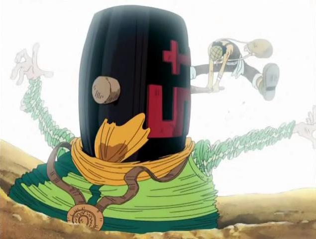
#1 - The palm fronds dont look right to me.. they look like they're too thick like the underside of the frond doesnt mathc the curve going over the top. Im not sure how to fix that for this peice... but something to watch for.
#2 - Also, the Guy with the mallat seems a bit further back than the guy in the hole... which kind of displaces hiw gaze down toward the ground. I assume he's supposed to be looking down toward the guy in the hole. I guess if you look at the location of his feet and look directly right toward the guy inthe ground, you see that his feet are slightly higher than the hole... which indicates he's further back... placed almost between the middle and furthest holes. I dont know if that's intentional.. but...
Either way man, as stated before.. this style you're developing lately is rad. Im lovin everythign you're putting out lately. |
|
| Back to top |
|
Tinusch
member
Member #
Joined: 25 Dec 1999
Posts: 2757
Location: Rhode Island, USA
|
| Posted: Tue Oct 30, 2007 12:32 pm |
|
|
| Thanks for the tips Affected and Awe. I repainted some of the awkward fronds, lowered the level of the guy, and added in that rabbit youve all been clamoring for. |
|
| Back to top |
|
gLitterbug
member
Member #
Joined: 13 Feb 2001
Posts: 1340
Location: Austria
|
| Posted: Sun Nov 11, 2007 9:17 am |
|
|
Sorry for being late to the party this time Tinusch, I hope you can forgive me.
Keeping things short this time. A lot of things have already been said and I'm not sure what to say myself really. The two main things bothering me is the one low hanging leaf and the form/shading of the mallet and where the handle connects to it. Seems a bit out of angle and makes me uncomfortable looking at it
I really like the color and the guy, the mood it conveys. Sorry for not being too useful this time. I'll try better next round again. |
|
| Back to top |
|
Tinusch
member
Member #
Joined: 25 Dec 1999
Posts: 2757
Location: Rhode Island, USA
|
| Posted: Mon Nov 12, 2007 1:47 pm |
|
|
| Thanks for the help. Didn't even notice the skewed handle, good catch. And yeah that one problem leaf is really stealing too much attention and killing the structure of the tree. Don't know if I'm still interested enough to operate that heavily, but I need to remember to watch for things like that before I start detailing everything. |
|
| Back to top |
|
|


