| View previous topic :: View next topic |
| Author |
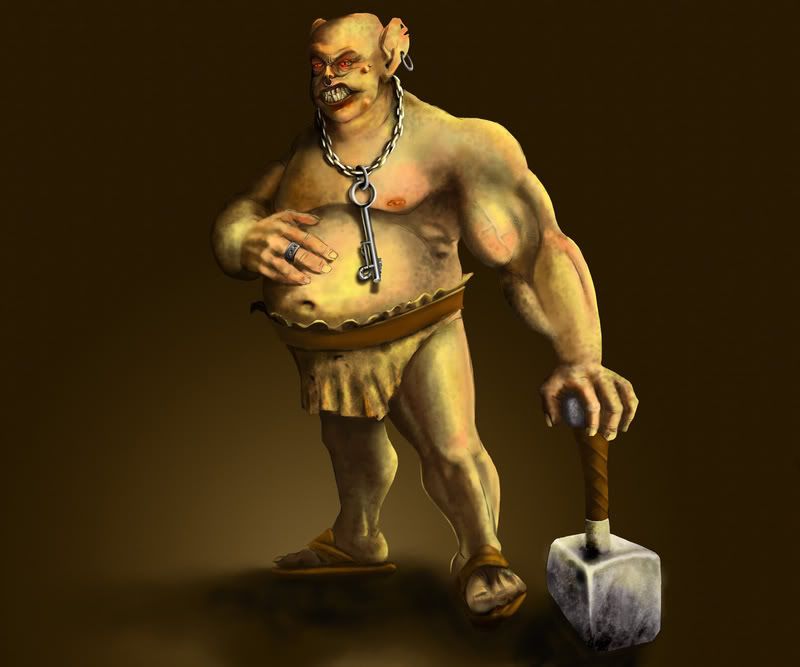
Topic : "Key keeper" |
mvd
junior member
Member #
Joined: 08 Jun 2006
Posts: 9
|
 Posted: Tue May 29, 2007 1:01 pm Posted: Tue May 29, 2007 1:01 pm |
 |
 |
Hi,
this is may recent work, a character that i make for fun and for training...
Any crits and comments are welcome!
 |
|
| Back to top |
|
SAM
junior member
Member #
Joined: 23 Mar 2006
Posts: 12
Location: Sweden
|
| Posted: Wed May 30, 2007 3:14 am |
|
|
Very cool looking character. I like the spotty texture.
The hard edges of your character clashes with the blurred rendering of the skin. The light on the legs which comes from the right suggest a different light source than that on the rest of his body, where it's more straight up from the camera.
What is keeping that belt up? I feel that it should be pushed further down from the weight of his belly.
_________________
My blog |
|
| Back to top |
|
mvd
junior member
Member #
Joined: 08 Jun 2006
Posts: 9
|
| Posted: Thu May 31, 2007 12:04 am |
|
|
I wasn't see the things that you mention, thanks for comment!
I'll fix them, first the sharp edges, i wonder how i miss this! |
|
| Back to top |
|
Tinusch
member
Member #
Joined: 25 Dec 1999
Posts: 2757
Location: Rhode Island, USA
|
| Posted: Thu May 31, 2007 5:37 pm |
|
|
| I see immense potential here, your textures and color variations are great but your lighting is spotty and inconsistent. Specifically, the dark smears on the upper arm don't suggest the same light source as most of the body, nor do the stomach or the right (his right) leg. Also, your shadowing is very blurry especially in contrast to the hard edges you have around him, I don't feel that your shading is really effectively suggesting form, again I'll point to his left arm as the prime example. I see a few dark areas but it still looks flat. I don't think you should scrap this one - Just rework it with a focus on how your shadows and highlights sculpt his form, and keep your light source in mind at all times. |
|
| Back to top |
|
mvd
junior member
Member #
Joined: 08 Jun 2006
Posts: 9
|
| Posted: Fri Jun 01, 2007 8:41 am |
|
|
Thanks for comment!
I thought that picture is finished, but now i'll try to repaint it and fix some of the problems that you mention 
I'll post the result when i'm done!
Cheers! |
|
| Back to top |
|
|


