| View previous topic :: View next topic |
| Author |
Topic : "Warhammer siege scene, BW" |
Freebooter
member
Member #
Joined: 31 Jan 2004
Posts: 417
|
 Posted: Tue Jan 30, 2007 4:36 pm Posted: Tue Jan 30, 2007 4:36 pm |
 |
 |
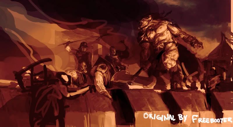
My portfolio needs more finished art and I decided to do this epic siege scene set in GamesWorkshop's Warhammer universe. I chose Warhammer because I'm quite familiar with it and I won't have to waste time in designing all the characters appearing in the picture.

I begun last night and this is two evenings worth of doodling. I really enjoyed drawing this but how far my patience is going to last remains to be seen. I'll propably keep this strictly grayscale.
Why I decided to create a thread? Because I'm a bloody show-off. |
|
| Back to top |
|
Novacaptain
member
Member #
Joined: 09 Jan 2001
Posts: 906
Location: Sweden
|
| Posted: Tue Jan 30, 2007 9:05 pm |
|
|
This is really awesome, the big dude looks like a really mean bastard.
I hope you don't mind a sketchy paintover with some suggestions.
I think the size of the canvas often plays a big part in determining the "feeling" portrayed by the image. If you're going for something epic, why not make it just a little wider for instance? I don't know if it's because of the movies that i make this association or if it's because battles are fought in wide, open spaces.
Another thing that i saw that might help would be to darken the background a little to make the big guy stand out a little from what's behind him. Right now his values and that of the background are very close. What if they had set fire to some of the buildings inside the city wall for instance? Black smoke and flames could provide some good contrast and interesting lights to work with.
Let's suppose that you did go with a slightly wider image here, there would need to be more things in there to make it seem like it's really a battle and not just a little fight about the local jousting tournament. This would also give you an opportunity to make the image less balanced. At present there's humans on the left and minotaur-beast on the right, so one side opposes the other like on a scale and it feels a little static. It becomes more interesting, in my opinion, if you add some rogue elements on both sides, like some soldiers flanking the beast or sneaking up behind it. Or what about a little goblin creeping over the wall unnoticed on the far left side?
As far as colors go, you can quite easily add a monochromatic tint to it later that will make it all more interesting. That's totally up to you though, grayscale images can be really appealing too.
Just to exemplify though:
I added a brown layer set to linear light (68%opacity) and another one with blue color using overlay (just on the top to make the sky look colder.
My monitor usually is a little brighter than most so if this looks too dark just ignore that.
_________________
It's nice to be important, but more important to be nice - Scooter |
|
| Back to top |
|
Joe84
member
Member #
Joined: 26 May 2004
Posts: 262
|
| Posted: Wed Jan 31, 2007 1:59 am |
|
|
i agree with the darker background and everysaid by nova. but i also think the foreground could be darker too, maybe have one guy swinging a flaming torch, which might add some dynamic lighting to the scene.
i love it though, i hope to see how this piece turns out! |
|
| Back to top |
|
Freebooter
member
Member #
Joined: 31 Jan 2004
Posts: 417
|
| Posted: Wed Jan 31, 2007 2:58 am |
|
|
Novacaptain you post was really helpful. I'll definitely go with that wider shot you suggested and frankly the darker BG also looks a lot better. Your overpaint makes me see in which parts of my painting lighting could use some work/ values could be picked somewhat better.
I intended to add those "rogue elements" before but now with this wider shot they will work out a lot better and the scene won't feel so crammed. Hell, I even like that one pillar of black smoke divivding the sky diagonally...
The reason I didn't go for wide-shot from day one is quite honestly that I started drawing the beastman on square shaped blank canvas, and decided to continue on adding elements to that. This overpaint shows just how much I have to learn about composition and background and I should always think of it beforehand.
Stay tuned for the upgrade. |
|
| Back to top |
|
3nasty
member
Member #
Joined: 05 Dec 2005
Posts: 340
Location: myspace.com/halomoto
|
| Posted: Wed Jan 31, 2007 5:45 am |
|
|
looks good..for now..for me  |
|
| Back to top |
|
Tomasis
member
Member #
Joined: 19 Apr 2002
Posts: 813
Location: Sweden
|
| Posted: Wed Jan 31, 2007 7:26 am |
|
|
| I'd place the person from the left to higher and larger (nearer) to get more varying places of subjects. Otherwise it looks like to be gonna to turn to a nice painting |
|
| Back to top |
|
Freebooter
member
Member #
Joined: 31 Jan 2004
Posts: 417
|
| Posted: Wed Jan 31, 2007 3:55 pm |
|
|
Ok new WIP.

There's some problems with the lightning, shields and the priest's face are lit by invisible lightsource etc. but I'm getting there. Some of the characters are just placeholders, and I'm not sure about the castle/barracks thing on the right . It's a bit too wonky.
Suggestions are still very welcome. |
|
| Back to top |
|
Novacaptain
member
Member #
Joined: 09 Jan 2001
Posts: 906
Location: Sweden
|
| Posted: Wed Jan 31, 2007 4:19 pm |
|
|
That's fantastic. I love the pose on the second beast, those humans in front of it look like they're unsure whether to fight or flee. I'd just say to be cautious about the details you put in there. Too many well-defined edges and details tend to make the image look "busy" but it looks like you've got a solid grip on things so i'm sure it won't be a problem. Can't wait to see how this progresses.
_________________
It's nice to be important, but more important to be nice - Scooter |
|
| Back to top |
|
M@.
member
Member #
Joined: 04 Nov 2003
Posts: 188
Location: Los Angeles
|
| Posted: Wed Jan 31, 2007 5:42 pm |
|
|
Woaw, crazy cool - can't say much so far. I' would cut a quite a bit of the lower part though. would widen the scene and cut out an uninterresting part of the pic.
_________________
http://mv.cgcommunity.com/ |
|
| Back to top |
|
RyanWalsh
Guest
Member #
|
| Posted: Wed Jan 31, 2007 7:17 pm |
|
|
| What a whinner, Your Cute when you Whine ^_^ |
|
| Back to top |
|
RyanWalsh
Guest
Member #
|
| Posted: Wed Jan 31, 2007 7:18 pm |
|
|
| amazing paintings skillz. |
|
| Back to top |
|
Tinusch
member
Member #
Joined: 25 Dec 1999
Posts: 2757
Location: Rhode Island, USA
|
| Posted: Wed Jan 31, 2007 8:32 pm |
|
|
| Wow, incredible update. That new scene on the right edge looks perfect as-is. |
|
| Back to top |
|
Ben Mauro
member
Member #
Joined: 25 Jun 2004
Posts: 153
Location: pasadena
|
| Posted: Wed Jan 31, 2007 9:24 pm |
|
|
lookin sexy! only thing i see is resolving the soldiers a bit more, especially on the left (or just crop it in). and maybe lose the edges on some of the clouds in the back to make the big guy more in focus.
other than that, cant wait for the next update! |
|
| Back to top |
|
designboot
member
Member #
Joined: 04 Jan 2007
Posts: 147
|
| Posted: Thu Feb 01, 2007 8:31 am |
|
|
This creature do not look like from warhammer ... more like a D&D monster ..
but i like your painting progress |
|
| Back to top |
|
Freebooter
member
Member #
Joined: 31 Jan 2004
Posts: 417
|
| Posted: Thu Feb 01, 2007 3:20 pm |
|
|
Thanks for the support, guys. I really appreciate it.
Sorry no update tonight. My brother (MikkoK) came back from England and we had a lot of catching up. In the evening I spent few hours defining the sky, castle and the right part of the pic in general, but nothing too different from my last version. There's still many thing I need to flesh out before next WIP-post.
Stay tuned if you don't have better things to do. |
|
| Back to top |
|
Joe84
member
Member #
Joined: 26 May 2004
Posts: 262
|
| Posted: Thu Feb 01, 2007 3:38 pm |
|
|
that looks way awesome, one thing that keeps bugging my eye is the tangent created by the huge swinging axe and the fort.
i cant wait for the next update! |
|
| Back to top |
|
octavian
member
Member #
Joined: 28 Feb 2004
Posts: 401
Location: Kalifornia
|
| Posted: Thu Feb 01, 2007 4:01 pm |
|
|
| Can't wait for tha update. I agree with a lot of the crits about cropping and composition, but I'm sure you plan on it already soooooo. btw, Mikkok is your brother? wow. Must be nice to be able to bounce ideas back and forth. |
|
| Back to top |
|
Freebooter
member
Member #
Joined: 31 Jan 2004
Posts: 417
|
| Posted: Fri Feb 02, 2007 11:20 am |
|
|
Thanks octavian.
Joe84, that shouldn't be a problem anymore.
An update!

I find it difficult to add objects and details while trying to keep it readable and in balance. |
|
| Back to top |
|
arttu
junior member
Member #
Joined: 24 Sep 2003
Posts: 31
Location: Finland
|
| Posted: Fri Feb 02, 2007 11:35 am |
|
|
| Definately the most convinsing painting from you in a while! The anatomy on the beastman is really solid. I just hope it won't get too crowded in the end. Its good you have really put your mind to this picture, it will turn out awesome I'm sure. |
|
| Back to top |
|
Sumaleth
Administrator
Member #
Joined: 30 Oct 1999
Posts: 2898
Location: Australia
|
| Posted: Fri Feb 02, 2007 3:56 pm |
|
|
Be careful that you don't lose the values composition. That last version has almost a patchy arrangement of lights and darks, rather than the composed shapes of light and dark that are more attractive in composition. Something to think about.
_________________
Art Links Archive -- Artists and Tutorials |
|
| Back to top |
|
ecsdesign
member
Member #
Joined: 16 Jan 2003
Posts: 65
Location: Sydney Australia
|
| Posted: Fri Feb 02, 2007 4:24 pm |
|
|
| Looking great freebooter. I thing i would use more of a 2.35-1 aspect ratio, maybe cropping down from the sky and adding more contrast/darkening the sky to define the focus. The shields/beastman and the imperial guy swinging his axe really look cool- nice pose and detail. |
|
| Back to top |
|
Mikko K
member
Member #
Joined: 29 Apr 2003
Posts: 639
|
| Posted: Sat Feb 03, 2007 3:24 am |
|
|
Hey looking good bro!
I think there are couple of things that need balancing. The value thing what Sumaleth mentioned and also the balance between detail/flatness. For example, the foreground seems a bit plain compared to the characters etc. You could add even more grappling ropes, more cracks to the stones etc.
I know we discussed this already and you're working on these things, but just thought I'd mention those.
I'd like to do more overpaint helps, but I don't have my computer at the moment.
Anyways, keep working on it, it looks like one of your strongest pieces so far! |
|
| Back to top |
|
Freebooter
member
Member #
Joined: 31 Jan 2004
Posts: 417
|
| Posted: Sun Feb 04, 2007 3:28 pm |
|
|
An update. I'm really not sure if this has gotten any better at all.

I tried to add some buildings at the background as my friend suggested but it looked like ass. And from that angle building would be ridiculously tall if it could be seen behind the ramparts.
Sumaleth and Mikko, I understand your points but I'm not sure at all how to keep the value composition and freshness while grinding in more detail.
Any new crits or suggestions are still very welcome. |
|
| Back to top |
|
Freebooter
member
Member #
Joined: 31 Jan 2004
Posts: 417
|
|
| Back to top |
|
|


