| View previous topic :: View next topic |
| Author |
Topic : "The Speedpainting Thread (IV)" |
lucabrasi
junior member
Member #
Joined: 18 Jun 2004
Posts: 39
|
 Posted: Sun Jan 29, 2006 11:02 pm Posted: Sun Jan 29, 2006 11:02 pm |
 |
 |
this isnt really a speedpainting but i thought iwould post it here anyways. Probably took me 3 hours to do. Im pretty happy with it since im new to digital painting.
 |
|
| Back to top |
|
Chris-Mayernik
member
Member #
Joined: 24 Feb 2004
Posts: 182
Location: USA
|
| Posted: Sun Jan 29, 2006 11:40 pm |
|
|
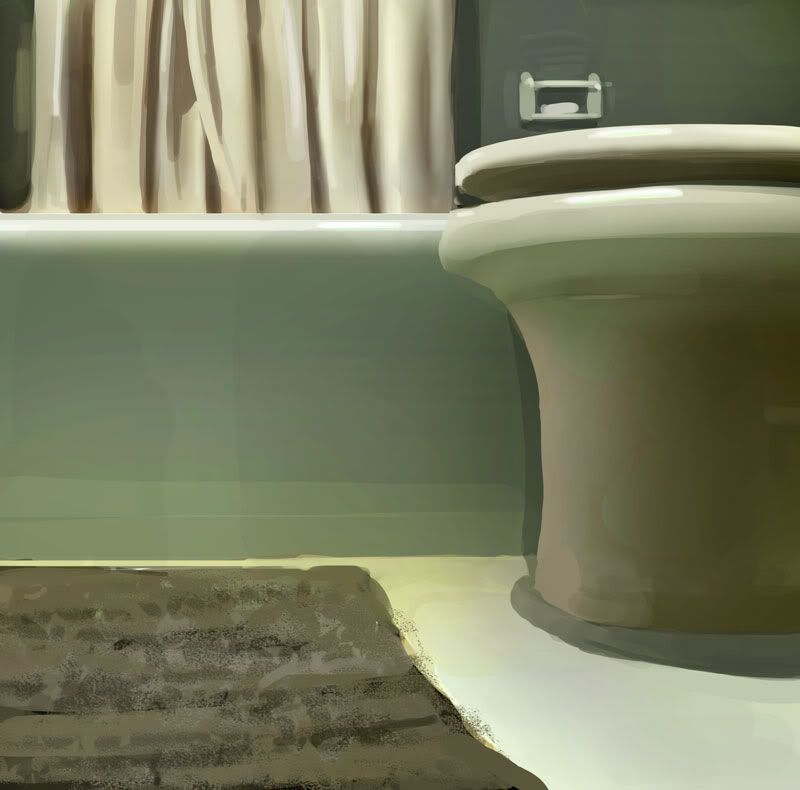
suppose to be my bathroom. From head.
 |
|
| Back to top |
|
spooge demon
member
Member #
Joined: 15 Nov 1999
Posts: 1475
Location: Haiku, HI, USA
|
| Posted: Mon Jan 30, 2006 12:50 am |
|
|

might make a poster from this. Both this and the last are more finished and high rez than usual. They suffer a lot in the resample and jpeg crunch, a lot more than a quick sketch.
glad you liked the baron!
/random thought/-if you guys are doing speedies for improvement as painters, lay off the color dodge and overlay. Or, paint it like that if that is the way you want it, like Rembrandt. You might say you have seen a lot of that in my work, and yes, a while ago I did do a lot of it. Not for a while. I even used a lensflare or 2 in 94. Not since it was widely abused. I think the leaf brush is going the same way. If it is easy and effective, it will be abused and become commonplace. But that is for learning I think For getting a real job done quickly and well, anything goes--feel free to disagree! /end random thought/
Has Dhabih disappeared again? |
|
| Back to top |
|
Cicinimo
member
Member #
Joined: 03 Mar 2001
Posts: 705
Location: Seattle
|
| Posted: Mon Jan 30, 2006 1:18 am |
|
|
Nah, I think Dhabih is still bouncing around. Within the last couple weeks anyways. Last one is beautiful, I'd buy a poster. How long on that one, if you don't mind my asking?

_________________
artpad.org |
|
| Back to top |
|
dhood
member
Member #
Joined: 08 Dec 2003
Posts: 146
Location: United States
|
| Posted: Mon Jan 30, 2006 1:30 am |
|
|
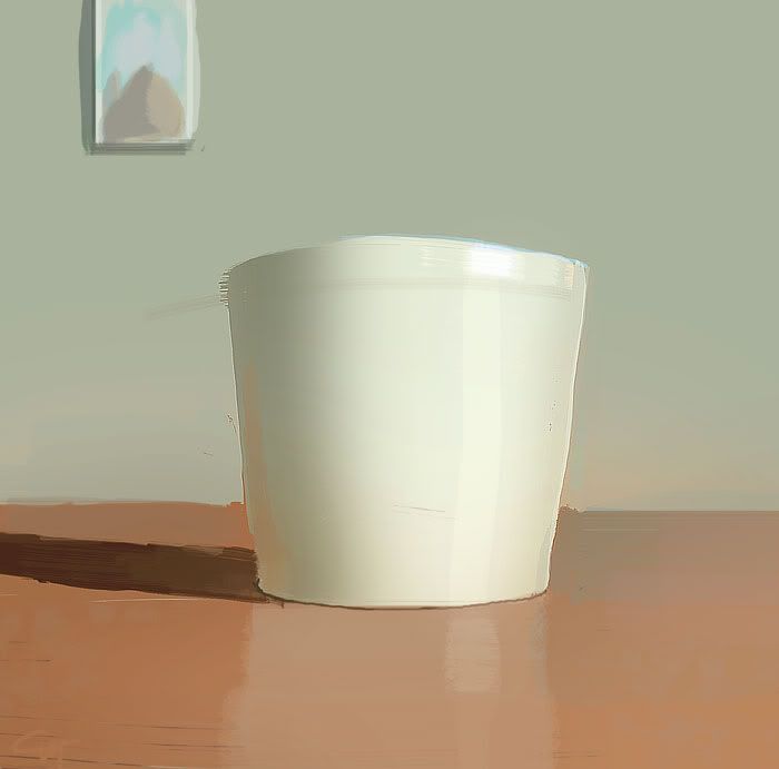
Spooge, that would make a great poster.
My poop-
I'll probably add more detail to this sooner or later, who knows.
 |
|
| Back to top |
|
3nasty
member
Member #
Joined: 05 Dec 2005
Posts: 340
Location: myspace.com/halomoto
|
| Posted: Mon Jan 30, 2006 3:37 am |
|
|
 |
|
| Back to top |
|
visual myriad
member
Member #
Joined: 28 Mar 2001
Posts: 150
Location: Sydney, Australia
|
| Posted: Mon Jan 30, 2006 4:37 am |
|
|
sukhoi: thanx!
ax--hv: hmmm...not sure what you mean by '...getting rid of the stroke edges? Your paintings look very solid'. feel free to email or pm to discuss and i'll do my best to answer.
skywalker: thanks again for your comments (i think i know what your saying). but i actually feel the closeups show how little detail there is, as i'm trying to suggest form rather than 'illustrate' it. but yes, give that technique a whirl:)
p-rik: spend too long on the pc -- just ask my ex-wife!
lingy-o:thank you sir.
miles: thanks -- McGinnis is more realistic i think, but i find his stuff simply mesmerizing.
luc: heh -- crazy indeed!
retro: ta -- more coming soon for you (just as soon as i get rid of these pesky clients with money).
watmough: 
These are for a project about Bonnie Parker:

 |
|
| Back to top |
|
Tomasis
member
Member #
Joined: 19 Apr 2002
Posts: 813
Location: Sweden
|
| Posted: Mon Jan 30, 2006 7:02 am |
|
|
removed
Last edited by Tomasis on Mon Jan 30, 2006 4:14 pm; edited 1 time in total |
|
| Back to top |
|
balistic
member
Member #
Joined: 01 Jun 2000
Posts: 2599
Location: Reno, NV, USA
|
| Posted: Mon Jan 30, 2006 9:14 am |
|
|
| spooge demon wrote: |
/random thought/-if you guys are doing speedies for improvement as painters, lay off the color dodge and overlay. Or, paint it like that if that is the way you want it, like Rembrandt. You might say you have seen a lot of that in my work, and yes, a while ago I did do a lot of it. Not for a while. I even used a lensflare or 2 in 94. Not since it was widely abused. I think the leaf brush is going the same way. If it is easy and effective, it will be abused and become commonplace. But that is for learning I think For getting a real job done quickly and well, anything goes--feel free to disagree! /end random thought/
|
Full agreement here. Additive color is one of those tell-tale digital watermarks . . . it too often creates garish oversaturation. That's my chief problem with the work of guys like Ryan Church. He's a great draftsman, no doubt, but that damned glow brush just looks so cheesy.
Yet it's hard to resist the siren song . . . I'm getting better about not giving in to laziness, but I still cave from time to time. Hi, my name's Brian and I'm addicted to glow.
It helps me to see the leap your work took when you stopped using additive color so much. Your old stuff is good, but it's got those RGB fingerprints on it, you know? That's not to say that looking digital is a bad thing, but your new stuff looks more deliberate in terms of the palettes you're using. I am terribly envious of the way you can turn an explosion of deli mustard browns and yellows into a nice picture. You've made me re-think my approach to color lately.
_________________
brian.prince|light.comp.paint
Last edited by balistic on Mon Jan 30, 2006 10:19 am; edited 1 time in total |
|
| Back to top |
|
skurai
member
Member #
Joined: 06 Aug 2005
Posts: 152
Location: sweden
|
| Posted: Mon Jan 30, 2006 10:05 am |
|
|
Strike a pose!
 |
|
| Back to top |
|
Ranath
member
Member #
Joined: 02 Apr 2004
Posts: 611
Location: Helsinki, Finland
|
| Posted: Mon Jan 30, 2006 10:21 am |
|
|
| balistic wrote: |
Full agreement here. Additive color is one of those tell-tale digital watermarks . . . it too often creates garish oversaturation. That's my chief problem with the work of guys like Ryan Church. He's a great draftsman, no doubt, but that damned glow brush just looks so cheesy.
|
well I do think he uses to glow brush to achieve something of a quick indication of metal or any shiny material. Most of his works seems to be renderings of a design, and I don't care if he created bg elements with the same tool to save time, it's a render of that design after all (not a fine art style painting or even an illustration!). Maybe he doesn't paint the same way spooge does, but who gives a jack? He's a designer, and his job is to present the designs, not to be a fine artist who should stick to ancient painting methods or something.. I never had a problem with his glow brush, it's just another style.
EDIT: by the way, you can check Ryan Church's acrylic (?) paintings in his site, personal work section, bottom of the page. I bet there's none of that digital tell-tale watermarks you have a problem with! |
|
| Back to top |
|
luc
member
Member #
Joined: 01 Aug 2005
Posts: 217
|
| Posted: Mon Jan 30, 2006 10:47 am |
|
|
Retro >> i can't overpaint on your delicate pieces with my poor knowledge of painting. I just want to participate a little more by giving an opinion. Glad to see you back.
Tomasis >> i think you misunderstand what i want to say because of my bad english. I've been frustrated of saying 'nice, great or very nice and very great' and want to get more involved....seems that i need more english practice. Thanks for my environnements.
Mant-raz >> nice ship very dynamic.
Chris-Mayernik >> you' re on fire !I like the way your do speculars.
Mistsui >> great character. Nice use of blur.
Spooge Demon >>  ... thanks for the tought. Using too effective tools or graphic elements sure is nice but leads to comformism wich is sad i think.(my work is full of comformism but i try to get away from it... ... thanks for the tought. Using too effective tools or graphic elements sure is nice but leads to comformism wich is sad i think.(my work is full of comformism but i try to get away from it...  ) )
Cicinino >> wow ! Love that army on the left.
Dhood >> nice painting.
Visual myriad >> you did it again . Love your color scheme.
 |
|
| Back to top |
|
balistic
member
Member #
Joined: 01 Jun 2000
Posts: 2599
Location: Reno, NV, USA
|
| Posted: Mon Jan 30, 2006 10:56 am |
|
|
| Ranath wrote: |
I bet there's none of that digital tell-tale watermarks you have a problem with! |
Am I allowed to not like how something looks?
Didn't I admit that I do the same thing in my own work and hate it?
Relax. Have a glowy picture.

(pencils by Jose Saenz, paint by me)
_________________
brian.prince|light.comp.paint |
|
| Back to top |
|
Chris-Mayernik
member
Member #
Joined: 24 Feb 2004
Posts: 182
Location: USA
|
| Posted: Mon Jan 30, 2006 11:41 am |
|
|
Cicinimo: yea I love that pic. Too bad you lost the full size one.
spooge demon: awesome. I'd buy a poster of that.
luc: yea thanks.
 |
|
| Back to top |
|
Chris-Mayernik
member
Member #
Joined: 24 Feb 2004
Posts: 182
Location: USA
|
| Posted: Mon Jan 30, 2006 1:18 pm |
|
|
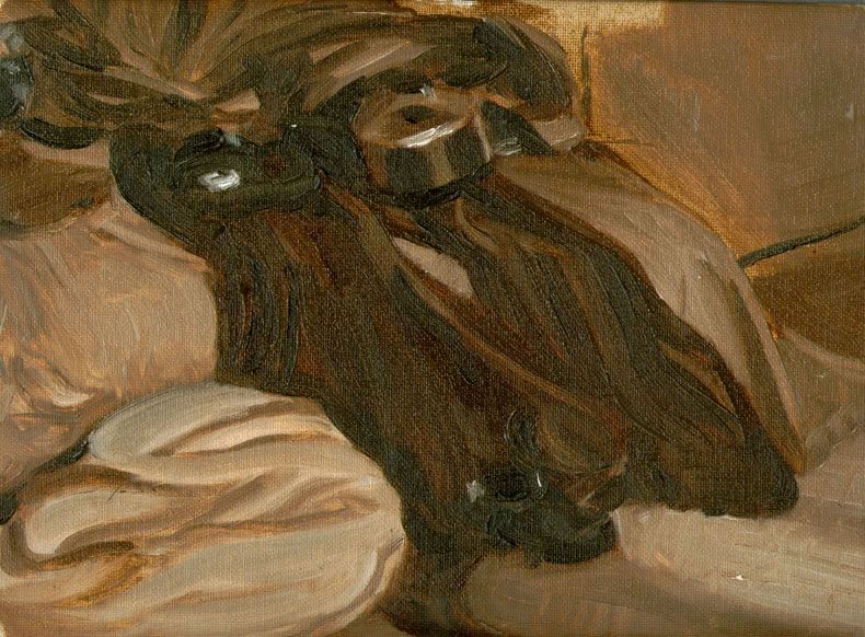
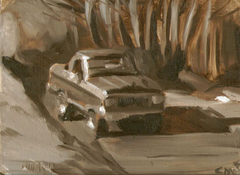
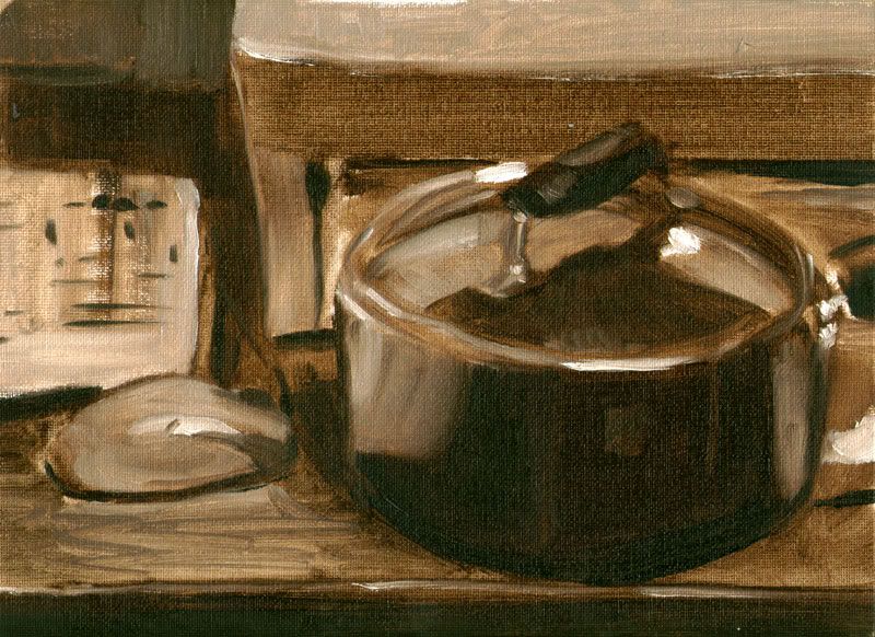
some oil speed paints. I scanned them in...
 |
|
| Back to top |
|
P-Rik
member
Member #
Joined: 14 Apr 2004
Posts: 554
Location: East of France
|
| Posted: Mon Jan 30, 2006 2:42 pm |
|
|
beautifull oil Chris !


_________________
Pierrick l'Illustrateur des bois.
Website ! |
|
| Back to top |
|
ecsdesign
member
Member #
Joined: 16 Jan 2003
Posts: 65
Location: Sydney Australia
|
| Posted: Mon Jan 30, 2006 3:25 pm |
|
|
a sketch done for a conceptart.org theme.

Cicinimo, stunning cinematic painting.
Visual Myriad, beautiful stuff.
Spooge i cant see any of your posts.[/list] |
|
| Back to top |
|
dougbot
member
Member #
Joined: 01 Aug 2003
Posts: 113
Location: Edmonds (by Seattle)
|
| Posted: Mon Jan 30, 2006 3:59 pm |
|
|
Damn Craig....I'm telling you, make a story around this mouse-eared hat girl and publish it. Make it a kids book, make it light, do whatever, but damn....do something with it. To wonderful not too.
Some others:


and this was a quicky:

that turned into a 3 hour...ahem...quicky:
_________________
Meow |
|
| Back to top |
|
Mitsui
member
Member #
Joined: 06 Aug 2002
Posts: 642
Location: Hamburg/Germany
|
| Posted: Mon Jan 30, 2006 5:22 pm |
|
|
lucabrasi and luc thnx!
Dougbot love your last one!
Prik nice!
Balistic awesome coloring!
Mr. Spooge.... m(_ _)m
_________________
Goro Fujita: www.area-56.de |
|
| Back to top |
|
Zombat
member
Member #
Joined: 18 Feb 2003
Posts: 112
|
| Posted: Mon Jan 30, 2006 6:44 pm |
|
|
Spooge, incredible, more so than usual. I'm reminded of one of the image I saw when playing marathon, the cathedral of sorts you did.
Cicinimo - awesome
you all are really really inspirational

_________________
Zombat
Website
Blog |
|
| Back to top |
|
SkyWalker
junior member
Member #
Joined: 01 Jun 2005
Posts: 27
Location: Portugal
|
| Posted: Mon Jan 30, 2006 7:12 pm |
|
|
Spooge demon -- A M A Z I N G P I C T U R E ! ! ! !
I will buy that poster...Master Spooge
I don`t know if i like more your loose style paintings or this more realistic paintings, I think i like both!
gizmodus -- Great composition and colors
Watmough -- That After Mucha girl is lovely, very good work!
Cicinimo -- Good color scheme and composition on the Landscape!
lingy-o -- Great perspective on the plane image, very beautiful colors!
dougbot -- Nice little cowboy
Visual myriad -- Well, what can i tell?.. i like your style
from Halo

i like the final result of this one, it doesn`t look digital!
 |
|
| Back to top |
|
respyre
junior member
Member #
Joined: 20 Sep 2002
Posts: 17
|
| Posted: Mon Jan 30, 2006 7:46 pm |
|
|
Last edited by respyre on Wed Dec 26, 2007 2:30 pm; edited 1 time in total |
|
| Back to top |
|
seth1
member
Member #
Joined: 06 Jun 2004
Posts: 534
|
| Posted: Mon Jan 30, 2006 9:01 pm |
|
|
Some intense work in here! Keep it comming!
SkyWalker: Yeah it looks like digital! looks like a mess of overlayed images. Mayjor spooge clone! Not getting any where near it though! Spooge is more for the shapes and putting down the proper value! His strokes are not random I am pretty sure each one has a meaning thats why he can paint with so few! may look like alot but he has complete control over every thing! Some one correct me if i am wrong..
Quick ones! Thinking about shape! and value..


Interceptor lines off ca! My color

Last edited by seth1 on Mon Jan 30, 2006 9:10 pm; edited 1 time in total |
|
| Back to top |
|
sagie
junior member
Member #
Joined: 15 Jan 2006
Posts: 42
Location: Karlstad, Sweden
|
| Posted: Mon Jan 30, 2006 9:04 pm |
|
|
Whoa! Some awesome stuff in here!

_________________
My site: http://sagie.com |
|
| Back to top |
|
GordMacDonald
member
Member #
Joined: 25 Sep 2004
Posts: 197
Location: Canada
|
|
| Back to top |
|
lingy-0
member
Member #
Joined: 19 Mar 2005
Posts: 173
|
| Posted: Tue Jan 31, 2006 6:24 am |
|
|
retro,thanx for your kind reply,you are right,and i wont give up.
Falcon-,spawn nice color and brush.
luc,thanx,your work is cool.
Mitsui,great work as always.really like the color.
KieranYanner,great work.
FallDamage,nice mattepainting.
ax--hv,thanks,i like the heavy desert vehicle .
M@.,cool.
SkyWalker,nice brush.
visual myriad,nice ones.
Cicinimo, great.
Mr.Spooge,thanks for your thought,im following it and
ref used

_________________
http://lingy000.com/
Last edited by lingy-0 on Tue Jan 31, 2006 9:27 am; edited 1 time in total |
|
| Back to top |
|
3nasty
member
Member #
Joined: 05 Dec 2005
Posts: 340
Location: myspace.com/halomoto
|
| Posted: Tue Jan 31, 2006 7:06 am |
|
|
hi everyone
balistic --> nice colors
dougbot -!!!!>  good to see Painter!!!!!!!!!!!!!!! on this photoshit site. good to see Painter!!!!!!!!!!!!!!! on this photoshit site.
 |
|
| Back to top |
|
Ranath
member
Member #
Joined: 02 Apr 2004
Posts: 611
Location: Helsinki, Finland
|
| Posted: Tue Jan 31, 2006 9:34 am |
|
|
| balistic wrote: |
Am I allowed to not like how something looks?
|
Of course you are, and that's why I recommended some cool designs you could enjoy of without having to suffer from the glow. I was voicing my opinions, just as you were.
An older pic, dunno if I have posted this before
 |
|
| Back to top |
|
3nasty
member
Member #
Joined: 05 Dec 2005
Posts: 340
Location: myspace.com/halomoto
|
| Posted: Tue Jan 31, 2006 9:51 am |
|
|
 |
|
| Back to top |
|
3nasty
member
Member #
Joined: 05 Dec 2005
Posts: 340
Location: myspace.com/halomoto
|
| Posted: Tue Jan 31, 2006 12:19 pm |
|
|
some ass ............ref
[img]http://img372.imageshack.us/my.php?image=ass9os.jpg[/img] |
|
| Back to top |
|
|


