| View previous topic :: View next topic |
| Author |
Topic : "The Speedpainting Thread (IV)" |
varg
member
Member #
Joined: 23 Jun 2003
Posts: 192
Location: sweden
|
 Posted: Thu Jan 12, 2006 4:07 am Posted: Thu Jan 12, 2006 4:07 am |
 |
 |
FreeBooter >>> Among the best ive seen from you so far,havent seen that much,but you get the idea  Very cool pose and excellent use of colors! Very cool pose and excellent use of colors!
Luc >>> Nice work (as always)
Fast one

_________________
"They didnt gave me a name,just a number when I was young" |
|
| Back to top |
|
Duracel
member
Member #
Joined: 08 Mar 2001
Posts: 910
Location: Germany - near Minster
|
| Posted: Thu Jan 12, 2006 8:58 am |
|
|
This is just a Test-Reply, because page 714 is listed on top, but if i click on it, the infotmation pops up "No posts exist for this topic"
Edit: Well, it looks like it was just a bug, 714 already listedon top ... but lets see, if the bug reappears on the following pages.
_________________
Lars G�tze
www.duracel.de Gallery
Detailling a speedpainting is nothing but speedpainting in detail. |
|
| Back to top |
|
spyroteknik
member
Member #
Joined: 29 Apr 2003
Posts: 376
Location: north east uk
|
| Posted: Thu Jan 12, 2006 9:18 am |
|
|
| yep, the cracks are starting to show in this monumental thread, it's happened for the last 3 pages that i've seen, quick, more art, to cover them up (none from me though) |
|
| Back to top |
|
FallDamage
member
Member #
Joined: 03 Nov 2003
Posts: 474
Location: Canada
|
| Posted: Thu Jan 12, 2006 12:39 pm |
|
|
I've been seein the same problem. You guys think we'll be needing a new Sp thread soon?
this is something like what I see out of my top floor window.

style study
 [/img] [/img] |
|
| Back to top |
|
stephan vachon
member
Member #
Joined: 17 Apr 2005
Posts: 99
Location: montreal
|
| Posted: Thu Jan 12, 2006 3:14 pm |
|
|
| FallDamage-very nice image, looks photorealistic and appeasing:) |
|
| Back to top |
|
wasssup
member
Member #
Joined: 29 Oct 2002
Posts: 275
Location: London, UK
|
| Posted: Thu Jan 12, 2006 3:33 pm |
|
|
Thanks and good work all!
lingy>> i like those bugs carrying their legs
mitsui>> nice graphic like treament, colour palette and all
luc>> have a lota fun looking at your latest work, so dynamic
dura>> good to see someone still sticking to the simple round brush  thumbnails...yeah i should do more of those, really neat thumbnails...yeah i should do more of those, really neat
eh...I hate ripples

another quick mess

Last edited by wasssup on Mon Jan 16, 2006 9:51 am; edited 2 times in total |
|
| Back to top |
|
arttu
junior member
Member #
Joined: 24 Sep 2003
Posts: 31
Location: Finland
|
| Posted: Thu Jan 12, 2006 3:55 pm |
|
|

4 quick sketches of a friend. |
|
| Back to top |
|
Sumaleth
Administrator
Member #
Joined: 30 Oct 1999
Posts: 2898
Location: Australia
|
|
| Back to top |
|
jr
member
Member #
Joined: 17 Jun 2001
Posts: 1046
Location: nyc
|
| Posted: Thu Jan 12, 2006 5:19 pm |
|
|
nice wass!

_________________
 |
|
| Back to top |
|
Zorglub
member
Member #
Joined: 20 Dec 2000
Posts: 268
Location: Ontario Canada
|
| Posted: Thu Jan 12, 2006 5:24 pm |
|
|
Refueling...
(I really need to stop trying to draw fancy perspectives)

c&c always appreciated |
|
| Back to top |
|
Chris-Mayernik
member
Member #
Joined: 24 Feb 2004
Posts: 182
Location: USA
|
| Posted: Thu Jan 12, 2006 9:34 pm |
|
|
<- No clue what I am doing.
 |
|
| Back to top |
|
Stewart one
member
Member #
Joined: 07 Jul 2004
Posts: 156
Location: sweden
|
| Posted: Fri Jan 13, 2006 12:10 am |
|
|
nice work everyone!!


_________________
ARRR!
Last edited by Stewart one on Fri Jan 13, 2006 5:10 am; edited 1 time in total |
|
| Back to top |
|
CrazyBrush
member
Member #
Joined: 22 Nov 2005
Posts: 61
Location: Toronto
|
| Posted: Fri Jan 13, 2006 4:48 am |
|
|
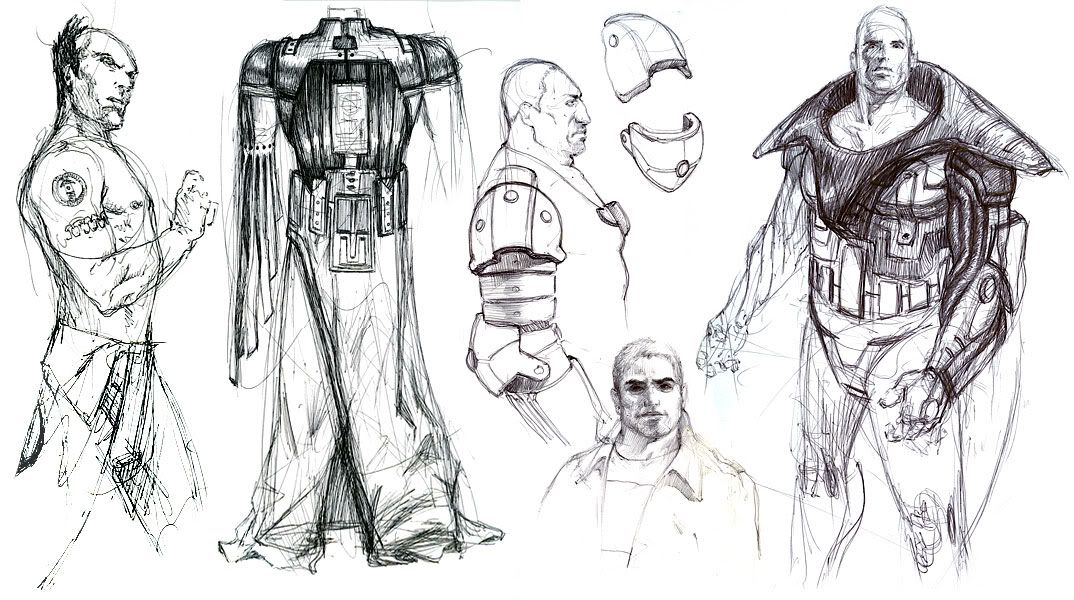
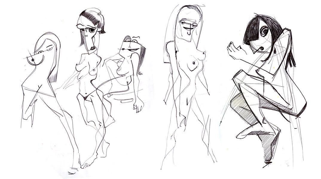
Luc, P-Rik, Lingy-o, Duracel, Mitsui...hell yeah!
Some random BIC pen siliness for a change...
 |
|
| Back to top |
|
luc
member
Member #
Joined: 01 Aug 2005
Posts: 217
|
| Posted: Fri Jan 13, 2006 7:14 am |
|
|
Thanks P-Rik.
Tzan >> ^^ ...to be continued.
MItsui >> nice girl. Love the white hairs.(and overall composition).
Lingy-0 >> nice perspective in the first of the page. I like your color scheme and the subtle saturation level.
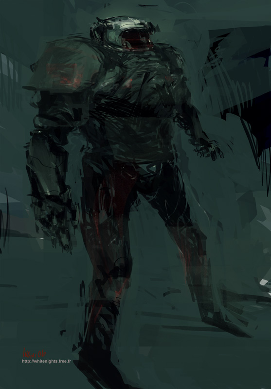
Rolthryn >> another great ground... the bot could have been more detailled
... nice picture.
Varg >> thanks.
Wasssup >> Thanks a lot. I'm trying to do less frontal point of view.... i'm having hard times with anatomy in perspective.
Arttu >> nice.
Jr >> cool.Love that 50's feeling. Great expression on his face!
Chris-Mayernik >> moody.I like the second for his abstraction.
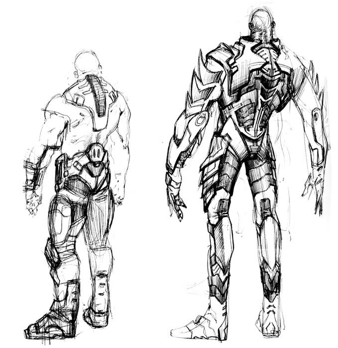
Stewart one >> wow ! nice armour.The second one reminds me of an anime...steam-medieval-punk rules.
CrazyBrush >> thanks. Nice sketches.Many good directions here.I loooive the cubist girls!!!
 |
|
| Back to top |
|
Sean J
junior member
Member #
Joined: 05 May 2005
Posts: 14
|
| Posted: Fri Jan 13, 2006 7:44 am |
|
|
M@., Lingy-0 , wasssup, luc...cool!!!
 [/url] [/url] |
|
| Back to top |
|
varg
member
Member #
Joined: 23 Jun 2003
Posts: 192
Location: sweden
|
| Posted: Fri Jan 13, 2006 9:22 am |
|
|
Crazybrush >>> cool concept work,really like it,
Wasssup >>> Giant,cool,freakin stuff.As usual.Nice work!
This came out rather messy with the digicam,I seriously need a scanner.Screwed around in PS to get it to work.

_________________
"They didnt gave me a name,just a number when I was young" |
|
| Back to top |
|
FallDamage
member
Member #
Joined: 03 Nov 2003
Posts: 474
Location: Canada
|
| Posted: Fri Jan 13, 2006 10:25 am |
|
|
It's supposed to be raining outside in this one btw, I dunno if I indicated that well or made a mess.
 |
|
| Back to top |
|
MattWaggle
junior member
Member #
Joined: 13 Sep 2005
Posts: 12
Location: San Francisco
|
| Posted: Fri Jan 13, 2006 3:59 pm |
|
|
Wasssup - Those subs are killer, I like the design. Maybe darker at the bottom for that feeling of depth in the water?
jr- good color choices in this. My digital stuff is often too saturated, so its nice to see someones got it figured out
crazybrush - nice drawings

_________________
Hi, dont mind me. Ill just sit in the back and try to learn |
|
| Back to top |
|
luc
member
Member #
Joined: 01 Aug 2005
Posts: 217
|
| Posted: Fri Jan 13, 2006 5:52 pm |
|
|
Thanks Sean J ! Nice character. Viva B&W !
Hey Varg i can see a hand (nice hand ). Love your style !
FallDamage nice ! I like the more graphical approach and the clever use of light to suggest environnement.
 |
|
| Back to top |
|
Zorglub
member
Member #
Joined: 20 Dec 2000
Posts: 268
Location: Ontario Canada
|
| Posted: Fri Jan 13, 2006 5:59 pm |
|
|
^^ whoah how do you follow that.. amazing luc!
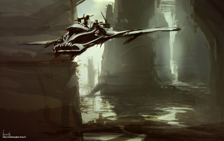
um no clue what this is.. airplane?
30 minutes
 |
|
| Back to top |
|
Omi-kun
member
Member #
Joined: 30 Nov 2002
Posts: 318
Location: Austin, tx
|
| Posted: Fri Jan 13, 2006 7:12 pm |
|
|
luc: like your stuff
 |
|
| Back to top |
|
lingy-0
member
Member #
Joined: 19 Mar 2005
Posts: 173
|
| Posted: Sat Jan 14, 2006 5:20 am |
|
|
u all rock guys!
CrazyBrush,Sean J,thanks.
luc,thank u,cool as always.
wasssup,thanks,the sea dogs shocks me a lot,i like the underwater feeling.
-----------------------------
another quick one,it looks grey from my monitor....i know it shouldn't be.

_________________
http://lingy000.com/ |
|
| Back to top |
|
gizmodus
member
Member #
Joined: 05 May 2004
Posts: 78
Location: Switzerland
|
| Posted: Sat Jan 14, 2006 6:22 am |
|
|
Thanks guys!
Luc, lingy-0, and all the others: Very, very nice!
 |
|
| Back to top |
|
M@.
member
Member #
Joined: 04 Nov 2003
Posts: 188
Location: Los Angeles
|
| Posted: Sat Jan 14, 2006 7:06 am |
|
|
Great page.
wasssup, luc, lingy-o, gizmodus : awesome!

_________________
http://mv.cgcommunity.com/ |
|
| Back to top |
|
luc
member
Member #
Joined: 01 Aug 2005
Posts: 217
|
| Posted: Sat Jan 14, 2006 7:51 am |
|
|
thanks Zorglub !
thanks Omi-kun. Cool surfaces treatment and desing in your flying drones!
thanks Lingy-0 ! very nice colors and feeling in your architecture ! Love the flow and simplification.
thanks Gizmodus.Nice color tones.
thanks M@ ! another killer picture from you. Love the way you create many different textures, it gives a natural feel to your drawings.(not to mention the mastery of light ).
Awesome thread !! thanks to everybody for sharing !
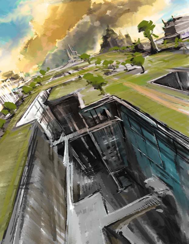
first try with Terragen (i can't afford the license so : low res rendering. ) Awesome tool to start a landscape and quickly establish basic lightning !!
Terragen render

1h00 photoshop

there's a thread dedicated to this software here on the Laborganika forums. |
|
| Back to top |
|
digitaldecoy
member
Member #
Joined: 08 Nov 2002
Posts: 118
Location: germany
|
| Posted: Sat Jan 14, 2006 9:33 am |
|
|
Two quick ones:


_________________
�Que la fuerza te acompa�e! |
|
| Back to top |
|
SkyWalker
junior member
Member #
Joined: 01 Jun 2005
Posts: 27
Location: Portugal
|
| Posted: Sat Jan 14, 2006 11:39 am |
|
|
Excellent artwork and dedication in this forum as always!!!!
Somethime ago I imagine a Black & White Matrix Comic Book .
This is Morpheus...
 |
|
| Back to top |
|
GordMacDonald
member
Member #
Joined: 25 Sep 2004
Posts: 197
Location: Canada
|
| Posted: Sat Jan 14, 2006 12:41 pm |
|
|
Good work everyone!
digital decoy - nice style/drawings
m@ - interesting subject, wonderfully painted (as usual)
lingy-o - nice painting/camera angle (its like being there!)
luc - more cool stuff
stewart one - i like these alot
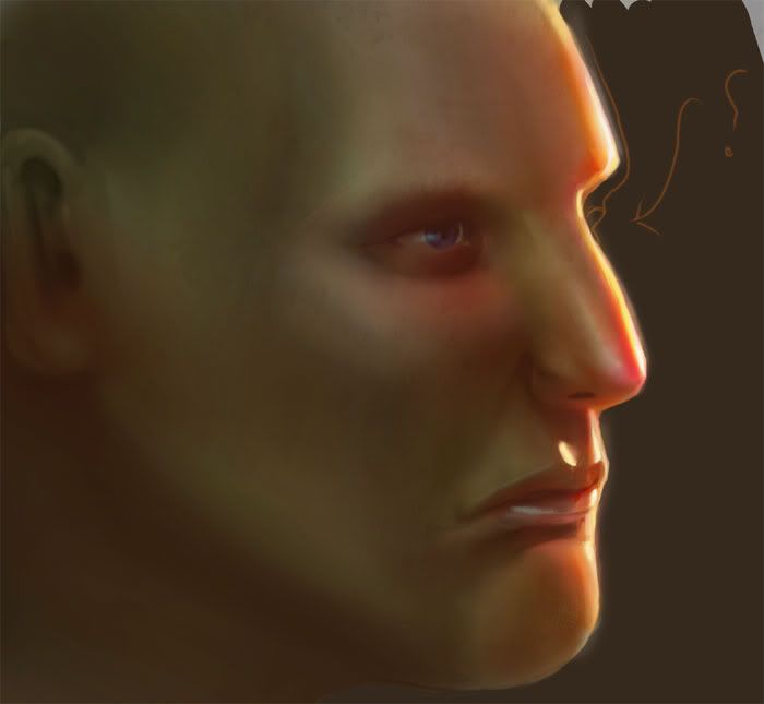
quick head study, noref

Gord
_________________
Gord MacDonald: http://www.cg2020.com |
|
| Back to top |
|
miles
member
Member #
Joined: 17 Oct 2005
Posts: 84
Location: berlin
|
| Posted: Sat Jan 14, 2006 2:01 pm |
|
|
Again I was nailed to my computer (will make a drawing of that one day... ) with only this great thread to cheer me up.
Always want to do a moody Sci-Fi-City. Here's my failure
 |
|
| Back to top |
|
Zorglub
member
Member #
Joined: 20 Dec 2000
Posts: 268
Location: Ontario Canada
|
| Posted: Sat Jan 14, 2006 2:28 pm |
|
|
Quick one, 20 minutes.. ref used
 |
|
| Back to top |
|
|


