| View previous topic :: View next topic |
| Author |
Topic : "Capitaine LeNoire - A Pirates Portrait" |
Duracel
member
Member #
Joined: 08 Mar 2001
Posts: 910
Location: Germany - near Minster
|
 Posted: Sun Jan 01, 2006 5:32 am Posted: Sun Jan 01, 2006 5:32 am |
 |
 |
Well, i guess not as much to say.
Did a lot of speedpaintings the last year (89), but only one other finished piece back in spring.
So here is another proof to show people, finishing is always possible but time consuming. 
For this one, i started with just a lot of thoughts about the charakter and what i'd like to show in this piece. A picture without any story is lifeless and you never hit the top, if you miss to aim high.
And while the most of my speedpaintings lack in this part, for this FinArt i take the time to think about the content first.
Anyway, here is the picture:
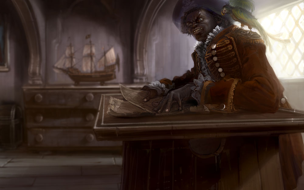
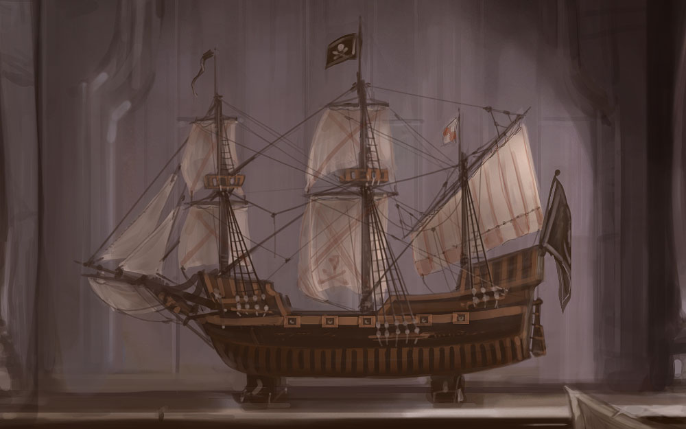
And while i decided to blur the background to focus on the pirate, i missed a lot of details in the model ship, so here is an unblurred closeup. 
_________________
Lars G�tze
www.duracel.de Gallery
Detailling a speedpainting is nothing but speedpainting in detail. |
|
| Back to top |
|
FallDamage
member
Member #
Joined: 03 Nov 2003
Posts: 474
Location: Canada
|
| Posted: Sun Jan 01, 2006 6:26 am |
|
|
Very nice Duracel. Well rendered and there's definitly content and thought behind the crazed determination in the character's face.
My only crit would be that his face seems almost overly monsterous. When I put my finger over his eyes (specifically the one on the right -his left) I like the whole picture much better. The way the eyelid raises to a point looks kind of weird to me (overexagerated?)
Anyway, that's just my opinion. I like it much over all. |
|
| Back to top |
|
Sampster
member
Member #
Joined: 01 Jun 2005
Posts: 182
|
| Posted: Sun Jan 01, 2006 6:47 am |
|
|
hmm...not that I have any right to be criticizing you, but if I were to be extremely nit picky I have to agree with FallDamage; the bulging eyes make the pirate seem a little caricatured, so that perhaps it loses some of the genuine personality.
Also, the desk angles up to the right a little...I would assume it's on purpose, it just looked a little out of whack at first.
Edit: I think I forgot to mention that I love the piece...the hands and coat look especially fantastic, as does the parrot. |
|
| Back to top |
|
Mega Muffin
member
Member #
Joined: 07 Oct 2003
Posts: 235
|
| Posted: Sun Jan 01, 2006 7:17 am |
|
|
This is awesome. When I first looked at it I really didn't like the pirate's face because he's so ugly, but now, having looked longer, I think it's perfect. I disagree that the eyes are inappropriate. Well, I'll just tell you what I read from this piece story-wise. It looks to me like he just discovered something on the map--maybe he'd been searching for something he missed before. Maybe he had went to where the X was and found no treasure, so searched the map again and just noticed that the X had been erased and moved (okay that's really lame but w/e). Regardless, something has clicked inside his head and he's getting up from the desk--that's why it's raised on the right side--and he's determined and in a hurry to go do something.
If that is near what you were trying to portray, it reads wonderfully for me. The whole thing is rendered really nicely. I just love it. I would almost say that the hat isn't sharp enough, but that might detract attention from the face so you probably made the right choice. The bird is really funny, kinda peering over his shoulder like that, and I just love the lighting from the window.
Great job on finishing a piece! Oh, and that boat is really nice, too. Shame you had to blur it. |
|
| Back to top |
|
neff
member
Member #
Joined: 11 May 2002
Posts: 1444
Location: Germany
|
| Posted: Sun Jan 01, 2006 8:14 am |
|
|
very nice, some parts looks photo-realistic!
_________________
*
 |
|
| Back to top |
|
Mikko K
member
Member #
Joined: 29 Apr 2003
Posts: 639
|
| Posted: Sun Jan 01, 2006 12:43 pm |
|
|
Hey Duracel, this is looking good, nice to see finished stuff also!
Technically solid stuff. I hope you'll post more of these!
A few crits. I'm not in love with the depth of field blurring, as it has a little cheap feeling to it. Not by principle, but my eyes somehow hurt when trying to focus into that blurred content. Especially the ship draws attention and it would be cool to really see it better.
Also, about the composition here. My eyes are not drawn to the character's face, maybe because he's floating so high in the corner.. It feels like the ship has become the focal point (to me at least), and the blurring makes it hard to see.
On the flip side, the values look really great! A nice scene overall. Keep it up! |
|
| Back to top |
|
Naeem
member
Member #
Joined: 13 Oct 2004
Posts: 1222
Location: USA
|
| Posted: Sun Jan 01, 2006 4:44 pm |
|
|
i love it duracel. just stunning! Perhaps, as everyone said, the blurring isn't too great. However, I'm still blown away ! Great work, sir!
_________________
http://www.annisnaeem.blogspot.com/ |
|
| Back to top |
|
gLitterbug
member
Member #
Joined: 13 Feb 2001
Posts: 1340
Location: Austria
|
| Posted: Sun Jan 01, 2006 4:52 pm |
|
|
| Very awesome. The only crit I have is that the composition could have been better. As Mikko just said, the pirate sitting in the top corner doesn't look as good as it could when the "camera" would've been angled or moved up a bit. Everything else is top notch though. |
|
| Back to top |
|
Duracel
member
Member #
Joined: 08 Mar 2001
Posts: 910
Location: Germany - near Minster
|
| Posted: Sun Jan 01, 2006 6:23 pm |
|
|
Thx all.
And well, im really happy to see everyone take the time to go into the painting and give some critiques instead of the overall typical sijun "awesome painting" adulations.
Even while im not going to change anything of the painting, it is still welcome to let mw know which things spoil the effect.
I agree the composition and the blur isn't perfect, but this is where my knowhow ends so far, Well,
im still happy with it, but i can see how it causes trouble a bit.
The face which is a little bit overexaggerated ... well i like it as it is; maybe its just me, but even in reallife i like people who have such strong face-expressions while most people don't seem to know eyebrows -in fact- can be moved.
I guess this lies mostly in the eye of the beholder (maybe im wrong).
Sampster, well observed, the table is not 100% in perspective. I recognized it while painting, while it even looked worse perfectly constructed. so i made some adjustments. Maybe my critical composition moved me into this trouble. ^^
Mega Muffin, my intended story is something like, the captain - while studying the treasure maps - just in a moment of firm belief into the treasures existence driven by greed and high hopes, he's dreaming of all the gold he can imagine and wich - in his thoughts - will be his, soon.
I'd like to say your interpretation is not far away.
_________________
Lars G�tze
www.duracel.de Gallery
Detailling a speedpainting is nothing but speedpainting in detail. |
|
| Back to top |
|
daryl
member
Member #
Joined: 28 Oct 2000
Posts: 441
Location: Stockholm, Sweden
|
| Posted: Mon Jan 02, 2006 8:09 am |
|
|
the face to me could use some work to actually look human - if you put some more effort into that area the picture will go a lot further as a whole (check for refs). the clothing, map and the ship are parts that are really well executed, but the proportions of the face (nose looks rather odd as well) could use a little more love.
anyways, some parts are really really good!
_________________
homepage:blog |
|
| Back to top |
|
Shiro_tengu
member
Member #
Joined: 02 Aug 2001
Posts: 430
Location: W. Australia
|
| Posted: Wed Jan 18, 2006 5:53 pm |
|
|
Hi,
This is fantastic. Beautiful lighting and it really looks as if he has discovered where great treasure can be found. I love the feel of the image. Great work. |
|
| Back to top |
|
|


