| View previous topic :: View next topic |
| Author |
Topic : "Sijun Challenge | CONGRATULATIONS MAX!" |
Capt. Fred
member
Member #
Joined: 21 Dec 2002
Posts: 1425
Location: South England
|
 Posted: Thu Nov 24, 2005 4:34 am Posted: Thu Nov 24, 2005 4:34 am |
 |
 |

Voting in progress.
Click me to vote!
You can continue to add images to this page and they will be added to the vote page.
To vote on each image, click on the thumbnails and choose a rating from beneath each image. The vote is registered when you click.
There is a rare page layout error. Reloading usually fixes the layout.
Your image should be, less than 800 px tall and 1000 px wide, and less than 200 kb.
Well done to all!
Last edited by Capt. Fred on Fri Dec 09, 2005 5:36 am; edited 8 times in total |
|
| Back to top |
|
watmough
member
Member #
Joined: 22 Sep 2003
Posts: 779
Location: Rockland, ME
|
| Posted: Thu Nov 24, 2005 7:21 am |
|
|
I appreciate your effort very much Capt. Fred!!! 
This is my take on the theme...no dramatic angles or action,really more of a set-piece i guess.
I was actually imagining some sort of ancient Sith temple...
 good luck everybody!!!!...lets see your work! good luck everybody!!!!...lets see your work!  |
|
| Back to top |
|
eyewoo
member
Member #
Joined: 23 Jun 2001
Posts: 2662
Location: Carbondale, CO
|
|
| Back to top |
|
Max
member
Member #
Joined: 12 Aug 2002
Posts: 3210
Location: MIND
|
| Posted: Wed Nov 30, 2005 1:30 pm |
|
|

About the Ruins the Planet and the Civilisation
The architecture of the city is very human like altough most of the buildings were more than 2500 meters high before the great doom. The planet called �Cavendish� on which the gigantic metropolis was built on consists of 80% iron which is therefore also the main material the aliens used to construct simply everything. There's little known about the aliens themselves altough it seems they had the same social structure as humans. Their technology was on a different level though. They didn't know anything about electricity. It's not sure how they managed to build that huge city. Scientists argue about the use of magnetism or some other unknown kind of power they could have taken use of to create their empire. The great doom could have been caused by the cessation of the iron magma deep inside Cavendish which produced a magnetic field of force which protected the planet of high energetic cosmic radiation. The gravity which is 17 times higher than the earths gravity was also increased and caused the huge builings to collapse. Futhermore the radiation of the star "Flux" and fallout are reasons for the slow weathering of the whole planet. It's literally melting.
I couldn't finish the painting on time actually. There's lots of unfinshed parts as you can see. I am not totally happy with the result however I have learned a lot. My progress was very confusing. At first I first painted the main shapes of the buidlings, clouds, etc and than made about 5 super detailed buildings (which I used ref for) which I combined and overlayed several times to create new forms. I made hundreds of different versions of the painting even at a very detailed stage because there was always something that didn't work. The whole pic looks messy...I don't know how mattepainters get that super clean look. It's amazing. One day I will find out their secrets : ) Anyway.
Concepts for Alien Ruins | Messy Detail Shot
Good luck everyone. I hope we will see more images soon! It looks great so far!!!
Last edited by Max on Thu Dec 01, 2005 8:55 am; edited 1 time in total |
|
| Back to top |
|
Japong
member
Member #
Joined: 20 Sep 2004
Posts: 54
Location: Ontario
|
| Posted: Wed Nov 30, 2005 2:55 pm |
|
|

This wasn't orginally intended to be an entry, but I figure that I might as well participate. The more contestants the merrier! |
|
| Back to top |
|
miles
member
Member #
Joined: 17 Oct 2005
Posts: 84
Location: berlin
|
| Posted: Wed Nov 30, 2005 3:02 pm |
|
|
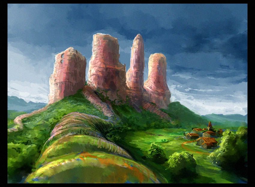
These ruins were to be found on planet earth in 1298. The Building was abandoned around year 1012 in middle europe and rapidly started falling appart. Around 1465 only a hill with a rocky plateau was left on which a citadel was constructed. Today the ruins like the citadel are gone...
I know it is really just a Speedpainting, though not really fast. It's the only way I can paint yet. |
|
| Back to top |
|
Spectra
member
Member #
Joined: 11 Nov 2000
Posts: 135
Location: Montreal, Quebec, Canada
|
| Posted: Thu Dec 01, 2005 12:09 am |
|
|

Recent Images transmited by one the U.E.E.P (United Earth Exploration Probes) are quite astonishing! These megalithic structures are apparently ruins of a primitive, but intelligent life form.
These stones show elaborated "hand work" of paths, stairs, tunneling and stone alignments, similar (but much larger) to the menhir alignment found on Earth, at Carnac. The use of these alignments is unclear, but could be a sign of religious behaviors.
Most of the elaborated stone work is present at the top of the monoliths. An interesting comparison to do, is that Earth's creatures who use height for their nesting, do it to escape predators...
There are 2 kind of erosion that can be seen on these solid metamorphic rock. Frist we notice the recent wind and sand erosion, but there is also a strong evidence of water erosion which happend in a much distant past.
The limited sensor of the exploration probe were unable to detect any signs of alien life, but could identify a multitude of living micro-organisms.
A new exploration probe is being built and will be lunched in 3 years to prepare the terrain for a human expedition. |
|
| Back to top |
|
Rolando.
member
Member #
Joined: 13 Sep 2004
Posts: 59
|
| Posted: Thu Dec 01, 2005 6:19 pm |
|
|
I'm a little late with my entry, I hope you don't mind ^^
I wanted to paint an alien city on a fronzen planet, but maybe in the end the architecture doesn't looks very alien.
 |
|
| Back to top |
|
Ranath
member
Member #
Joined: 02 Apr 2004
Posts: 611
Location: Helsinki, Finland
|
| Posted: Mon Dec 05, 2005 8:41 am |
|
|

okay sorry I'm late but this was pain.. this is also my cg challenge entry, sorry about that as well..
The dark building is a base of space miners (aliens) that had landed to a distant, cold planet in the outer rim. They had thought the planet to be desolate, but they were wrong. And they chose the wrong mountain to search minerals from - now they had to face the wrath of the ancient people who still lingered in the caves of their sacred mountains... |
|
| Back to top |
|
Capt. Fred
member
Member #
Joined: 21 Dec 2002
Posts: 1425
Location: South England
|
| Posted: Fri Dec 09, 2005 5:48 am |
|
|
Well done every one, great stories behind the art too.
Anyway here are the results:
8 Rolando.
7 Japong
6 miles
5 Ranath
4 Spectra
3 watmough

2 eyewoo

1 Max Kulich

Max, I'm sure the other entrants are eager for their critique, so feel free to do that in here.
I wasn't able to join you guys in the end which is a bummer, but I got some kicks out of doin the graphicy stuff and problem-solving website, learnt a bit doing that. Maybe next year we'll have another challenge, I hope this isn't the last of the idea cuase i think it's a goodun, though it could do with getting simpler, less organisation. maybe round mid summer time rather than christmas too.
gotta go |
|
| Back to top |
|
Max
member
Member #
Joined: 12 Aug 2002
Posts: 3210
Location: MIND
|
| Posted: Fri Dec 09, 2005 7:44 am |
|
|
Yeah!! Hey, that's great. I feel very honoured - truly!!
Thank you everybody for your voting support!!! That's very nice!
Congratulations to you all! I am glad we made it this far.
eyewoo, I would have bet that you get the first place since yours is
the most "finished" and professional looking imo! Again, well done!
Capt.Fred, it's a pity you didn't make it. I would have loved to see your painting. Maybe next time! : )
Anyway, thanks alot for the effort! We would not have made this without your motivation.
Okay guys, give me some time to think about the critique and all. Holy,...this is going to be fun. lol. I hope I'll do your great pics justice.
I wouldn't mind if you could give me some comments or suggestions too though. Don't wanna be the only one without critique.
Alright, I'll be back with some writing/paintovers(?) soon. |
|
| Back to top |
|
Capt. Fred
member
Member #
Joined: 21 Dec 2002
Posts: 1425
Location: South England
|
| Posted: Fri Dec 09, 2005 7:49 am |
|
|
thanks max, it was no problem
you want a crit?
your picture's too small to do it justice, give us a bigger version to ogle! |
|
| Back to top |
|
watmough
member
Member #
Joined: 22 Sep 2003
Posts: 779
Location: Rockland, ME
|
| Posted: Fri Dec 09, 2005 8:01 am |
|
|
grats,Max!!!!!!...superb painting!
thanks again Fred,much appreciated....I only wish we could have seen yours too. |
|
| Back to top |
|
Rolando.
member
Member #
Joined: 13 Sep 2004
Posts: 59
|
| Posted: Fri Dec 09, 2005 10:06 am |
|
|
| Very nice Max, congrats !! I like the attention to detail in you work |
|
| Back to top |
|
Max
member
Member #
Joined: 12 Aug 2002
Posts: 3210
Location: MIND
|
| Posted: Sat Dec 10, 2005 3:04 am |
|
|
Alright, here we go!
watmough: I like your pic since it really looks as if this is a very old and fogotten place somwhere in no-mans-land. That might sound funny however I think your temple has a "dark expression" which I like too. As if it would say, "don't come in!" : ) The detail is actually the only thing that lacks here. Some kind of runes and patterns could make this image more interesting maybe. By adding more shapes (rocks mountains temples) to the background you could also add more depth to your image. Anyway, that's all just stuff you could easily achieve by spending more time on the pic. The main impression is set and that's what is important.
Another major thing that came to my mind is the composition. Your temple is pretty "centered" in the middle of the pic. On the one hand that's nice since it feels like it "looks" at us on the other hand it lacks tension, I think...by placeing it a bit to the right or to the left and adding some foreground elements you could catch the viewers eye and he would "go around" in your pic from one element to another.
Heres's a quick PAINTOVER to show you what I mean. I just added/replaced some elements and played around with color/contrast settings. Nothing fancy however it should give you an idea of what I am talking about. Detail is another factor, no the most important though.
Again, I am no pro, not at all so,...don't take it to serious. : )
eyewoo: I tried really, really hard to find something in your pic I really don't like but there simply is nothing. It's perfect! I love it. Nice colors, nice mood, A LOT of character and just a simple very funny idea. You've go a very chiselled style. Concerning our technique there's nothing that buthers me. If I am really super meticulous I would change to pose of the alien. Remember the pose of him in your first skech? I think that was perfect. In your finished version it looks a bit stiff. That's something I wouldn't have noticed though without seeing your first sketch. There's also some stuff I have in mind concerning dramatic lightning, shadows et cetera but that just wouldn't fit your style. That's more of a taste thing so I won't bother you with that. It would add more realism to the scene but that's not really what it needs anyway. As I said, it's just good as it is. Now just print and enframe it : )
Japong: It looks as if it's very cold in your alien ruins. That's the feeling I got as I saw the girl. Your pic has an interesting perspective and it almost has the feeling of a scene of a movie. I am curious about the girl and ruins. Looks like there's a story behind it.
Concerning the technical aspect of your image there's still alot of work to do. It doesn't look very finished. It's abit monoton. The colors and shapes aren't very interesting but I am sure you could add more variation easily. You just have to spend another couple of hours on your image. I made a paintover for you to show you haw you can make extremely quick and very easy adjustments to higher to overal quality (imho) of your pic. Just take a look at this PAINTOVER I made for you. Believe me, this was just a 10 minute workover. You can do that too, there's no special painting skill involved in that really. The only time I painted was a few strokes on the girls face. Everything else is just a mix of transforming, levels, contrast, color balance and some layer tricks. I basically changed the image proportions of your pic because I think the highness of the buildings get stronger this way. Than I added some kind of snowflakes or energy balls to give more depth to the scene. I also added some other lightning elements to give the scene more variation. Play around with your color/lightning settings and you will find out that you can easily get the same effect, if that's what you want of course. These are just some quick tipps which doesn't have to do much about painting itself so I thought they might help you more than a super detailed paintover. Hope that helps!
miles: I like your pic because it looks so friendly. It's a very nice and realistic interpretation of alien ruins. Your image is very compact. Is has nice colors, good lightning and even depth which is very important for landscapes. As you said yourself it looks more like a speedpainting. Adding detail to such a pic isn't easy at all. It would take me quite a while too I think. Before adding more detail I would make some changes to some elements of the pic though. The ruins themselves look abit "fuzzy". Not like hard old rock. You could also give them more interesting shapes. At the moment they look like normal rocks. I like the tubelike paths though. Very interesting concept. I made a PAINTOVER in which I just changed the format of the pic. This is really more of taste thing again however I think a landscape scene always looks better this way. The rest is really just detail work. Not sure if you used reference for some parts but that would be very helpful. Scenery really isn't easy. I couldn't start such a pic without looking at some ref. Maybe try that next time. It's the technique you have to work on, your idea is great. I really like it. Keep it up!
Spectra: That's a very complex image too. I think you combined your elements pretty good. Your pic has an interesting atmosphere and I like the story behind it too. Very realistic. The only thing that doesn't 100% fit are some of the ruins rocks. Hard to tell why that is exacly. I think the are too sharp while the dunes are abit too blured. Most of the other elements work togehter pretty good. One minor thing. Ther are some stars infront of you planet (looks like mars btw) which is imposible : ) The foreground elements look smudged or blurred. You could change that with the sharpen tool or some painting maybe. Anyway, that's all just little things. Overall it looks quite finished. That's it I think.
Rolando.: INteresting concept! It looks very different to all the other images. I almoust looks more fantasy like but there's enough sterotype alienish stuff out there anyway so who cares : ) The discoverers down there are a nice touch. Adds life to the scene. And we can tell that these buildings are huge.
What you need to do is refining your shapes. They are a bit confusing. It's hard tell what some of the objects actually are. The perspective is off at parts which might also be the reason for the overall lack of depth. It looks a bit flat. Adding more light and shadow yould work. I made a PAINTOVER in which I again did just some color/contrast adjustments just like in the pic of Japong. Some quick and easy things. No painting stuff involved again. I added some lightning and made the scene look colder. You can play around with those adjustment settings quite abit and see what you like. I always to that from time to time to see if the overal atmosphere and color composition is the way I like it. You can do that very quickly and it can change your image alot as you can see. Anyway, keep up the good work!
Ranath: I love the dark atmophere in your image. Looks like a very bad place to be. Like Mordor : ) Great mood! It would like to see more of your ruins though. They are hidden in the darkness. The visible parts of the architectur look interesting. A huge battle was going on at this place as I see. Poor aliens : ) You could have defined some of the parts of the image. Several rocks and other stuff is abit unfinished altough it doesn't really affect the overal impact of the scene. I looks quite cool as it is. The only thing I would change, as I said, are the ruins. "Change" might be the wrong word. It would be nice to add more light back there to see things. An entrance into the mountain, stuff like that. Good work though.
Okay guys, please forgive me all the spelling mistakes. : )
I hope I could help some of you and wasn't too harsh with my critique.
I am no pro myself so keep that in mind. I tried my best to give you some useful tipps.
Alright, I think I am done with my "price" lol. It was a pleasure
Thanks for the commments btw. I might post a bigger verion Capt.Fred. Let's see...
Edit: Alright, here it is! HIGHREZ VERSION
Now you can see the mess which drove me crazy. Fire away!!! |
|
| Back to top |
|
Petri.J
member
Member #
Joined: 04 Dec 2003
Posts: 437
Location: Helsinki, Finland
|
| Posted: Sun Dec 11, 2005 3:55 am |
|
|
Great paintings! And congratulations to Max. Hope you enjoy your prize, just don't spend it all at once
You did a great job on those paintovers, I learned alot from them all.
Cheers |
|
| Back to top |
|
eyewoo
member
Member #
Joined: 23 Jun 2001
Posts: 2662
Location: Carbondale, CO
|
|
| Back to top |
|
Joe84
member
Member #
Joined: 26 May 2004
Posts: 262
|
| Posted: Wed Dec 14, 2005 1:00 am |
|
|
yeah max, this one you did is quite an eye popper.
great work |
|
| Back to top |
|
Max
member
Member #
Joined: 12 Aug 2002
Posts: 3210
Location: MIND
|
| Posted: Thu Dec 15, 2005 2:05 am |
|
|
Thanks guys. Glad you like it! : )
Petri.J: thank you. It was fun playing around with those images. I learned somthing doing them myself. |
|
| Back to top |
|
Gort
member
Member #
Joined: 09 Oct 2001
Posts: 1545
Location: Atlanta, GA
|
| Posted: Thu Dec 15, 2005 4:39 am |
|
|
Kudos Max!!
_________________
- Tom Carter
"You can't stop the waves but you can learn to surf" - Jack Kornfield |
|
| Back to top |
|
Max
member
Member #
Joined: 12 Aug 2002
Posts: 3210
Location: MIND
|
| Posted: Sat Dec 17, 2005 3:25 pm |
|
|
| Thanks Gort! : ) |
|
| Back to top |
|
Capt. Fred
member
Member #
Joined: 21 Dec 2002
Posts: 1425
Location: South England
|
| Posted: Sun Dec 18, 2005 9:38 am |
|
|
Great job on the critique max!
Your image is stunningly detailed. the shapes and variation in the detailing really draws you in. though the detail work is photographic, i find the rendition presents it all to you in the form of a solid wall. I think you need to add some more air between midground and foreground to create a feeling the these buildings are not only enormous and ornate but also stemming from the ground at different positions in space- it looks as though the city is wide left to right but not deep front to back. clearer edges would help separate the buildings in space too as i find the glow and bloom effects weaken the feeling of space by bluring close and far buildings into one another, and in some of the mid-distant buildings the contrast could be reduced.
Great job though, holy smokes! |
|
| Back to top |
|
watmough
member
Member #
Joined: 22 Sep 2003
Posts: 779
Location: Rockland, ME
|
| Posted: Sun Dec 18, 2005 12:14 pm |
|
|
Thanks for the critique,Max!....you are right of course.
VERY hard for me to detail without losing something. |
|
| Back to top |
|
Max
member
Member #
Joined: 12 Aug 2002
Posts: 3210
Location: MIND
|
| Posted: Mon Dec 19, 2005 2:47 am |
|
|
Fred: Thanks alot! I appreciate it. I have to agree with everything you said. That's the weak part with all my city paintings. I just can't manage perspective, correct lightning and clear forms therefore I fill it up with details. Maybe I'll start with a blockmodeling next time. I've seen the stuff spooge did for final Fantasy and they did those renderings of the main shapes of the city and he painted over them. Seems to be a good progress. Still not easy though. Thanks again Fred!!!
watmough: You're welcome! |
|
| Back to top |
|
miles
member
Member #
Joined: 17 Oct 2005
Posts: 84
Location: berlin
|
| Posted: Thu Feb 16, 2006 2:39 pm |
|
|
My congratulations Max!
I don't know if you ever come back here after 2 months...
I imagined all the people calling the competition a good idea would join, so I was a bit disappointed. Still it was fun to do and many thanks Capt.Fred for pulling it off!
Only came back here today and found Max's critique. Thank you very much for spending some time on this. I really came to Sijun to learn, so this is the best feedback I ever got so far! I guess I have to swallow my pride and use ref. Not that I despise ref, I only feel a bit cheating when copying or immitating. I still blush when I hit "submit"  |
|
| Back to top |
|
|


