| View previous topic :: View next topic |
| Author |
Topic : "Hoping for comments and crits on a new oil (scroll WAY down)" |
Sampster
member
Member #
Joined: 01 Jun 2005
Posts: 182
|
 Posted: Wed Aug 31, 2005 5:33 pm Posted: Wed Aug 31, 2005 5:33 pm |
 |
 |
Edit: Scroll down (all the way) for new stuff!
Edit: these first ones have been up for long enough, and they're ugly  if you want another look I'm leaving links, but the images are no longer posted. if you want another look I'm leaving links, but the images are no longer posted.
Frankly I don't know if I have any business posting here. I came upon this site while looking at tutorials, and I am by no means a professional. If you all don't mind having a young and rather inexperienced artist posting in your midst then I will continue to post here. If I have to be booted because of my lack of skill so be it My art is for my personal benefit, so unless otherwise stated assume it has no purpose other than developing my skills.
I've been lurking at the Sijun forums all summer, and to give you and idea of how my art has changed (and possibly improved, no guarantees though), I'll post some art from way back.
This is back around Christmas 2004:
http://img.photobucket.com/albums/v330/samphil/DarkKnightRedoneUpload.gif
http://img.photobucket.com/albums/v330/samphil/DarkQueenColorUpload.gif
This is closer to the Spring '05:
http://img.photobucket.com/albums/v330/samphil/SidekickComparison.jpg
http://img.photobucket.com/albums/v330/samphil/TobeNamedLineArtCrop.jpg
This is early summer '05:
http://img.photobucket.com/albums/v330/samphil/finishedclone.jpg
Please don't bother to crit any of these too much, I know they're horrible, it's just to give you an idea of what I was producing over those months. (all but the clone, which was a speedie, were serious, time-consuming artworks)
You'll also notice I've broken away from anime in the more recent pics.
here is some (edit: not even close to current anymore, I think fall '05) stuff:
This one's a bit of a speedie:
http://img.photobucket.com/albums/v330/samphil/SeaBloat6.jpg
you can see progression at
http://img.photobucket.com/albums/v330/samphil/SeaBloat1.jpg
it goes 1-6, just change the URL
This one took a lot more time, many refs used to get the anatomy down.
http://img.photobucket.com/albums/v330/samphil/FellBeast7.jpg
you can see progression at
http://img.photobucket.com/albums/v330/samphil/FellBeast1.jpg
it goes 1-7, it'll be faster for you just to change the URL than me to post links.
Again I'm not a pro, just a high school guy lucky enough to stumble upon this site, I hope it'll be fun to work with me, as opposed to me being a nuisance to you all.
Last edited by Sampster on Sun Jun 04, 2006 3:35 pm; edited 15 times in total |
|
| Back to top |
|
gLitterbug
member
Member #
Joined: 13 Feb 2001
Posts: 1340
Location: Austria
|
| Posted: Thu Sep 01, 2005 4:56 am |
|
|
Welcome Sampster. While you clearly have a long way to go art-wise, just as you said yourself, you amaze me. I never thought it�d be possible, but there you are, a guy who actually is honest with himself and knows his skill level and does not post a 2 minute speedy and asks for crits to be like spooge overnight.
I think it�d be a good idea to just do figure drawing sketches and the usual way to improve, watch, practice, learn. Stick to that and you�ll be able to see some big progress soon.
That said, good luck with it and don�t be affraid to show us your stuff from time to time. |
|
| Back to top |
|
lysander
member
Member #
Joined: 25 May 2005
Posts: 131
Location: the spoon factory
|
| Posted: Thu Sep 01, 2005 8:07 am |
|
|
practice practice practice!
_________________
Earth under attack by paper mache aliens; world leaders plead - 'Save us! Doctor Who!' |
|
| Back to top |
|
Sampster
member
Member #
Joined: 01 Jun 2005
Posts: 182
|
| Posted: Thu Sep 01, 2005 7:32 pm |
|
|
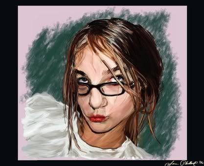
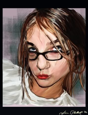
I've been working at this for a couple weeks. It's a portrait referenced from a couple of girls in my class. I'll try to pull of the photo for comparison soon.
Now that this is done I'm going to focus my art on more 'educational' works, and hopefully improve my skill overall.
This was done in Painter IX with acrylics. (except for the face of the girl on the left, her face was done in Painter Essentials 2)
http://img.photobucket.com/albums/v330/samphil/FinishedPortrait.jpg
Anyway if anyone could spare some comments and crits so I can do better next time around I'd appreciate it.
Edit: image removed, link placed instead, because this is too old.
Last edited by Sampster on Sun Dec 25, 2005 9:39 am; edited 2 times in total |
|
| Back to top |
|
JW
junior member
Member #
Joined: 13 Jun 2005
Posts: 15
|
| Posted: Sat Sep 03, 2005 10:29 am |
|
|
| You've probably heard it before, but the best advice I can give is to just practice and put the time in. Put the idea of constant improvement in your head. Take the mentality of 'this is a learning experience' as opposed to 'this is a failure'. Learn anatomy, take life drawing classes if you can, at the very least study readily available material online, such as Andrew Loomis' books at http://www.saveloomis.org/ (check out 'Figure Drawing For All It's Worth'). But above all, just practice, practice, practice as lysander said. Draw every day and you'll see improvement faster than you'd think. Keep on the path, good luck. |
|
| Back to top |
|
Sampster
member
Member #
Joined: 01 Jun 2005
Posts: 182
|
| Posted: Wed Sep 14, 2005 3:55 pm |
|
|
Here's my latest offering...and I know i have to practice constantly, could I get a few specific crits on this one? (any replys are appreciated though...)
This is the 'final'....the background is horrible because I just sort of threw it on so it could have a background, i'll post the progression too.
http://img.photobucket.com/albums/v330/samphil/CompleteSWwestern.jpg
The guy is supposed to be a bit of a weirdo, in my mind he's like a half-insane vigilante who wanders around on an outer-rim planet in the star wars universe. Villainous, and having his left body composed of machine to boot, his skin is palid and almost faded like old yellowed paper.
At least that's how it is in my mind.
Crits?
Edit: This picture was also taken down because it too is far too old.
Last edited by Sampster on Sun Dec 25, 2005 9:40 am; edited 1 time in total |
|
| Back to top |
|
Sampster
member
Member #
Joined: 01 Jun 2005
Posts: 182
|
| Posted: Fri Dec 09, 2005 5:05 am |
|
|
Edit: These were done in early December 2005:
http://img.photobucket.com/albums/v330/samphil/ScordraxBurn.jpg
The fire isn't anything special, oh well...
also here's a really weird/overdone self-portrait: 
I think my normal stuff on paper is a head and shoulders above most of what I've been posting here just because I'm not all that great with digital art (that's a severe understatement).
Any crits are welcome...even if it's the same old "keep on practicing", then I at least know people are taking some small amount of notice.
like I said I haven't ignored people's advice to just practice drawing from life and work with natural media. if I get the chance I'll scan and post some faces and hands and other stuff I've done with natural media.
(I've done more stuff between now and September but I don't want to bore you with all of it.)
Last edited by Sampster on Thu Feb 16, 2006 6:52 pm; edited 2 times in total |
|
| Back to top |
|
3xodus
junior member
Member #
Joined: 08 Mar 2005
Posts: 13
|
| Posted: Fri Dec 09, 2005 10:21 am |
|
|
hey ur improving!
i like the half-man half robot guy, especially the way u made his coat
ive never seen some1 as dedicated as u! |
|
| Back to top |
|
the_insider
member
Member #
Joined: 06 Apr 2002
Posts: 547
Location: DENVER COLORADO--rocky mountains whoo hoo!!
|
| Posted: Sun Dec 11, 2005 10:35 am |
|
|
good last face...you seem to be more skilled in human figures above all else so you should take that and hone it to your best advantage,...then you can apply what you learn about anatomy and shadows and blah blah blah to your fantasy scenes and figures..so work with life a lot more to gain that technical aspect....and go easy on the effing dodge tool!!!....keep em comin
_________________
www.andresguzman.com
---Would you believe me if i told you i was a liar?... |
|
| Back to top |
|
Sampster
member
Member #
Joined: 01 Jun 2005
Posts: 182
|
| Posted: Thu Dec 22, 2005 12:32 pm |
|
|
This might be a stupid question, but what's the "dodge"?
(Ick, looking at some old pictures, especially that portrait of the two girls makes me cringe...I really screwed up some stuff pretty badly...) |
|
| Back to top |
|
Sampster
member
Member #
Joined: 01 Jun 2005
Posts: 182
|
| Posted: Sun Dec 25, 2005 6:47 pm |
|
|
I hope you guys won't eat me for this double post
This is my 2004-2005 progress in a nutshell (both were done at the very end of the year...so you could think of it was early 2005- early 2006 if you want because it's close enough).
These were the artworks I did at the end of 2004:
http://img.photobucket.com/albums/v330/samphil/DarkKnightRedoneUpload.gif
http://img.photobucket.com/albums/v330/samphil/DarkQueenColorUpload.gif
Here's my final work for 2005 (30 different versions, 18 layers total).
http://img.photobucket.com/albums/v330/samphil/TemplarFinished.jpg
here's a zoom of just the guy with no background:
http://img.photobucket.com/albums/v330/samphil/TemplarFinalNB.jpg
[Edit: Again I took down the pictures and left a link because I don't want this thread to be filled with pictures everyone's seen]
I really tried to focus on the metal in this piece (the horse's headplate, the knight's breastplate, the chainmail, the helmet, etc...) So any crits on that are especially appreciated.
I feel like I've come a long way in one year (no small part in thanks to the influence of sijun). The stuff I did in the spring wasn't that great; but after finding this place in the summer I started doing a lot more art and holding my work to a (somewhat) higher standard. Or at least I had higher goals to strive for, and artwork to compare to that was far above anything I had (or still have) to offer.
Thanks for all the inspiration everyone and Merry Christmas.
Last edited by Sampster on Thu Feb 16, 2006 6:47 pm; edited 1 time in total |
|
| Back to top |
|
Sampster
member
Member #
Joined: 01 Jun 2005
Posts: 182
|
| Posted: Fri Jan 20, 2006 4:47 pm |
|
|
A triple post! Maybe I'm failing to take a hint here, but I hope my first project of 2006 will elicit a response and some criticisms from everyone.
Before that: Here's some nose and lip studies I did, I posted the lips in the SP thread, I was hoping this year to do some more studies and post them there, but with finals last week and drama starting up I haven't had the time I wish I did. anyway here they are:
http://img.photobucket.com/albums/v330/samphil/nosestudies.jpg
http://img.photobucket.com/albums/v330/samphil/LipStudy.jpg
And here's the first project of 2006, unfortunately the file had to be sized down because I don't have anything except photobucket yet...but here it is (2 versions):
I confess I used the dropper for some of the colors here...I know it's a horrible thing to do; but frankly I have no experience with picking out face colors and tones.
Also, my art teacher wants me to print out a few high quality (and big) copies of the paintings. I'm thinking the local staples will do it (pay a couple bucks to load up the files, then it's around 30 cents to print of large copies). Right the thing is right now my files are at a 300 pixel per inch resolution...but they're only about 1600x2000 pixels.
So I'm wondering, is 300 PPI high enough for a high quality print, and how many inches (or pixels) wide should it be if I want a print that's larger than a normal piece of paper?
Thanks in advance to anyone who answers.
Last edited by Sampster on Thu Feb 16, 2006 6:52 pm; edited 2 times in total |
|
| Back to top |
|
eyewoo
member
Member #
Joined: 23 Jun 2001
Posts: 2662
Location: Carbondale, CO
|
| Posted: Sat Jan 21, 2006 5:48 am |
|
|
| Sampster wrote: |
I confess I used the dropper for some of the colors here...I know it's a horrible thing to do; |
Hey... this is the digital medium. The dropper is just one of a huge number of useful tools the medium offers... and a very useful tool. Once a picture is under way, the dropper is a great way to pick up and reuse colors or pickup blended colors or... any number of neat and useful uses. Horrible??? More like inspiring! This is digital, man!
_________________
HonePie.com
tumblr blog
digtal art |
|
| Back to top |
|
Sampster
member
Member #
Joined: 01 Jun 2005
Posts: 182
|
| Posted: Thu Feb 16, 2006 7:03 pm |
|
|
Eyewoo: I wrote what I did about the dropper because I see people in the other threads mention they "didn't use any dropper" for certain pics; I thought it was only right to tell people that I did use it to get some of my colors right. Anyway thanks for setting me straight 
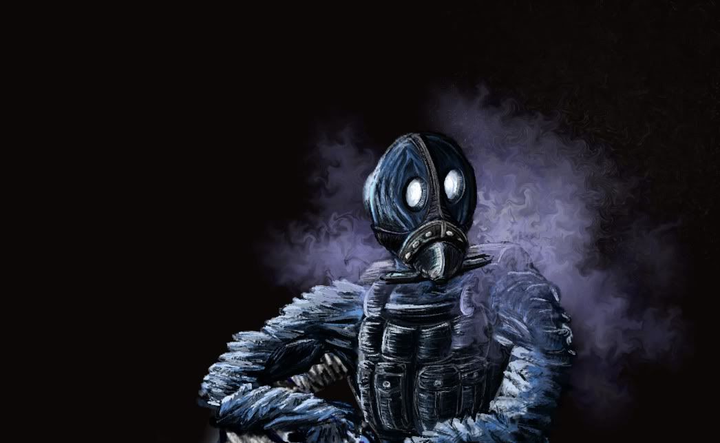
I won't bother you all with most of the crud I've been churning out, but here's just one work I did over a couple days. It's hardly a full "project" but enough hours went into it that it's not quite a speedpaint (for me) either. It's digital digital conte, except for some airbrushing and distortion for the CO2 vapor.
I didn't quite get down the textures I was hoping for (my metal isn't so great), so some criticism on that would be helpful. Criticisms on anything are helpful, actually.
This is bob. You can see the carbon dioxide vapor sublimating off the dry ice in his pack.
Last edited by Sampster on Sun Jun 04, 2006 3:33 pm; edited 1 time in total |
|
| Back to top |
|
B0b
member
Member #
Joined: 14 Jul 2002
Posts: 1807
Location: Sunny Dorset, England
|
| Posted: Fri Feb 17, 2006 2:44 am |
|
|
| Sampster wrote: |
So I'm wondering, is 300 PPI high enough for a high quality print, and how many inches (or pixels) wide should it be if I want a print that's larger than a normal piece of paper?
Thanks in advance to anyone who answers. |
some nice work here 
to answer that question -
your 2000x1600 pic @ 300dpi / ppi is the same as a 6x5 printed pic
you can happily bring it up to the same size as 15x10 (shave some off the top or its 15x12) without too much degridation of the pic (i'd suggest going to your local photo store that makes prints from digital cameras and using their machine, you'll get a much better result than going to staples and getting them to do it on a digital printer) |
|
| Back to top |
|
Sampster
member
Member #
Joined: 01 Jun 2005
Posts: 182
|
| Posted: Sun Jun 04, 2006 3:46 pm |
|
|
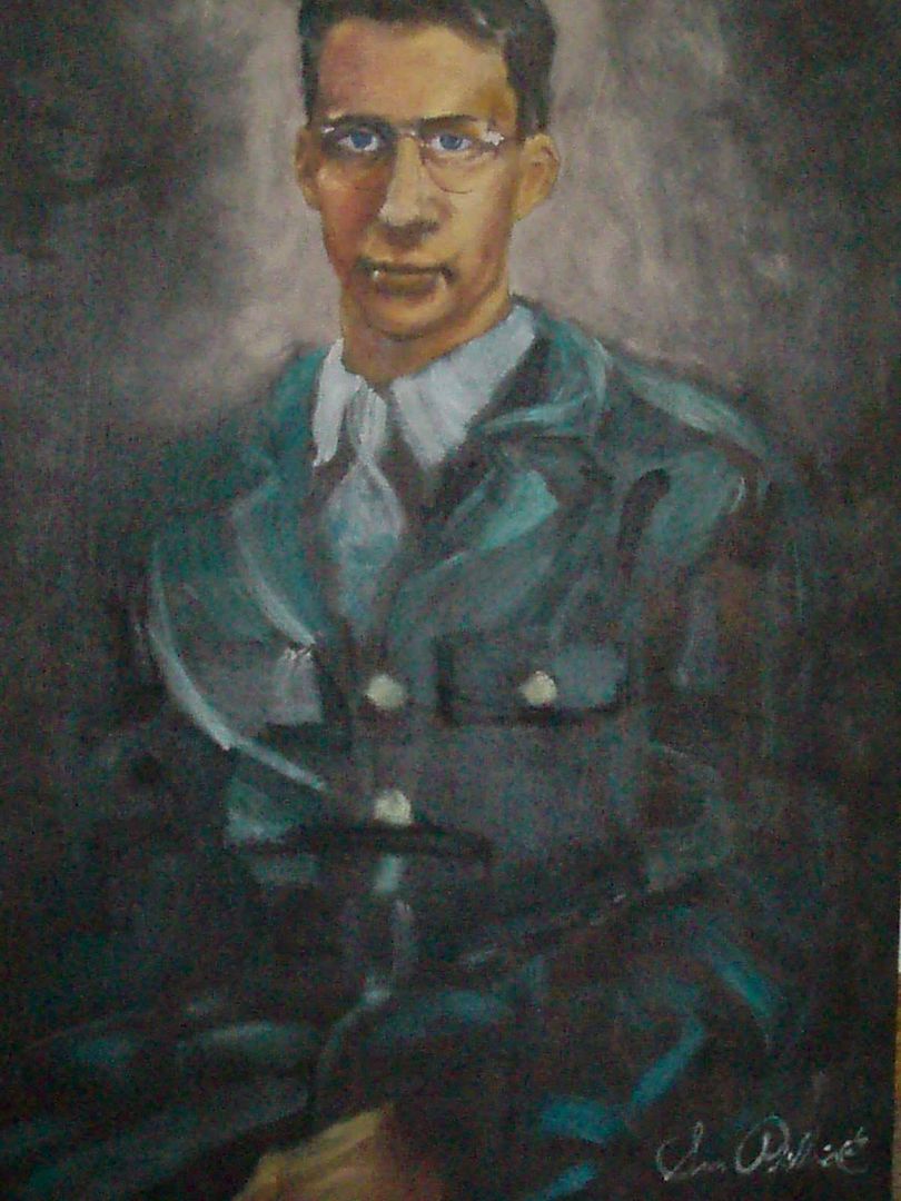
I spent a lot of time doing this piece. It's oil on canvas (so no computer stuff this time), a portrait of my grandpa referenced from a photo taken sometime during WWII. I wanted to attempt to imitate a little of Rembrandt's technique in this painting, so I started off with a dark background, and painted the bottom layer of my face with blues. I used lots of yellows and reds (rather than more natural skintones), and let the focus fade out at the bottom.
I was very pleased with it when I finished, and my art teacher said the form was good and the proportions line up (corners of mouth with the eyes, level ears, though not perfect because they aren't in the ref photo, etc).
My mother on the other hand keeps saying she doesn't like it and something's not right about it. She also wanted me to paint a landscape for her though...
My dad also came across like he was trying to be nice but didn't think it was good, but he was like that with the earlier portrait that I posted...only mom liked that one.
My sister thought it was great and asked me to paint her next...
So with the mixed reactions I'm not sure what's wrong with the painting and people here can tell me better than anywhere else, so without further ado:
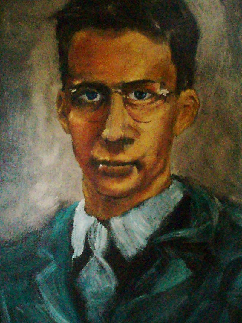
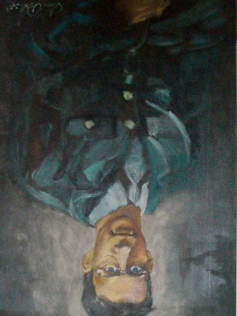
Looking at things from different angles is supposed to help (I looked at mine in a mirror and upside down), so here's some fresh perspective:
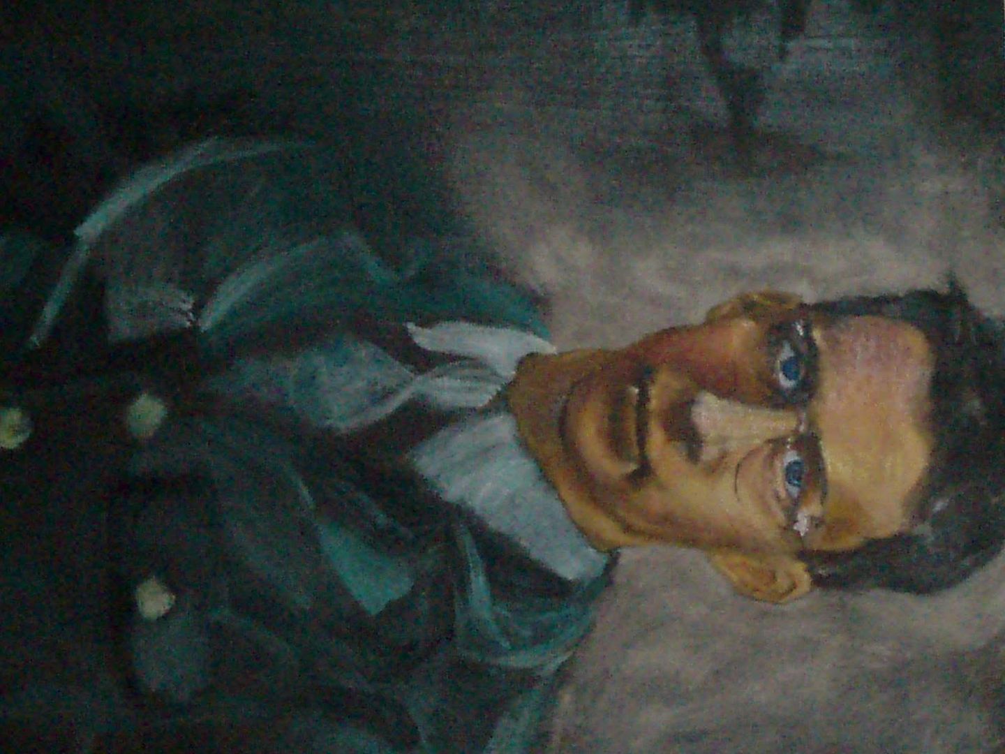
Here's the ref photo:
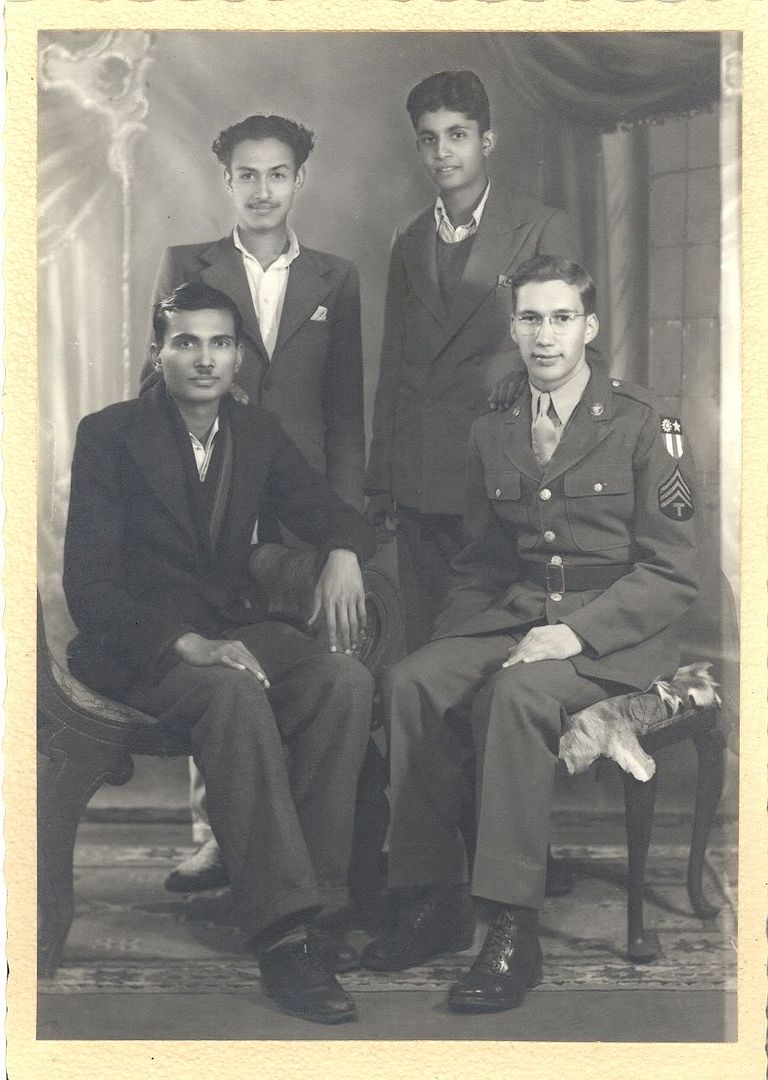
I would greatly appreciate any input, whether it be reinforcement or criticism. Especially criticism though. Thanks. |
|
| Back to top |
|
|


