| View previous topic :: View next topic |
| Author |
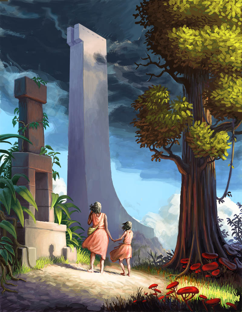
Topic : "The Third Tower" |
antweiler
junior member
Member #
Joined: 31 May 2005
Posts: 13
Location: Berlin, Germany
|
 Posted: Thu Sep 01, 2005 11:42 am Posted: Thu Sep 01, 2005 11:42 am |
 |
 |
hi,
even though i plan some tweaks to make the tower apear larger, I think its finished, i dont want dig into details. Tell me how you like it.
*click*

Last edited by antweiler on Thu Oct 20, 2005 3:27 pm; edited 1 time in total |
|
| Back to top |
|
Sampster
member
Member #
Joined: 01 Jun 2005
Posts: 182
|
| Posted: Thu Sep 01, 2005 5:59 pm |
|
|
I like how you've got the bottom part of the tower (that's in front of the figures) looking distant and grey but the pinacle has stronger contrast. I emphasizes the top well. Though I'm not sure about all the lighting, how is it that only the bottom right of the tree on the left is lit...would the top-right at least have light shining on it as well (though maybe you did that too keep the whole middle area low-contrast, I don't know).
I also like the color saturation on the bottom part of the page, it keeps the foreground distant from the background. Anyway I don't really have any more comments or crits. At any rate it's better than I could do. |
|
| Back to top |
|
antweiler
junior member
Member #
Joined: 31 May 2005
Posts: 13
Location: Berlin, Germany
|
| Posted: Sat Jun 14, 2008 8:44 am |
|
|
after such a long time i continued to work on this peace. I think i will do a little work on th clouds. Do you think there is still something missing? Thanks a lot.
 [/img] [/img] |
|
| Back to top |
|
Sampster
member
Member #
Joined: 01 Jun 2005
Posts: 182
|
| Posted: Sat Jun 14, 2008 2:46 pm |
|
|
I think the style of this rework seems much more consistent. The change from another tree to the stone is very interesting�compositionally the structure in the background seems less mysterious and more familiar because there's a smaller stone monument in the foreground. On the other hand I think in the original the green "framing" was worse for the composition, and color-wise the darker stone monument is a much better choice.
It also seems like we've been brought a little closer to the foreground; the two people are bigger, I think this is also a good choice, I feel much more drawn into the image.
Some of the edges (like the girl on the left's dress) still feel "colored in" rather than having the look of the tree�where the color was just painted on. If you were going to work on anything I'd do something with that or the scribbly parts of the clouds in the top left. Overall I really like what you did with the image though. |
|
| Back to top |
|
antweiler
junior member
Member #
Joined: 31 May 2005
Posts: 13
Location: Berlin, Germany
|
| Posted: Mon Jun 16, 2008 4:47 am |
|
|
Thanks a lot for your reply, Sampster, much appreciated!!
I fixed some minor things, obviously the clouds. I dont really understand, what you meant, but yes, i often use color mode in photoshop to recolor things. I agree, it would be cooler to have the right color with the first stroke  But i didnt touch the girls too much anymore, because i suck at characters, and im happy, they work somehow. But i didnt touch the girls too much anymore, because i suck at characters, and im happy, they work somehow.
 |
|
| Back to top |
|
|


