| View previous topic :: View next topic |
| Author |
Topic : "Oil Paintings" |
Heysoos
member
Member #
Joined: 24 Mar 2004
Posts: 294
Location: the New Mexico
|
|
| Back to top |
|
watmough
member
Member #
Joined: 22 Sep 2003
Posts: 779
Location: Rockland, ME
|
 Posted: Tue Jul 19, 2005 7:59 pm Posted: Tue Jul 19, 2005 7:59 pm |
 |
 |
I think they're great.
It seems you're resisting the urge to finish them more than necessary,hard to do.....I respect that. |
|
| Back to top |
|
Max
member
Member #
Joined: 12 Aug 2002
Posts: 3210
Location: MIND
|
| Posted: Tue Jul 19, 2005 11:40 pm |
|
|
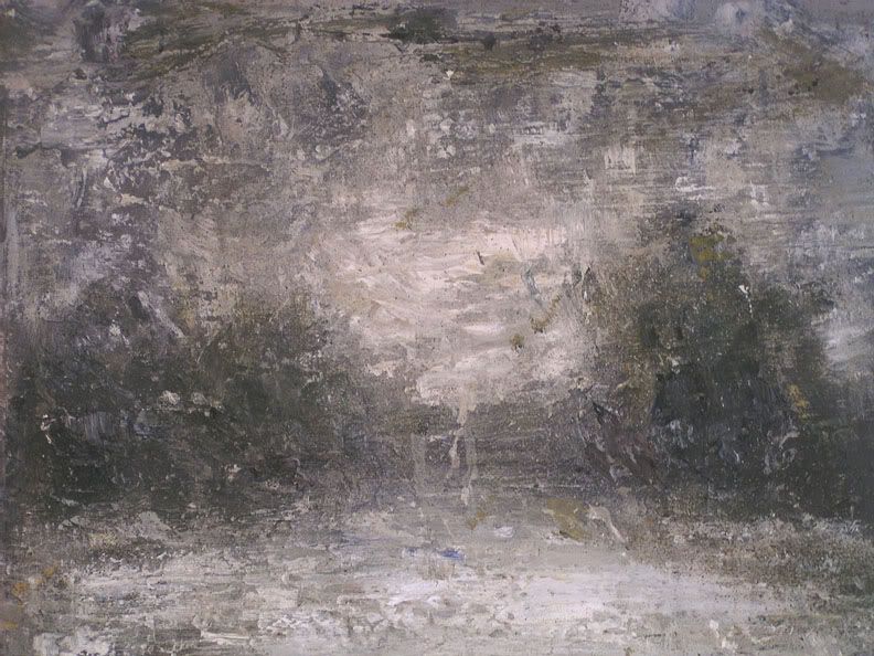
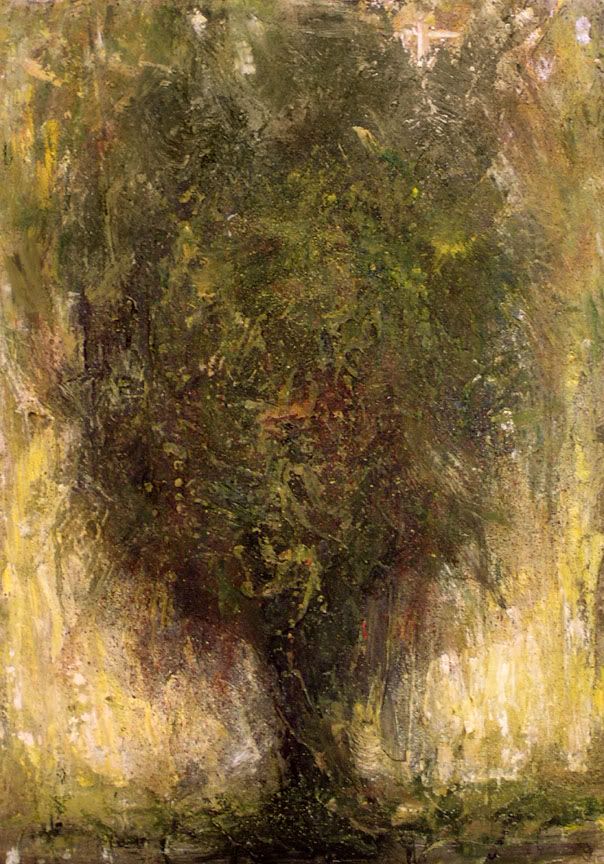
| Quite interesting! I really like the second one. First one would be a nice wall texture : ) |
|
| Back to top |
|
Matthew
member
Member #
Joined: 05 Oct 2002
Posts: 3784
Location: I am out of here for good
|
| Posted: Wed Jul 20, 2005 12:05 am |
|
|
Your work somehow resemble something between Turner and this swedish author "August Strindberg", 19th century. He picked up painting late 19th century and was very much inspired by Turner as what I have read about him.
Here's some of his paintings, pretty small so I am sorry about that:
http://www.strindbergsmuseet.se/verken/paintings/1.html
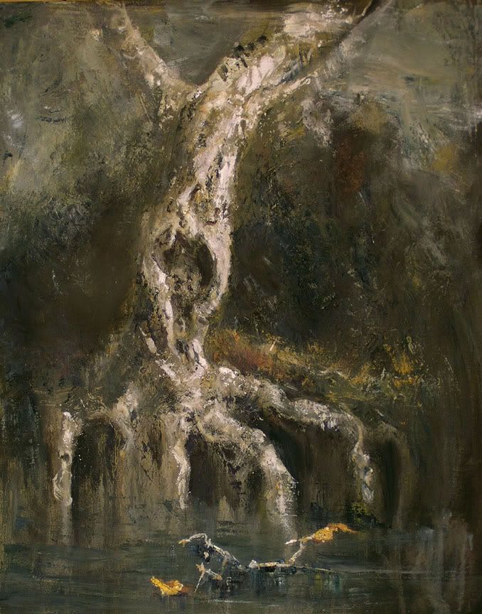
Anyway nice to see you tackle the painting different ways and I mostly prefer when you have a steady workflow as in that whitetree one.
ok I am rambling here 
keep up the good work
Matthew |
|
| Back to top |
|
Petri.J
member
Member #
Joined: 04 Dec 2003
Posts: 437
Location: Helsinki, Finland
|
| Posted: Wed Jul 20, 2005 4:57 am |
|
|
I like them.
How do you do those textures? |
|
| Back to top |
|
noxi
member
Member #
Joined: 04 Jul 2003
Posts: 281
Location: Finland
|
| Posted: Wed Jul 20, 2005 11:34 am |
|
|
have you posted your oil paintings before? Reminds me alot of one my favorite romantic painter Turner (like Matthew mentioned). The first one is great. I love the lighting and atmosphere. Second one has a bit boring composition, but it�s ok too. The last one is very interesting, the mood is very accurate. Water looks ver.... well, wet.  Great use of brush strokes and palette knife. Admireable. Great use of brush strokes and palette knife. Admireable. |
|
| Back to top |
|
Heysoos
member
Member #
Joined: 24 Mar 2004
Posts: 294
Location: the New Mexico
|
| Posted: Wed Jul 20, 2005 5:44 pm |
|
|
watmough: thanks a lot. yeah, its definitely a hard urge to resist to keep noodling
on things more than I should.
Max Kulich: Thanks man.
Matthew: Awesome, thanks for the link, I hadn't heard of that guy before. Reminds
me of your stuff too. I searched the web a bit for some more pictures of his
and found this page: http://www.zwoje-scrolls.com/zwoje41/text07p.htm
Petri.J: Thanks. For the textures I start out with thick gesso for priming the
surface which I apply by hand and play around with as it dries to create an
interesting surface to work on. while painting I do a lot of work with a putty knife,
and layers of drippy washes, scumbling, toothbrushering, and whatever other ways
of making marks I can think of. I'm working on one now where I'm using cement
for the first layer and then gessoing and painting ontop of that, good fun.
noxi: thanks a lot. I've posted oil paintings a few times before. you can check out
some more of them at my site at www.angelfire.com/art2/wfkeil (I'll make
myself a good website one of these days). And yeah, I'm a huge Turner fan 
thanks for the comments.
_________________
http://www.angelfire.com/art2/wfkeil |
|
| Back to top |
|
Petri.J
member
Member #
Joined: 04 Dec 2003
Posts: 437
Location: Helsinki, Finland
|
| Posted: Thu Jul 21, 2005 11:13 am |
|
|
| Heysoos wrote: |
Petri.J: Thanks. For the textures I start out with thick gesso for priming the
surface which I apply by hand and play around with as it dries to create an
interesting surface to work on. while painting I do a lot of work with a putty knife,
and layers of drippy washes, scumbling, toothbrushering, and whatever other ways
of making marks I can think of. I'm working on one now where I'm using cement
for the first layer and then gessoing and painting ontop of that, good fun.
|
Thanks alot. After looking at your paintings I'm very inspired of trying to do the same with acryl. Do you know any tutorials about this subject?
I think I'll get to some cheap painting course in autumn, though those teachers don't know shit when it comes to painting, but I'm student, so I don't have too much money. 
Cheers. |
|
| Back to top |
|
Heysoos
member
Member #
Joined: 24 Mar 2004
Posts: 294
Location: the New Mexico
|
| Posted: Thu Jul 21, 2005 10:22 pm |
|
|
I don't know of any tutorials, this is just some goofy little technique I figured out by experimenting and have been playing with. It kind of comes from doing woodcuts, intaglio and collagraph printmaking. with print making you learn to really pay attention to the way texture turns into marks, especially with collographs. So I like to recommend people who want to be painters to also take printmaking classes if they get a chance just because its a good learning experience and what you learn will feed into your paintings. Thats my experience with it anyway.
I don't have any of my collographs I've done with me to show, but heres an example of what one is that I found on google.
http://www.iowabiennial.org/Selections/large/pages/Depart_Large.htm
_________________
http://www.angelfire.com/art2/wfkeil |
|
| Back to top |
|
shft5
junior member
Member #
Joined: 27 Dec 2004
Posts: 15
Location: Ontario
|
| Posted: Fri Jul 22, 2005 12:16 pm |
|
|
| I absolutely love the second piece. It's so lively and expressionistic. |
|
| Back to top |
|
Naeem
member
Member #
Joined: 13 Oct 2004
Posts: 1222
Location: USA
|
| Posted: Fri Jul 22, 2005 12:31 pm |
|
|
i love them.
but the first one, i thought it was a picture of eroded concrete/stone or something. there's little contrast. perhaps it was the camera?
beautiful work. i love ur oil paintings.
_________________
http://www.annisnaeem.blogspot.com/ |
|
| Back to top |
|
Heysoos
member
Member #
Joined: 24 Mar 2004
Posts: 294
Location: the New Mexico
|
| Posted: Sat Jul 23, 2005 12:09 pm |
|
|
thanks a lot shft5 and annisahmad. yeah, I think the top two pictures are a little off from what they really look like. the top ones a bit washed out, the real thing is still kinda hazy and not really contrasty but a bit more so than it looks in that picture. I'll try to get some better pictures of them.
_________________
http://www.angelfire.com/art2/wfkeil |
|
| Back to top |
|
|