| View previous topic :: View next topic |
| Author |
Topic : "The Speedpainting Thread (IV)" |
Mikko K
member
Member #
Joined: 29 Apr 2003
Posts: 639
|
 Posted: Thu Jan 27, 2005 4:03 pm Posted: Thu Jan 27, 2005 4:03 pm |
 |
 |
Just finished "Drawing With Wrong Side of the Brain" by B.S. Hitter

good stuph fellas. |
|
| Back to top |
|
Reakshun
member
Member #
Joined: 21 Dec 2002
Posts: 302
Location: left coast
|
| Posted: Thu Jan 27, 2005 5:00 pm |
|
|

watmough: thanks for the shout.
Everybody...keep it loose. |
|
| Back to top |
|
Drunken Monkey
member
Member #
Joined: 08 Feb 2000
Posts: 1016
Location: mothership
|
| Posted: Thu Jan 27, 2005 9:42 pm |
|
|
max kulich, really good stuff from you lately...
for trans portfolio
 |
|
| Back to top |
|
Tedsuo
junior member
Member #
Joined: 20 Jan 2004
Posts: 38
Location: SF
|
| Posted: Fri Jan 28, 2005 2:03 am |
|
|
Ultrahsu, that last one's great.

-T |
|
| Back to top |
|
Arri.
junior member
Member #
Joined: 21 Jan 2005
Posts: 13
Location: bilbao
|
| Posted: Fri Jan 28, 2005 2:26 am |
|
|
Annishad> thanks for your warm welcome 
Tedsuo> Really nice "monster", looks wise and peaceful.
Here is mine,lately I'm quite lazy.

_________________
- AA. |
|
| Back to top |
|
P-Rik
member
Member #
Joined: 14 Apr 2004
Posts: 554
Location: East of France
|
| Posted: Fri Jan 28, 2005 2:42 am |
|
|

_________________
Pierrick l'Illustrateur des bois.
Website !
Last edited by P-Rik on Fri Jan 28, 2005 4:03 am; edited 1 time in total |
|
| Back to top |
|
P-Rik
member
Member #
Joined: 14 Apr 2004
Posts: 554
Location: East of France
|
| Posted: Fri Jan 28, 2005 4:03 am |
|
|
New one ...
Thats strange... Sometimes, i really feel inspired, i feel productive and iam ok with my SP ... and sometimes, i spend hours and hours on a sp and it really sucks!! Is it the same for you guys ??

_________________
Pierrick l'Illustrateur des bois.
Website ! |
|
| Back to top |
|
Speaky
junior member
Member #
Joined: 20 Jul 2003
Posts: 30
Location: Ireland
|
| Posted: Fri Jan 28, 2005 8:13 am |
|
|
Lovely pics, you lot!
Here's one I made. I find I often have a problem getting the levels / values right. I start off and seem to have it under control, but I end up with too even a spread which leads to an image which is quite 'flat' looking. If I don't give up there and then, I'll try to adjust levels and curves in Photoshop to try and get it right, but this only seems to work sometimes. I know this is too dark, but there's a blinding sun just behind the figure and so I imagine the rest of the pic needs to be very dark in order for the sun to be blinding.
Any tips or advice on how to deal with value and contrast? I'd appreciate it because I feel it's because I'm just not 'getting' some fundamental aspect here.
 |
|
| Back to top |
|
Speaky
junior member
Member #
Joined: 20 Jul 2003
Posts: 30
Location: Ireland
|
| Posted: Fri Jan 28, 2005 1:32 pm |
|
|
At the risk of appearing eager, here's another pic. A bit of abstract SF, with an explosion, can't go too far wrong with the subject matter. This one turned out a bit better than my last, but to my eyes it's still lacking the vivid 'pop' that I'm after.
 |
|
| Back to top |
|
Mitsui
member
Member #
Joined: 06 Aug 2002
Posts: 642
Location: Hamburg/Germany
|
| Posted: Fri Jan 28, 2005 2:10 pm |
|
|
thnx seth, noxi, annisahmad
annisahmad love to seee you improving so fast!
XIA I did at least one little speedy today! 
 |
|
| Back to top |
|
Speaky
junior member
Member #
Joined: 20 Jul 2003
Posts: 30
Location: Ireland
|
| Posted: Fri Jan 28, 2005 2:41 pm |
|
|
Mitsui, I like it, good use of texture, especially like the snow and bark on the tree.
One last speedy before calling it a day. Took about 15 mins in Photoshop. Started with a blank canvas, a gradient and just swabbed and dabbed the brush round until something emerged. Quite pleased with it!
 |
|
| Back to top |
|
buzzz3d
member
Member #
Joined: 10 Mar 2004
Posts: 134
|
| Posted: Fri Jan 28, 2005 3:21 pm |
|
|

Last couple of pages have been great. |
|
| Back to top |
|
dylancole
junior member
Member #
Joined: 29 Apr 2003
Posts: 24
Location: Los Angeles
|
| Posted: Fri Jan 28, 2005 3:49 pm |
|
|
Been awhile-
Here is a recent sketch-

_________________
Dylan
www.dylancolestudio.com |
|
| Back to top |
|
zhalimuto
member
Member #
Joined: 25 Nov 2003
Posts: 72
Location: Vancouver
|
| Posted: Fri Jan 28, 2005 10:23 pm |
|
|
Havent come here for a while, glad to see everybody is still here and doing well. 
 |
|
| Back to top |
|
Tedsuo
junior member
Member #
Joined: 20 Jan 2004
Posts: 38
Location: SF
|
| Posted: Sat Jan 29, 2005 12:11 am |
|
|
Hey Speaky,
Good stuff, especially for how fast you're going! You asked about value and contrast, and how to get things to "pop." I'm far from the most qualified on the board in that area, but a good rule of thumb would be to make sure you have a definite focal point for the image. All of your values and color relations, as well as lines of action, should be thought of in terms of how they relate to their importance in the image. For example, in your second image, the explosion is obviously the main point of interest. But the sharpest value contrast in the image is actually the rim light on the underside of the same structure. I feel this might be why the painting feels flat. That strong rim light also acts as a line of action that actually swerves to avoid any of the other points of interest in the painting, including the focal point.
With those ideas in mind, I did this quick overpaint:
http://tedsuo.com/art/skribbles/Paint_Over/explosionnode8_overpaint.jpg
It's not the bee's knees, but I tried toning down the contrast on the rim light, and added an element to push a line of action from top left to bottom right, which hits all the points of interest. The line was already there in the bottom right, I just continued it with the spaceship. Maybe it helped?
Hope that was the kind of respone you were looking for! I've been thinking about this stuff alot lately, so if anyone wants to add or punch holes in my logic, please feel free.
EDIT: I just realized that by adding a spaceship, it would naturally become the focal point (esp where it's sitting in the painting). But because the explosion is now the highest contrast in both value and color, and not the spaceship, it still feels kind of weak. Argh!!!
-T |
|
| Back to top |
|
artvandeley
junior member
Member #
Joined: 02 Jul 2004
Posts: 11
Location: Cologne
|
| Posted: Sat Jan 29, 2005 1:37 am |
|
|
What the...? Been away for only 3 days and there are already 2 entirely new pages? ...hmpf..scary,....you guys are killing me.
gizmodus: Thank you. I like your last one too, escpacially the composition.
Duracel: You really catched the moment in this one
Ultrashu: Yezzz, finally someone who knows the origin of my nic. I always have a hard time to explain it when s.o here asks me about it. In Germany that is.
Er...about your comment: thank you, i feel honoured.
Yours is great. As always. I like the softness in your pics.
Mon: WOW! Simply WOW!
watmough:Last 3 ones: Love �m!
P-Rik: Your last two ones are looking very inspired and fresh. Good job!
dylancole: man, that�s perfect. Damn...
Tedsuo: I totally agree with you. You pointed out some very interesting ideas.
speaky: About the values:I think your main misunderstanding is that a picture has got to be "realistic". O.K. whatever that means. In the 2nd one you figured out what the light will look like just fine and maybe a real picture taken by a little digicam would look like this. But this is not about being realistic it�s about being interesting. Therefore you can "bend" so to speak reality a little bit here and there in order to get an interesting picture.
For example you can lighten ( is that the proper word?..hum) the background to put some more emphasis on his shape. Or establish an extreemly unrealistic bouncelight on his face for the sake of the narrative aspect. Like i did on this OP.
Hope you don�t mind this lame attempt.

Hum, brings me to point that i shouldn�t tweak values that often.
Roundbrush "unplugged"
 |
|
| Back to top |
|
Mikko K
member
Member #
Joined: 29 Apr 2003
Posts: 639
|
| Posted: Sat Jan 29, 2005 3:57 am |
|
|
Probably the first time ever I got two werks on a same page, you're slowing down guyz 
annisahmad, thanx!
 |
|
| Back to top |
|
Naeem
member
Member #
Joined: 13 Oct 2004
Posts: 1222
Location: USA
|
| Posted: Sat Jan 29, 2005 6:41 am |
|
|
no problem Mikko. keep it up .
Dylancole> beautiful concept. i keep thinking thats a reflection there but then the bottom half doesnt look like the top half . anyway, great work!
mitsui> thanks i appreciate it. same goes for u; really like that last one of urs .
speaky> i really dig that one of urs .
u guys are all a great inspiration.
something i did last night; would have submjitted it then but sijun wasn't working...
anyway, 27 minute concept. + i used one of mitsui's brushes for the foreground .

Last edited by Naeem on Sat Jan 29, 2005 6:42 am; edited 1 time in total |
|
| Back to top |
|
spooge demon
member
Member #
Joined: 15 Nov 1999
Posts: 1475
Location: Haiku, HI, USA
|
| Posted: Sat Jan 29, 2005 6:42 am |
|
|
did these fast in front of audience (ulp)
you can feel the audience attention wandering, I have always said an illustrator was an entertainer, and I guess this was pretty literal.
"So, when does the magic happen, Mr. Mullins?"
"Is THAT done?"

 |
|
| Back to top |
|
The Real Mark
member
Member #
Joined: 13 Dec 2003
Posts: 322
Location: Brisbane Australia
|
| Posted: Sat Jan 29, 2005 7:44 am |
|
|
haha, doesn't sound like much of an audience, i'd probably be on the seat of my chair
Those are nice though. I can get a good feel on how you made them. |
|
| Back to top |
|
remic20
junior member
Member #
Joined: 20 Jun 2004
Posts: 29
|
| Posted: Sat Jan 29, 2005 8:32 am |
|
|
still life of mary
just quick 1 hour wacom sketch
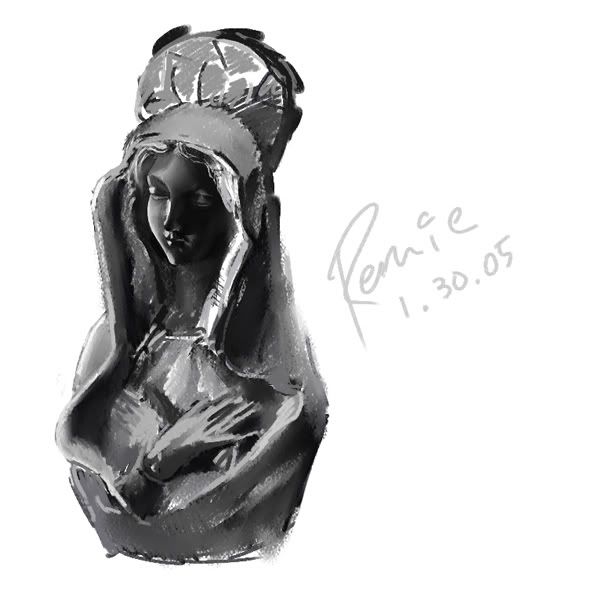 http://img.photobucket.com/albums/v634/remic20/mary.jpg http://img.photobucket.com/albums/v634/remic20/mary.jpg |
|
| Back to top |
|
remic20
junior member
Member #
Joined: 20 Jun 2004
Posts: 29
|
| Posted: Sat Jan 29, 2005 9:08 am |
|
|
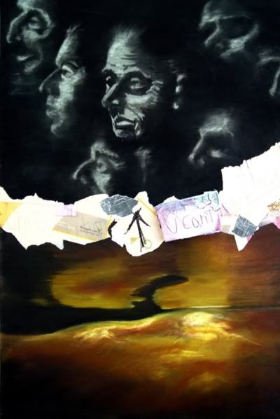
old work..mixed media (charcoal, soft pastel, papers etc)
never got to finish it, since its in a different country:?
 |
|
| Back to top |
|
Naeem
member
Member #
Joined: 13 Oct 2004
Posts: 1222
Location: USA
|
| Posted: Sat Jan 29, 2005 10:03 am |
|
|
sorry to hear that spooge. i'd have fallen off my site in excitement .
25 minute concept... i dont like how this came out...
 |
|
| Back to top |
|
Naeem
member
Member #
Joined: 13 Oct 2004
Posts: 1222
Location: USA
|
| Posted: Sat Jan 29, 2005 11:22 am |
|
|
making a 'piece' which will be a collaboration with my friend...
here's a 1hr 22 min concept of it so far...
 |
|
| Back to top |
|
Levan
junior member
Member #
Joined: 06 Jul 2004
Posts: 39
|
| Posted: Sat Jan 29, 2005 2:12 pm |
|
|
spooge: as usual - great speed
 |
|
| Back to top |
|
Affected
member
Member #
Joined: 22 Oct 1999
Posts: 1854
Location: Helsinki, Finland
|
| Posted: Sat Jan 29, 2005 3:05 pm |
|
|
45 min. or so gouache. I have no idea what I'm doing with this medium.
Used a photo I took on the way to school as reference.
 |
|
| Back to top |
|
Speaky
junior member
Member #
Joined: 20 Jul 2003
Posts: 30
Location: Ireland
|
| Posted: Sat Jan 29, 2005 3:29 pm |
|
|
Tedsuo: Hey, overpaint much appreciated! I agree that a strong focal point is very necessary in order to make it read properly, and you've given it some real point of reference, i.e. a spaceship or missile. That strong rim light was one of the last things I added to it because I felt the form needed a counterbalance to the explosion. I was relying on a colour contrast rather than a value contrast to focus the eye where I wanted it.
The kind of flatness which bothers me is something inherent in the way I treat value, spreading the values too evenly over the range, rather than bunching it into lights and darks and working subtly within. Not sure if I'm being cryptic here!
Artvandeley: Thanks for taking the time to overpaint it, you've managed to salvage something worthwhile from it! I do know what you mean about realism, but I think the answer for me would have been to anticipate the problems here earlier on and come up with a solution that seemed believable, rather than try and bend reality to fix it. That's purely my preference, mind, there are so many approaches to SF / concept art but what really gets my juices flowing are images which have a filmic feel to them, a knowledge of exposure, a convincing colour palette and so forth. I'm trying to learn it!
Anyway, tonight's image. One hour in Photoshop:
 |
|
| Back to top |
|
jfb
member
Member #
Joined: 17 Feb 2004
Posts: 94
Location: Paris
|
| Posted: Sat Jan 29, 2005 4:52 pm |
|
|
Great work as always, a lot of inspiration for me. This thread will never dye.

 |
|
| Back to top |
|
lucabrasi
junior member
Member #
Joined: 18 Jun 2004
Posts: 39
|
| Posted: Sat Jan 29, 2005 5:25 pm |
|
|
not an original but a Craig Mullins copy.I saw this pic on a slurpy cup some guy at work had and i did a search online and came across the image.Excuse the sloppyness but i havent gotten my tablet yet.
 |
|
| Back to top |
|
Naeem
member
Member #
Joined: 13 Oct 2004
Posts: 1222
Location: USA
|
| Posted: Sat Jan 29, 2005 6:09 pm |
|
|
good work guys.
another concept for the day. im getting uninspired from my own paintings  . they suck so bad it brings me to tears... . they suck so bad it brings me to tears...
 |
|
| Back to top |
|
|


