| View previous topic :: View next topic |
| Author |
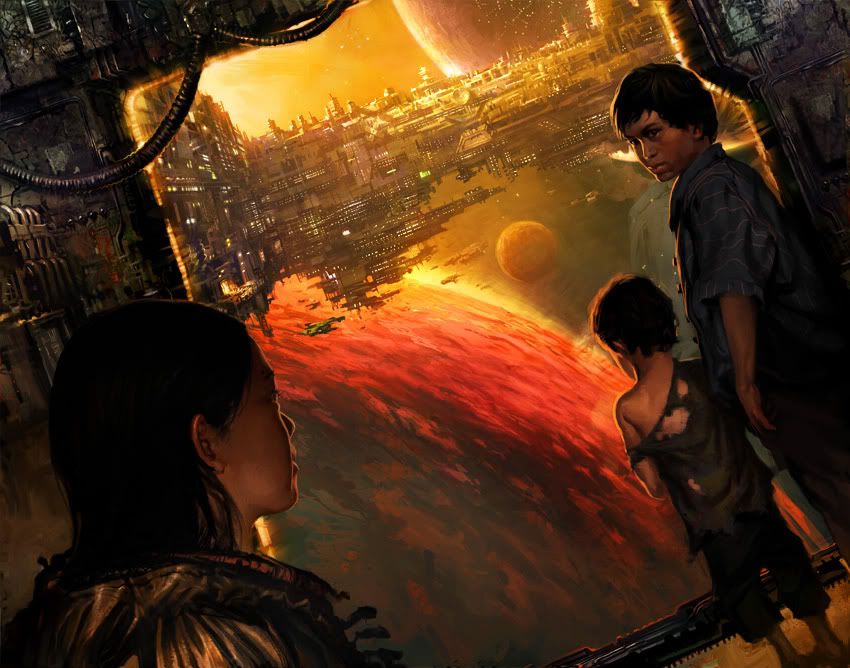
Topic : "Colony Urchins *finaler 2/1" |
Cicinimo
member
Member #
Joined: 03 Mar 2001
Posts: 705
Location: Seattle
|
 Posted: Fri Jan 14, 2005 12:30 am Posted: Fri Jan 14, 2005 12:30 am |
 |
 |

WHEW. All time longest painting. I put more planning/effort/thought into this one than I ever have. I really hope it shows.
This is for the CGTalk Space Opera Challenge. While this is close to final, I'd still love to improve it however I can, so feel free to offer critiques or paintovers.
_________________
artpad.org
Last edited by Cicinimo on Tue Feb 01, 2005 7:23 pm; edited 2 times in total |
|
| Back to top |
|
Sumaleth
Administrator
Member #
Joined: 30 Oct 1999
Posts: 2898
Location: Australia
|
| Posted: Fri Jan 14, 2005 2:03 am |
|
|
First thing: really nice painting.
Crits?
The foreground head is a focal point but it's the least-effective part of the image. He pulls down an otherwise very appealing image.
The smallest kid looks a little out of proportion?
The background feels a bit squewy. For example, the pilar at right of the image doesn't look to be at 90-degrees to the background. Other things that add to this squewy feeling are the implied floor (perhaps a result of the closest character being positioned so low), parts of the background structure to the left, the left pilar, and the beam along the floor. You need to bring it all into solid angles.
The kid on the right is fantastic, and I like what's going on in the distance.
_________________
Art Links Archive -- Artists and Tutorials |
|
| Back to top |
|
daZork
junior member
Member #
Joined: 24 Aug 2004
Posts: 46
Location: Sweden
|
| Posted: Fri Jan 14, 2005 2:19 am |
|
|
I can really feel the effort... 
I agree with Sumaleth about the big head though. It spoils the picture. But I don't agree about the angles. (edit** I looked at it closer and I agree now  ) )
And the little boy may be a little out of propotion but thats just cute. However... I cant see his feets clearly. Did you forget to make that layer visible or what?
_________________
Some people are bad. That is because many people are better. |
|
| Back to top |
|
Mikko K
member
Member #
Joined: 29 Apr 2003
Posts: 639
|
| Posted: Fri Jan 14, 2005 2:46 am |
|
|
This is by far the coolest entry for the Space Opera thing I've seen. It beats the crap out of all the silicone Cgtalk-characters, haha (you know the generic "I spent 28 days hilighting this chicks hair kinda stuff")
The mood is just great. Your effort shows. I don't think that the minor distortions in background that sumaleth mentioned really matter, but I kinda agree that the foreground head is the weakest part, though my attention is constantly pulled to the guy at the right. His arm seems a little too short. It could be just me, but that's honestly about the only thing that looked "wrong" at the first glance.
That's nitpicking really, and I think it's just awesome already. Hope you do well in the contest, keep up the great work! 
edit: Sheesh, some great stuff on your site as well. And not just the digital, I like the drawings. |
|
| Back to top |
|
Freddio
Administrator
Member #
Joined: 29 Dec 1999
Posts: 2078
Location: Australia
|
| Posted: Fri Jan 14, 2005 4:30 am |
|
|
Yea, Fantastic work cicinimo,
a nice atmosphere you have going there.
Samuleth says some interesting things.
Good luck with this pic.
_________________
Design portfolio |
|
| Back to top |
|
Capt. Fred
member
Member #
Joined: 21 Dec 2002
Posts: 1425
Location: South England
|
| Posted: Fri Jan 14, 2005 4:32 am |
|
|
really nice!
-edit
Although I could never produce what you have done, i thought since you asked for criticisms or paint-overs, I'd add my criticisms.
I think there's not enough separation/contrast between the foreground 'on a space ship' bit, and the background 'deep-space' bit. Similar detail level, colour palette etc, and similar light. I think the difference could be accentuated, even more than I have done. And i can't quite figure out the lighting situation in the background.
here's a paintover to show you what I mean. it's a little cheesier looking than yours, and without the subtlety, but i was trying to have a clear difference in lighting in foreground and background to separate them. because i felt yours was verging on being a little too uniform

fantastic work, appologies for being impertinent!
Last edited by Capt. Fred on Fri Jan 14, 2005 6:40 am; edited 2 times in total |
|
| Back to top |
|
gLitterbug
member
Member #
Joined: 13 Feb 2001
Posts: 1340
Location: Austria
|
| Posted: Fri Jan 14, 2005 4:43 am |
|
|
Hey Cicinimo!
Great stuff you got there, good luck with it in the contest.
I agree with Suma�s crits and I think the feet of the boy have too soft edges, they look more like shadows than the actual feet themselves. |
|
| Back to top |
|
see
member
Member #
Joined: 04 Aug 2001
Posts: 481
Location: Austria
|
| Posted: Fri Jan 14, 2005 7:30 am |
|
|
i luv it 
here is a little something
 |
|
| Back to top |
|
Cicinimo
member
Member #
Joined: 03 Mar 2001
Posts: 705
Location: Seattle
|
| Posted: Sat Jan 15, 2005 12:40 am |
|
|
Really appreciate the feedback guys. I've made changes based on what I got:

Still totally open to your overpaints and critiques. that last set was very very helpful.
Sum: I took a shot of my girlfriend and painter her overtop to boy, because I agree the boy was pretty weak. Hopefully she's fills the space in a better way. I also tweaked the window edge.
daZork: thanks!
Mikko: appreciate it! I was looking to make something a little different from the insane huge crazy busy space fights everybody else was doing. I wanted alot of drama but no action, and I wanted the punch of an epic scope juxtoposed with something intimate in feel.
Freddio: Thanks man! What are you up to these days?
Fred: You're always so humble. Your paintover is AWESOME and I really appreciate it. It helped me hugely for this last step. I was temped to break down and use your blue lighting everywhere, but I resisted. I definately yanked your beautiful work on my background.
glitter: thanks bug!
see: with my newest version I played up the light in teh background and took down the contrast/brightness of the foreground, alot like your overpaint. Appreciate it!
_________________
artpad.org |
|
| Back to top |
|
Sumaleth
Administrator
Member #
Joined: 30 Oct 1999
Posts: 2898
Location: Australia
|
| Posted: Sat Jan 15, 2005 2:13 am |
|
|
That works great.
The angles still seem inconsistent to me, but I'm beginning to wonder if that works in its favor a bit. It opens up the image a little.
_________________
Art Links Archive -- Artists and Tutorials |
|
| Back to top |
|
oDD
member
Member #
Joined: 07 May 2002
Posts: 1000
Location: Wroclaw Poland
|
| Posted: Sat Jan 15, 2005 2:30 am |
|
|
incredible. After seeing this i'm not angry anmore at myself for not taking part in the challange 
the only thing i don't like is the reflection in the window of the people on the right. They don't look right. So either make them look as they supossed to look (i don;t know how) or ger rid of them.
_________________
portfolio | art blog |
|
| Back to top |
|
Mikko K
member
Member #
Joined: 29 Apr 2003
Posts: 639
|
| Posted: Sat Jan 15, 2005 4:42 am |
|
|
Getting even better!
I just wanted to say that I like it more now when the girl is not looking out of the picture but at the boy instead. It creates more tension.
Just excellent! |
|
| Back to top |
|
see
member
Member #
Joined: 04 Aug 2001
Posts: 481
Location: Austria
|
| Posted: Sat Jan 15, 2005 7:57 am |
|
|
| Much better yes cicinimo.! I agree with Mikko K. Good luck for the big competition. |
|
| Back to top |
|
-Tepox-
member
Member #
Joined: 25 Mar 2001
Posts: 352
Location: Finland
|
| Posted: Sun Jan 23, 2005 2:06 pm |
|
|
| I still like it! This is definately one of my favourite entries. See & Capt.Fred gave good suggestions for the painting, what I do remember your progress version of this. I hope you get good placement in the contest |
|
| Back to top |
|
Odds
member
Member #
Joined: 17 Sep 2004
Posts: 374
|
| Posted: Sun Jan 23, 2005 3:48 pm |
|
|
Awesome stuff, but I think it's a little too light... It kind of looks like there is a layer of gray over the whole picture at a low opacity. Anyways, I fixed that:
 |
|
| Back to top |
|
swampbug
member
Member #
Joined: 18 May 2000
Posts: 401
Location: il
|
| Posted: Sun Jan 23, 2005 6:35 pm |
|
|
wow!.. what a powerful piece.
BEst things about it..
The tilt of the camera..
Lighting!
reflections on the window.
The look on the boy/mans face, has such an unsure look like "we arent gona make it are we?"
All that insane detail out there!
_________________
Swampbugs Boogie Base 3.0 |
|
| Back to top |
|
Ian Jones
member
Member #
Joined: 01 Oct 2001
Posts: 1114
Location: Brisbane, QLD, Australia.
|
| Posted: Sun Jan 23, 2005 8:31 pm |
|
|
| One of my favourites in the contest... I haven't voted yet, but I'll certainly be hitting the vote button for this. Composition, colours and atmosphere is defintely grand. Nice work. |
|
| Back to top |
|
xzacto
member
Member #
Joined: 20 Oct 2003
Posts: 91
Location: Rochester, New York (farmington)
|
| Posted: Sun Jan 23, 2005 11:48 pm |
|
|
Uh yeah, man, amazing artwork you have there.
Tommy (Swampbug), good to see you are still on here! (it's Matt from BG)
i will message you sometime if I see you on.
DAMMIT MAN! GET SWAMPBUG.NET BACK UP! I keep looking, and you are disappointing me Mr. Stanton.... *shaking finger*
Cicinimo -- keep painting, you are a huge inspiration.
_________________
 |
|
| Back to top |
|
Cicinimo
member
Member #
Joined: 03 Mar 2001
Posts: 705
Location: Seattle
|
| Posted: Tue Feb 01, 2005 7:15 pm |
|
|
Here is a highish res shot of the final I turned in for the competition. I dont mind more critiques, but this is probably how the image will stay (so so sick of it).
e
Sumaleth: I tweaked the angles for a while, and nothing really looked right. I kinda doubt they're correct now, but i hope it doesnt hurt the image to much.
odd: aw, the reflection was one of my favorite parts  . I think it was just an idea i really wanted to use once it was suggested. It probably doesnt help much, but I kept them as an indulgence . I think it was just an idea i really wanted to use once it was suggested. It probably doesnt help much, but I kept them as an indulgence 
Mikko: Thanks! I thing having the two look at each other really helped too.
see: Thanks!
Tepox: Capt Fred definately had some good ideas. I used what I could. Thanks.
Odds: The image isnt showing up for me! I'd really like to see what you did though.
swampbuggy: thankyou! I put alot of planning into this one and I'm glad a few of my ideas made it through the process.
Ian Jones: Appreciate it!
xzacto: thankee
_________________
artpad.org |
|
| Back to top |
|
Affected
member
Member #
Joined: 22 Oct 1999
Posts: 1854
Location: Helsinki, Finland
|
| Posted: Tue Feb 01, 2005 11:34 pm |
|
|
| About the reflection odd mentioned: it's out of perspective, that's why it looks off. The horizon here is quite high, but for the reflections it's low. |
|
| Back to top |
|
Cicinimo
member
Member #
Joined: 03 Mar 2001
Posts: 705
Location: Seattle
|
| Posted: Wed Feb 02, 2005 8:25 am |
|
|
| Affected wrote: |
| About the reflection odd mentioned: it's out of perspective, that's why it looks off. The horizon here is quite high, but for the reflections it's low. |
How do you calculate this stuff? I'm not at all sayign you're wrong, just that I don't understand how this works. I just eyeballed the placement of the reflections, because I have no knowledge of how they work in perspective.
_________________
artpad.org |
|
| Back to top |
|
faeklone
member
Member #
Joined: 03 Apr 2002
Posts: 215
Location: Calgary
|
| Posted: Wed Feb 02, 2005 10:54 pm |
|
|
figure out where you are as the viewer in relation to the people and the glass. The reflextion will be like seeing the image of the person outside the glass, bout the distance they are away from the glass on the other side. IE make the reflection a bit smaller than they are actually, and make them on the same plane as the figures are. Just image them floating out in space, except not blue from lack of oxygen.
_________________
"It's not the tools you use but how you use them that counts." |
|
| Back to top |
|
ten
member
Member #
Joined: 30 Dec 2003
Posts: 76
|
| Posted: Thu Feb 03, 2005 10:05 am |
|
|
thx
Last edited by ten on Wed Sep 07, 2005 10:16 am; edited 1 time in total |
|
| Back to top |
|
Affected
member
Member #
Joined: 22 Oct 1999
Posts: 1854
Location: Helsinki, Finland
|
| Posted: Thu Feb 03, 2005 10:31 am |
|
|
if you draw a line from the top of your character's head to the vanishing point (the one that gives you lines perpendicular to the reflective surface) it should pass through the top of the reflected head. Likewise for all other features.
(Please correct me if I'm wrong here, anyone, but that's how I figure it should work) |
|
| Back to top |
|
Sumaleth
Administrator
Member #
Joined: 30 Oct 1999
Posts: 2898
Location: Australia
|
|
| Back to top |
|
Cicinimo
member
Member #
Joined: 03 Mar 2001
Posts: 705
Location: Seattle
|
|
| Back to top |
|
|


