| View previous topic :: View next topic |
| Author |
Topic : "Mortal Trappings" |
Oxideyes
junior member
Member #
Joined: 11 Sep 2004
Posts: 21
|
 Posted: Mon Dec 27, 2004 5:39 pm Posted: Mon Dec 27, 2004 5:39 pm |
 |
 |
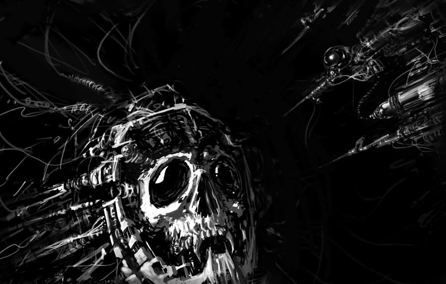
This started out as an 80's style hardcore albumn cover art. It has evolved so far to this, I'm not sure when I'll call it finished, as I keep messing with it.
_________________
not "smallpox" I said "small box" |
|
| Back to top |
|
Oxideyes
junior member
Member #
Joined: 11 Sep 2004
Posts: 21
|
| Posted: Tue Dec 28, 2004 12:47 am |
|
|
I blew out the mids and will probobly leave it at this.... I included the original just in case anyone wants to see the madness of overworking I tend to Wacom into my work lately.
This is the latest:
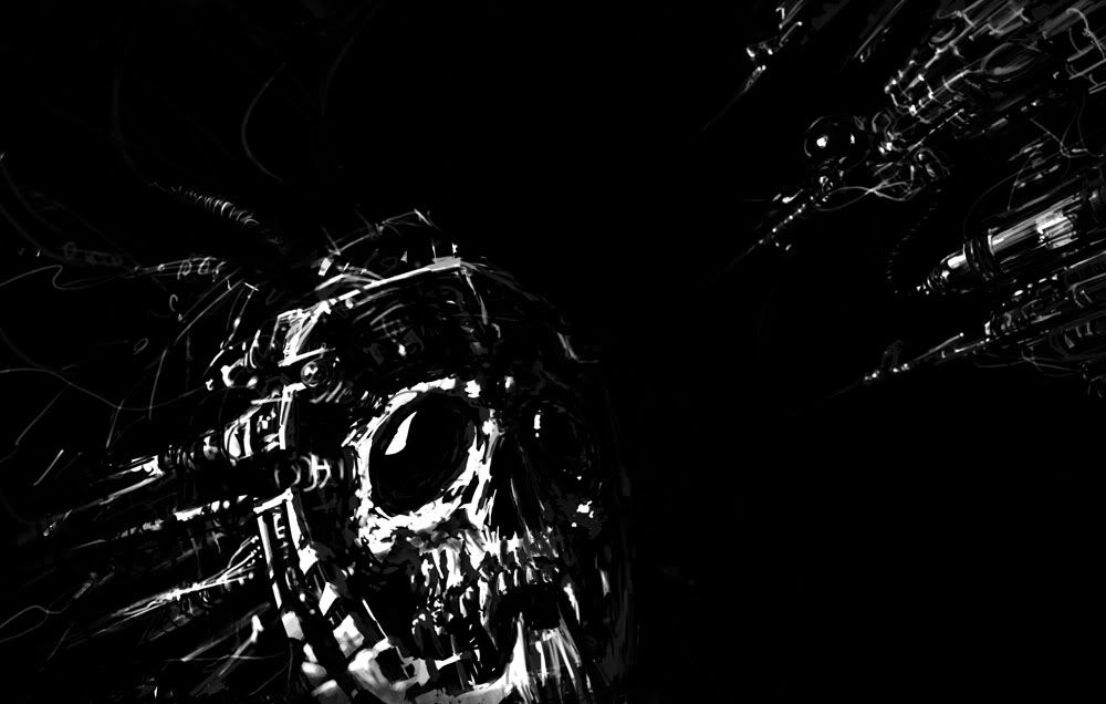
This is the original:
_________________
not "smallpox" I said "small box" |
|
| Back to top |
|
matter
member
Member #
Joined: 10 Aug 2004
Posts: 82
Location: ny
|
| Posted: Wed Dec 29, 2004 12:57 pm |
|
|
looks sweet, i really like it... strange subject matter, but well-handled the way you've kept it loose.. you can see all the stages it's gone through at once.. i think one suggestion would be to add a few hints of some dramatic color in the darker values of the syringes and mask? to visually connect them, and also to add a little more mood into the piece..
-matt
_________________
Sorry! for any digressive, pompous, or just plain off-topic rants. |
|
| Back to top |
|
Wagner
member
Member #
Joined: 11 Feb 2004
Posts: 134
Location: United States
|
| Posted: Wed Dec 29, 2004 6:00 pm |
|
|
I think the value contrasts too much. I'd like the values to be more like in the upper right hand corner.
Looks cool though!
_________________
I just realised that my screen name is Wagner, but my last name is Wagner, I'm not making any references to anyone. |
|
| Back to top |
|
Niten
junior member
Member #
Joined: 25 Jan 2005
Posts: 5
Location: Helsinki, Finland
|
| Posted: Fri Feb 04, 2005 2:34 pm |
|
|
| I think the first one is really cool. Reminds me about the Space marine concepts from the Warhammer 40,000. But something is really missing... I think you should add some more lights and shadows. Background could help.. |
|
| Back to top |
|
|


