| View previous topic :: View next topic |
| Author |
Topic : "Wip illustration - Cave dragons" |
Wojtala
junior member
Member #
Joined: 23 Oct 2004
Posts: 30
Location: Warsaw, Poland
|
 Posted: Sat Nov 13, 2004 1:44 pm Posted: Sat Nov 13, 2004 1:44 pm |
 |
 |
Hello,
Here is a sketch for my illustration, depicting some cave dragons (no wings) by the entrance to their cave. I have some problem with the composition - I dont like it - I think its too static  ... and I just cant get it right. Maybe I should paint them more from below? ... and I just cant get it right. Maybe I should paint them more from below?
I would appreciate all kind of comments - especially on the composition...
Thanks

_________________
Maciej Wojtala | wojtala.com |
|
| Back to top |
|
Mega Muffin
member
Member #
Joined: 07 Oct 2003
Posts: 235
|
| Posted: Sun Nov 14, 2004 9:54 am |
|
|
| I bet if you added more to the top, and created a focal point out of something up there, maybe whatever the dragon is roaring at. Like a flock of birds or something? That way you could spread it out wherever you needed. Also, that lower right dragon looks off to me. The lower part of his jaw looks outta whack. I really love the head of the main dragon. It's really fierce, although now that I look at it more he kinda looks like he's smiling. Perhaps if you took the bit of skin between the upper and lower jaws, where it makes a little crease (hope I described it good enough) and made the corner go down intstead of come up, it would fix it. I dont' know though. |
|
| Back to top |
|
Wojtala
junior member
Member #
Joined: 23 Oct 2004
Posts: 30
Location: Warsaw, Poland
|
| Posted: Sun Nov 14, 2004 1:05 pm |
|
|
Thanks for the comment - I will be adding changes soon. You are right - dragon smiles a little and it needs to be changed 
And below is earlier stage of the illustration - composition was wide with monk with 2 blades. Even earlier the monk was a dragon tamer, and then changed to killer with 2 blades and finally...he was erased.

_________________
Maciej Wojtala | wojtala.com |
|
| Back to top |
|
Wojtala
junior member
Member #
Joined: 23 Oct 2004
Posts: 30
Location: Warsaw, Poland
|
| Posted: Mon Nov 15, 2004 2:51 pm |
|
|
Thank You for the comments. Here goes an update.
It needed a breath desparetly - I cleared and silenced the background... now I have to focus more on dragons....
Im not sure if the legs position is ok ?

_________________
Maciej Wojtala | wojtala.com |
|
| Back to top |
|
Mega Muffin
member
Member #
Joined: 07 Oct 2003
Posts: 235
|
| Posted: Tue Nov 16, 2004 12:27 pm |
|
|
| the dragon's left arm might be a bit off. Right now the forearm looks really long compared to the bicep. If it's coming toward us then you should bring the hand up quite a bit, and if not than angle the hand differently. The uppper arm also looks too short in general, or maybe not... I'm not too sure about that one. I really like the new arrangement with the littler dragons coming out from under the bigger one. Awsome movement. Looks like a swarm of dragons is about to attack or something. I also like how you darkened the background around the dragon's head. Brings alot more focus to it. |
|
| Back to top |
|
Oxideyes
junior member
Member #
Joined: 11 Sep 2004
Posts: 21
|
| Posted: Fri Nov 19, 2004 9:35 pm |
|
|

I love the colors and mood but the perspective could use some attention I think. Perspective lines in a face follow the same rules as a building or anything else. For instance, the big drangon's mouth corners and brow line up to point away from the lines the rest of the face are setting up. (all lines would actually converge to a common point but because they are so close together and the point of view is relatively distant; the lines will look mostly parallel)
The lower left dragon's neck leads the viewer to beleive the head will point a certain direction but the jaw defies this.
The lower right dragon seems cool except for the lower jaw which points to a different position than the rest of its face..
Anyway good start on the rest I can't wait to see it finished.
_________________
not "smallpox" I said "small box" |
|
| Back to top |
|
Wojtala
junior member
Member #
Joined: 23 Oct 2004
Posts: 30
Location: Warsaw, Poland
|
| Posted: Sat Nov 20, 2004 4:32 pm |
|
|
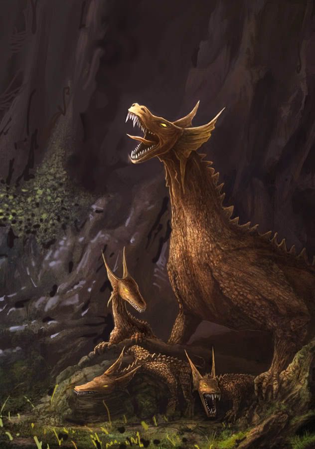
Here is another Cave Dragons update. I tried to give the some weight and dinosaur feeling...
Thanks for the comments Mega Muffin and Oxideyes

_________________
Maciej Wojtala | wojtala.com |
|
| Back to top |
|
Mega Muffin
member
Member #
Joined: 07 Oct 2003
Posts: 235
|
| Posted: Sun Nov 21, 2004 9:23 am |
|
|
| Definatly has more weight and dinosaur feeling. The only thing that bothers me is how the scales on his arm come down without changing size to fit his arm. It almost looks like the scales are draped on him rather than clinging to him. |
|
| Back to top |
|
Wojtala
junior member
Member #
Joined: 23 Oct 2004
Posts: 30
Location: Warsaw, Poland
|
| Posted: Wed Nov 24, 2004 6:39 pm |
|
|
Here is another major update... It took so long because my school "organised" my free time last week  what is about getting cold outdoors and learning more indoors? what is about getting cold outdoors and learning more indoors?
I changed the dragon's arms and skin.. and many more...hope You like it..
I think I know now what I want to achive but still I will appreciate all creative critics...
more coming soon

_________________
Maciej Wojtala | wojtala.com |
|
| Back to top |
|
Wojtala
junior member
Member #
Joined: 23 Oct 2004
Posts: 30
Location: Warsaw, Poland
|
| Posted: Sat Dec 04, 2004 5:00 am |
|
|
Here is another update - soon I will finish it...
I will appreciate comments...I wonder if its not too dark?

_________________
Maciej Wojtala | wojtala.com
Last edited by Wojtala on Mon Dec 20, 2004 2:58 pm; edited 1 time in total |
|
| Back to top |
|
Naeem
member
Member #
Joined: 13 Oct 2004
Posts: 1222
Location: USA
|
| Posted: Sat Dec 04, 2004 8:00 pm |
|
|
| great work on the latest! really impressive dragon there. looks like a mighty beast full of years of wisdom in its belly |
|
| Back to top |
|
matter
member
Member #
Joined: 10 Aug 2004
Posts: 82
Location: ny
|
| Posted: Sun Dec 05, 2004 7:25 am |
|
|
first i'd like to say what an improvement you've made in your picture since the beginning of this thread, wojtalal... they're really glowing now anyways, i hav to apologize cuz i dont hav time to read all the posts so what i hav to say may be back-tracking or redundant...
only suggestions i would have (and these are minor)... the rocks in the back, consider sharpening/highlighting the left edges, and right sides should be very blurry in comparison... perhaps a bit more faded than what you've already got? also the grass in front looks a bit.. muddy and hard to understand. i think if you went in to define some more edges, individual blades of grass, etc., and pushed the contrast (around the contrast ratio in the dragon's scales..), it could really come foward to draw more focus on the dragons..
-matt
_________________
Sorry! for any digressive, pompous, or just plain off-topic rants. |
|
| Back to top |
|
matter
member
Member #
Joined: 10 Aug 2004
Posts: 82
Location: ny
|
| Posted: Sun Dec 05, 2004 7:53 am |
|
|
couldn't help myself... hope this helps my point (and that u dont mind an overpaint):
i think also if you go this way, you could make the right side a lot darker... so it's like they're just at the edge of a giant cavern?
-matt
_________________
Sorry! for any digressive, pompous, or just plain off-topic rants. |
|
| Back to top |
|
Wojtala
junior member
Member #
Joined: 23 Oct 2004
Posts: 30
Location: Warsaw, Poland
|
| Posted: Sun Dec 05, 2004 1:20 pm |
|
|
Thank You ala for the comments 
Matter: Thanks I sharpened the rocks and make them more defined - but I didnt paint the lightspots on them .I didnt changed the grass a lot too- I left it mudy like. I thought it will be ok. I wanted the light to focus on dragons..but now, after seeing your little overpaint I think about repainting it a little..
so for now it looks like this:
 (alt+p) (alt+p)
BTW. Should I it in Finished 2d gallery after finishing it? Or maybe its flooding and not welcomed:) ?
_________________
Maciej Wojtala | wojtala.com
Last edited by Wojtala on Mon Dec 20, 2004 2:57 pm; edited 1 time in total |
|
| Back to top |
|
Mega Muffin
member
Member #
Joined: 07 Oct 2003
Posts: 235
|
| Posted: Wed Dec 08, 2004 5:50 pm |
|
|
| Wow, nice improvements. I have to say though, I really like what matter did in the overpaint. I think the bright colors just make the whole thing livlier. I would add some more contrast in there, just to make everything pop. I understand wanting to showcase the dragons, but they will still be the main focus even if you liven up the background a bit. Anyway, I love the detail in the dragons, especially the little details on the smaller dragons. Good job, and I would definately stick this in the gallery when ur done. |
|
| Back to top |
|
Wojtala
junior member
Member #
Joined: 23 Oct 2004
Posts: 30
Location: Warsaw, Poland
|
| Posted: Thu Dec 16, 2004 3:37 pm |
|
|
I had a hard time at my studies, so here is a late update. I added some contrast and details...but its coming to finish - I dont want to kill the illustration ... what do You think about it ?

I will give it few days and post it in Finished Work section
_________________
Maciej Wojtala | wojtala.com |
|
| Back to top |
|
Zoso
member
Member #
Joined: 23 Dec 2000
Posts: 132
Location: Stuttgart, Germany
|
| Posted: Sun Dec 19, 2004 1:11 am |
|
|
I especially like the head of mama dragon, and the curious little fellow who has their neck parralell to the ground. The lighting works and overall the composition is good.
My only crit is that I think the musculature should be defined more, expecially on the parent. Her left foreleg kind of looks like a scaled sack filled with ground meat ... or something. |
|
| Back to top |
|
Kimon
junior member
Member #
Joined: 01 Jan 2005
Posts: 16
Location: Buffalo NY
|
| Posted: Fri Jan 14, 2005 8:08 pm |
|
|
Nice concept, it came out pretty well.
The only thing that takes away from the drawing I think is the mother's legs. The left foreleg reminds me of old ladies with their little 'wattles.' Otherwise, really good job!
_________________
I can only hope to one day become an artist. |
|
| Back to top |
|
|


