| View previous topic :: View next topic |
| Author |
Topic : "The Speedpainting Thread (IV)" |
Sheff
member
Member #
Joined: 22 Jan 2004
Posts: 56
Location: Las Vegas
|
 Posted: Wed Oct 13, 2004 4:52 pm Posted: Wed Oct 13, 2004 4:52 pm |
 |
 |
Capt. Fred, spyroteknik, gecko, Chruser, thanks for the complements. Wish some of my clients felt the same way.

Self portraits turn out better when you put some emotion into them.
Hey Spooge, what sizes/res do you work at? What are the "magic" brushes?
_________________
Sheff
www.sheff.com |
|
| Back to top |
|
Hawkswift
junior member
Member #
Joined: 24 Oct 2000
Posts: 37
Location: Seattle, Wa, USA
|
| Posted: Wed Oct 13, 2004 5:01 pm |
|
|
This thread is always inspirational...
about an hour:
 |
|
| Back to top |
|
seth1
member
Member #
Joined: 06 Jun 2004
Posts: 534
|
| Posted: Wed Oct 13, 2004 5:48 pm |
|
|
misc: Really like your black and white stuff keep it up...
Nice work guys...
Vaule you study image 3 from ref
 |
|
| Back to top |
|
Chris-Mayernik
member
Member #
Joined: 24 Feb 2004
Posts: 182
Location: USA
|
| Posted: Wed Oct 13, 2004 7:53 pm |
|
|
Sheff: Wow so dynamic. Great brush strokes.
SO I was watching the presidential debate and did these sketches. I'm pretty sure now the reasons the contrast is to high in my images is because of my sony trinitron monitor. I researched it and found out that monitor has some bright feature that makes all the whites not so white and the blacks are meduim grays. I guess I shouldnt of picked that monitor out of the trash, 21 inch... it looked so nice. haha well I gotta save up for a nice one so my art looks the way I intend it to look.
ok on to helpful tips. I've been studying value a lot today. I have found that its amazingly easy to paint light if you break it down into ten values at first. I'm sure you know this anyways. ( in gray scale mode ) Photoshop makes this very easy because the value slider goes from 0 - 100 . All you got to do is pick 0 for the lightest, 10 for the second lightest, 80 percent for a dark gray, ect. I started off by painting the convas a midtone value and working from there. A white or black convas can trick you into thinking a value is right when it's not. OK later everyone.
No refs.
 |
|
| Back to top |
|
retro
member
Member #
Joined: 08 Jul 2003
Posts: 146
|
| Posted: Wed Oct 13, 2004 11:53 pm |
|
|

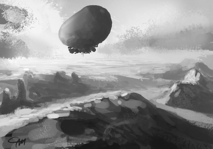
i kno the perspective is wacky, but this one is for matthew. if things work out right i'll visit skagen early next year |
|
| Back to top |
|
Naeem
member
Member #
Joined: 13 Oct 2004
Posts: 1222
Location: USA
|
| Posted: Thu Oct 14, 2004 2:29 am |
|
|
hey guys. new here. here's one i did in within 1 hr.
 |
|
| Back to top |
|
faB
member
Member #
Joined: 16 Jul 2002
Posts: 300
Location: Brussels, Belgium
|
| Posted: Thu Oct 14, 2004 2:39 am |
|
|
retro: that's nice, I think I remember you posting on the SP thread at concept art bout 2 year ago?
spooge: wow!  looks deceptively simple.. looks deceptively simple..
Chris-Mayernik: I gotta do a ton of those as well, thanks for the tips. Problem for me is when I fill in a middle gray in Photoshop I cant see the cursor at all unless I set it to 'standard' mode, where it looks like a little brush icon instead of the actual brush shape/size. Photoshop seems to 'invert' the color of the background to display the cursor so if its middle gray its invisible :/
_________________
"I'm not a shrimp, I'm a KING PRAWN !" -- Pepe.
selfportraits & stuff |
|
| Back to top |
|
Naeem
member
Member #
Joined: 13 Oct 2004
Posts: 1222
Location: USA
|
| Posted: Thu Oct 14, 2004 3:51 am |
|
|
a couple of speedpaints i did.
2 hours:

3 hours:

1 hour:

1 hour:

1 hour:

30 minutes:

20 minutes:
 |
|
| Back to top |
|
Mitsui
member
Member #
Joined: 06 Aug 2002
Posts: 642
Location: Hamburg/Germany
|
| Posted: Thu Oct 14, 2004 4:54 am |
|
|
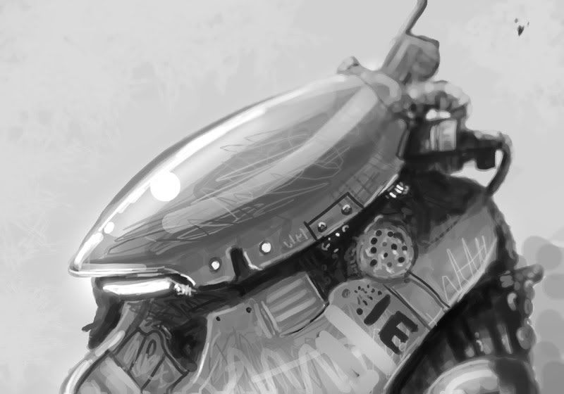
thnx viag!
 |
|
| Back to top |
|
Capt. Fred
member
Member #
Joined: 21 Dec 2002
Posts: 1425
Location: South England
|
| Posted: Thu Oct 14, 2004 6:03 am |
|
|
mitsui, that one reminds me of balsitic, use of colour maybe.
Cool. |
|
| Back to top |
|
Yarik
member
Member #
Joined: 11 May 2004
Posts: 231
Location: Russian/Ukrainian American in California
|
| Posted: Thu Oct 14, 2004 6:07 am |
|
|
@Mitsui: Don't use custom made brushe's. The leaves look like they dont belong in your picture, everything around it is in minimul detail then BAM the leaves are like perfect.  |
|
| Back to top |
|
Sheff
member
Member #
Joined: 22 Jan 2004
Posts: 56
Location: Las Vegas
|
| Posted: Thu Oct 14, 2004 7:24 am |
|
|
Thanks Chris. I try not to think too much about my brushstrokes, and just make them. Kind of like shooting a foul shot from the free throw line.

This was a quick study to show my students what a master copy assignment (their homework) should look like. After Sargent. I'm off in sky values and saturation in the distance, but the point of the assignment was to not worry about detail and go simply for shapes and value. This was one of my first artrage pieces.
_________________
Sheff
www.sheff.com |
|
| Back to top |
|
BARoNTiERi
member
Member #
Joined: 25 Mar 2002
Posts: 201
Location: Montreal, CA
|
|
| Back to top |
|
Matthew
member
Member #
Joined: 05 Oct 2002
Posts: 3784
Location: I am out of here for good
|
| Posted: Thu Oct 14, 2004 8:06 am |
|
|
sparth, really nice work
Capt.Fred, many thanks there, it's good to be back and chat with you guys here. 
retro, yea hehe I love the skagen painters and I know that painting u did there, good work there and thanks for dedicate that one for me.
I saw a program about Skagen and why they choosed to be there, apparently the light from a desert nearby makes it kind of magical to paint there and the colors and light gets interesting. I really wanna visit that place too.
ok I hope I didn't forget anyone, thanks again for the warm welcom guys and it's really nice to push the post reply button again. 
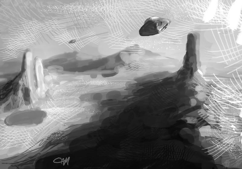
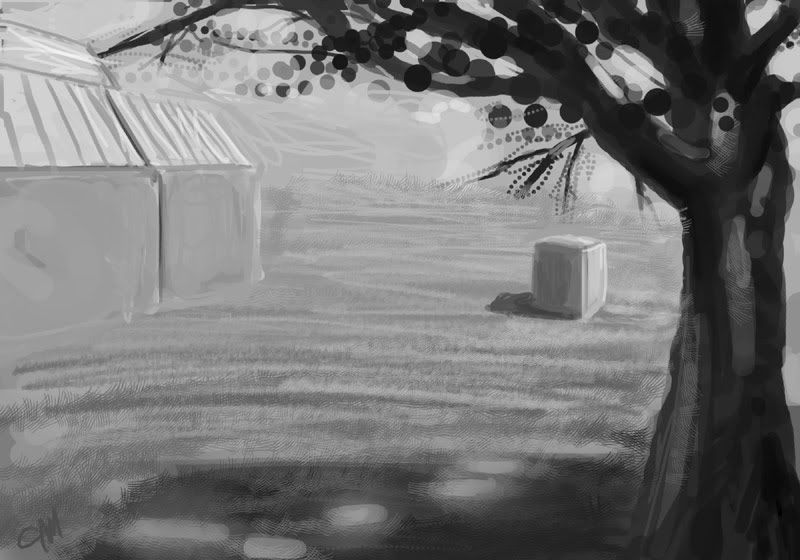
quick warm-up sketch, think I will post one more later.

later and keep up everyone, lots of good work lately. |
|
| Back to top |
|
Matthew
member
Member #
Joined: 05 Oct 2002
Posts: 3784
Location: I am out of here for good
|
| Posted: Thu Oct 14, 2004 8:49 am |
|
|
ohh sniff and bloody hell, I better watch that spenny vs kenny.

later |
|
| Back to top |
|
Stewart one
member
Member #
Joined: 07 Jul 2004
Posts: 156
Location: sweden
|
| Posted: Thu Oct 14, 2004 10:57 am |
|
|
hi everyone- hope your all doing well and feeling inspired. did this in OC today. bout 20 mins. nice work everyone.

_________________
ARRR! |
|
| Back to top |
|
Misc
member
Member #
Joined: 04 Jun 2004
Posts: 475
Location: Sweden
|
| Posted: Thu Oct 14, 2004 11:42 am |
|
|
seth1: Thanks! Keep it up you too
 |
|
| Back to top |
|
Matthew
member
Member #
Joined: 05 Oct 2002
Posts: 3784
Location: I am out of here for good
|
| Posted: Thu Oct 14, 2004 11:52 am |
|
|
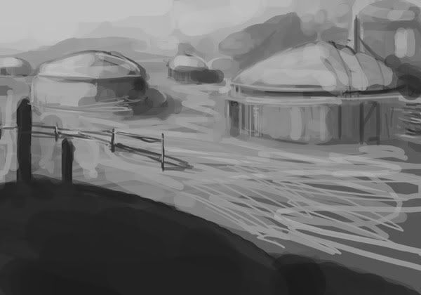
less info can u still see what it is?
ok me better call it a day, last one for today.

-- |
|
| Back to top |
|
Lite.
junior member
Member #
Joined: 28 Sep 2004
Posts: 11
Location: Finland
|
| Posted: Thu Oct 14, 2004 12:05 pm |
|
|

_________________
Well that was perfectly terrific. |
|
| Back to top |
|
Reakshun
member
Member #
Joined: 21 Dec 2002
Posts: 302
Location: left coast
|
| Posted: Thu Oct 14, 2004 12:42 pm |
|
|
old skool...PAINT TO POST.

Thread question:
The darkest dark and the lightest light. What exactly does this mean in terms of how the rest of your colors are placed? Example: If a painting is so called in the high-key, where would the darkest dark fall in that. Is there a such thing as a high key dark? Or...if a painting is low key...where is the brightest bright in that?
I'm just trynna understand.  |
|
| Back to top |
|
Capt. Fred
member
Member #
Joined: 21 Dec 2002
Posts: 1425
Location: South England
|
| Posted: Thu Oct 14, 2004 2:29 pm |
|
|
reakshun: I guess the darkest dark and the brightest bright will never change. Kind of like in levels with that histogram. When you paint in a different key the darkest dark on the dark end and brightest bright on the bright end are stationary and your effectively moving the middle slider to shift the mid-tones. I have no idea, in truth, but I'm guessing painting in different keys is equivalent to shifting the mid-tones slider to bright end or to dark end.
I was watching changing lanes and noticed how samuel l jackson's profile, all the extremeties are pretty much in a vertical line. no reference on this though. his head reminds me of yoda.
 |
|
| Back to top |
|
Combustion
junior member
Member #
Joined: 29 Feb 2004
Posts: 43
|
| Posted: Thu Oct 14, 2004 3:12 pm |
|
|
"ok class, today we are going to learn how to paint like shit. . . . oh, very impressive combustion. . . . you have a natural talent."
 |
|
| Back to top |
|
viag
member
Member #
Joined: 04 Mar 2003
Posts: 250
Location: Canada
|
| Posted: Thu Oct 14, 2004 3:16 pm |
|
|
lite , baron , sheff ! nice !!

_________________
WEBSITE
BLOG |
|
| Back to top |
|
The Insane Lemur
member
Member #
Joined: 19 Oct 2003
Posts: 768
|
| Posted: Thu Oct 14, 2004 4:42 pm |
|
|

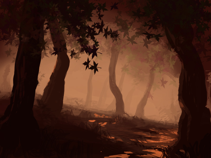
i feel its incomplete, but dont know how |
|
| Back to top |
|
BARoNTiERi
member
Member #
Joined: 25 Mar 2002
Posts: 201
Location: Montreal, CA
|
|
| Back to top |
|
octavian
member
Member #
Joined: 28 Feb 2004
Posts: 401
Location: Kalifornia
|
| Posted: Thu Oct 14, 2004 7:14 pm |
|
|
Been gone a while. Lots has happened here. NICE!
A Sargent study:
 |
|
| Back to top |
|
allpetter
member
Member #
Joined: 18 Aug 2003
Posts: 395
Location: sweden
|
| Posted: Thu Oct 14, 2004 7:38 pm |
|
|
Welcome back Matthew!
hi guys!
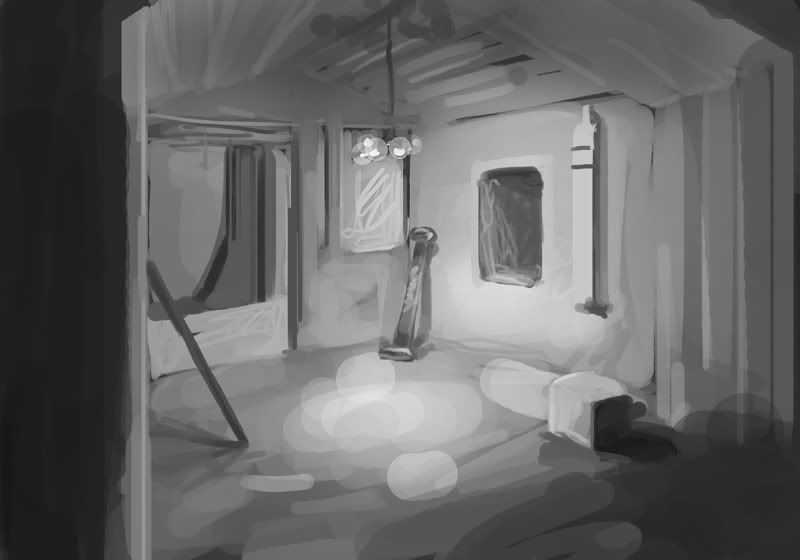
No reference used for this one.
Been analyzzing loads of shit latly!
keep it up guys!

_________________
Fru Tina K�ttet |
|
| Back to top |
|
Spectra
member
Member #
Joined: 11 Nov 2000
Posts: 135
Location: Montreal, Quebec, Canada
|
| Posted: Thu Oct 14, 2004 8:02 pm |
|
|
Tonight's anatomical disaster�
Painter 9 is a huge improvement! 1st time I don�t get upset fighting with that devil software with a will of its own and some crazy lag! It�s the 1st artwork I get this far with painter; I�ll start using it now.

_________________
http://www.letual.ca |
|
| Back to top |
|
seth1
member
Member #
Joined: 06 Jun 2004
Posts: 534
|
| Posted: Thu Oct 14, 2004 8:37 pm |
|
|
Every body so amazing keep it up... Thank you all for the inspiring paintings..
Oh man, never done this befor just let me self go lol....
 |
|
| Back to top |
|
zhuzhu
member
Member #
Joined: 11 Dec 2002
Posts: 683
Location: Shanghai
|
| Posted: Thu Oct 14, 2004 9:31 pm |
|
|
fashion design:

_________________
I am the king of the world! hahaha^-^ |
|
| Back to top |
|
|


