| View previous topic :: View next topic |
| Author |
Topic : "Fantasyscene - Before the War" |
bM
member
Member #
Joined: 07 Nov 2000
Posts: 152
Location: SWEDEN
|
 Posted: Thu Feb 19, 2004 6:26 am Posted: Thu Feb 19, 2004 6:26 am |
 |
 |
Finally this is the fifth and final version of my Before the War painting. Many improvements, a remake of the sky, color variations, unicorns eye and neck, shading and some other details are fixed.
This took 40+ hours in Adobe Photoshop using a Wacom Intuos A4. Its original size is about 5000 pixel high in 300dpi. A3+ print ready. Original concept.
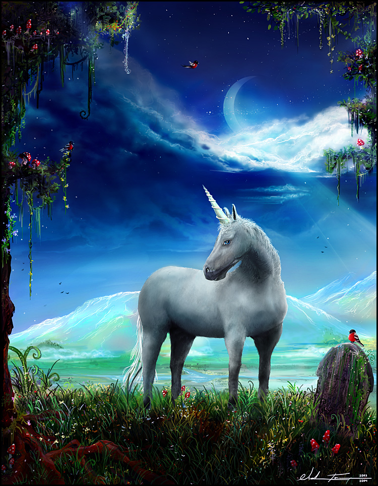
Hope you like.
Sincerely
- Nicklas Forsberg a.k.a bM
- http://www.nalf.it |
|
| Back to top |
|
Duracel
member
Member #
Joined: 08 Mar 2001
Posts: 910
Location: Germany - near Minster
|
| Posted: Thu Feb 19, 2004 10:38 am |
|
|
I still don't really like the horse - especially the very straight legs, but also the colorlessness compared to the rest. Also it looks a bit too much "tried to paint realistic" compared to the rest.
But well, i really dig all those little mushrooms, the sky in this beautiful deep blue, the stone and all this. 
_________________
Lars G�tze
www.duracel.de Gallery
Detailling a speedpainting is nothing but speedpainting in detail. |
|
| Back to top |
|
see
member
Member #
Joined: 04 Aug 2001
Posts: 481
Location: Austria
|
| Posted: Thu Feb 19, 2004 11:46 am |
|
|
hehe dura you like mushrooms ha? 
You have choosen nice colors. And one can see you spent a lot of time in it.
The horse look good altough i have to agree with Dura about the legs.
Its a well drawn nice compositioned artwork. |
|
| Back to top |
|
Tinusch
member
Member #
Joined: 25 Dec 1999
Posts: 2757
Location: Rhode Island, USA
|
| Posted: Thu Feb 19, 2004 1:04 pm |
|
|
| Well it's about time we got the final version of this. Looks really nice, especially the new sky, which is absolutely amazing. The horse looks good, though the eye I think could still use some work. The front leg closest to us seems a bit disjointed, as well, maybe it it a but more of a curve so he doesn't look so stiff and awkward. |
|
| Back to top |
|
Killer Napkins
junior member
Member #
Joined: 25 Oct 2003
Posts: 23
Location: STL
|
| Posted: Fri Feb 20, 2004 4:42 pm |
|
|
are u blind?! its not a horse... its a unicorn.... anyway i think it look awesome... very color ful like the edges and background look s nice
_________________
yea.. im cool... |
|
| Back to top |
|
|


