| View previous topic :: View next topic |
| Author |
Topic : "Nymph" |
Capt. Fred
member
Member #
Joined: 21 Dec 2002
Posts: 1425
Location: South England
|
 Posted: Tue Dec 02, 2003 1:07 am Posted: Tue Dec 02, 2003 1:07 am |
 |
 |
I'm not usually particularly interested in spending too long on pic, or in refining it particularly, but at about four hours worth this is about as highly rendered as I can go  . "no ref". . "no ref".
Was looking through a book about the barbizon painters earlier that day and wanted to have a play, plus I don't do enough women.

I really wanted to do something more radical with the colours, but I somehow I couldn't get myself to dammit.. And how do i get away from these blobbly cartoon shapes? .. more negative shapes maybe .. And boy, I really don't understand these bushes and trees too good.. ha! look at that bush bottom right! time for a walk in the forest.
Any input you can offer would be appreciated. |
|
| Back to top |
|
Capt. Fred
member
Member #
Joined: 21 Dec 2002
Posts: 1425
Location: South England
|
| Posted: Tue Dec 02, 2003 5:36 am |
|
|
looking at it again.. I think it's lacking dynamism, and I think I failed to achieve the burnout-to-white-sky thing.
EDIT: and oh god the composition I just noticed is horrible.
Maybe this quick hack is and imporvement..
I'm growing to hate this pic, I should never have flopped it, lol.
http://www.stidston.org/freddie/albums/digitaltraditional_painting/nymph2.jpg
Last edited by Capt. Fred on Wed Dec 03, 2003 12:33 am; edited 1 time in total |
|
| Back to top |
|
AndyT
member
Member #
Joined: 24 Mar 2002
Posts: 1545
Location: Germany
|
| Posted: Tue Dec 02, 2003 7:11 am |
|
|
I love it! I think the composition is great.
The light source and the color of the sun ...
I think the sky would affect the objects more ...
maybe the sun would affect the sky more
(orange-yellowish)!?
But what do I know ...
It reminds me of balistic's draw club image:
http://www.bprince.com/ApplesRevisedSmall.jpg
_________________
http://www.conceptworld.org |
|
| Back to top |
|
Cpt.Obvious
member
Member #
Joined: 23 Sep 2003
Posts: 239
|
| Posted: Tue Dec 02, 2003 9:25 am |
|
|
Imho U should work on it. As a speed it's ok, but this could be a really nice pic 
_________________
You must click here |
|
| Back to top |
|
XIA
member
Member #
Joined: 01 Sep 2003
Posts: 535
Location: Nowhere
|
| Posted: Tue Dec 02, 2003 9:33 am |
|
|
| Yo! Great comp. and lignting. Looks great over all. Great work Buddy! |
|
| Back to top |
|
Capt. Fred
member
Member #
Joined: 21 Dec 2002
Posts: 1425
Location: South England
|
| Posted: Tue Dec 02, 2003 9:35 am |
|
|
xia: thanks, though... I'm not keen on it anymore. I was too hasty with it, careless. i think it's rather horrible.
tiger: yeah.. i think maybe you're right.
The first one was not really much of a speed-painting, but the hacked up version is, you're right. And the lighting is also completely inexplicable, with everything being hit with so much light yet where she stands there're just two little pools hitting the ground..
right then. I will do it properly.. lazy idiot that I am. good idea -- back to the drawing.
andy: balistic's pic's nice, that tree.. woo!
this should be in WIP  |
|
| Back to top |
|
geoman2k
member
Member #
Joined: 26 Apr 2001
Posts: 375
Location: Indiana
|
| Posted: Tue Dec 02, 2003 3:28 pm |
|
|
very good, great atmosphere
i like the first one a lot better than the second tho
the bright colors in the seond one distract my eyes a bit....
_________________
check out my webpage @ http://www.evanart.com/ |
|
| Back to top |
|
Duracel
member
Member #
Joined: 08 Mar 2001
Posts: 910
Location: Germany - near Minster
|
| Posted: Wed Dec 03, 2003 12:30 am |
|
|
Agree, i like the first better, too.
Its a really great picture so i could not take me away from overpaint it a bit.
First of all i did some changes for the composition. The large white part on the right was imho too eyecathing, so i streched the backgroundtree a bit as a willow. So i like the radial shape the free-space goes, so the straight hanging leaves of a willow dont cut the flow of this curve.
Than i added two far-behind trees(same straight form as the willow) to move the highest contrast to the womans upper head. Also those blue background-trees give some contrast to the yellow parts and add depth.
A added foreground-bush to the lower-right also gives some depth and most important is balancing the great tree on the upperleft, which i breaked up a bit.
Then i fixed the lighting on the womans body. I gave her a white direct-light and stressed the backlight from the lit ground. Also a little bit bluish tone to the upper-right head to make out the line between hair and face.
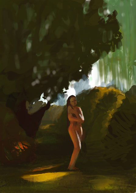
Now with those some fixes i think your picture is kickin' asses. 
_________________
Lars G�tze
www.duracel.de Gallery
Detailling a speedpainting is nothing but speedpainting in detail. |
|
| Back to top |
|
Capt. Fred
member
Member #
Joined: 21 Dec 2002
Posts: 1425
Location: South England
|
| Posted: Wed Dec 03, 2003 12:49 am |
|
|
hey!, nice work there duracel. nice.
Yeah.. your suggestions all make sense.. and the paintover is really helpful, thanks.
At first I really wanted to play with diffuse light on the character from the bright sky so that in shadow she was flat, 'without lighting'. but then.. it was muddled, I added bright orange sun which isn't actually that low in the sky at all, and the reflected light from the grass just for cheapness.. then it become something different..
I really need to plan out images before I start. I NEver remember. I should just do a decent sketch, and then when I have it, then move on.. [slaps forehead]
Geoman: thanks. and it's also nice to hear which one you prefer.. after having that image in front of me for so long I really lost ability to see if I was ruining it or improving it. |
|
| Back to top |
|
|


