| View previous topic :: View next topic |
| Author |
Topic : "Ancient ship" |
Zorglub
member
Member #
Joined: 20 Dec 2000
Posts: 268
Location: Ontario Canada
|
 Posted: Sat Jul 19, 2003 1:30 pm Posted: Sat Jul 19, 2003 1:30 pm |
 |
 |
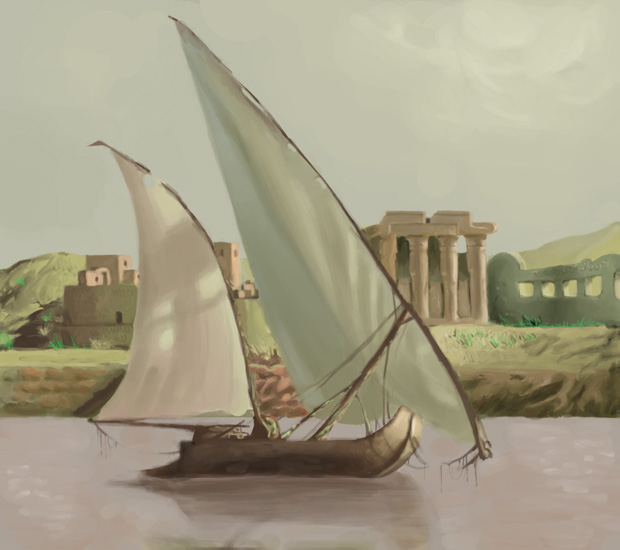
Done from reference.
I know there can be improvements made but I'm not sure what.
I need brutal and honest critiques (I can take it). So here it is.
 |
|
| Back to top |
|
maxetormer
member
Member #
Joined: 14 Dec 2002
Posts: 259
Location: M�xico
|
| Posted: Sat Jul 19, 2003 2:11 pm |
|
|
It is a very good image the shapes are very propocitanted and the volumen is there.  
I think it lacks on higth ligths and really dark areas,
It would help to see the photo u used nice looking painting a bit to smudgi on some parts the rock buildings I think they don�t look solid enought, the water does not look transparet enought, but never the less with out seeing the reference u used i can�t tell if it is allrigth, since the water on that river can be very dark.
keep it up!!!
_________________
Never underestimate the stupidity of the human race.Sorrow is the contrast of happines then sorrow is some how the esence of happiness  + +  = = |
|
| Back to top |
|
CwStone
member
Member #
Joined: 27 Jan 2003
Posts: 489
Location: New York, USA
|
| Posted: Sat Jul 19, 2003 2:16 pm |
|
|
i think it might look good if u added some tiny white glints to the water, not a lot, but enough to give an overall efect. But even w/o 'em, it looks really good. And as maxetormer said, i think u could also use some brighter highlights and darker shadows.
_________________
-Chase |
|
| Back to top |
|
Zorglub
member
Member #
Joined: 20 Dec 2000
Posts: 268
Location: Ontario Canada
|
| Posted: Sat Jul 19, 2003 8:22 pm |
|
|
Thanks guys that was very helpful. I need to work on the background some more, that is what I had the most trouble with. And yeah now that you mention the water could use a bit more highlights and darker areas
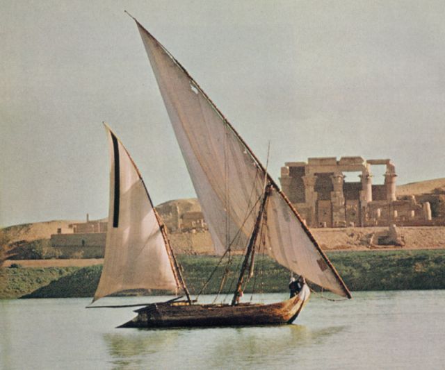
By the way, here is the reference I used
 |
|
| Back to top |
|
|


