| View previous topic :: View next topic |
| Author |
Topic : "The mana tree (UPDATE)" |
Novacaptain
member
Member #
Joined: 09 Jan 2001
Posts: 906
Location: Sweden
|
 Posted: Sat May 10, 2003 10:48 pm Posted: Sat May 10, 2003 10:48 pm |
 |
 |
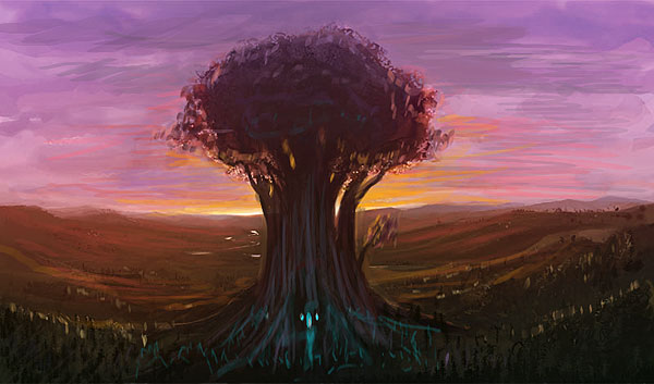
Is it safe..is it safe? It's been so long since i did anything other than sketches and speed paintings that I felt that i needed something really Woah! and Zaaahh! to work on.
I took one of my later sketches and started to work on making it look like a finished piece.

After an hour i notice that the red/pink/purple just isn't working...so I re-paint and would now like to hear some oppinions. I'm aiming at something near-photorealistic here so any thoughts on that are very welcome. As always; critiques, comments, questions, paint overs, monetary donations and grapefruit warmly welcomed.

_________________
It's nice to be important, but more important to be nice - Scooter
Last edited by Novacaptain on Sun May 11, 2003 10:56 am; edited 1 time in total |
|
| Back to top |
|
Capt. Fred
member
Member #
Joined: 21 Dec 2002
Posts: 1425
Location: South England
|
| Posted: Sun May 11, 2003 12:50 am |
|
|
First of all, It looks totally awesome.
Since you wnated criticisms... hmm... I think that although the tree looks cool, it may be hard to get a feeling for how big it is with no scale reference, no normal sized trees in a small forest anyway or buildings or people. I don't think it would be good with buildings and people around; it's better like you've done it, but it is hard to get a strong feeling of it's size. It doesn't make me think, "woah! big!". and the original sketch gave the impression that is was failry big becuase it had doorways and windows I think, so you could SEE how big.
Plus, the choice of camera angle doesn serve to mounmentalize the tree IMO. It's a fairly scientific kind of camera by which I mean that it shows the size of the tree plainly with no attempts to make it look towering or look little. It's just: "there's a tree". Rather than from lower down looking up (but not so much that you loose the lovely horizon.)
I also reckon it's a shame that those orignal colours weren't wurking. They were truly lovely, and a large part of what was nice about the orignal sketch.
And finally: I think maybe the sunlight cathcing on the edges of those roots maybe could be played down a bit mainly towards the bottom, becuase I imagine that with the sun that low, any hills o bumps would prevent the light from skirting the ground so closely and hitting those low roottips just before they enter the ground. Although, this last point is something which is right or wrong rather than subjective, and so you're probably better equipped to judge these things.
Like I said it's looking really good like your art always does, but while you're looking criticisms/comments that's waht I've got to say. |
|
| Back to top |
|
Novacaptain
member
Member #
Joined: 09 Jan 2001
Posts: 906
Location: Sweden
|
| Posted: Sun May 11, 2003 10:54 am |
|
|
Thanks a lot for the help fellow Captain, you'll make a fine admiral some day.
I took most of the critiques to heart and changed the stuff as best i could...I'm keeping the horizon there because i think that even though it would make the tree stand out as a more colossal object, if i had a shot from a lower level, It would take a lot of the landscape away which is something that i very much enjoy painting (as opposed to sky hehehe).
I'll be adding the gate and windows last of all. I don't regret changing the colors actually - Doing it different was refreshing and i really think it would be hard to pull off the type of near-realism i was aiming for with that color scheme (i'm starting to think i missed but that's ok).
Update:

_________________
It's nice to be important, but more important to be nice - Scooter |
|
| Back to top |
|
krAtul
member
Member #
Joined: 06 Oct 2001
Posts: 55
Location: Paris
|
| Posted: Wed May 28, 2003 3:18 pm |
|
|
damn nova you're getting better quickly ! the last color version is really awesome, but i think it misses the original speed painting tree's thickness that was making it believable for its size, your actual tree looks like a normal tree resized, not like a really huge tree. make it thicker! like in larger, and shorter, with a foliage going more on the horizontal axis than on the vertical one :]
excuse my poor english at this time of the night :/
#k
sonho todas as noites vir passar o ver�o no Brasil, sinto que vou comprar os meus bilhetes  |
|
| Back to top |
|
Max
member
Member #
Joined: 12 Aug 2002
Posts: 3210
Location: MIND
|
| Posted: Sun Jun 08, 2003 11:46 pm |
|
|
very well done Nova!
This pic has athmosphere.
I love it! |
|
| Back to top |
|
eyalyab
member
Member #
Joined: 11 Jan 2003
Posts: 308
Location: Israel
|
| Posted: Tue Jun 10, 2003 4:19 pm |
|
|
wow. this is beautiful.
something i thought.. objects that are right between our eyes and a direct lighsource look very dark, like a sillhouette (is that how you spell it?). the trunk of the tree, at the hight of the horizon, where the sun is peaking behind, looks too defined (colorwise). i think it should be just a sillhouette, at least around the horizon, but im not sure, and you prolly know better than me in that field..
-cheers |
|
| Back to top |
|
Yuri
member
Member #
Joined: 02 Mar 2003
Posts: 73
|
| Posted: Sun Jun 15, 2003 2:48 am |
|
|
Actually, I'm also one of those who prefer the original piece.
It's not just the landscape but also the size and colours of the tree that made it look so special. I especially liked the "light blue" highlights at the bottom of the tree. Also, the brush strokes on the tree made it look pretty nifty.
The color of the sky made it look even more beautiful and magical too.
In the updated version of the second pix, it looks extremely ordinary. Also, the colours in the pix do nothing to emphasize it. It just looks like a landscape pix, that's all.
Nevermind if you decide to start using different colors, but it should convey a sense of being really special and the tree should stand out from the landscape and not blend in. |
|
| Back to top |
|
Duracel
member
Member #
Joined: 08 Mar 2001
Posts: 910
Location: Germany - near Minster
|
| Posted: Sun Jun 15, 2003 12:14 pm |
|
|
I have to agree (treetrunk-size and overall-colorscheme)
But i have to say, especially the background looks really good in the newer ones and the pointed sunset-light is damn beautiful. I'd say, those more realistic colors makes it a more "wow"-Feeling, 'cause you can imagine this situation in a better way. So take the fantastic points like the treetrunk-size in this version, plz.
Also in the newest version the near ground is really good-looking.
Nevertheless here is an overpaint combines the last version with the speedpaitning. Its up to you, how you stay with your newer colorchoice. 
Its both great, imho.
_________________
Lars G�tze
www.duracel.de Gallery
Detailling a speedpainting is nothing but speedpainting in detail. |
|
| Back to top |
|
Novacaptain
member
Member #
Joined: 09 Jan 2001
Posts: 906
Location: Sweden
|
| Posted: Tue Jun 24, 2003 9:42 am |
|
|
WOW i totally gave up on this for a while...thank you so much for the critique and be sure that i'll make some changes. That overpaint looks gorgeous by the way!
I'll post the finished version sometime soon
Thanks again.
_________________
It's nice to be important, but more important to be nice - Scooter |
|
| Back to top |
|
|


