| View previous topic :: View next topic |
| Author |
Topic : "WIP - Minotaur" |
Andy`Ba
member
Member #
Joined: 20 Jan 2001
Posts: 98
|
|
| Back to top |
|
Aloys
junior member
Member #
Joined: 05 Oct 2002
Posts: 29
Location: The Netherlands
|
 Posted: Wed Mar 05, 2003 6:40 am Posted: Wed Mar 05, 2003 6:40 am |
 |
 |
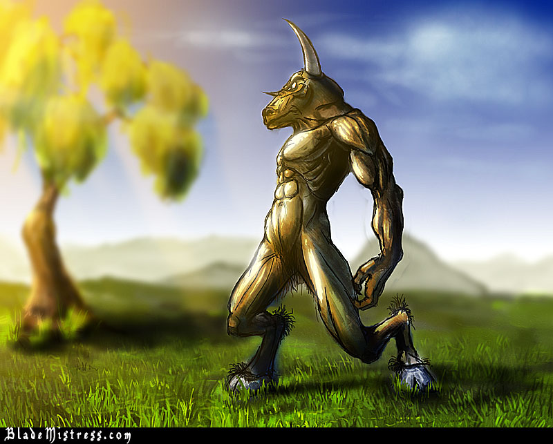
I really like it! The perspective is very good I think. It really looks like the minotaur is really close, because of the faded background.
Well done!
Aloys. |
|
| Back to top |
|
DarkVVulf
member
Member #
Joined: 27 Nov 1999
Posts: 201
Location: CO
|
 Posted: Thu Mar 06, 2003 11:55 pm Posted: Thu Mar 06, 2003 11:55 pm |
 |
 |
I like the design on the minotaur.
I know it's supposed to be blurred but the background could use some more detail, namely the tree because it's closer than the mountains.
Good anatomy, but the head feels a little too big for the body.
Cool work so far.
_________________
den.vvulf |
|
| Back to top |
|
Radiance
junior member
Member #
Joined: 28 Feb 2003
Posts: 27
|
 Posted: Fri Mar 07, 2003 7:18 am Posted: Fri Mar 07, 2003 7:18 am |
 |
 |
i like the design as well.
but i don't like the tone and colours of this background. well, of course that depends on what you had in mind originally. but as it is now, i find the background too happy and sweet looking.
i would make the background more dramatic, like at sunset or sunrise, or cloudy, an arriving storm, etc. it would add 'character' to the minotaur.
but that's just my suggestion  |
|
| Back to top |
|
Xyster21
member
Member #
Joined: 13 Apr 2001
Posts: 204
Location: California USA
|
 Posted: Sat Mar 08, 2003 2:42 am Posted: Sat Mar 08, 2003 2:42 am |
 |
 |
I like it.
Maybe add some more detail and reflections in his eyes to make them stand out more. When I first look at it, I see the eyes or am drawn to look at the eyes and they aren't shaded for the most part. It would add to the whole feeling with some strong reflections in them/shadows as well.
I like the background with the fierce looking monotaur because it is an interesting contrast of a character of such fierceness in a place where you would see a lil bunny trodding along any moment haha. So don't ditch that background :p
looks good otherwise. 
g-luck
_________________
Meep meep |
|
| Back to top |
|
AnKart
junior member
Member #
Joined: 30 Jan 2001
Posts: 11
Location: Moldova
|
 Posted: Sun Mar 09, 2003 6:33 am Posted: Sun Mar 09, 2003 6:33 am |
 |
 |
| The picture looks nice - although i think the saturation level is to high, the minotaur is imho a little bit to flat and glossy and i think you should lower the depth of field ... |
|
| Back to top |
|
CwStone
member
Member #
Joined: 27 Jan 2003
Posts: 489
Location: New York, USA
|
 Posted: Sun Mar 09, 2003 8:59 am Posted: Sun Mar 09, 2003 8:59 am |
 |
 |
uhh...all of the crits have been said already so im just gonna say really nice job and i cant wait to see it finished!
_________________
-Chase |
|
| Back to top |
|
Andy`Ba
member
Member #
Joined: 20 Jan 2001
Posts: 98
|
 Posted: Sun Mar 16, 2003 2:55 am Posted: Sun Mar 16, 2003 2:55 am |
 |
 |
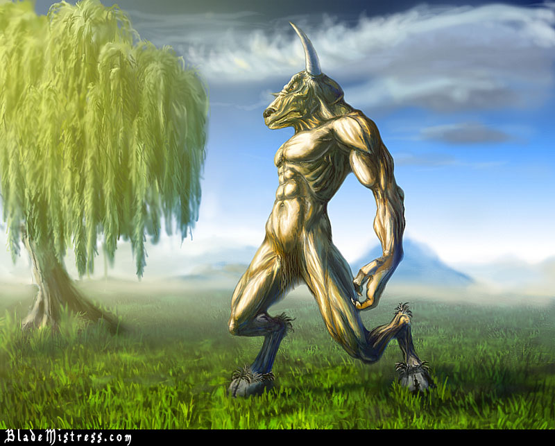
Thanks for all suggestions. I tried to implement most of them.
I think something is still wrong since I'm not too hapy with it.
Please WIP - HardER!!!  I just need it. I just need it.

_________________
Andy`Ba,3D artist
web 3D service
Free textures, 3D tutorials 3d jobs |
|
| Back to top |
|
AnKart
junior member
Member #
Joined: 30 Jan 2001
Posts: 11
Location: Moldova
|
 Posted: Thu Mar 20, 2003 2:40 am Posted: Thu Mar 20, 2003 2:40 am |
 |
 |
Hi Andy'Ba
it looks better this way! but i would have a few suggestions....
I've noticed before that there is to much saturation or contrast between elements of the picture....for example the grass....it looks to muddy because of the rich color of green and black...try making it more smooth in color and texture..
The Minotaur looks a bit old (maybe you wanted him that way) couse of his skin, it looks dry and full of creases.
anyway good work ! keep updating it... |
|
| Back to top |
|
Andy`Ba
member
Member #
Joined: 20 Jan 2001
Posts: 98
|
 Posted: Mon Mar 24, 2003 1:13 am Posted: Mon Mar 24, 2003 1:13 am |
 |
 |
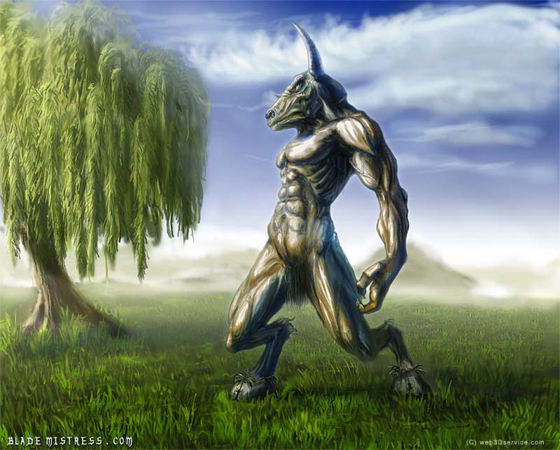
More changes. I added more shadows. I correctd the left leg. And changed the nose. Is it any better then previous or it's just different?

_________________
Andy`Ba,3D artist
web 3D service
Free textures, 3D tutorials 3d jobs |
|
| Back to top |
|
4nton
member
Member #
Joined: 02 Sep 2002
Posts: 50
|
 Posted: Mon Mar 24, 2003 10:16 am Posted: Mon Mar 24, 2003 10:16 am |
 |
 |
I think the changes you've made look good - on the right track, to be sure!
This image has a neat feel to it.
The only suggestions I have are just for fun, and can be taken however you like.
What if you added a "portal" or "rip" in the air behind him, that you could see a very different landscape in, that would suggest that he just walked in on this scene from somewhere - might give it some more story to the composition. |
|
| Back to top |
|
DarkVVulf
member
Member #
Joined: 27 Nov 1999
Posts: 201
Location: CO
|
 Posted: Fri Mar 28, 2003 7:56 pm Posted: Fri Mar 28, 2003 7:56 pm |
 |
 |
Excellent improvements. With the desaturation he fits in significantly better.
_________________
den.vvulf |
|
| Back to top |
|
B0b
member
Member #
Joined: 14 Jul 2002
Posts: 1807
Location: Sunny Dorset, England
|
 Posted: Thu Apr 03, 2003 5:17 am Posted: Thu Apr 03, 2003 5:17 am |
 |
 |
| his abs look funny 2 me - they should b wider more towards the ribs |
|
| Back to top |
|
Andy`Ba
member
Member #
Joined: 20 Jan 2001
Posts: 98
|
|
| Back to top |
|
Andy`Ba
member
Member #
Joined: 20 Jan 2001
Posts: 98
|
 Posted: Thu Feb 16, 2006 4:22 pm Posted: Thu Feb 16, 2006 4:22 pm |
 |
 |
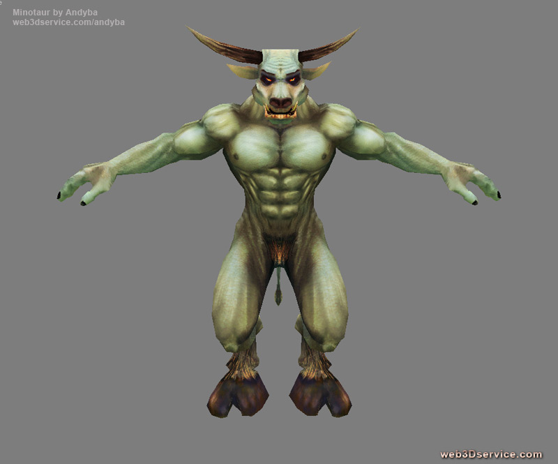
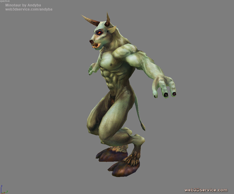
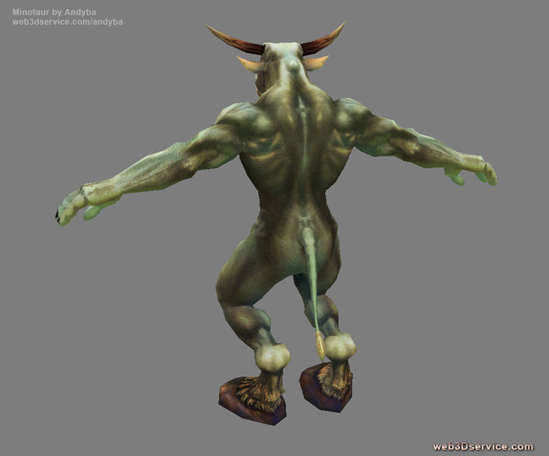
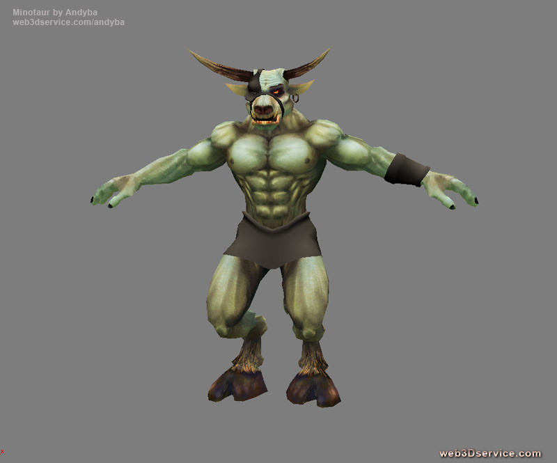
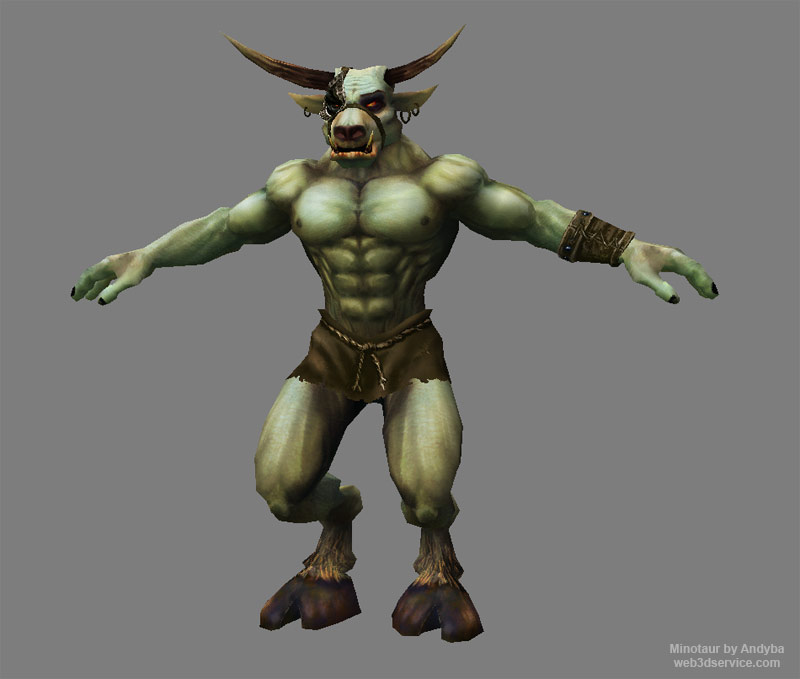
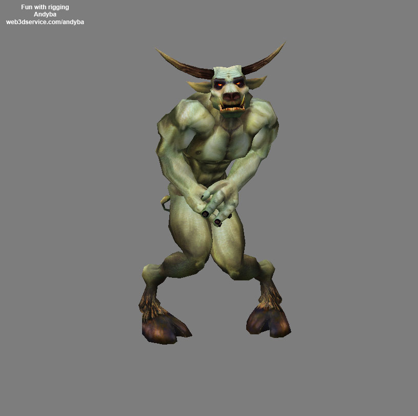
Just wanted to renew this thread cause i started to work on the 3d version of this minotaur.
And I would like to know what you guys think.


Thanks in advance for crits and suggestions.
_________________
Andy`Ba,3D artist
web 3D service
Free textures, 3D tutorials 3d jobs |
|
| Back to top |
|
Sampster
member
Member #
Joined: 01 Jun 2005
Posts: 182
|
 Posted: Thu Feb 16, 2006 7:38 pm Posted: Thu Feb 16, 2006 7:38 pm |
 |
 |
Personally, I like the longer, more "ripped" arms in the painting more than the thicker, shorter arms in the 3D model.
But it's far and away beyond what I could do, amazing stuff. It really took a huge turn for the better when you fixed that left leg in the painting, that was the first thing I noticed about it; but after scrolling down a few more pics you fixed it 
The good thick calf muscle in the 3d model is good...it makes it a lot more believable for a thing like a minotaur to actually stand when you give it good muscles to stand on 
anyway nice stuff. |
|
| Back to top |
|
Andy`Ba
member
Member #
Joined: 20 Jan 2001
Posts: 98
|
|
| Back to top |
|
Colonized
junior member
Member #
Joined: 15 Feb 2006
Posts: 2
|
 Posted: Fri Feb 17, 2006 1:19 pm Posted: Fri Feb 17, 2006 1:19 pm |
 |
 |
| That last one is very good, i didnt like the second one but the last one is nice. Good job. Nice model by the way. What program you using? |
|
| Back to top |
|
Andy`Ba
member
Member #
Joined: 20 Jan 2001
Posts: 98
|
|
| Back to top |
|
Andy`Ba
member
Member #
Joined: 20 Jan 2001
Posts: 98
|
|
| Back to top |
|
|


