| View previous topic :: View next topic |
| Author |
Topic : "Environment Concept Painting" |
WacoMonkey
member
Member #
Joined: 26 Apr 2000
Posts: 172
Location: Santa Monica, CA, USA
|
 Posted: Sun Feb 16, 2003 10:02 pm Posted: Sun Feb 16, 2003 10:02 pm |
 |
 |
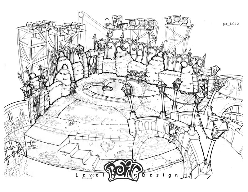
Did this before the Holidays. It's a paint-over of a line drawing I did for the x-box game WHACKED! Wanted to practice some more whimsical environments in a realistic style, so I did this.
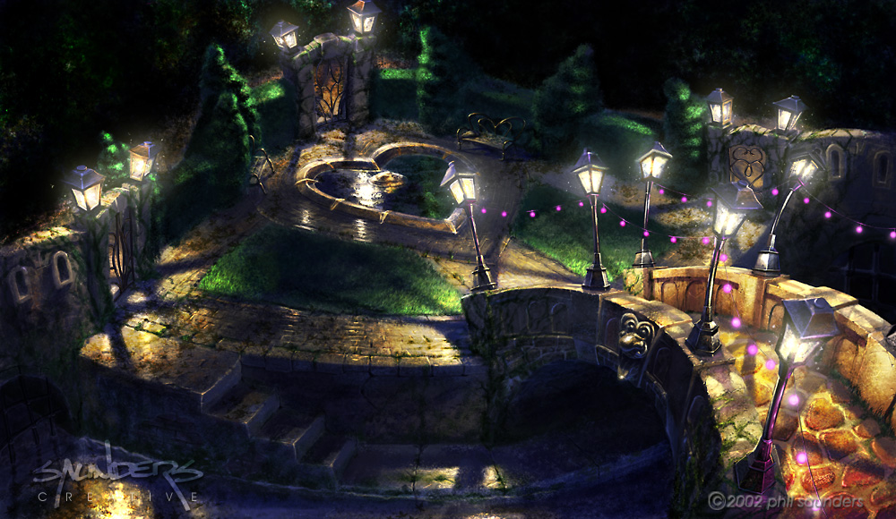
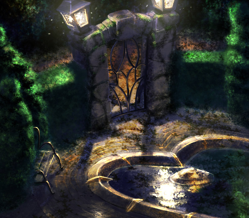
For anyone who's played the game, you'll recognize it as the garden in the Can Can level. Here's a detail at full res.
Crits welcome, I'm trying to figure out a technique for this sort of thing.
Phil.
_________________
www.saunderscreative.com |
|
| Back to top |
|
themagicpen
member
Member #
Joined: 09 Nov 2002
Posts: 81
|
| Posted: Sun Feb 16, 2003 10:05 pm |
|
|
| You win ....horrayyyyy |
|
| Back to top |
|
Herb
member
Member #
Joined: 06 Jul 2002
Posts: 78
|
| Posted: Mon Feb 17, 2003 2:09 am |
|
|
Wow, superb. Did you do this in Photoshop?
_________________
"So...remember, whenya put down one mutha, you puttun down muthas all ovah da worhl." - Mr. T |
|
| Back to top |
|
zap.br
member
Member #
Joined: 07 Oct 2002
Posts: 155
Location: Brazil
|
| Posted: Mon Feb 17, 2003 4:25 am |
|
|
very very nice ..
i love the heart-shaped-fontain

_________________
Brasil GFX POWER
zhp |
|
| Back to top |
|
Francis
member
Member #
Joined: 18 Mar 2000
Posts: 1155
Location: San Diego, CA
|
| Posted: Mon Feb 17, 2003 7:45 am |
|
|
Phil, nice job!
You know, it actually looks a little odd only because the design is meant to be cartoony and "whacked." The realistic rendering of it is a bit jarring in that sense. But that's just me.
Have you tried this with one of your other straight up design stuff? Like the cars, or the Myst stuff for example?
Hey what's new?
_________________
Francis Tsai
TeamGT Studios |
|
| Back to top |
|
Wiked Ewok
member
Member #
Joined: 19 Aug 2000
Posts: 215
Location: San Francisco, CA USA
|
| Posted: Mon Feb 17, 2003 1:15 pm |
|
|
Wow! Nice work, really digging the colors!
_________________
-------Wicked------- |
|
| Back to top |
|
tom!
junior member
Member #
Joined: 16 Feb 2003
Posts: 19
Location: canada
|
| Posted: Mon Feb 17, 2003 1:31 pm |
|
|
thats really amasing...
(do you have a version of the lineart? that'd be cool to see)
kinda reminds me of that medievil game for psx...
(I don't have an xbox so I wouldn't know what game your talking about ^^
_________________
`junk |
|
| Back to top |
|
gezstar
member
Member #
Joined: 27 Nov 2002
Posts: 224
Location: Kamakura
|
| Posted: Mon Feb 17, 2003 4:41 pm |
|
|
That's really nicely done - the lighting is especially good. The only crit I have is with the composition. To me, the eye is drawn off the right side of the picture by the lights and bridge. Bear in mind that's only relevant if this is intended as a standalone image; if it's a level design, ignore me
Anyways I like it a lot, and I'd like to see more. |
|
| Back to top |
|
Vesuvius
member
Member #
Joined: 13 Jan 2001
Posts: 718
Location: Newton, Ma, USA
|
| Posted: Mon Feb 17, 2003 4:47 pm |
|
|
| so, you and synj worked on whacked... the art was good, the gameplay was kind of bland however... as for this piece, I like it, but it's hard to conceive of how you want it represented in-game based on the art... |
|
| Back to top |
|
TheNeverman
member
Member #
Joined: 27 Mar 2002
Posts: 103
Location: Topeka, Kansas
|
| Posted: Mon Feb 17, 2003 5:46 pm |
|
|
| A beautiful piece. Will there be more pics in this series? |
|
| Back to top |
|
ShawnYe
junior member
Member #
Joined: 24 Jun 2002
Posts: 14
Location: Singapore
|
| Posted: Mon Feb 17, 2003 8:03 pm |
|
|
| I love the lighting of this piece and the colours looks really nice. Could you give us a insight of how you painted this? |
|
| Back to top |
|
WacoMonkey
member
Member #
Joined: 26 Apr 2000
Posts: 172
Location: Santa Monica, CA, USA
|
| Posted: Mon Feb 17, 2003 10:13 pm |
|
|
Thanks for the feedback, people!
Herb - Yes, it's PS 7. This was kind of a test piece for the new brushes for me. I'm used to working very solid (gouache-like) with opaque round brushes, wanted to do something a little more painterly and textural with this.
zap.br; Wiked Ewok - Thanks!
Francis - That was kind of the idea behind the style in Whacked. Cartoony distortion & subject matter, but highly rendered, realistic texturemaps & lighting (though highly stylized and saturated). No, haven't done too much of this technique except on "speed paintings" (photoreference copies). Check the 'paintings' section of my site.
How's it going with you?
Tom! - I'll try to dig up the line art & post. Nuthin' too fancy!
gezstar - Very true on the composition. The lower right is the least successful part of the piece, IMO. It is just meant as a level design, though that should never be used as an excuse!
Vesuvius - Synj and I indeed! And Fred Flick Stone (Ron Lemen) as well. Francis did some early conceptuals also, I think he has them on his site. Just look for the unusually wierd stuff. This piece would have represented the 'ideal' execution for the level. In production all I did was a line drawing & a color & lighting break-down, the texture artist (The irrepressible Kelly Page-Standard) went to town on the final execution. This painting is something of a revisionist history, so it deviates from the finished product fairly substantially. I did this as a last-minute portfolio sample for a CGI feature film that wanted "whimsical" environment designs, so it's more geared to higher-end production. (And no, I don't know if I got the job yet!)
The Neverman - Thanks! I don't know, we'll see! I do have more old line-art that's itching for some color
ShawnYe - Thanks! Hard to remember how I did this, there was a lot of experimentation involved. I do know that I started with the lineart on a multiply layer, filled in some rough tones & lighting on a separate layer, then took my line-art layer, inverted it and (if I remember correctly) blended it as an overlay layer. This gave me 'highlights' with some texture of all the salient details, as well as richening & darkening up my colors. I kept working in details and texture on the color layer using exclusively textured brushes, and occasionally overlay brushes. At some point I merged the two layers, deciding to keep some of the lineart for texture (such as on the cobblestones) and painting out edges of objects I wanted to be more 'solid'. Keeping the line-art for so long allowed me to be really loose without losing my way. Areas where the line art wasdistracting, i would just systematically paint it out on the lineart layer, keeping the lines that texturally added to the image. Then it was just a matter of touching the whole thing up once it was merged.
_________________
www.saunderscreative.com |
|
| Back to top |
|
WacoMonkey
member
Member #
Joined: 26 Apr 2000
Posts: 172
Location: Santa Monica, CA, USA
|
|
| Back to top |
|
Tsmith2010
junior member
Member #
Joined: 24 Jan 2003
Posts: 15
Location: LA
|
| Posted: Thu Feb 20, 2003 7:46 pm |
|
|
| fantastic!!! Nice work. |
|
| Back to top |
|
|