| View previous topic :: View next topic |
| Author |
Topic : "Full load Humpy Dumpy" |
khangle81
junior member
Member #
Joined: 07 Oct 2002
Posts: 14
Location: CA
|
 Posted: Wed Jan 29, 2003 1:04 am Posted: Wed Jan 29, 2003 1:04 am |
 |
 |
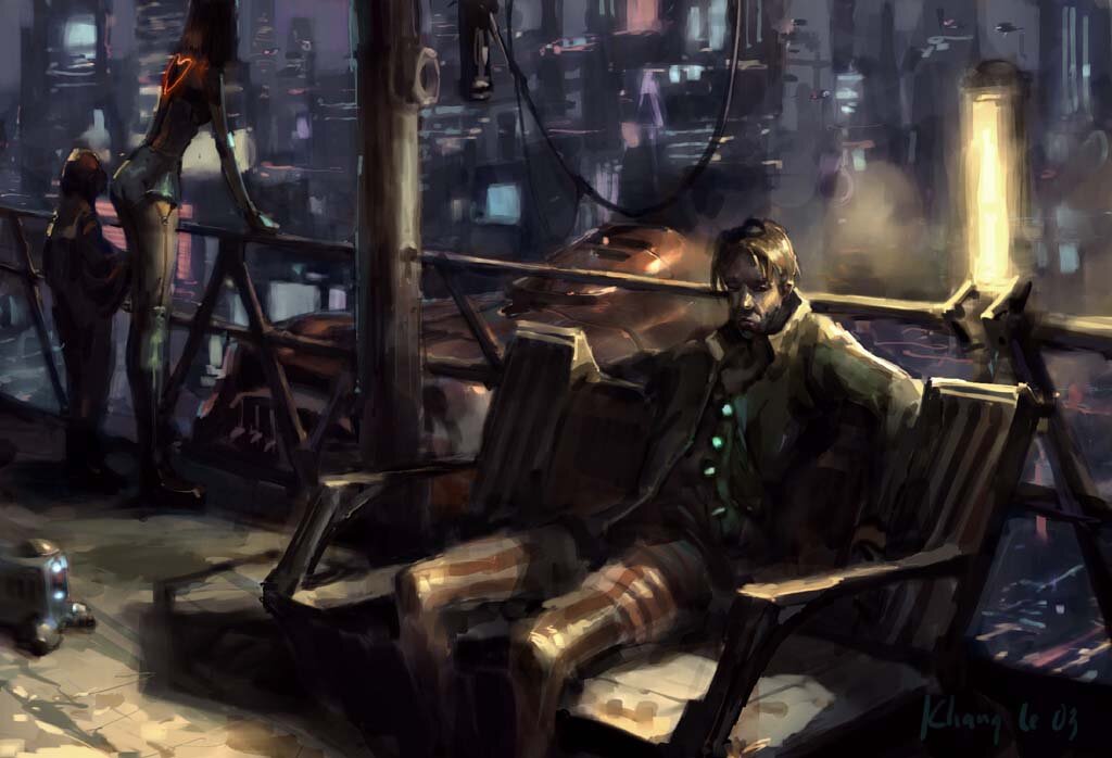
Hey all. its been a while since I post here. I've been real busy with work but those stuff are NDA...bummer  .... but here are 2 pieces I did recently for fun. I'm gonna keep posting more stuff on this thread so check back once in while. Thanks for your time .... but here are 2 pieces I did recently for fun. I'm gonna keep posting more stuff on this thread so check back once in while. Thanks for your time 
 |
|
| Back to top |
|
oDD
member
Member #
Joined: 07 May 2002
Posts: 1000
Location: Wroclaw Poland
|
| Posted: Wed Jan 29, 2003 2:01 am |
|
|
those two are great. Your style is amazing and very oryginal. I like the colors and composition on both of them. Love the strong shadows on the first one and the traditional feeling on the second one. Only crit would be the face of the guy on the first one, it looks cartoony to me, but maybe that was intentional...
anyway great work
_________________
portfolio | art blog |
|
| Back to top |
|
AndyT
member
Member #
Joined: 24 Mar 2002
Posts: 1545
Location: Germany
|
| Posted: Wed Jan 29, 2003 6:26 am |
|
|
I don't like the yellow light too much.
And I think I know what oDD means. The woman could be from Max Payne and the guy from Monkey Island 
(The guy's face and the lighting in the second picture kinda remind me of eBoy's stuff)
The first one is great but it could be better. The second one must be the best thing in ages! 
Btw. I'd change the thread's subject to something more interesting. I almost missed it.
_________________
http://www.conceptworld.org |
|
| Back to top |
|
Sukhoi
member
Member #
Joined: 15 Jul 2001
Posts: 1074
Location: CPH / Denmark
|
| Posted: Wed Jan 29, 2003 8:03 am |
|
|
Gasp.....
I love the blurry style, and especially the background on the first one. Excellent.
Ohh... ....gotta go rest now.
Sukhoi |
|
| Back to top |
|
haohmaru
member
Member #
Joined: 09 Jan 2001
Posts: 206
Location: graz | austria
|
| Posted: Wed Jan 29, 2003 9:03 am |
|
|
wow. your colors and style are amazing!
_________________
 |
|
| Back to top |
|
acrynick
junior member
Member #
Joined: 29 Jan 2003
Posts: 49
|
| Posted: Wed Jan 29, 2003 9:13 am |
|
|
| i like the way you color it...rough and right on the spot |
|
| Back to top |
|
dr . bang
member
Member #
Joined: 07 Apr 2000
Posts: 1245
Location: Den Haag, Holland
|
| Posted: Wed Jan 29, 2003 9:37 am |
|
|
Dude, your art is incredible! Every time i look at your pictture, i KNOW its done by you, because No one, NO one can do enviromental picture as well as you. Your art is not concept games level, your art is Hollywood level baby! THANKS FOR POSTING THESE~!
_________________
Join Roundeye SECRET art forum shhhhhhhhhhh!!!!!!!! |
|
| Back to top |
|
Inspector Lee
member
Member #
Joined: 28 Oct 2002
Posts: 270
Location: San Francisco, CA.
|
| Posted: Wed Jan 29, 2003 11:33 am |
|
|
I love the atmospheric quality in both of these. Very nice stuff.
_________________
Smokey, this is not 'Nam this is bowling. There are rules. |
|
| Back to top |
|
Gecko
member
Member #
Joined: 07 Mar 2000
Posts: 876
Location: Finland
|
| Posted: Wed Jan 29, 2003 12:28 pm |
|
|
very, very easy for my eyes. i like a lot. even with the busyness very good grasp of depth
_________________
Gecko
[email protected]
Portfolio |
|
| Back to top |
|
khangle81
junior member
Member #
Joined: 07 Oct 2002
Posts: 14
Location: CA
|
| Posted: Wed Jan 29, 2003 11:59 pm |
|
|
Thanks for all the nice words from everyone and the time you guys took for the replies. I had a lot of fun reading through them Me and some friends are going to the APE independent comicbook convention in San Francisco on Saturday and Sunday. We're gonna have our own little table to sell random junks (mini comic books, some of my painting prints, post cards...) So if you're in the area, come and hang out with us
http://www.comic-con.org/pages/APE2003.html
Here are some replies to your replies :
Gecko :
very, very easy for my eyes. i like a lot. even with the busyness very good grasp of depth
- thanks, I was struggling with the same problem the whole way through
Inspector Lee :
I love the atmospheric quality in both of these. Very nice stuff.
-thanks
dr . bang
Dude, your art is incredible! Every time i look at your pictture, i KNOW its done by you, because No one, NO one can do enviromental picture as well as you. Your art is not concept games level, your art is Hollywood level baby! THANKS FOR POSTING THESE~!
-thanks but I don't deserve that...I recently got a chance to check out Steven Olds portfolio and his shit was absolutely blew me away
acrynick
i like the way you color it...rough and right on the spot
- thanks
haohmaru
wow. your colors and style are amazing!
- thanks...is your name from Samurai Showdown?
Sukhoi
Gasp.....
I love the blurry style, and especially the background on the first one. Excellent.
Ohh... ....gotta go rest now.
- thanks, the blurry style is called laziness
AndyT
I don't like the yellow light too much.
And I think I know what oDD means. The woman could be from Max Payne and the guy from Monkey Island
(The guy's face and the lighting in the second picture kinda remind me of eBoy's stuff)
- I don't know some of the references you are making but Max Payne is an awesome game.
The first one is great but it could be better. The second one must be the best thing in ages!
Btw. I'd change the thread's subject to something more interesting. I almost missed it.
-- thanks
oDD
those two are great. Your style is amazing and very oryginal. I like the colors and composition on both of them. Love the strong shadows on the first one and the traditional feeling on the second one. Only crit would be the face of the guy on the first one, it looks cartoony to me, but maybe that was intentional...
anyway great work
-thanks, I'm usually too lazy to gather references so the figures get generalize sometime. |
|
| Back to top |
|
haohmaru
member
Member #
Joined: 09 Jan 2001
Posts: 206
Location: graz | austria
|
| Posted: Thu Jan 30, 2003 1:30 am |
|
|
samurai shodown, yep. ...didn't think someone would still remember the game =)
_________________
|
|
| Back to top |
|
juhis_r
member
Member #
Joined: 18 Jan 2003
Posts: 62
Location: Helsinki, FIN
|
|
| Back to top |
|
krichmond
junior member
Member #
Joined: 30 Jan 2003
Posts: 18
Location: Brisbane, QLD, Australia
|
| Posted: Thu Jan 30, 2003 7:28 pm |
|
|
| Mr Juha they are absolutely nothing like each other what so ever, completely different in every way, all are beautiful well done |
|
| Back to top |
|
Tinusch
member
Member #
Joined: 25 Dec 1999
Posts: 2757
Location: Rhode Island, USA
|
| Posted: Fri Jan 31, 2003 8:49 pm |
|
|
Very nice. I especially like the second one, and how you managed to create such a cohesive image with such soft colors and irregular shapes. Comes together excellently. The first one is nice, but I think the focus is very scattered. Too much black, too much contrast. It's well-done, but compositionally, it's not terribly comfortable to look at.
Krichmond - I definitely see a striking resemblance. Not so much in the technique and colors, but the layout is similar. I'm definitely not saying he copied, it's just a sharp coincidence. |
|
| Back to top |
|
juhis_r
member
Member #
Joined: 18 Jan 2003
Posts: 62
Location: Helsinki, FIN
|
| Posted: Sat Feb 01, 2003 3:17 am |
|
|
men, you get me wrong...
I meant that the perspetive is quite same and both of them are rough, big brushes used. ! There isn't details and there are same tones on those.
But I do NOT accuse of anything.. nice paintings.
- Juha
_________________
J.p.
http://paint.at/plumsgfx |
|
| Back to top |
|
|


